Let me start with a quick preface: my blog was bad. It was difficult to navigate, hard to understand, and frankly – just boring to look at. I spent several hours diving into the WordPress customization tool to give my blog a much-needed makeover.
Home Page
Let’s stat by looking at the before.
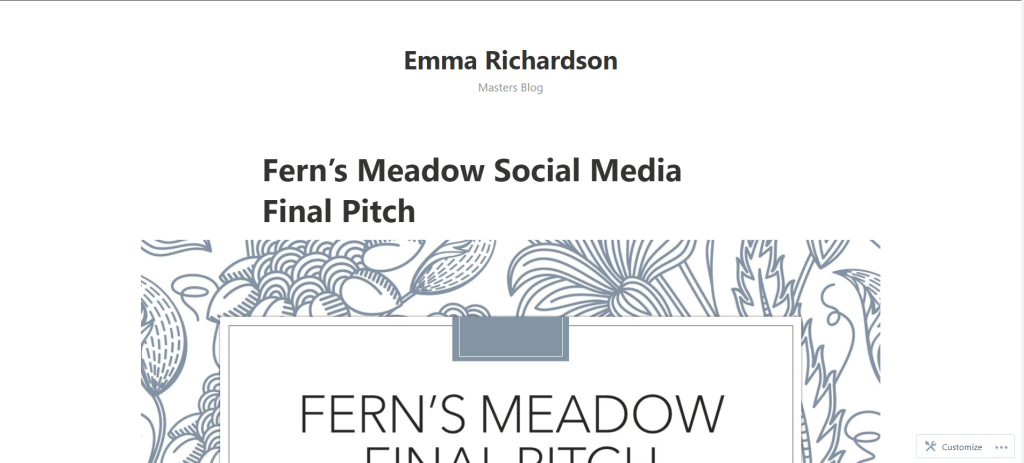
While I am all for minimalist design, this is a little overboard. When I first go to my site, all I am greeted with is my name and the title “Masters Blog”, then my blog posts starting with the most recent. First of all, no one knows who I am – there is no photo of me and no bio to be found. Second of all, who wants to read a blog called “Masters Blog”?
This needed a big overhaul. Here is what I came up with:

In the header I address those two issues – people now have an idea of who is speaking to them through the writing and the subtitle changed to give a bit of a better idea about what is going on here. There is also a background photo (while it will no doubt change when I get the chance to do a photo shoot) which makes this much more compelling to look at.
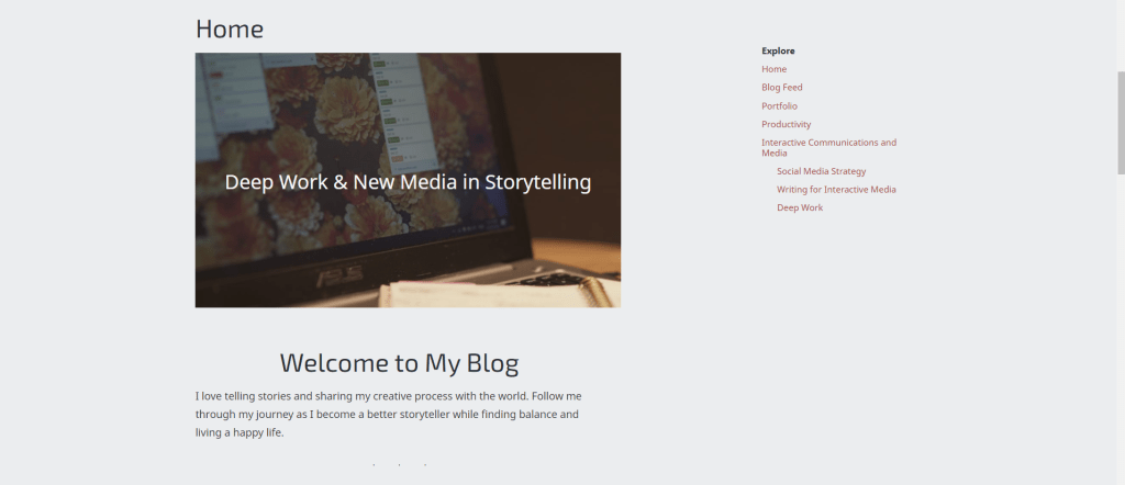
Below that is a quick introduction to the blog, some recent posts, an “about me” and a contact footer. And just like that a simple blog feed turned into a multi-page website.
There where some hiccups along the way, like having a logo and a duplicate header image – but it is all a part of the process!

The before and after is just a drastic on the mobile version. All of the information a reader could need is right at the top of the page and it has a lot more character.


Blog Feed
One of the most important aspects that needed improvement was the navigation from post to post. To do this figure out how to properly use categories to add them to the menu. This article by AF Themes gave me the roadblocks for me to start organizing my posts. This unfortunately required me to go back and edit each one, but was far worth it for the organization that exists now.
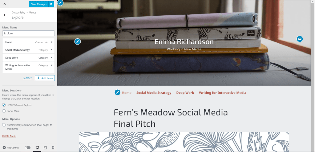

This final menu is on the sidebar of every page. While it is not very fancy, it is straightforward and does the job.
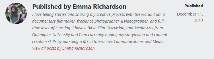
Author Bio
One of the other elements that needed improvement was the bio at the end of every post. Or rather, it needed to be added so that people could know who wrote the post.
Before my renovation, all there was at the end of a post was my WordPress handle. I decided to spruce it up by adding a my photo and a bio.
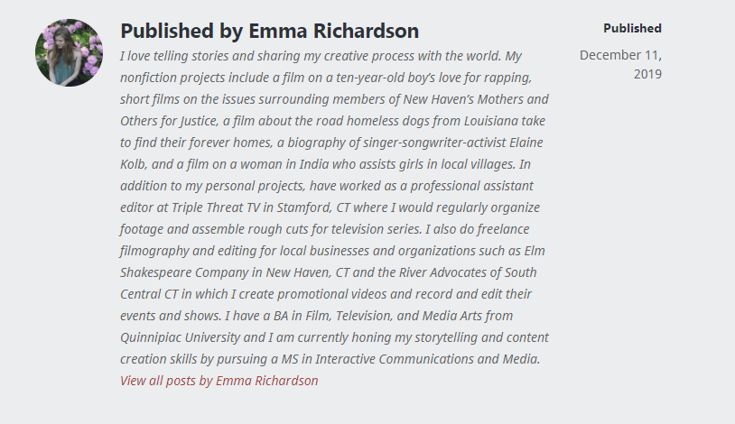
Then I realized that maybe it is a little much. Too much information is almost as bad as not enough – I know that I wouldn’t bother reading that monster of a paragraph after already reading an entire blog post.
A Work in Progress
While a lot has changed, there is so much further to go. As I learn more about HTML, CSS, and proper Web Layout I will improve the look and effectiveness of my blog.
