Fern’s Meadow is my family’s small farm in Meriden, Connecticut that sells fresh produce, artisan products, and breeds Nigerian Dwarf Goats. In a past class I have re-worked Fern’s Meadow’s social strategy – and now I will be taking the next step in improving their internet presence by re-working their website.
First, let me explain the process of creating a website:
- Project Definition: The most vital part to the development process is defining the goals of the business. According to Jeff Cardello’s article The Modern Web Design Process: Setting Goals he points out that in the excitement of all the other steps, “it’s easy to lose sight of what’s important. Fuzzy expectations lead to frustration and can slow down the process. That’s why you need a clear sense of your project’s goals early on.” In order to clearly define your goal you could create personas to understand your target audience and do an audit of your competition to know what they are doing well and where they are going wrong.
- Planning: The next step website creation is to plan the site architecture. This is made from the sitemap and the wire frame. This step is vital as it not only provides a clear guideline for you to follow in development, but it ensures that your are following the goal you defined in the last step. I go more into this step below as I create the site architecture for the Fern’s Meadow re-design.
- Design: The design component consists of two parts – User Experience (UX) Design and User Interface (UI) Design. While they are often confused or grouped together, the article The Difference Between UX and UI Design – A Layman’s Guide outlines the difference between the two, summarizing a website as a living creature: “The organs represent the UX design: measuring and optimizing against input for supporting life functions. And UI design represents the cosmetics of the body; its presentation, its senses and reactions.” To design your website you can create mood boards, color palettes, grid structures, sketches, mockups, prototypes, and web typography.
- Development, Testing, Delivery, and Maintenance: The reason I am grouping these tasks together is because these steps will continue in a loop. Once you have a finished website you must test it to ensure it works, release it to the public, gather analytics, re-develop it, and repeat.
The Fern’s Meadow website was made using a template from GoDaddy. While it is okay, it could do with a makeover that aligns more with the business’ goal of providing fresh veggies, quality goods, and cute goats to the public.
Before I dive into the new site architecture, I will review the old one.
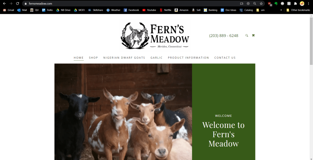
Looking right from the get-go, things need to change. The picture is outdated and low-quality and doesn’t work with a screen that has an average resolution. It looks almost exactly the same on mobile thanks to the CMS’s responsive design, but it still needs to be made a bit more inviting.
The remainder of the page is the background of the farm then the navigation buttons on the bottom. This needs to be changed so the navigation is more accessible (and uniform).

The shop page is functional, but not great. The images should be bigger to show off the quality of each product. Some of the images must be replaced as well. The menu to the left is a little confusing and unnecessary since there are only five products.
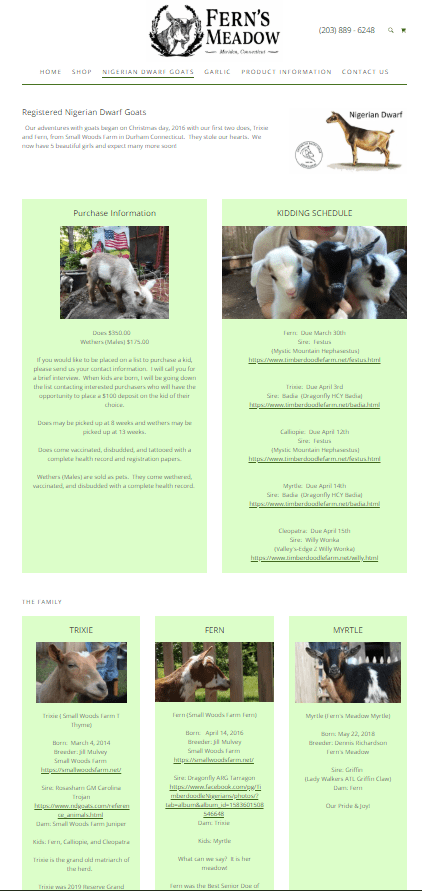
This page is again, functional, but not much more. First of all it needs to be updated with the new kids and better photos. There should be some sort of call to action with the purchase information. The family section could be made more appealing if it was a gallery-style – the light green box with an image is too repetitive.

Instead of having a single page dedicated to garlic, this needs to be updated to all fresh produce. There also needs to be another call to action to contact about joining the email list.

This entire page needs to be merged with the shop. The lavender information should be added to the new fresh produce section as well.

At the bottom of this product info page is a gallery. This needs to be updated and moved to the top, although the images don’t belong on this page at all.
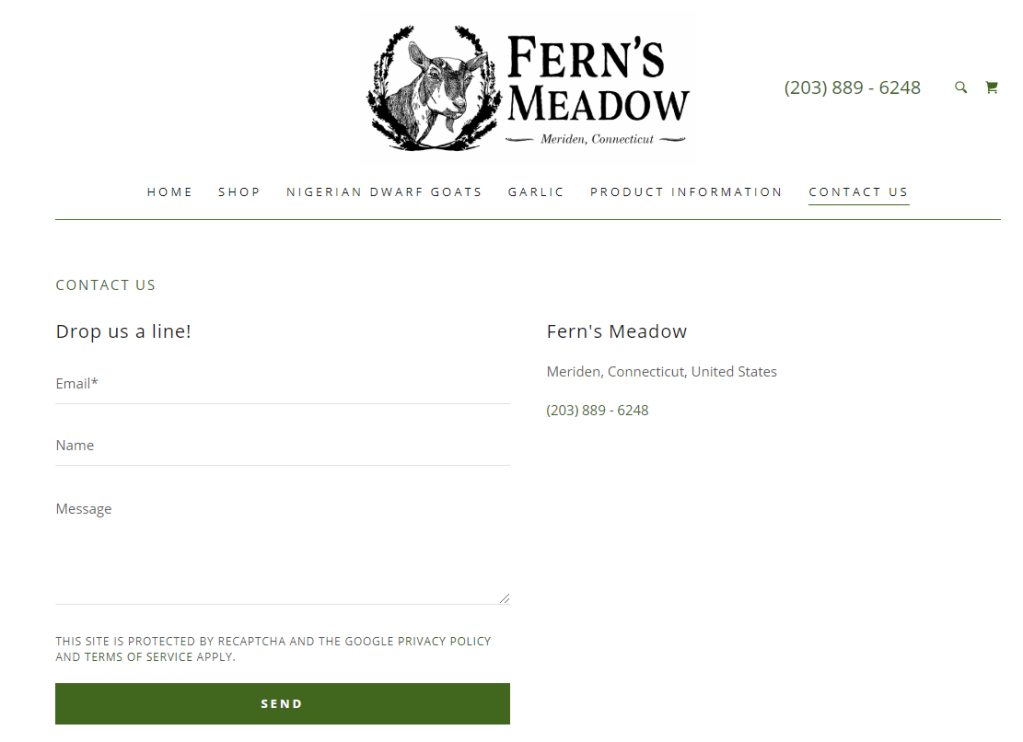
The contact page is typical. I would move the map (which is below) to the side to get rid of the excessive white space.
Now that we have assessed what needs to change, it is time to plot out these changes.
Sitemap
Sitemaps are a useful tool when it comes to ensuring your goal is reached through the site’s design. It can also help avoid duplicated or misplaced content, something the current website is guilty of on several counts.
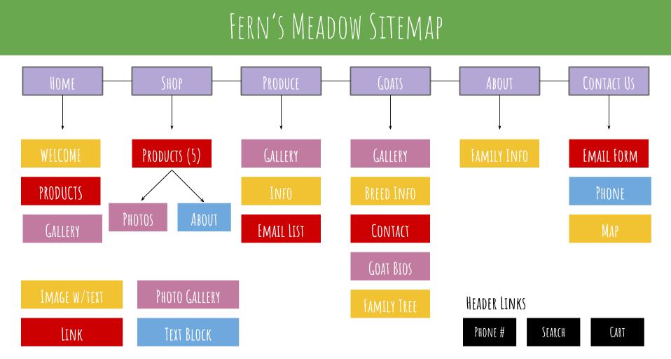
When creating this sitemap I took into consideration each critique I made in the audit of the current site. You will notice that I simplified the site quite a bit in order to make the site as easy as possible to navigate for the user.
Having this site map enables me to know exactly what pages need to be made. In order to know how each page is presented, I created wireframes.
Wireframes
Wireframes are the next step in the planning process. They outline all of the important features on a website that allow a designer to visualize each page’s structure without getting distracted by the aesthetics or more surface-level elements.
To make my wireframes I used wireframe.cc. If you are having trouble understanding them, check out this visual on how to read wireframes. Since the website is simple the only two elements that you need to understand are that the boxes with x’s are images (and galleries if arrows are to either side) and the text that is colored and underlined are links.
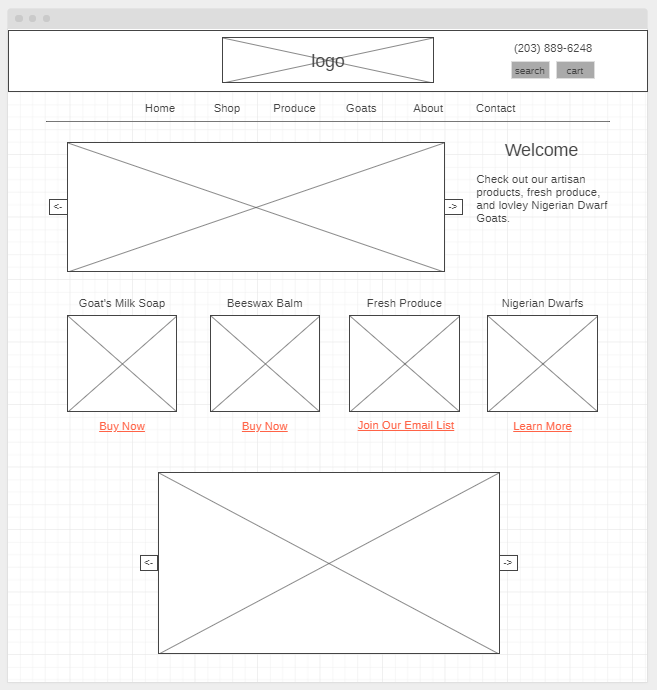


I decided to not include the About and Contact page – those pages are extremely simple and will be similar to their previous versions.
When creating these wireframes I had a few things in mind which I had discovered when comparing good and bad site design: simplicity, a clear visual design, an obvious value proposition, and attractive imagery.
Something to note is how easy it was to create these because I had my sitemap. I never questioned what content should be there; I was only concerned with how it was presented. Breaking down each step like this is a must if you want to stay organized and stress-free during your website creation.
Mood Board
Now that the site architecture has been established, it is time to design the aesthetic. The first step in this is creating a mood board.
Mood boards are collages of images and materials that help reflect the ideas and style of your web page. There are countless mood board tools out there like Pinterest and Photoshop, but I chose to go with a site that had pre-made templates since this was my first time.

The style I want to convey is homegrown and natural. The photos are all ones that I took from the farm (except for the photos of the produce). The brand’s message is to share quality products from the animals we love and to show our hard work, so I was sure to include photos of all of that. If the mood board were bigger I would add photos of the rustic barn and surroundings to add to the homegrown aesthetic, but I believe this mood board captures my vision for Fern’s Meadow.
Color Palette
You may have noticed the color blocks in the mood board. The color palette is another important part of the design process. Every color has a certain mood that comes with it, so I chose the colors carefully to align them with what want to convey.
This article by Neil Patel gives a basic explanation of how color psychology can affect your user’s actions and feelings towards your brand. Using his guidelines, I chose the colors that best matched the interest of the site.

Green is the main color – as you can see, it is the main color for the original site as well. It is the best choice for environmental products as it gives off a nice and organic feel.
I chose blue as a secondary color because it is preferred the most by both genders and conveys a sense of trust. However, Patel warns designers NOT to use it for food, so it will only be used in the Goats and Contact page if there are more colors needed. If the page feels too overwhelming with the blue and other colors, then I will choose not to include it.
Orange is the call-to-action color. It will be used on the buttons like “buy now” and “add to cart” as it gives a sense of haste, impulse, and action. It will only be used to contrast the most important actions in order to make the call to action as clear as possible.
Now that the design and site architecture has been laid out it is time to develop, test, deliver, update, and repeat! Follow my blog for updates as I learn more about web design and I enhance my family’s web presence.
