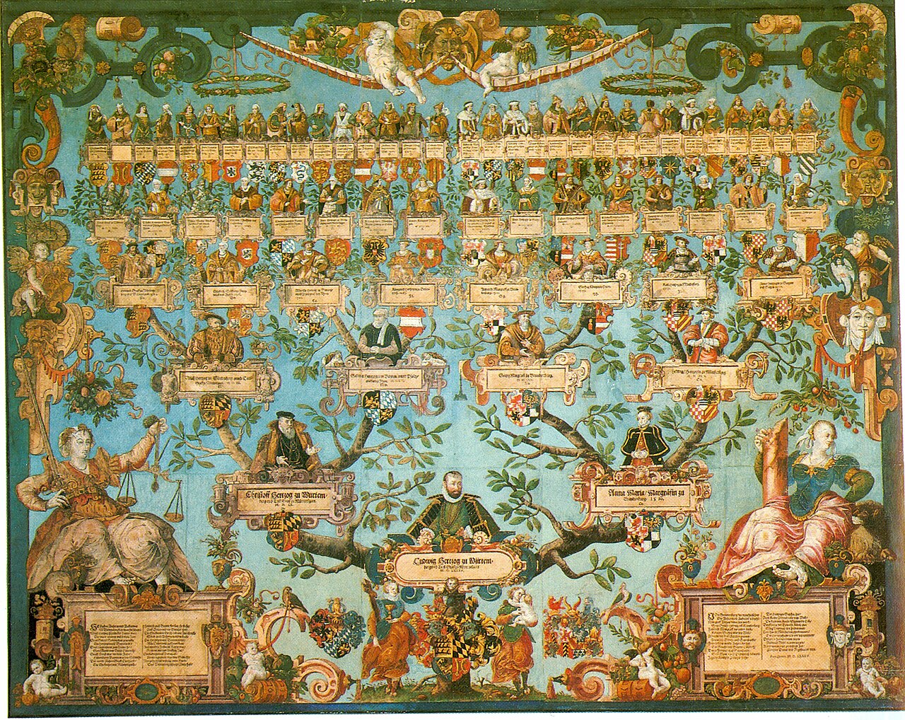
Data visualization is one of the fastest-growing methods of communicating the ever-expanding wealth of knowledge that the world is accumulating into an easy-to-digest way. As explained in the TED Talk by Manuel Lima, humans have been using visuals to process and portray information since ancient times; the most popular form of visual information being the Porphyrian tree which was used to map morality, genealogy, systems of law, species, and more. While still a popular form of visualization, there has been a trend towards networkism: an art full of variety that carries the principle that everything is connected in some way, rather than strictly hierarchical.
These networks are often extremely complex, yet through data visualization humans can understand visuals with minimal cognitive effort. This is because we are constantly bombarded with sensory information, most of which is unconscious and visual. As explained by David McCandless in his TED Talk, the huge amounts of data that are now in this world need some sort of “knowledge compression,” and mixing visual design with data is an optimal way to do so. In an article by Tableau, this idea is clearly defined in a few sentences:
“While traditional education typically draws a distinct line between creative storytelling and technical analysis, the modern professional world also values those who can cross between the two: data visualization sits right in the middle of analysis and visual storytelling.”
“Data visualization beginner’s guide: a definition, examples, and learning resources.” Tableau. https://www.tableau.com/learn/articles/data-visualization.
Without this combination, the sheer amount of data can lead to decision paralysis. However, there is no way to include every part of the data in one visual. Bringing in different data sets for comparison can help bring context to stats that may seem to imply something that is far from the whole picture (just watch this TED Talk starting at 10:05 to see how different data sets can change how you see an issue).
Still, it is impossible to show every point of data. That is why when it comes to creating these visualizations the information, story, goal, and visual form must balance each other out to make sure you are successful in achieving what you want with your presentation. This whole concept is explained in a graphic by David McCandless:

In addition to understanding those aspects of your visualization, you need to determine what type of visualization you want to create. This depends on the complexity and type of data you are conveying. While it is best to be as simple as possible with your visuals since people are more likely to accurately interpret them, sometimes simple visualizations won’t be in-depth enough so you will have to turn to things like slopegraphs, parallel coordinates, or others.
No matter the type of visualization it is, you always want to keep in mind some principles outlined in a presentation by HubSpot and Visage:
- Use Color Well. Each data point should have its own color so that it is easy to compare, but stick to six or less. Also stay away from high-contrast color combinations.
- Do Not Distract from the Data. While callouts and visual cues can be used to emphasize or enhance data, avoid using unnecessary illustrations, fonts, or font elements.
- Order Your Data Correctly. Use a logical hierarchy when ordering your data. Your main goal is to make it as easy for your viewer to understand as possible.
There are more ways to represent data than with the typical graphs and charts, though. Sarah Illenberger creates data-driven images that are more on the creative side. Using objects related to her data, she takes photos of them and uses a key to outline the differences between them and what they represent.
Using the same technique, I created this infographic based on data collected by Julia Engelmann in 2019.
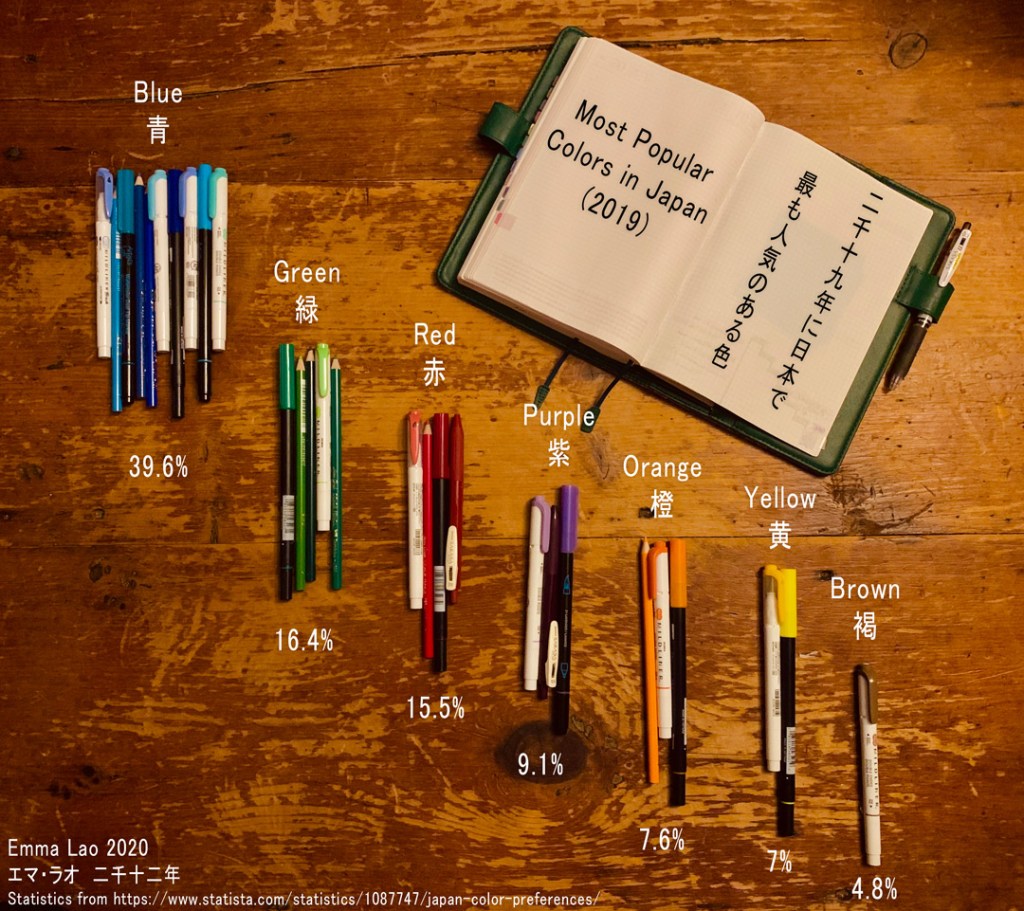
This image took quite a long time to produce for a number of reasons. First of all, I had planned on creating an infographic on the benefits of jounrnaling, but after hours of research I could only find one statistic on it – the rest of it was all qualitative. Still set on using my collection of Japanese stationary to create my image, I scaled back my grand plan and went with a data point that is simple to collect.
After I finally had the statistics, it was time to translate them to real life. I divided the percentages by 4 (unfortunately I do not have that many pens) and made groups of each color based on their percentage. From there I began to experiment with how to present the data. At first I tried re-creating a pie-chart using the groups of pens, but the differences between the colors were not obvious enough. In addition to this I would have had to place the key in awkward positions, something that is advised against in the guide by HubSpot and Visage.
Instead I created a mix of a bar graph and clusters of data – both the amount of pens and their vertical position show their popularity. As a bonus I know a bit of Japanese, so I was able to make my infographic bi-lingual. While the process of creating it did not go as planned, I am proud of how I was able to adapt the data in a fun way that is a little more interesting (albeit, slightly less accurate) than a simple pie chart.
“Data visualization beginner’s guide: a definition, examples, and learning resources.” Tableau. https://www.tableau.com/learn/articles/data-visualization.
“Data Visualization: How to Design Charts and Graphs.” HubSpot & Visage. https://cdn2.hubspot.net/hub/53/file-863940581-pdf/Data_Visualization_101_How_to_Design_Charts_and_Graphs.pdf.
“Information Visualization – A Brief Introduction.” Interaction Design Foundation, July 2020. https://www.interaction-design.org/literature/article/information-visualization-a-brief-introduction.
Lima, Manuel. “A visual history of human knowledge.” TED, 2015, https://www.ted.com/talks/manuel_lima_a_visual_history_of_human_knowledge?language=en#t-11500.
McCandless, David. “The beauty of data visualization.” TED, 2010, https://www.ted.com/talks/david_mccandless_the_beauty_of_data_visualization#t-35216.
McCandless, David. “Knowledge is Beautiful.” Harper Design, New York, 21 Oct. 2014.
Sinar, Evan. “7 Data Visualization Types You Should be Using More (and How to Start).” Medium, 14 Feb. 2016. https://medium.com/@EvanSinar/7-data-visualization-types-you-should-be-using-more-and-how-to-start-4015b5d4adf2
Watson, Hugh. (2017). Data Visualization, Data Interpreters, and Storytelling. Business Intelligence Journal. 22. 5-10.
