In this module I explore the ever-growing medium of user interface (UI) animations and take a whack at it by creating my own little calendar animation.
Reading & Writing: Animate!
In previous posts I covered all of the steps for planning an animation from Liz Blazer’s book Animated Storytelling. Now it is finally time to begin the process of actually making the darn thing!
However (as a professional procrastinator I am well aware of this), sometimes starting is the hardest part. What Blazer suggests you do is start with the easiest tasks first so that you can gain the momentum that is required to get through the rough patches. You should also do your best to break up bigger tasks into specific and smaller goals so you don’t get overwhelmed or intimidated. Here is one (of many) YouTube videos that break down how to break down tasks:
It is also important that you are constantly saving, backing up your files, and ensuring proper organization. In fact, before you even begin you should plan out how you are going to organize your files. This will take no more that 7 minutes and save you lots of time in the long run.
You should also be keeping the basic animation principles in mind, as well as being open to changing up the movement and sounds as appropriate. The soundtrack is very important as you are creating your piece – while you should be flexible with the music, animate to the music you do choose to use.
After you made a sequence of shots it is very important that you take a step back and analyze every shot to see if it is worth keeping in the piece or not. I have done this many times with documentary editing as well – even if a shot is good or you love it, it is sometimes best to cut it for the sake of moving the story forward and maintaining flow.
This weekend I will be publishing a post on the final part of the process – getting your work out there. Stay tuned for that!
Research to Inform: UI Animations
Animations have become a key part of making a user interface feel smooth and responsive. They are key indicators that the program is working and that an action done by the user actually did something. It also enhances UX by adding a bit of fun to simple tasks, as seen in the animations below.
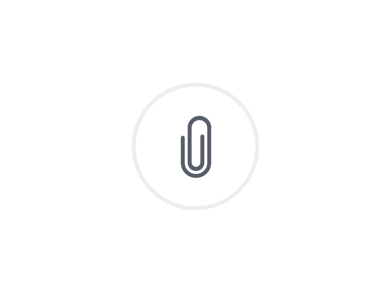
This first animation is one of the most “functional”. There are a few elements that suggest to the user that their actions have meaning. First, when the attach button is clicked it shrinks and expands to show that the click was registered. Next the circle around the icon fills up as the attachment is uploading, presumably the amount of progress that is being made is equivalent to the amount of the ring that is green. Once it reaches 100%, a green paper icon slides into the paperclip addon, meaning that the document was successfully attached.
Not only is the animation itself a key indicator of its success, but the color is as well. Green has become synonymous with correctness, goodness, or simply the action for “go”. If the color were to be changed to red, it would seem that the file did not attach successfully. In the same vein, yellow may mean that the attachment was paused. While it is just a color, a color with as strong of an implication as green is an intentional and important choice.
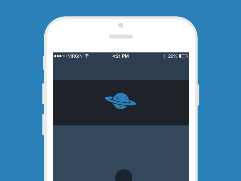
This animation has a bit of fun mixed with function. When the moon revolves around the planet it indicates that the app is refreshing. There is an additional animation that makes it appear like the planet is spinning – something that is really unnecessary, but a nice subtle addition to the interaction.
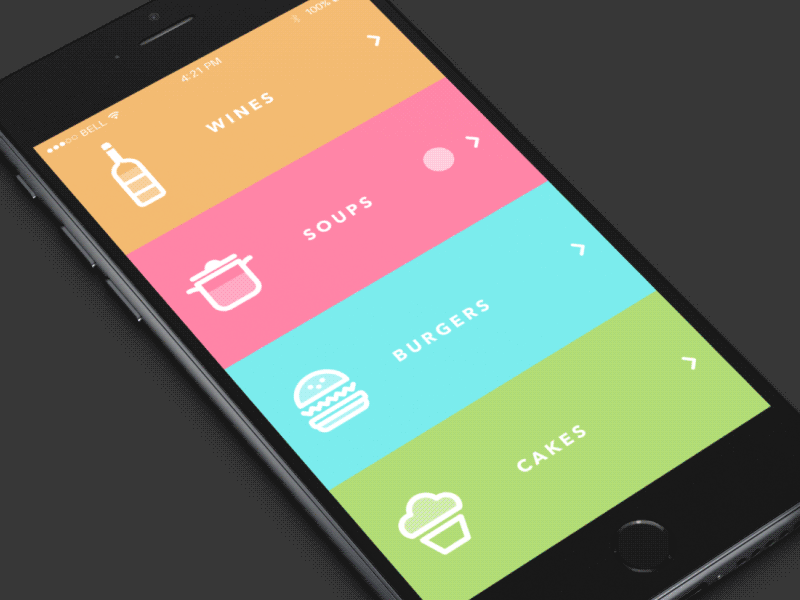
This animation again has two elements – the fun and the functional. The functionality is more direct – the menu, separated into colored blocks, moves as the user swipes up and down. The “fun” part is how the icons match the physics of the movement is various ways. While this is one of the most unique, I may argue that it is bordering the line of being a bit distracting to the user. It gets away with it on a screen with so little information, but it is good to keep in mind that too much of a good thing can be bad.
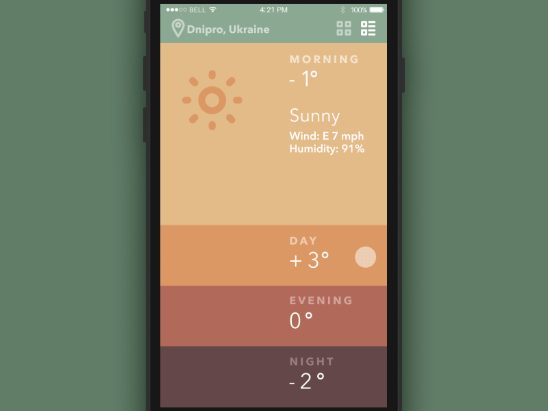
This interface and its animation are beautifully designed. Every piece of it serves a function while being engaging to use. The first part of the animation is the dragging of the time-of-day card which makes that time bigger, revealing more information and making space for the other animation. The sun/moon and cloud are great because they add fun and functionality at the same time. The sun is always spinning to show its presence and the cloud and precipitation show the user what the weather is without them having to read anything. It is also amazing to see how seamlessly it is able to change from one part of the day to the next – the balance of the expanding screens and slight movement of the icon makes a well-composed UI.

This UI animation is complex, but completely functional. The first element is the click of the register button – it goes up and down to imply that the click worked. Next, the text of the questions appear then shrink, and the line for you to fill in your answer swipes onto the screen. As each form is filled out the color of the background progresses along the screen to show that the user is only steps away from finishing. Each answer is also met with either a slick “click” movement to acknowledge the input or shakes side to side (and turns red) to show that it was wrong. Finally, the box swipes out of existence and the welcome text is seen.
The animation of this login screen is all fun – and fantastic! The yeti’s eyes and face follow the text as it is typed, then he covers his eyes for the password. It is simple, but effective at making the user feel welcomed by the service.
The final UI animation that I explored was this neat little calendar widget. It is extremely simple – the user clicks on a day, a line of white with the text “What would you like to do?” appears between the separated calendar, and the user types in a simple task. Afterward a dot is placed under that date to show that there is a task assigned to it.
Create: My Own UI Animation
I absolutely love planning and journaling, so I knew from the start that I wanted to create an animation that incorporates that passion. I was inspired by the minimal aesthetic of the one I just analyzed, but I wanted to add a bit more of a free-drawn look as if it were from a physical planner.
There are several pieces to this animation. First, the action of clicking on a date will expand that date, move the calendar to the side, and open up the note menu. After the user inputs a goal, a circle appears around that date. If the user checks the box to say that it is finished, the circle fills in. If those actions are erased, the animations are reversed.
Finally I added some simple sounds: typing and a clicking sound. My goal was to keep the UX as simple and minimal as possible to align with the idea of getting their task done.
While I wish I was better at knowing how to orient the animation over the mockup photo, I am proud of what I made!
