For my first venture into the world of visual design, I created a piece of abstract art inspired by a series of paintings created by another artist. After some discussion with my friend who appreciated abstract paintings, he suggested that I check out the work of Simon C Page, a British graphic designer and illustrator.
While browsing through his work, the series “Grunge Geometry”, which can be viewed on Page’s art prints shop, stood out to me. Before taking a try of creating my own composition based on his style, I analyzed each of the pieces below, keeping the basics of graphic design in mind.

The first of the series starts with a geometric bang. This composition is made of many randomly-colored curved lines and a ground that is a light beige. The curved lines do not touch, but due to the Gestalt Principle of continuity (Callahan), the human brain perceives the four curved lines that are just barley separated to be touching in order to make a full circle.

The next in the series that caught my eye was “Grunge Geometry D”. This one is vastly different from the previous since it is asymmetrical. According to Anthony Fontana’s presentation on 2-D Foundations, an asymmetric balance in a composition, unlike a symmetric one, will bring movement and dynamic qualities to the image. There are also elements of hierarchy – the larger hexagons are more dominant than the smaller ones near the center of the image (Fontana). This could also imply that the larger hexagons are closer to us than the further ones, giving a feel of fore, middle, and background. Looking at it this way makes it seem like the viewer is positioned in between two waterfalls of colorful hexagons (although it is a bit of a stretch – still abstract art is there to make you think)!

“E”, again, is different from the rest. If it were not for the colors the symmetry of the piece would make it static, but the gradient from orange to pink to purple to many shades of blue makes for a dynamic and compelling piece. In addition, the different colors of the triangles create the illusion of a form shadow on the shapes (Callahan), making the point where four triangles meet appear as if it were closer like a bunch of little pyramids poking up at the viewer.

“G” is very eye-catching. The color palette, randomization of color, and presence of many shapes is similar to the rest of the group, but the way the curved rectangles are larger on the outside and get smaller as they go in makes the piece very dynamic. This composition uses the depth perception cue of linear perspective – the bigger shapes appear closer to the viewer and the smaller ones appear very distant (Callahan). It is as if it is a colorful tunnel that the viewer is peering down.

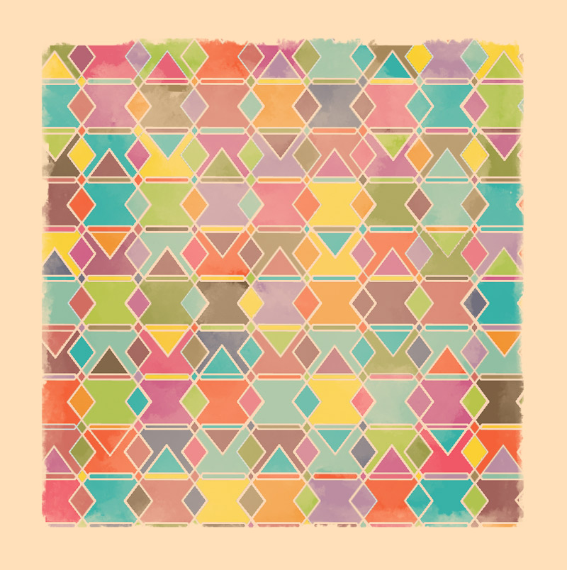
“J” is my favorite of the collection since it seems so simple at first glance, but is actually quite complex. Page used only 2 types of shapes – a diamond and a hexagon – to create this entire image. The lines (which I would consider a sort of white space/ground as it is the same color as the border around the figures) are all parts of the shapes – one long hexagon, one regular hexagon, and a large diamond in the middle with a smaller diamond on either side.

This one is much like “J” but only has large hexagons overlapping each other, creating random polygons in the process. While the idea of that sounds boring, I believe that the unity of the piece makes it all come together very nicely; the repetition in the hexagons, the satisfying configuration which leaves no space odd or unaccounted for, and the variety that the randomly selected colors from the palette bring (Landa).

The final piece I reviewed stumped me more than the rest – From what I could gather Page was using lines to create triangles within triangles within triangles until two small triangles overlapped into a shape resembling the Star of David. For this choice of shape I agree with Rune Madsen in his article “Basic Shapes and Relationships” – the triangle is still basic, but brings a lot of edge and movement into the piece. That combined with the huge variety in color from shape to shape (while sticking to a somewhat limited palette) take the eyes for a rollercoaster.
For my own piece I based the color palette mostly on J, K, and M but did my best to keep the spirit of symmetry and continuity that is present in the majority of the series intact. I was also drawn to the thin, but vital, whitespace that those three utilized.
I wanted to do the same idea as “J” where I use two shapes (of varying sizes) to create a composition, and I think it worked well. I began with stretched hexagons then overlapped them vertically to make a new super thin hexagon. After adding more rows, I overlapped them again horizontally to create medium-sized diamonds within the figures and a small diamond where there was a bit of “ground” (which became a figure when I colored it in and made it its own shape). Finally, I added larger diamonds on top of every other horizontal hexagon, which I feel added a little more variety to the image.
Next, I used the eyedrop tool in Photoshop to select colors from the palettes that were used in J, K, and M. Since I was using the fill tool to do this and not an actual paintbrush I added a bit of variety to the value of the colors for some texture.
After I had the fully colored shapes and lines, I used the brush tool (while holding shift to keep it straight) to create the border, then the blend tool to add the brush-like strokes near the inner edges like in the original paintings.
Finally, I needed to emulate the cloud-like texture that is present in the original pieces. To do this I used the same brush as the border, lowered the opacity, scribbled in the center of the canvas, then blended it like crazy with the finger smudge tool.
In time I hope to be able to create pieces more complex than this – one that is asymmetrical and with more movement perhaps – but for my first piece, I am happy with it. Follow my blog to keep updated in my pursuit to know more about visual design and the pieces I make to practice those concepts along the way!
Sources:
Callahan, Ewa. “Depth Perception.” Visual Design, 25 Jan. 2021. Quinnipiac University. Lecture Recording.
Fontana, Anthony. “2D Foundations: Intro to Composition.” Bowling Green State University. Microsoft PowerPoint presentation.
Landa, Robin. Graphic Design Solutions. 6th ed., Cengage, 2019.
Madsen, Rune. “Basic Shapes and Relationships.” Programming Design Systems, http://printingcode.runemadsen.com/lecture-form/. Accessed 27 Jan. 2021.
