This morning shake is my go-to breakfast that I prepare for myself and my husband in less than 5 minutes. I’ve found it to be perfect for my low-budget healthy diet plan. Here’s how you make it:
First you add about a ½ cup of frozen fruit. I usually use blueberries since they taste great and are cheapest by the pound where I live but you can pick any fruit or blend you like.
Next you add 1 cup of almond milk. You can swap this for any milk/milk alternative but almond milk is again the cheapest and has the lowest calorie count out of the milk options.
Next you add your scoop of protein powder. Since I am trying to lose weight and focus on protein consumption I went with this vegan chocolate protein powder. Everyone has different goals though, so I suggest you research and pick what would be best for your diet and goals. For instance my husband is focusing on weight gain, so I put mass gainer in his shake.
Then you add about a ½ cup of spinach. I like to freeze a bunch for easy preservation and storage.
Lastly you add water to the fill line so the shake isn’t too thick then blend.
This is the most bare-bones version of the shake I make. Some other foods I like to add are:
a banana – personally I prefer to save the banana for it’s own snack, but it’s a great addition to the shake
oatmeal – you can use either a ⅓ cup of oats or a pack of instant oatmeal for some nice flavor (just be sure to blend well!)
olive oil – it may sound odd, but adding a tablespoon or so of olive oil is perfect for those looking to add more fat to their diet or to gain weight
peanut butter – a great flavor boost that’s high in fat
fruit juice – instead of topping with water you can use fruit juice, just be aware of how sugary it can be
honey – if you need more sweetness honey is a great natural option for it’s nutrients and antioxidants
coffee – for coffee lovers adding about a cup or an espresso shot makes for a nice all-in-one morning drink
I hope that you enjoyed this recipe. Please follow for more wellness tips if you’d like to see more!
For my final week of my exploration of Audio & Video Production, I filmed & edited the mini-documentary I had planned last week.
Reading & Writing: A Reflection on My Practice
To wrap up my study of Tom Schoreppel’s book The Bare Bones Course for Film and Video I read his final words on page 141. In these, he explains that all art is subjective, but the basic principles that he wrote about and that I have studied in the last 6 weeks are what is known to work.
Since I was already accustomed to audio & video production, this course served more of a practice than a learning experience. I believe that I have improved my pre-production process and therefore the productions go much more smoothly than they had in the past.
However, I would like to take Schoreppel’s advice and begin to explore “going all artsy-craftsy” – I want to create a distinctive creative tone that is a part of my future works that goes beyond the basics. I was especially inspired to do so because of the subject of my mini-doc and close friend (seen below). Like her, I want to be more confident in my creativity and use it to change the world for the better.
Research to Inform: J & L Cuts
In editing, J and L cuts make for a smoother transition from one image to the next by overlapping the audio from the previous or following shot.
In this VICE video, there is the first L-cut at 0:22 when the images break away from the journalist to shots of the crowd while he is still speaking. At 15:12, there is an example of a J-cut, where the images continue to be shots of the city streets as the journalist begins to speak, then cuts to him speaking shortly after. I think these cuts make the story flow smoothly with imagery. Of course, it also serves to cover-up any cuts during the standup that they made.
These cuts are also effective in transitioning between scenes. In this clip from Shawshank Redemption (1994) at 1:36 when the warden is looking through the hole you can begin to hear sirens before the road and the police cars are shown. This is a very common type of edit to bridge between connection events – in this case they discovered his escape, so police cars were dispatched.
Create: Choose Your Battle
For my mini-doc I interviewed Juliet Royster about her nonprofit called Choose Your Battle that sponsors the education of young Rwandans. There were a few road bumps that I had to go through with the production, but overall I think it turned out very well. I hope you enjoy!
This is my final week of college so I would like to use this post for a moment of reflection. For my first graduate class I created a whitepaper on Deep Work in Documentary Production. I will be analyzing how this advice has worked for me so far and some new things that I have learned since then.
A Distracted World
In the whitepaper, I explain how the “attention economy” is enveloping more and more of our time. With the pandemic, things have only gotten worse.
When working at home or in a personal office, like many documentary producers do, it is even more difficult to avoid distractions. Through your computer you have access to hundreds of social and informational sites within seconds. Even away from your desk, your phone is a tether to constant connection and distraction.
In 2020 and 2021, it is not only documentary filmmakers who are staying at home – it jumped to 71% because of the pandemic. Working from home is not a bad thing, it can actually make your time a lot more productive – if you take the right steps to ensure that you do not get trapped by the only increasing distractions.
How to Do Deep Work
So how can we work from home, or anywhere, distraction-free and fully focused?
The first step is to decide what your deep work schedule looks like. There are three different types of schedules; bimodal (taking a chunk of days to focus on deep work), rhythmic (carving out time within specific days of the week), and a hybrid of the two. I had concluded that the hybrid schedule is best for documentary production where you can use the rhythmic philosophy for the “shallow work” of documentary production and the bimodal philosophy for “deep work”.
Having planned, filmed, and edited a documentary since that time I think that the “best” schedule depends on who you are and how you work. The bimodal philosophy can be extremely draining when you dive fully into a project and nothing else for a few days. I had done two very taxing shoots that would be in the category of bimodal and I can honestly say that it was not a stable way of working for me.
When I was editing my film, I tried the rhythmic philosophy: every morning I would get up at 5:30 AM to do another cut of the film. I would usually be done by 10 so I was able to use the rest of the day to attend to my other habits, duties, or shallow work.
Part of the reason that this was such a productive time for me was because I did this work in an uninterrupted and distraction-free environment. The apps on my phone would be locked (and I would use my phone for a Pomodoro timer) and my only task was editing – work that is definitely valuable and deep.
When to Do Deep Work
Carving out a chunk of the morning for deep work is no small task.
We only have 24 hours in the day, so we must make the most of it. Many people make the mistake of seeing the eight or nine hours they spend at work as the day and the time before and after it as bookends when we have nine more hours of conscious time to do with as we please.
The easiest way to make sure that you actually take advantage of each hour of the day is to find a proper planning system where you can plan exactly how you spend all of your time. While in my whitepaper I suggested using Trello, I have since moved to a physical planner, namely the Hobonichi Cousin.
Another tactic that I am still getting used to is living by the “hell yes!” or “no” methodology. I have been so close to burnout several times in the last few years, mostly because it is difficult for me to say no to opportunities that I am offered. (Actually, just last week I accepted two freelance gigs for the week of my finals – had I reminded myself of this method, I would not be writing this blog at 1 AM and two days late.) Really I need to practice what I preach, so this is a reminder for myself as well: only say yes when it is a hell yes, otherwise say no thank you.
Why Deep Work is Important
Deep Work is not only valuable in the sense that it creates something that is useful, entertaining, and unique; it gives the person doing the work purpose. In the whitepaper I talk about Steven Pressfield’s The War of Art and how it addresses the pain of facing resistance – a resistance that is strong, brutal, and ever-present – in order to create your life’s work.
Ask yourself ‘if I were the last person on earth, would I still want to be doing this?’ If your answer is yes, then you know that you can and will face any resistance necessary to create meaningful and irreplaceable work.
As my job search begins, I must keep this vital question in mind. I genuinely want to do work that is meaningful and that can allow me to make change in the world. I want to work somewhere where I am willing to face the resistance every single day with pride and courage. After reflecting on my whitepaper and the experiences I have gone through to get to this point, I am ready and more excited than ever.
This week I began the pre-production phase for my mini documentary.
Reading & Writing
To begin my research on the production of my mini-doc, I began by reading the chapters about lighting and “getting it done” from Tom Schroeppel’s The Bare Bones Course for Film and Video.
Lighting is something that sets apart an ammeter from a professional when it comes to the visuals in a film or video. In the past I have gone without it, but I recently purchased two LEDs (plus my bouncer) for a basic 4-light setup. This 4-light setup consists of:
Key light: the main light which is 45 degrees to either side of the subject
Fill light: on the opposite side of the key; used to fill in shadows (but leave enough to imply depth)
Backlight: set behind the subject towards the camera to make an outline separating the subject from the background
Background light: a soft light facing the background to add some depth
More common types of interior lights include focusing quartz lights, which are much like spotlights, broads, which are wider and softer, and softlights, which are broads that have a built-in bounce. All of these lights can (and the first two should) be adjusted to be softer and avoid hot spots by using a diffuser or bouncing it off the ceiling or floor.
If you are filming outside, it is best to shoot when the sun is under 45 degrees from the horizon – otherwise there can be harsh and odd shadows cast from the overhead sun. It is also a good idea to bring a portable light or reflector to fill in the shadows that may be cast so that your subject doesn’t have to stare directly into the sun.
Planning a shoot is vital to making the day go smoothly. It is best to approach a shoot knowing exactly what you want to end up with and the exact shots and locations for each shot. For bigger projects, using a slate can help the organization when filming tremendously.
Research to Inform
The first example of a documentary that tells a story very well and in a fun way is The Last Week of High School in Gary, Indiana (2016). This is a part of a documentary series where the journalist, Thomas Morton, dives into the lives of the people they are sharing the stories of. While I am usually not a huge fan of narration in documentary (I am a diehard believer in show, don’t tell) but in this case his stand-ups and voiceovers give some valuable insight to what he was experiencing. This video was not only able to share the story of him re-living some nostalgia from high school, but gave an honest look at the anxieties and hopes of graduating seniors.
The Last Taboo (2019) is a little bit of a mixed bag for me. I think that the way that the interviews from the three separate women are intertwined is interesting, but I think it doesn’t quite hit that mark of addressing the issue that they wanted to address as to why they are judged more for their decision than non-custodial fathers would be. While their personal experiences were interesting to hear, it would have been interesting to hear what other people thought of their decision to see if and how they are truly being judged. Even including some archival footage or stats about mothers v fathers with custody would have set that question in the mind of the viewers a bit more accurately.
Filming wise, this short is great. The lighting, clarity, and composition on the sit-down interviews and b-roll was wonderful to look at. At times, however, I feel like they may have over-used b-roll. Sometimes it is best to sit in the emotions of the person you are interviewing. Another small aspect of the editing that threw me off was the use of the 1940’s and 1950’s footage. I think it fit in some places, but at times it made it confusing since two of the three women are millennials. It could have been hinting at the fact that not much has changed, but if that was the case I think they needed to make it a little more clear. Having imagery from modern-day ads or media would convince me more as a viewer that the idea that single mothers should always have custody is actually something that is still present.
Francis Bacon: A Brush with Violence (2017) is a great example of the concept I was mentioning earlier – there was no need for stand-ups or narration since the interviews of the many artists and acquaintances of Bacon paired with some wonderful editing made for a perfectly clear and linear story of Bacon’s life and legacy. Along with the wonderful storytelling done by cutting the interviews together, the use of archival footage of Bacon himself and his paintings were great additions. The audio from the interviews also stood out to me for how deep and dynamic it sounded – they must have had a great mixer.
My final pick is quite different from the other videos I chose, but I think that this and all of the videos like these are excellent at telling the stories of the too many homeless people living in America. There is no editing – just a dude asking a person about their experiences and the person opening up to him about them. I honestly think that this series is great as it is – it goes to show how simply stopping and listening can open your eyes. The only thing that I would modify is the audio. It seems like they may have a shotgun or something on their DSLR, which isn’t optimal for these outdoor interviews with wind and people in the background.
Create: Documentary Pre-Production Plan
As I mentioned from my reading – planning is super important if you want a pain-free shoot! For this particular project I went a little light on the script since the story will mostly depend on where the interview goes. Instead of a script I listed a shot list and interview questions, but both of these lists will be expanded up as I conduct the interview and generate ideas with Juliet.
This week I practiced my filming and editing skills by creating a how-to video. In the spirit of my YouTube channel, I decided to make a how-to based on habits and productivity.
Reading & Writing: Film Sequence
In preparation for the filming of the video, I read that chapters about basic sequence and screen direction from Tom Schroeppel’s Bare Bones Camera Course For Film And Video.
A basic sequence in video is composed of a combination of wide/establishing shots, medium shots, close-ups, and cutaways. Whenever a cut is made the difference between the first and the second should be both in angle and size so that it is not mistaken as a jump cut. Schroeppel explains that “each new shot should, if at all possible, involve a change in both image size and camera angle” (52).
Cuts should also be on the action, meaning that an action is continued smoothly throughout the two shots. Clean entrances and exits are also important to give the viewer some orientation for the scene.
Screen direction mostly concerns the 180 degree rule – the camera should never “cross the line”. If the camera moves past the 180 degree line that it established it can cause confusion for the viewer. If this is unavoidable, the editor can use a cutaway to lessen the confusion.
Research to Inform: Continuity Editing
To be sure that I understand continuity editing in practice, I looked at a few scenes from my favorite films to see how they shot the same action in multiple angles to make smooth cuts.
This scene from The Handmaiden (2016) begins with one long, continuous shot but goes on to have several cuts – all of which are smooth and invisible to those who aren’t looking for them. First there is the cutaway/POV shot of her looking a the portrait. When she gets to the hall between her bed and the lady’s bedroom, there are multiple angles of the same conversation – one from her bed, another in the hall, and another outside the house looking through the window. The scene closes with a cut on action when she hears a noise as she’s peeking to the lady’s bedroom. For all of these cuts, the angle and distance from the subjects vary, making it smooth and appealing.
The music video for Anna by Will Butler is one of my favorites, partially due to the upbeat and constantly-moving editing. The video is constantly in motion – almost every cut is a cut on action so you barley even notice that the angle has changed. It is almost as if it is one long take until the 1:11 mark since the cuts are so seamless. When the sailors and Emma Stone begin to dance, the cuts are more obvious, but it is cut so that the dance is continuing so again it is smooth. There is even an invisible cut at 3:15.
A very common use of continuity editing in video is during conversations. In these Arrested Development scenes the camera changes angles (almost all of them “over the shoulder”) quite a bit, but it is such a natural convention at this point that it is not disorienting to the viewer at all. Something to note here is that the editors had quite a bit of wiggle room when cutting these scenes since there were many cutaway shots of the many family members.
Create: How To Form Habits and Reach Your Goals
In order to make this video match the theme of my YouTube channel, I did have to bend the assignment’s rules a bit. Instead of a single action with multiple angles over many takes, I decided to do many actions on a few takes, giving each action at least 2 angles and cutting on action, and having clean entrances/exits whenever possible.
While I am not 100% happy with my audio quality, considering I had to create this in one day (one of my goats was in labor and gave birth this weekend!), I am still content with the result. I think it is a decent explanation of the content of the book I am summarizing and I hope it gives value to mu subscribers!
This week I used the visual montage production plan to shoot and edit the final montage for my family farm.
Reading & Writing: Editing Video
To prepare for the post-production of my video montage I read Chapter 10 of Tom Schroeppel’s “The Bare Bones Camera Course for Film and Video”: After the Shoot – Editing. This was a good reminder of what I should keep in mind for my montage so that I could achieve the goal of the video’s project proposal.
As Schroeppel explains, all editing decisions must be made with this question in mind: “Is this the best way to make my viewers react the way I want them to? (123)”. For the most part, the best editing is that is invisible – cuts that only someone who studies or makes film should notice. After all, videos and films are meant to immerse the viewer into a certain mindset or experience for their education or entertainment. If a cut does not belong it had better serve some sort of purpose and make the viewer feel that something does not belong.
For montage editing in particular, it is important to be sure that each new shot is different and presents new information in a new (and hopefully exciting) way. When using sound, see if L or J cuts could make the transitions into different shots smoother. Background music can also do a great job at pushing viewers towards the mood you wish to convey.
Something that is important to do, and unfortunately difficult if you are both the director and the editor, is to divorce the director from the editor and simply do your best edit with the footage you are given. Otherwise scenes or shots that the director loves but just does not make any sense stay out of the way for footage that actually progresses the film or video.
Finally, you also need to divorce the editor from the viewer so that you can see the cut from the perspective of your audience. I suggest that you actually find someone who had little to no involvement in the production to take a look and give you notes so that you are sure that you are getting the right message across.
Research to Inform: Editing Styles
Before I edit my own montage, I decided to look to some notable filmmakers and their distinctive editing decisions that made scenes more effective.
My first editing highlight is form Once Upon a Time in the West (1968). This scene that introduces our main cowboy is an excellent example of pacing and cutting to action. Even without any dialogue it is clear that they are waiting for someone and that someone is trouble in their eyes. At first the pacing is slow as they survey the scene, the sound of the train like a heavy heartbeat, the suddenly as the door opens and shocks them there are three quick cuts. Again, it is slow again since it was a false alarm. As harmonica is revealed to them it remains slow, if not slower, as the tension builds. When the guns are drawn and shot, again there are three quick shots and fast camera movement, then the longest shot of the windmill. The pacing of the cuts compliment the high tension of this scene wonderfully.
Skip to 1:15 for the start of the cross-cuts I am referencing
The next clip I chose highlights cross-cutting – when the scene cuts between two things happening in different places at the same time. The opening scene of Star Trek (2009) is a very intense showcase of this technique as it follows the captain’s death and his son’s birth. When the diegetic sound cuts and the emotional soundtrack takes over the clip is at its peak tension as both the captain and his wife are experiencing the most difficult moments in their life together, but apart – which makes it that much more emotional.
This last scene I chose from Scott Pilgrim (2010) has several examples of “invisible cuts”. Invisible cuts are when a cut is made during a movement of either the camera of something on-screen to make it seem like it was all taken in one shot. In this clip it first happens when the Vegan dude throws Scott into the air, and again when the camera quickly tilts back down. It happens again (kind of) when the camera moves past Scott’s head and into the animation, and ends when it moves past the back of Ramona’s head. These types of edits are common in Edgar Wright’s out-there style and they work very well for the genre of films he creates.
Create: Fern’s Meadow Montage
Last week’s work in pre-production came to fruition this week with the final video montage. Check it out here:
The day was not optimal to film since it was so sunny, the Spring colors are not quite here yet, and the goats were lazier than usual, but I still think that the piece met its objective of showcasing Fern’s Meadow and the products we offer. I will likely do a re-shoot on a better day (and once the babies are born)!
Also please excuse any camera movement that is outdoors – when the goats weren’t trying to chew up the lav wire, they were using the tripod as an extra scratching post. I suppose those are just the hazards you should expect on the job!
This week I reviewed the basics of visual composition and pre-production to prepare for the creation of my own Montage about my family’s farm, Fern’s Meadow.
Reading & Writing: The Basics of Composition
The first research I did to review the basics of composition was from The Bare Bones Camera Course for Film and Video by Tom Schroppel. While I knew almost all of the content he covered since this was the first book I read in my undergraduate education, it was still a decent reminder (and a great text for those who don’t know) about the basics of cameras, composition, camera moves, and montages. While his notes on exposure, temperature, ISO, lenses, depth of field, rule of thirds, balance, angles, frames, leading lines, and backgrounds were mostly old knowledge, I did take note of his definition of montages and the fact that every shot should be clearly different from the one before it.
I also looked at the article “Video Pre-Production Planning Checklist” by Jimm Fox. This article outlines the steps that should be taken for each video project, beginning with a clearly defined objective, defining your audience, and your key messages, then going on to create a treatment, storyboard, and schedule/production plan. This coming montage shoot will require each of these steps since it will be serving as a promotional video for my family farm.
Finally I read Mark R Robertson’s article “Storyboarding Tips: How to Plan & Visualize Your Next Video”. In this article he outlined the fact that storyboards are a necessary part of the production process since they serve as a blueprint for your video, but you shouldn’t worry about being artistic as long as the idea gets across. It should not only include visualizations, but technical details, content, and verbal delivery for each shot as well.
Research to Inform: Composition Done Right
Next I looked to some of my favorite videos to assess how they use the basic principles of composition successfully.
Frame with frame is 0:40-1:15
This is a subtle, yet interesting use of “frames within frames”. A frame within a frame is when the subject of the shot is enclosed by a natural frame – whether than be a door, tree branches, windows, arches, or others. In this scene of Kill Bill: Vol. I there are two frames within frames – one that encloses Uma Thurman and another that encloses the daughter of the woman who was killed. Tarantino also uses angles to show the difference of power, the camera is looking down on the girl, showing how vulnerable and scared she is in that moment.
The Rule of Thirds can be seen in nearly every shot.
This might be my favorite music video just because of how visually appealing it is. There are many elements of composition used in this, but one of the most prominent is the constant use of the rule of thirds. Almost every shot aligns where the subject is taking up either 1/3 or 2/3 of the grid. When it isn’t, the subject is is much more prominent (like the rose in the glass or when Grimes is in the tub of….tar? black paint?).
So many shots in this documentary are beautiful – all of which show the power of perspective.
I love Samsara for the same reason as the previous video – every shot is gorgeous and so well-composed. Many of the shots in this documentary have an interesting use of angles for perspective. The entire point of this documentary is to show cultures, practices, and rituals from different perspectives and since there is not one word of dialogue, the camera has to do all of the talking (and it does such a good job at it)! In this trailer, the shots at 0:22, 0:27, and 0:49 especially stand out.
Montage of The Handmaiden
Finally, I found a favorite montage of mine – the trailer for Park Chan Wook’s film The Handmaiden. There is such a large variety of shots that do an incredible job of portraying the tone of the film. After watching these videos, I was full of creative energy and ready to get creating!
Create: Montage Pre-Production
My first step in the pre-production process was to practice the basics of composition. The this first document I compiled shots from my location shoot that followed guidelines for composition rules. I am not super proud of the photos themselves since I could only take about 3 hours of being outdoors since it was freezing but I am feeling more confident about what I will do for when I film my montage.
I also completed a pre-production planning document that included a creative brief, notes, a script, and my storyboard. Now that I have everything mapped out I am feeling confident about filming and editing my montage!
This week I used my production plan to record, edit, and upload the first episode of my podcast, Planning Ahead. Before I created the podcast I still had to do more research into audio recording and good uses of audio.
Reading & Writing: Audio Recording & Editing
I began my research with an article on 7 Secrets for Getting Pro-Sounding Vocals on Home Recordings. This article helped me come up with some ideas for getting good sound since I am in the process of moving and live in a not-so-optimal sound recording environment.
I took the articles advice to “hack my bedroom” by using pillows, blankets, mattresses ect. to create a reverb-free space. I ended up going into the corner of an empty room and creating a box with couch cushions around me and a heavy blanket covering my head. It wasn’t the most comfortable setup, but it did fine. I also took heed of the advice to get the right mic levels (just under peaking) by testing different distances and angles.
The next article I read was Sound Advice: Editing for Audio and Video. This article gave some good advice about making L and J-cuts to smooth out audio transitions, collecting plenty of B-roll AND B-audio, and using EQ plugins to enhance the sound’s quality.
Research to Inform: Effective Audio
Next I looked at some of my favorite creators and assessed how they use sound to effectively tell a story, set the tone, and elicit some laughs.
Internet Historian is a YouTuber known for his in-depth research, stellar storytelling, and, most of all, his visuals and editing. The fact that he composed and animated this entire 46 minute video is impressive enough, but his use of sound puts the icing on top. He adds music, sound effects, and uses archival audio to perfectly compliment his voiceovers.
ContraPoints is another well-researched YouTuber who does deep dives into social issues from a very educated, but entertaining, stance. She uses sound effects, but mostly music, to emphasize her points and make each video an interesting audio experience. What I think makes this stand out is how this content can be taken either audio-only or as a group and still be just as entertaining. Her voice is also soothing yet compelling – so much so that you can spend an hour and a half listening to her talk without getting bored.
Sushi Ramen (Riku) is a Japanese YouTuber who does lighthearted pranks and crazy experiments. His videos are edited to a different pace every time depending on the comedic timing. His use of SFX and music make this (and every video of his) hilarious.
Micarah Tewers is a very talented seamstress & fashion designer who has a chaotic, yet wholesome, vlogging channel. For all of her videos the audio quality is not excellent (I believe it is all recorded on her phone or laptop), but it goes to show that you do not need stellar equipment or circumstances to tell a compelling story. While the audio cuts are a bit jagged, it is difficult to notice unless you are specifically looking for them since the fast-paced storytelling and interesting content almost distracts you.
Create: Planning Ahead Episode #1
After finishing my research and writing my script, I was ready to record my first episode! Unfortunately I was unable to get an interviewee in time for the first episode, but I think I was able to make a nice establishing episode nonetheless. I also have a few interviews lined up for future episodes!
I recorded this episode using my Blue Yeti Microphone on cardioid mode in my little couch-cushion/blanket fort and I edited it in Adobe Audition. Let me know what you think!
This week I am diving into an exploration and further practice of audio and video design. The first project I am undertaking is the very first episode of my brand new podcast!
Reading & Writing: Planning a Podcast
Before I began planning my podcast, I needed to explore the best practices for recording sound. For this research I explored Chapter 8 of Tom Schroeppel’s book The Bare Bones Course for Film and Video.
Some main takeaways included diving into the types of microphones and their pickup patterns. Mics are either dynamic or electret condenser, which is determined by how they translate sound waves into vibrations that can be recorded electronically. There are omnidirectional pickup patterns which picks up sound equally in all directions around the mic, and directional cardioid (heart-shaped) and shotgun (narrow forward and backwards) pickup patterns.
The types of microphones include:
lavalier: small electret condenser mike, omnidirectional – good for getting up-close
hand mic: most versatile – can be any pickup pattern or type
shotgun: either type, directional pickup pattern – will pickup ALL the sounds it is pointing towards
smartphone/tablet mics: electret, omnidirectional – not the best choice for quality
Beyond mics, the chapter also discussed sound waves and how to stop them from bouncing and producing reverberation, ambience, the voice slate, and basic audio mixing practices.
I also checked out a series of posts by The Podcast Host that went over the best practices of writing a podcast script. In one post they say that you can write a script in three different ways: word-by-word, point-by-point, and the rough bullet point podcast plan. Since I am thinking that I want to do an interview-style podcast, I will go with a rough bullet point script with some word-by-word sections in the beginning and the end. In another they discuss Hooks, Taglines, and the Power of Words. There are many ways to approach taglines, so this would be a big consideration when writing my own script.
Research to Inform: Inspiring Audio Productions
In order to get inspiration for my own podcasts, I looked to some that I listen to regularly for what makes them work so well. Note that while there are video versions, I originally listened to these on Spotify.
First is Matt D’Avella‘s podcast, Ground Up. Every episode is consistently high-quality and engaging. The main takeaway from this podcast that I would like to consider for my own is the tagline and the way he draws in the viewer. In the beginning of each episode he introduces himself, the show, the guest, and the topics they cover so you know exactly what to look forward to. He also inserts a highlight quote from the guest to increase the anticipation for what is coming next even more.
This next example differs quite a bit from the last and is much more informal, but I think there are some aspects that I could think about for my own podcast. I like their theme song (which is completely gibberish, by the way) since it sets a fun mood for the podcast. I also love their bit at the end of every episode called “Unhelpful Advice” where they listen to a listener’s problem and give advice (that they declare as unhelpful to avoid any accountability in worst-case scenarios). What I like about this is that it allows the viewer and the guest to interact and it gives new perspectives to real problems. While I probably would not have many submissions at first, this is something I would love to implement later on.
Before I talk about this podcast, I would like to say that I no longer support it or its creator due to troubling things that he had done. Still, this series is extremely well done. The music, ambiance, sound effects, and voiceover combined with the interview or archival audio combines in an amazing (and often disturbing) storytelling experience. The research and script are so well done and must have taken a long time to create. This is starkly different from the other two and is not likely to influence my own show too much, but if anything I will consider the power of well-done sound effects and ambiance.
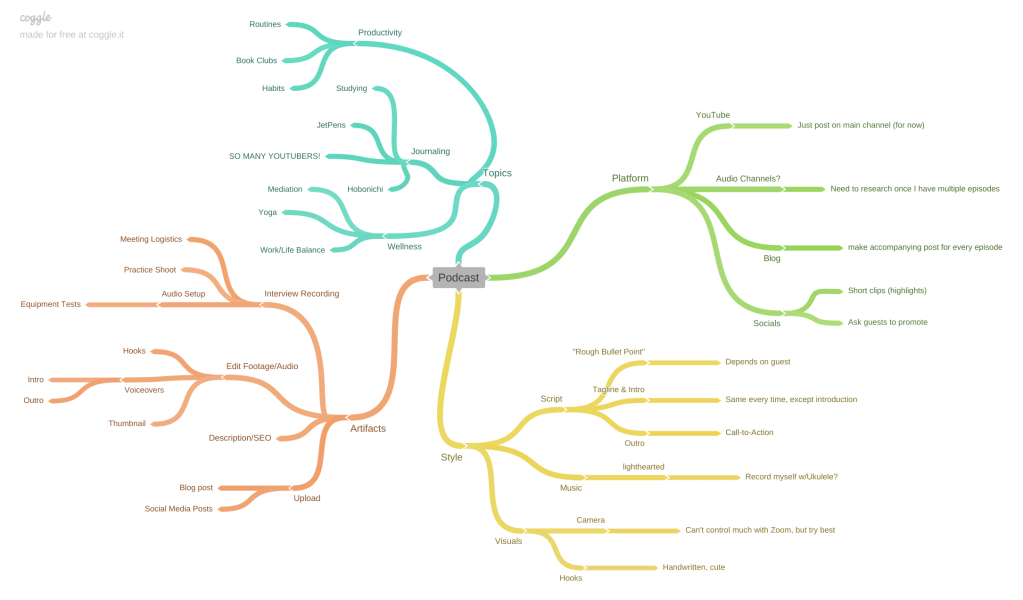
Create: My Podcast Plan
The first step of creating my podcast was to do a creative brief, mind map, list of elements, and rough script. While the title is still pending and I am waiting to hear from my possible guests, I am so excited to begin the first episode of my podcast on my YouTube channel. I feel like there is a lot of opportunity to collaborate with other people in the niche of journaling and productivity. I am a little worried about getting a guest in time (and of course complications with doing an audio interview on the internet) but I am still very excited. Check out my plan below:
For my final project in Visual Design I put all of the concepts I have learned in the past few weeks to create a brochure for Fern’s Meadow, my family’s farm. I was especially excited to create this since my family could print and use them once the farmer’s markets begin again.
Before I began to work on my design, I re-read the chapter on The Grid & Brochure Design in Robin Landa’s Graphic Design Solutions. Brochures, according to Landa, are excellent devices for a brand because “In a few pages, with text and images, you can tell a brand story, convey information or instructions, or display products” (170). I knew that this would be the perfect opportunity for me to combine the images I have taken over that last few years with information that could have a customer understand everything we do.
Later in the chapter, Landa lists a few considerations as you are planning your design:
“How the brochure system will work with the existing visual system”: Last week I had re-designed the website using two font families, certain colors (well, mostly just green), and assets that the brand already has.
“What type of content”: I knew that I wanted this brochure to include information about our story and what products we sell. This was the moment when I made up my mind what the six columns would include: (1) name, contact info, and tagline, (2) our story, (3) our artisan products, (4) our soap, (5) our animals, and (6) how to contact us.
“How to communicate the content”: For each column and within the entire brochure I needed to plan out how I wanted the reader’s eyes to travel from one element to the next using visual hierarchies. I knew that the first column and the last column needed to stand out from the rest, as they were the most important for the reader, much like the content “above the fold” on a webpage (Kolowhich Cox). The rest of the content should be uniform with each other, but still have some variation to keep the viewer interested.
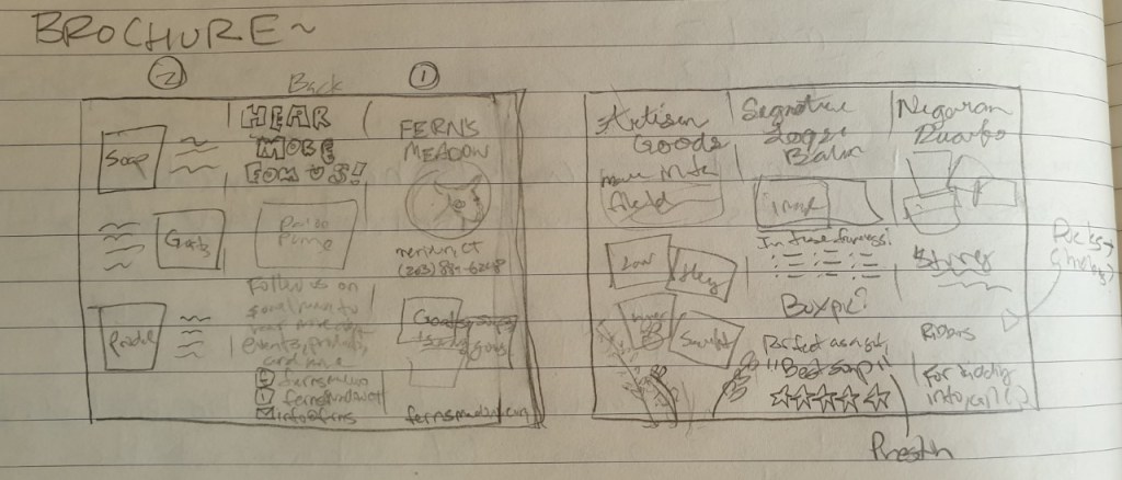
Next, I sketched out a draft of the content I wanted to add for each column and copied it to a blank piece of paper so that I could be sure the order of the columns was correct for a tri-fold format.
A little rough, but it definitely helped to make the process more clear.
After that I began to organize my images and assets then watched a tutorial on how to create a brochure in InDesign. By using the correct layout I would be sure that the margins were properly aligned so it prints normally. This is how it turned out!
For the entire brochure I decided to so with green an beige as the primary color since green elicits soothing and natural feelings and implies environmental friendliness and sustainability in a brand (Baker). I chose the beige since it works well as a neutral secondary color to make the other colors and elements pop (Cao).
The cover fold has the most important information: The name, logo, tagline, phone number, and website. I also included a sweet and compelling image of two of our mama goats and a kid. Since the image included a lot of green, I used a small black border so that it didn’t blend in with the background color (Golombisky). The name and logo are the largest elements in the entire brochure since out of anything, that is what I want the readers to understand and remember.
The backside of the brochure is simple, but important. The type on this column is large as well so that it can also be easily seen. I used the Facebook and Instagram logos from their business toolkit and created my own little email logo.
The next column (the first one going left to right) is the first fold that the reader will see when they open the tri-fold. This is where I put the text explaining the story and overview of the brand, along with photos of us as a family at markets and fairs. I also added our goal in bold and italic, setting it out from the rest of the text so that if anyone just wants to skim that fold they get the most important part. In this fold I also “broke the grid” by wrapping the text around two of the photos to “liven up” the panel (Creger).
Page two: the inner spread
For each of the inner-panel columns I used the same typeface as I had for the “Our Story” panel – a bold serif font for the title and a sleek sans-serif font for the body content. I wanted to make the two contrast each other as much as I could so that it stood out instead of mushing together (Lupton). I also used a line to separate the contents from the title to make them stand out even more.
For first panel I “broke the grid” again by both wrapping the text a bit and overlapping the images (Creger). For the middle panel I added a customer testimonial to add credibility to our brand (Kolowich Cox). For the last panel I chose the cutest images I could and made simple, but compelling pattern with the text. Since these columns would all be viewed at once I strived for balance and rhythm across all of the panels.
While this brochure will not print out correctly on an everyday office printer due to the margins that most printers have, it will be no problem for a printing company. I am excited to see my creation being read by our customers!
While this is my last post about Visual Design, follow me to keep up with my creative projects. Next I will be working on creating a killer portfolio and doing audio and video productions.