For my final project in Visual Design I put all of the concepts I have learned in the past few weeks to create a brochure for Fern’s Meadow, my family’s farm. I was especially excited to create this since my family could print and use them once the farmer’s markets begin again.
Before I began to work on my design, I re-read the chapter on The Grid & Brochure Design in Robin Landa’s Graphic Design Solutions. Brochures, according to Landa, are excellent devices for a brand because “In a few pages, with text and images, you can tell a brand story, convey information or instructions, or display products” (170). I knew that this would be the perfect opportunity for me to combine the images I have taken over that last few years with information that could have a customer understand everything we do.
Later in the chapter, Landa lists a few considerations as you are planning your design:
- “How the brochure system will work with the existing visual system”: Last week I had re-designed the website using two font families, certain colors (well, mostly just green), and assets that the brand already has.
- “What type of content”: I knew that I wanted this brochure to include information about our story and what products we sell. This was the moment when I made up my mind what the six columns would include: (1) name, contact info, and tagline, (2) our story, (3) our artisan products, (4) our soap, (5) our animals, and (6) how to contact us.
- “How to communicate the content”: For each column and within the entire brochure I needed to plan out how I wanted the reader’s eyes to travel from one element to the next using visual hierarchies. I knew that the first column and the last column needed to stand out from the rest, as they were the most important for the reader, much like the content “above the fold” on a webpage (Kolowhich Cox). The rest of the content should be uniform with each other, but still have some variation to keep the viewer interested.
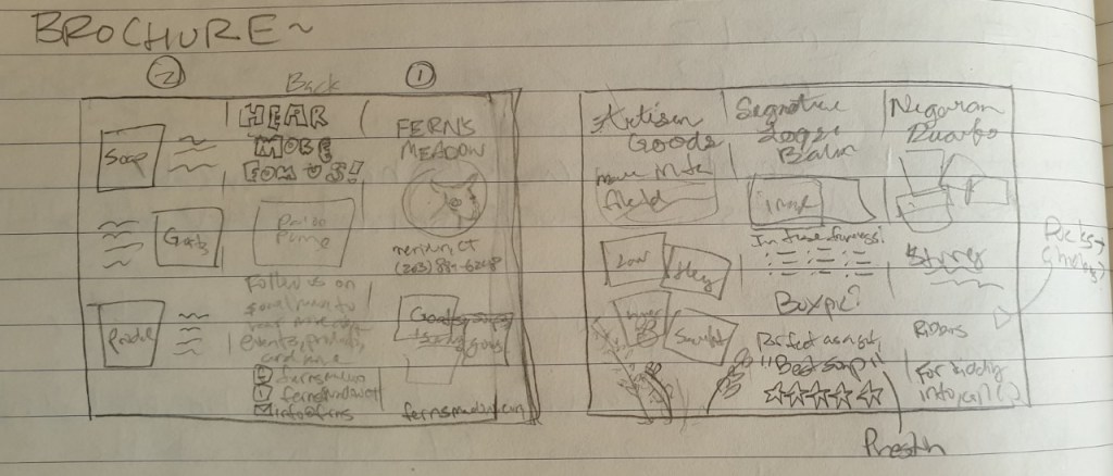
Next, I sketched out a draft of the content I wanted to add for each column and copied it to a blank piece of paper so that I could be sure the order of the columns was correct for a tri-fold format.
After that I began to organize my images and assets then watched a tutorial on how to create a brochure in InDesign. By using the correct layout I would be sure that the margins were properly aligned so it prints normally. This is how it turned out!

For the entire brochure I decided to so with green an beige as the primary color since green elicits soothing and natural feelings and implies environmental friendliness and sustainability in a brand (Baker). I chose the beige since it works well as a neutral secondary color to make the other colors and elements pop (Cao).
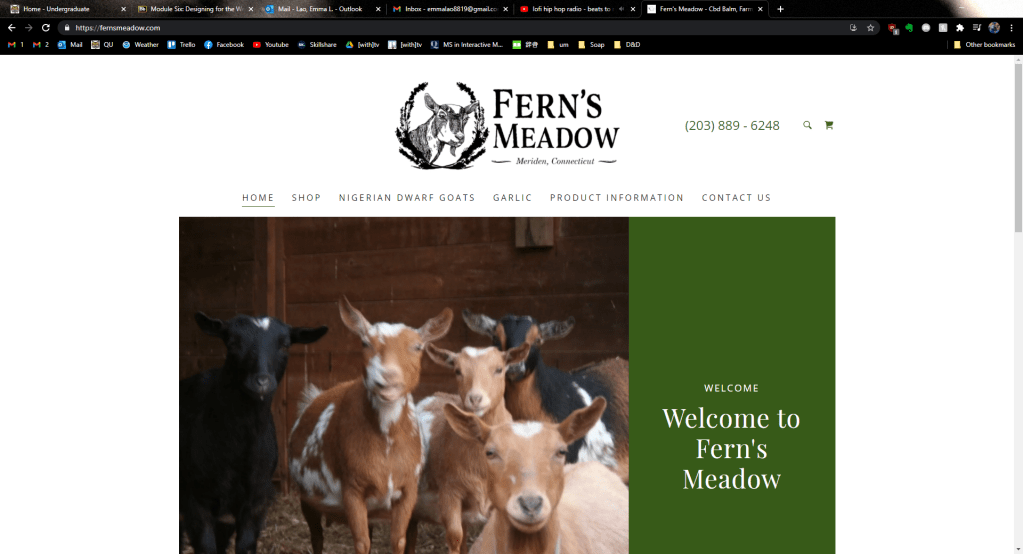
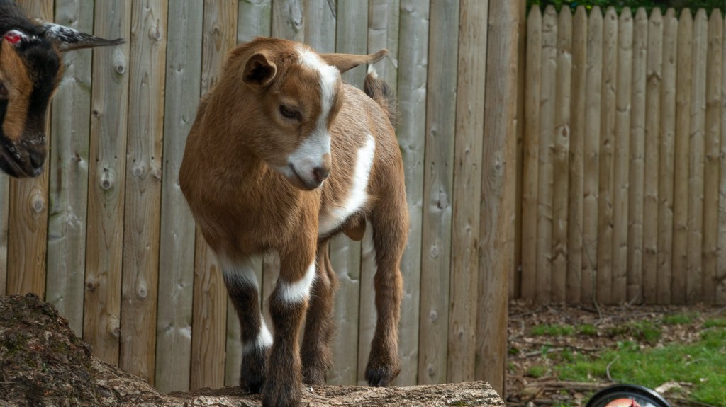
The cover fold has the most important information: The name, logo, tagline, phone number, and website. I also included a sweet and compelling image of two of our mama goats and a kid. Since the image included a lot of green, I used a small black border so that it didn’t blend in with the background color (Golombisky). The name and logo are the largest elements in the entire brochure since out of anything, that is what I want the readers to understand and remember.
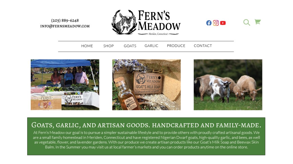
The backside of the brochure is simple, but important. The type on this column is large as well so that it can also be easily seen. I used the Facebook and Instagram logos from their business toolkit and created my own little email logo.
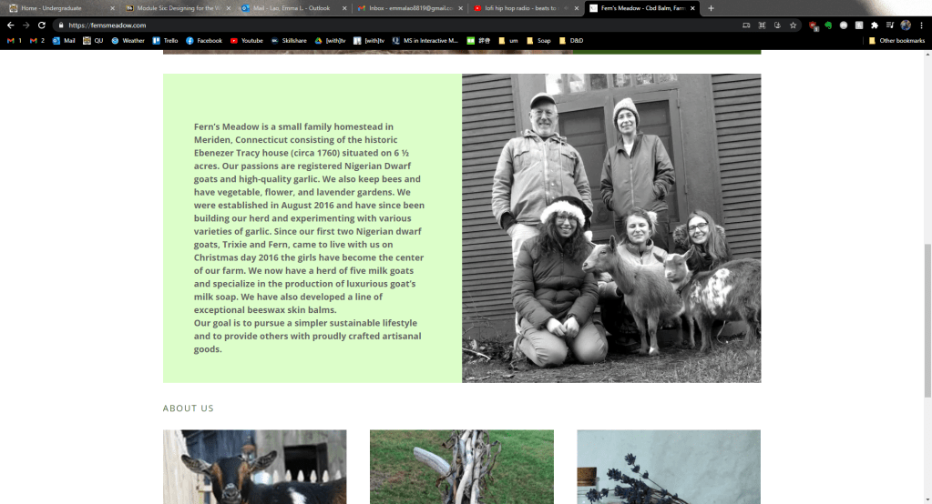
The next column (the first one going left to right) is the first fold that the reader will see when they open the tri-fold. This is where I put the text explaining the story and overview of the brand, along with photos of us as a family at markets and fairs. I also added our goal in bold and italic, setting it out from the rest of the text so that if anyone just wants to skim that fold they get the most important part. In this fold I also “broke the grid” by wrapping the text around two of the photos to “liven up” the panel (Creger).

For each of the inner-panel columns I used the same typeface as I had for the “Our Story” panel – a bold serif font for the title and a sleek sans-serif font for the body content. I wanted to make the two contrast each other as much as I could so that it stood out instead of mushing together (Lupton). I also used a line to separate the contents from the title to make them stand out even more.
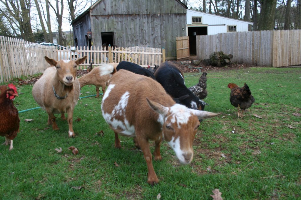
For first panel I “broke the grid” again by both wrapping the text a bit and overlapping the images (Creger). For the middle panel I added a customer testimonial to add credibility to our brand (Kolowich Cox). For the last panel I chose the cutest images I could and made simple, but compelling pattern with the text. Since these columns would all be viewed at once I strived for balance and rhythm across all of the panels.
While this brochure will not print out correctly on an everyday office printer due to the margins that most printers have, it will be no problem for a printing company. I am excited to see my creation being read by our customers!
While this is my last post about Visual Design, follow me to keep up with my creative projects. Next I will be working on creating a killer portfolio and doing audio and video productions.
Baker, Justin. The Ultimate UX Guide to Color Design. Medium, 4 Dec 2017, https://medium.muz.li/the-ultimate-ux-guide-to-color-design-4d0a18a706ed.
Cao, Jerry. “Web design color theory: how to create the right emotions with color in web design.” The Next Web, 7 April 2015, https://thenextweb.com/dd/2015/04/07/how-to-create-the-right-emotions-with-color-in-web-design/. Accessed 4 Sept. 2020.
Creger, Rebecca. 11 techniques for breaking the typographic grid. 99designs, 2014, https://99designs.com/blog/tips/11-techniques-for-breaking-the-typographic-grid/. Accessed 10 March 2021.
Golombisky, Kim & Rebecca Hagen. White Space is Not Your Enemy: A Beginner’s Guide to Communicating Visually Through Graphic, Web & Multimedia Design. Baton Rouge, Taylor & Francis Group, 2017.
Kolowich Cox, Lindsay. “The Anatomy of a Winning Website Design [Infographic].” hubspot, https://blog.hubspot.com/marketing/anatomy-web-design. Accessed 3 Feb 2021.
Landa, Robin. Graphic Design Solutions. 6th ed., Cengage, 2019.
Lupton, Ellen. Thinking With Type. Ellen Lupton, 2009, http://thinkingwithtype.com/. Accessed 11 Feb. 2021.
T, Joseph. Create a brochure. Adobe, 30 May 2018, https://helpx.adobe.com/indesign/how-to/make-brochure.html. Accessed 10 March 2021.