For my final project in exploring web technologies I created a web page based on a template from W3Schools. The reality is that when hand-coding, you rarely have to start from scratch since there are thousands of free templates for you to use. Don’t think it is easy though – you will have to do a lot (and I mean a lot) of tweaking if you want the website to be fully functional and exactly what you want it to be.
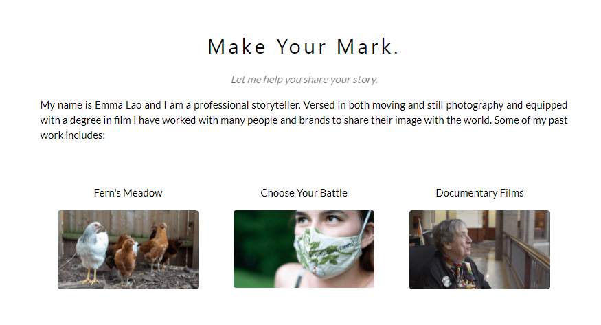
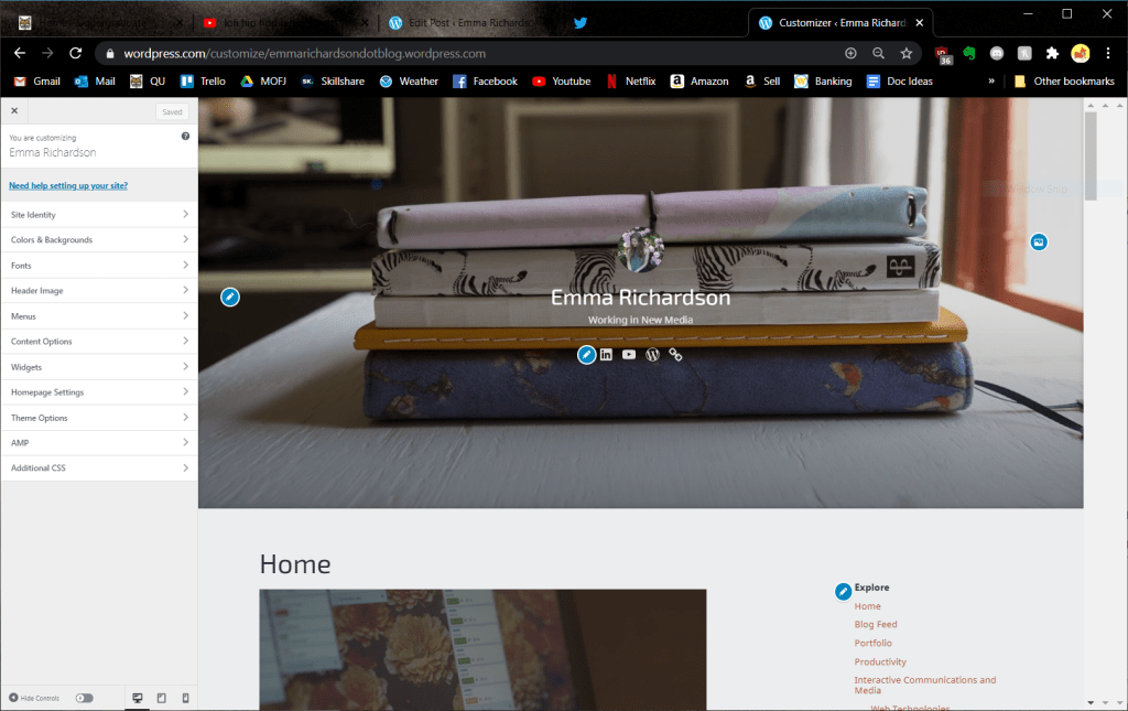
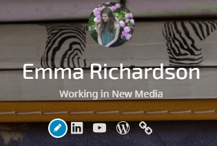
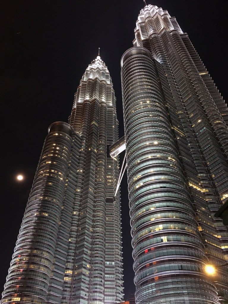
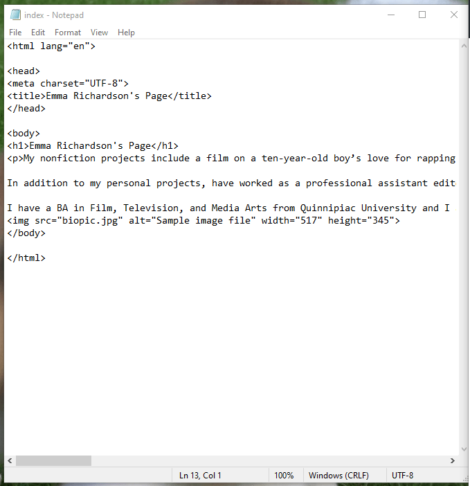
What I thought would be a simple and straight-forward process of customizing this site turned into hours of me going deeper and deeper into customization, coding, and fixing errors. Let me walk you through how I went from this:
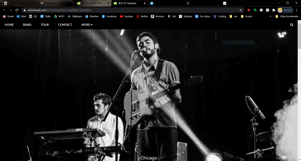
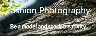
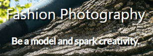
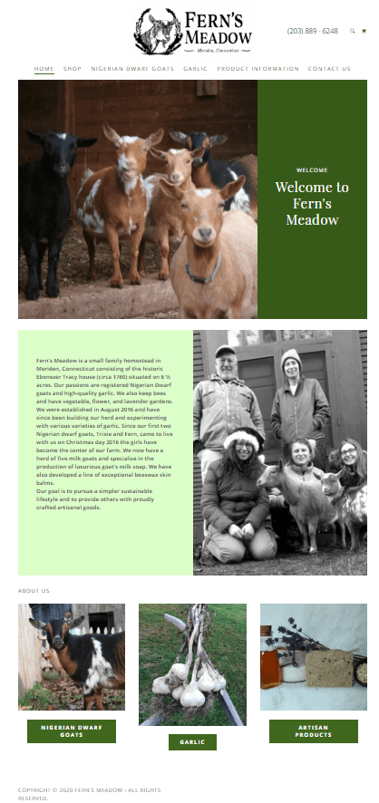
To this:

Let’s get started!
The Easy Stuff
Replacing Images
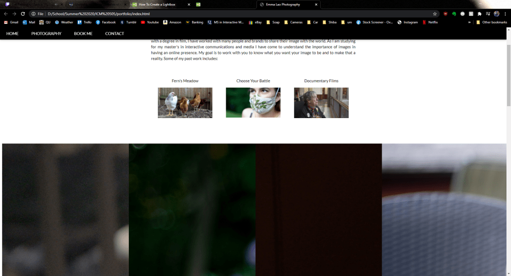
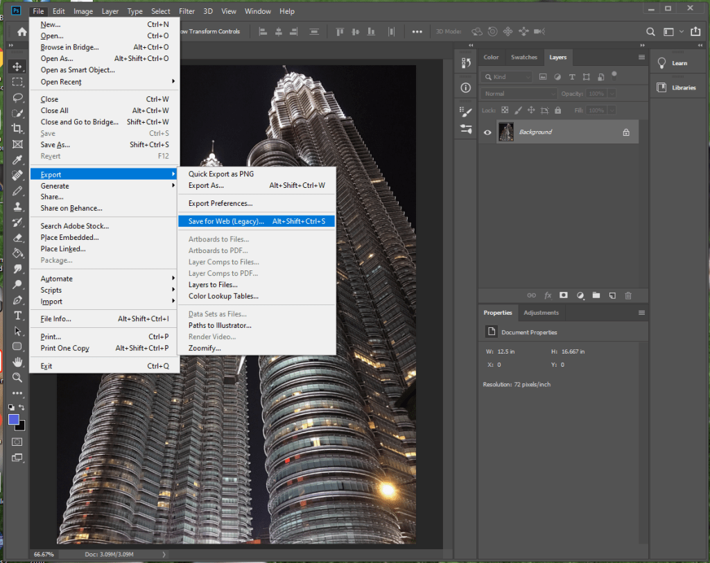
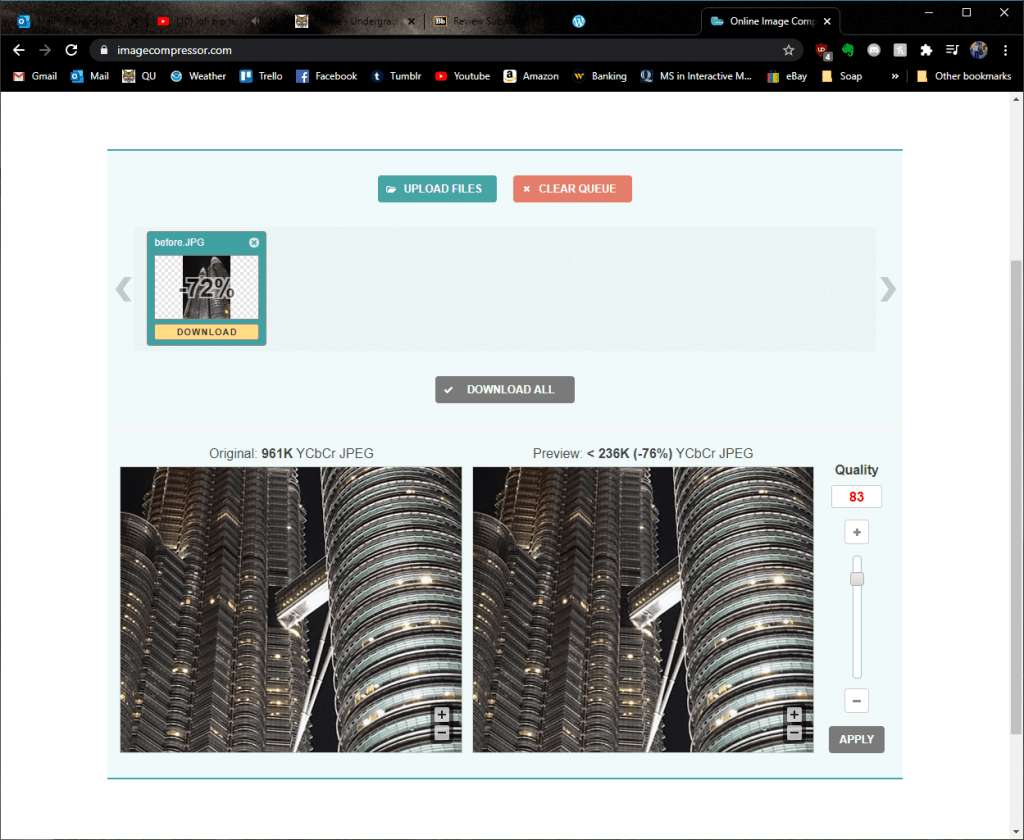
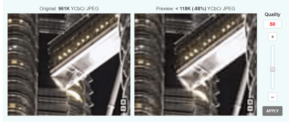
This was the first and most important step for me since I wanted to make a photography site. The first part of it was simple – optimizing the images as I had learned in the past and changing the filename in the code to link to the correct image.
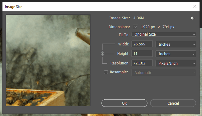
Optimizing took a bit longer than I had thought since using optimizialla was not quite enough. I also imported each of the images into Photoshop, downsized them to be no bigger than 500 px wide (except for the gallery images), and exported them all with no metadata. Watch the tutorial below to follow the process I took:
Replacing Colors
This was probably the easiest of the tasks to do technically, but it actually took me quite some time since I tested nearly every color from the W3Schools rainbow. I ultimately decided to go with “sand” and all I had to do was change the inline style in the navigation bar, photography section, and footer.
Replacing Text
This was mostly straightforward, except for the fact that I could not see the text from the image gallery because it was white. It was not as simple as changing the text to black since the pictures were multi-colored, so I decided to add some dropshadow. It took some tweaking, but I was able to make it readable.
Adding Links
After changing the text, images, and colors I wanted to make the social media icons in the footer functional. All I had to do was replace the “i” (for icon) with an “a” (for a link) and insert the href.

The Harder Stuff
Adding a Gallery
This is one that I spend about 4 hours on, and unfortunately had to give up after realizing that the style of the gallery made by W3Schools would interfere with the templates I found from the internet. I could have chosen not to share this on my blog post, but I want to be clear in the fact that coding, even when using a template, is not always easy.
Re-Sizing Images
After I optimized the images and placed them in the right spots, I noticed an issue. The width matched on all of the images, but for both the gallery and the portfolio images I saw that the height varied.
What I had to do was open the images in Photoshop, change the images to the same width and resolution, then crop the images to the same height.
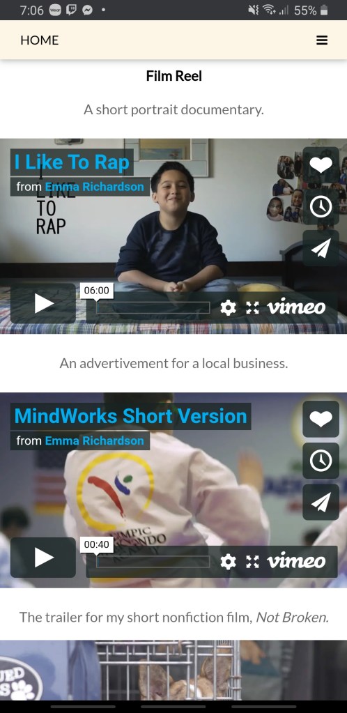
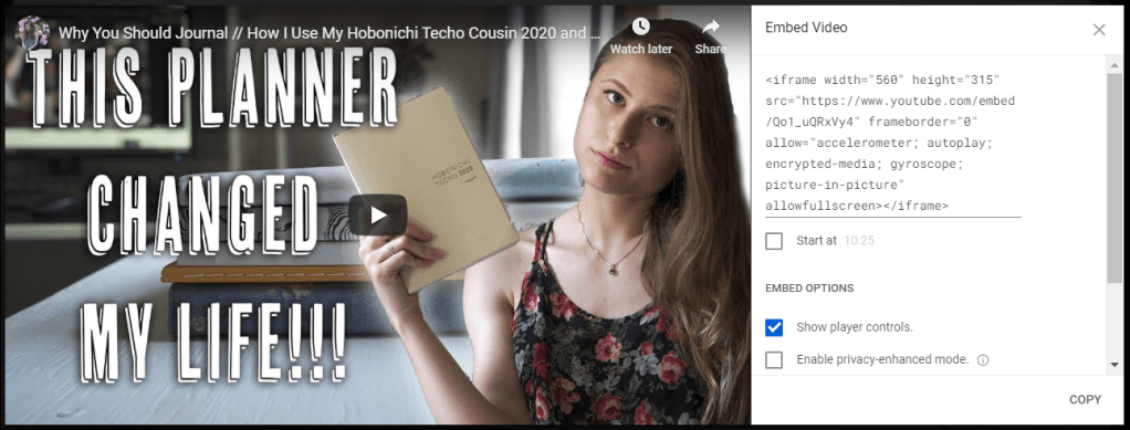
Embedding Videos
Since this site is supposed to be my full portfolio, I decided to add some of my documentary and film freelancing work. To do this all I had to do was create a new <div> and add the embedding links. Beware, though, because Vimeo’s embedding uses outdated code.

There were two issues I ran into while embedding the videos. First of all, Facebook, automatically has a smaller screen.
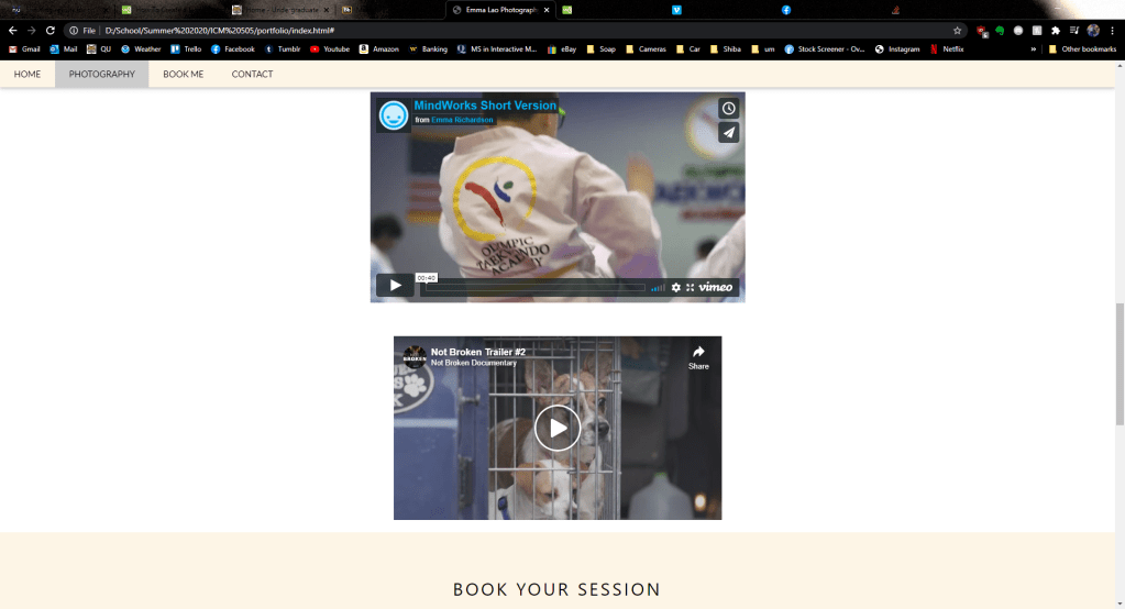
Second of all, the videos were not responsive. This meant on mobile devices and smaller screens, the video ran off the screen and caused an awkward gap on the left side of the page.
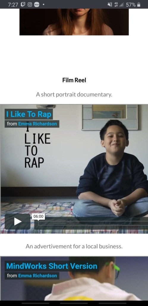
To make the embedded videos responsive, I had to follow the steps on this site. After inputting the code they told me to – voila! A good-looking and functional design. It also fixed the Facebook’s size issue.
Going The Next Step: Making it Fully Functional
While at this point my website looked good, I was not quite content since it was not fully functional. There were two parts of the page that were not functional – the “book now” modal and the contact form on the bottom. Had I learned PHP I would be able to make these forms work, but I found some work-arounds.

On the template after clicking the “book now” button a menu like this would pop up:

The pop-up looks cool and all, but when you click “pay” nothing happens. Since I do not know PHP, I decided to change the code inside the button tags to link to an external sheet. Now, instead of it going nowhere, the button links to this Google Form.
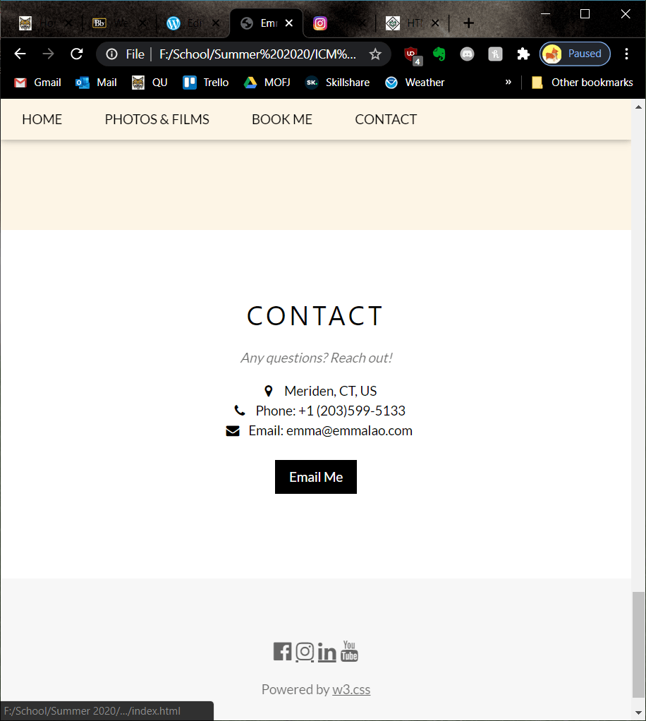
The contact form on the bottom was another element that lead to nowhere.

I decided to cut out the form and go straight to an “email me” button that causes your mail app to pop up upon clicking it. I also had to delete the <div> that held the contact form and modify the one with my contact info so it would be centered.
Don’t Forget to Validate!
Especially if you are using an older template, it is important to check for outdated code. Keep pasting your code into the validator and editing it until you see this message.

And now the page is live! It took hours of doing, re-doing, and doing again before I was fully happy with it, but this is a page that I intend to use for my new photography and videography business. In fact, I went the extra step and bought my name’s domain on Google domains and plan to move it there soon. If I make updated to the website in the future, I will be sure to post it to my blog.
For more posts on creating media follow my blog. In the next seven weeks I will be posting about Motion Across Media and Visual Storytelling – I cannot wait!


