• Blog Feed

Emma Lao

Habits

Tarot

Wellness

Hobonichi

Productivity

Media Studies

  • YouTube
  • Instagram
  • Facebook
  • Goodreads
  • TikTok
  • Visual Composition II: Fern’s Meadow Montage

    April 12th, 2021

    This week I used the visual montage production plan to shoot and edit the final montage for my family farm.

    Reading & Writing: Editing Video

    To prepare for the post-production of my video montage I read Chapter 10 of Tom Schroeppel’s “The Bare Bones Camera Course for Film and Video”: After the Shoot – Editing. This was a good reminder of what I should keep in mind for my montage so that I could achieve the goal of the video’s project proposal.

    As Schroeppel explains, all editing decisions must be made with this question in mind: “Is this the best way to make my viewers react the way I want them to? (123)”. For the most part, the best editing is that is invisible – cuts that only someone who studies or makes film should notice. After all, videos and films are meant to immerse the viewer into a certain mindset or experience for their education or entertainment. If a cut does not belong it had better serve some sort of purpose and make the viewer feel that something does not belong.

    For montage editing in particular, it is important to be sure that each new shot is different and presents new information in a new (and hopefully exciting) way. When using sound, see if L or J cuts could make the transitions into different shots smoother. Background music can also do a great job at pushing viewers towards the mood you wish to convey.

    Something that is important to do, and unfortunately difficult if you are both the director and the editor, is to divorce the director from the editor and simply do your best edit with the footage you are given. Otherwise scenes or shots that the director loves but just does not make any sense stay out of the way for footage that actually progresses the film or video.

    Finally, you also need to divorce the editor from the viewer so that you can see the cut from the perspective of your audience. I suggest that you actually find someone who had little to no involvement in the production to take a look and give you notes so that you are sure that you are getting the right message across.

    Research to Inform: Editing Styles

    Before I edit my own montage, I decided to look to some notable filmmakers and their distinctive editing decisions that made scenes more effective.

    My first editing highlight is form Once Upon a Time in the West (1968). This scene that introduces our main cowboy is an excellent example of pacing and cutting to action. Even without any dialogue it is clear that they are waiting for someone and that someone is trouble in their eyes. At first the pacing is slow as they survey the scene, the sound of the train like a heavy heartbeat, the suddenly as the door opens and shocks them there are three quick cuts. Again, it is slow again since it was a false alarm. As harmonica is revealed to them it remains slow, if not slower, as the tension builds. When the guns are drawn and shot, again there are three quick shots and fast camera movement, then the longest shot of the windmill. The pacing of the cuts compliment the high tension of this scene wonderfully.

    Skip to 1:15 for the start of the cross-cuts I am referencing

    The next clip I chose highlights cross-cutting – when the scene cuts between two things happening in different places at the same time. The opening scene of Star Trek (2009) is a very intense showcase of this technique as it follows the captain’s death and his son’s birth. When the diegetic sound cuts and the emotional soundtrack takes over the clip is at its peak tension as both the captain and his wife are experiencing the most difficult moments in their life together, but apart – which makes it that much more emotional.

    This last scene I chose from Scott Pilgrim (2010) has several examples of “invisible cuts”. Invisible cuts are when a cut is made during a movement of either the camera of something on-screen to make it seem like it was all taken in one shot. In this clip it first happens when the Vegan dude throws Scott into the air, and again when the camera quickly tilts back down. It happens again (kind of) when the camera moves past Scott’s head and into the animation, and ends when it moves past the back of Ramona’s head. These types of edits are common in Edgar Wright’s out-there style and they work very well for the genre of films he creates.

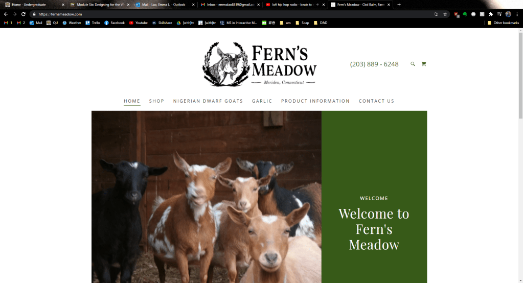
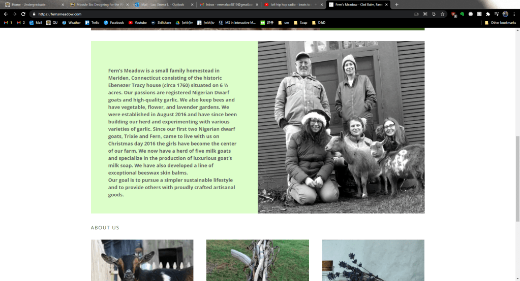
    Create: Fern’s Meadow Montage

    Last week’s work in pre-production came to fruition this week with the final video montage. Check it out here:

    The day was not optimal to film since it was so sunny, the Spring colors are not quite here yet, and the goats were lazier than usual, but I still think that the piece met its objective of showcasing Fern’s Meadow and the products we offer. I will likely do a re-shoot on a better day (and once the babies are born)!

    Also please excuse any camera movement that is outdoors – when the goats weren’t trying to chew up the lav wire, they were using the tripod as an extra scratching post. I suppose those are just the hazards you should expect on the job!

  • How to Set Monthly Goals

    April 4th, 2021

    At the end of every month I open my Hobonichi Cousin planner and assess how my month went in regards to habits, scheduling, and my month’s goals. Yes, dates (and time in general) are a fabrication of mankind and may seem arbitrary – but there is a lot of power in making a fresh start every month.

    In this post I will break down my process for mapping out my monthly goals and how you can follow those steps to become a better and more balanced you.

    The Three-Step Process: Reflect, Ideate, & Create

    When I was researching different methods of goal creation, I came across this wonderful video by struthless. From his process for creating goals for a new year, I created an abridged version for a month-to-month plan. I still suggest you check out his video (and his entire channel) if you want to know more or go more in-depth with your plan.

    Step One: Reflect

    Before you can plan how to make this month better than the last, you need to first see what went well and what went poorly in the last. Ask yourself (and write out your thoughts about) these three questions:

    1. What excited me?
    2. What drained me of energy?
    3. What did I learn?

    My thinking process (yes, it is messy – but that’s me!) looked something like this:

    Step Two: Ideate the Perfect Month

    Next, assess two or three actions in each category that you could take to make you month better in these ten categories:

    1. Personal Life & Family
    2. Work, Studies, Profession
    3. Belongings
    4. Relaxation, Hobbies, Creativity
    5. Friends & Community
    6. Health & Fitness
    7. Intellectual
    8. Emotional & Spiritual
    9. Finances
    10. Bucket List

    While you are typically thinking of all of these aspects in them back of your mind, specifically writing them out on paper makes the action plan much more clear and in-reach.

    After all of your thoughts are written out, write these questions (warning: things are about to get introspective):

    1. Why do you want this?
    2. Who do you have to be to do these things?
    3. What would you have to say no to?
    4. What would you have to say yes to?
    5. How will you persevere through hardship?
    6. Why do you deserve this?

    Again, here is my messy thought process:

    Step Three: Create Goals & Habits

    Finally, see which of these actions you would like to pursue the most and make them into habits. The Hobonichi Cousin has 10 slots in its habit tracker, but if you are new to habit tracking I would suggest you start with no more than six and work up from there. Here are the habits that I decided to go with:

    For clarification: social is spending at least 30 minutes with a friend (virtual or otherwise) and the hearts are spending meaningful time with my husband (like doing something other than eating and watching TV together).

    I also like to pick three major goals and map them out on the daily page that begins each month in my Hobonichi. This month I chose to focus on friends, finding my creative identity, and giving myself time for inner awareness.

    To see my entire monthly planning process, check out my Plan With Me video for April:


    I hope that you gained some insight on planning your monthly goals from this post! If you would like to learn more about productivity, habits, wellness, and creativity follow my blog and subscribe to my YouTube channel. If you are a fan of the Hobonichi, I also have a Facebook group where members share how they use their planners and journals.

    Do you have another way of creating monthly goals? Let me know in the comments!

  • Visual Composition I: Montage Pre-Production

    April 2nd, 2021

    This week I reviewed the basics of visual composition and pre-production to prepare for the creation of my own Montage about my family’s farm, Fern’s Meadow.

    Reading & Writing: The Basics of Composition

    The first research I did to review the basics of composition was from The Bare Bones Camera Course for Film and Video by Tom Schroppel. While I knew almost all of the content he covered since this was the first book I read in my undergraduate education, it was still a decent reminder (and a great text for those who don’t know) about the basics of cameras, composition, camera moves, and montages. While his notes on exposure, temperature, ISO, lenses, depth of field, rule of thirds, balance, angles, frames, leading lines, and backgrounds were mostly old knowledge, I did take note of his definition of montages and the fact that every shot should be clearly different from the one before it.

    I also looked at the article “Video Pre-Production Planning Checklist” by Jimm Fox. This article outlines the steps that should be taken for each video project, beginning with a clearly defined objective, defining your audience, and your key messages, then going on to create a treatment, storyboard, and schedule/production plan. This coming montage shoot will require each of these steps since it will be serving as a promotional video for my family farm.

    Finally I read Mark R Robertson’s article “Storyboarding Tips: How to Plan & Visualize Your Next Video”. In this article he outlined the fact that storyboards are a necessary part of the production process since they serve as a blueprint for your video, but you shouldn’t worry about being artistic as long as the idea gets across. It should not only include visualizations, but technical details, content, and verbal delivery for each shot as well.

    Research to Inform: Composition Done Right

    Next I looked to some of my favorite videos to assess how they use the basic principles of composition successfully.

    Frame with frame is 0:40-1:15

    This is a subtle, yet interesting use of “frames within frames”. A frame within a frame is when the subject of the shot is enclosed by a natural frame – whether than be a door, tree branches, windows, arches, or others. In this scene of Kill Bill: Vol. I there are two frames within frames – one that encloses Uma Thurman and another that encloses the daughter of the woman who was killed. Tarantino also uses angles to show the difference of power, the camera is looking down on the girl, showing how vulnerable and scared she is in that moment.

    The Rule of Thirds can be seen in nearly every shot.

    This might be my favorite music video just because of how visually appealing it is. There are many elements of composition used in this, but one of the most prominent is the constant use of the rule of thirds. Almost every shot aligns where the subject is taking up either 1/3 or 2/3 of the grid. When it isn’t, the subject is is much more prominent (like the rose in the glass or when Grimes is in the tub of….tar? black paint?).

    So many shots in this documentary are beautiful – all of which show the power of perspective.

    I love Samsara for the same reason as the previous video – every shot is gorgeous and so well-composed. Many of the shots in this documentary have an interesting use of angles for perspective. The entire point of this documentary is to show cultures, practices, and rituals from different perspectives and since there is not one word of dialogue, the camera has to do all of the talking (and it does such a good job at it)! In this trailer, the shots at 0:22, 0:27, and 0:49 especially stand out.

    Montage of The Handmaiden

    Finally, I found a favorite montage of mine – the trailer for Park Chan Wook’s film The Handmaiden. There is such a large variety of shots that do an incredible job of portraying the tone of the film. After watching these videos, I was full of creative energy and ready to get creating!

    Create: Montage Pre-Production

    My first step in the pre-production process was to practice the basics of composition. The this first document I compiled shots from my location shoot that followed guidelines for composition rules. I am not super proud of the photos themselves since I could only take about 3 hours of being outdoors since it was freezing but I am feeling more confident about what I will do for when I film my montage.

    lao-visual-composition-shot-listDownload

    I also completed a pre-production planning document that included a creative brief, notes, a script, and my storyboard. Now that I have everything mapped out I am feeling confident about filming and editing my montage!

    lao-pre-production-planning-document-for-montageDownload
  • Audio Design II: Podcast Production

    March 28th, 2021

    This week I used my production plan to record, edit, and upload the first episode of my podcast, Planning Ahead. Before I created the podcast I still had to do more research into audio recording and good uses of audio.

    Reading & Writing: Audio Recording & Editing

    I began my research with an article on 7 Secrets for Getting Pro-Sounding Vocals on Home Recordings. This article helped me come up with some ideas for getting good sound since I am in the process of moving and live in a not-so-optimal sound recording environment.

    I took the articles advice to “hack my bedroom” by using pillows, blankets, mattresses ect. to create a reverb-free space. I ended up going into the corner of an empty room and creating a box with couch cushions around me and a heavy blanket covering my head. It wasn’t the most comfortable setup, but it did fine. I also took heed of the advice to get the right mic levels (just under peaking) by testing different distances and angles.

    The next article I read was Sound Advice: Editing for Audio and Video. This article gave some good advice about making L and J-cuts to smooth out audio transitions, collecting plenty of B-roll AND B-audio, and using EQ plugins to enhance the sound’s quality.

    Research to Inform: Effective Audio

    Next I looked at some of my favorite creators and assessed how they use sound to effectively tell a story, set the tone, and elicit some laughs.

    Internet Historian is a YouTuber known for his in-depth research, stellar storytelling, and, most of all, his visuals and editing. The fact that he composed and animated this entire 46 minute video is impressive enough, but his use of sound puts the icing on top. He adds music, sound effects, and uses archival audio to perfectly compliment his voiceovers.

    ContraPoints is another well-researched YouTuber who does deep dives into social issues from a very educated, but entertaining, stance. She uses sound effects, but mostly music, to emphasize her points and make each video an interesting audio experience. What I think makes this stand out is how this content can be taken either audio-only or as a group and still be just as entertaining. Her voice is also soothing yet compelling – so much so that you can spend an hour and a half listening to her talk without getting bored.

    Sushi Ramen (Riku) is a Japanese YouTuber who does lighthearted pranks and crazy experiments. His videos are edited to a different pace every time depending on the comedic timing. His use of SFX and music make this (and every video of his) hilarious.

    Micarah Tewers is a very talented seamstress & fashion designer who has a chaotic, yet wholesome, vlogging channel. For all of her videos the audio quality is not excellent (I believe it is all recorded on her phone or laptop), but it goes to show that you do not need stellar equipment or circumstances to tell a compelling story. While the audio cuts are a bit jagged, it is difficult to notice unless you are specifically looking for them since the fast-paced storytelling and interesting content almost distracts you.

    Create: Planning Ahead Episode #1

    After finishing my research and writing my script, I was ready to record my first episode! Unfortunately I was unable to get an interviewee in time for the first episode, but I think I was able to make a nice establishing episode nonetheless. I also have a few interviews lined up for future episodes!

    I recorded this episode using my Blue Yeti Microphone on cardioid mode in my little couch-cushion/blanket fort and I edited it in Adobe Audition. Let me know what you think!

  • Organize Your Life with the Hobonichi Cousin Planner

    March 24th, 2021

    Are you feeling lost, unmotivated, and overwhelmed? Do you keep procrastinating even though you know it only increases your anxiety? I know that I was. At the peak of my anxiety and frustration, I knew that I needed some sort of system to put in place to make sense of things and get my life back on track. The system that works best for me is journaling in my Hobonichi Techo Cousin planner.

    Why the Hobonichi Cousin?

    Before I began researching new planners, my experience was limited to the ones provided by my public schools or those made by Blue Sky. These are fine, but rather limited in what you can do with them. My eyes were opened by JetPens’ stock of Japanese planners.

    With so many to choose from, why the Hobonichi? The primary that I chose to buy it, and chose to continue using it, is because of its (structured) freedom.

    The Hobonichi Cousin has four distinct sections – the habit tracker & monthly, weekly, and daily spreads – so you have some guidance for what to put where. However, the pages are blank enough where you can be creative and do what you want to do with each of them. If you are attracted to bullet journaling but feel that it is too hard to fill a blank page on your own, the structure that the Hobonichi provides is perfect.

    The Habit Tracker & Monthly Spread: Reach Your Goals & Organize

    The first section of the Hobonichi Techo is the habit tracker. Here you can list up to ten habits to keep track of daily. Visualizing progress of your habits is an important step to making them a reality, but there is much more that goes into habit formation than that. My next post will dive deeper into how to create systems to make your a consistent part of your life, so stay tuned!

    The monthly spread is the most straightforward section in my own Hobonichi. You can use it to organize every event and appointment you must attend to so that everything for the month can be seen at-a-glance. As I explain in my video, I do not use it as much as the other sections, but it is still an excellent tool for organizing your time.

    The Weekly Spread: Time Management

    The weekly section of the Hobonichi Cousin shows every single hour of every single day, which makes it the perfect tool for time management. Balance between work and wellness was one of the main problems contributing to my anxiety, so having time blocking every minute of your day can be helpful in figuring out where you need to reallocate how you spend your time.

    On this spread you can also add a weekly to-do list, create art in the margins, or track your mood. I like to use the bottom three hours of each day to track my mood with a cute sticker and a short summary of the day.

    The Daily Page: Journaling for Wellness & Creativity

    By far my favorite part of the Hobonichi Cousin is the daily page. Each day has a blank grid-line paper for you to write anything you want. There are countless videos and articles about the benefits of daily journaling (and the benefits will vary from person to person) but for me it is a sort of therapy to fill out the page at the end of every day. This page is a space solely for you – so do what speaks to you and makes you happy.

    Besides the wellness befits, there is also ample space for you to keep daily to-do lists. I have another video on the power of lists so check it out if you would like to learn more. Helpful tip: even if your to-do list has multiple items (as it often will), highlight the item that you most want to get done and be sure to do that task first. That way, even if you can’t get to everything, you still make progress.


    There are so many reasons why I love this planner that one blog post is not enough. To hear more about the Hobonichi Cousin, journaling, habits, and wellness follow my blog and subscribe to my YouTube channel.

    If you would like to see what other Hobonichi Cousin owners do with their planners, join my Facebook group. Do you have a Hobonichi Cousin, or any questions about how to use it? Please leave a comment below!

  • How to Make Reading a Habit

    March 22nd, 2021

    When I was little I loved to read, but as I got it became a chore. No matter how hard I tried to make it a habit, it just was not working! Does this sound familiar?

    Even when I was out of school and able to pick books that I knew I would enjoy, I simply could not find the motivation to sit down and read. I tried to make it a habit by sticking it in my Hobonichi Cousin’s habit tracker, but those squares were left blank anyway.

    Recently, I have found the secret to making a reading a habit – and a habit that is incredibly fun and rewarding.

    Read Audiobooks (for Free!) with Libby

    I broke out of this long-standing phobia of starting a new book when I decided to use my commute to listen to audiobooks. At first I was put off by the idea since Audible is actually quite expensive (especially for broke students), but then I found out about Libby.

    Libby is a free service linked that allows you to check out any digital or audio book in your public library’s database. All you need is a library card and some sort of smart device and you can start listening or reading instantly.

    Because of Libby, I was able to listen to over 30 books in one Summer, all without actually picking up a physical book and carving out time only for reading. Since you can download the entire book to your phone you can listen anywhere and at any speed (at this point I listen to most of my books at x1.9).

    Replace Your Phone with A Kindle

    Despite convincing myself that I had no time for reading, I would still go to bed every night a YouTube video or an Instagram scroll. Not only is this a waste of time, but it is damaging to your sleep and eyes!

    After a suggestion from YouTuber Ali Abdaal, I decided to buy myself a Kindle Paperwhite. This has to be one of the best purchase I have made this year. Within a week of receiving it, I finished three books – again, all for free though Libby.

    Along with the benefits of having a reduced eye strain you can also highlight and take notes to reference later. I like to highlight nice quotes then re-write them in my Hobonichi for future reference.

    Track Your Reading in a Habit Tracker

    A great way to promote any habit is to use a habit tracker. Seeing a streak of good habits is super satisfying. Check out my video on how to use the Hobonichi’s Habit tracker here!

    In addition to the habit tracker, I have a list in the back of my Hobonichi of each book I’ve read that year. I will also write any insightful or interesting quotes and takeaways in my daily journal pages.

    Make a Goodreads Account

    One extra step that I took recently to increase my reading was to create a Goodreads account. There you can track the books you’ve read, make a to-read list, check out rating for books you might be interested in, and join a club.

    To get started, I have created a book club focusing on productivity, habits, wellness, and creativity. The first book we will be reading is Atomic Habits by James Clear – a book that I have found to be extremely helpful in creating systems that create habits which in turn let me reach my goals. Join us to take part in discussions and see important takeaways!


    Were these tips helpful in motivating you to read? Do you have any other tips to add to the list? Please comment, I would love to hear what you have to say!

    If you are interested in content like this, follow my blog and subscribe to my YouTube channel. Also, if you use a Hobonichi for Productivity, Creativity, and Wellness (or would like to know how to) join my Facebook group!

  • Audio Design I: Podcast Pre-Production

    March 22nd, 2021

    This week I am diving into an exploration and further practice of audio and video design. The first project I am undertaking is the very first episode of my brand new podcast!

    Reading & Writing: Planning a Podcast

    Before I began planning my podcast, I needed to explore the best practices for recording sound. For this research I explored Chapter 8 of Tom Schroeppel’s book The Bare Bones Course for Film and Video.

    Some main takeaways included diving into the types of microphones and their pickup patterns. Mics are either dynamic or electret condenser, which is determined by how they translate sound waves into vibrations that can be recorded electronically. There are omnidirectional pickup patterns which picks up sound equally in all directions around the mic, and directional cardioid (heart-shaped) and shotgun (narrow forward and backwards) pickup patterns.

    The types of microphones include:

    • lavalier: small electret condenser mike, omnidirectional – good for getting up-close
    • hand mic: most versatile – can be any pickup pattern or type
    • shotgun: either type, directional pickup pattern – will pickup ALL the sounds it is pointing towards
    • smartphone/tablet mics: electret, omnidirectional – not the best choice for quality

    Beyond mics, the chapter also discussed sound waves and how to stop them from bouncing and producing reverberation, ambience, the voice slate, and basic audio mixing practices.

    I also checked out a series of posts by The Podcast Host that went over the best practices of writing a podcast script. In one post they say that you can write a script in three different ways: word-by-word, point-by-point, and the rough bullet point podcast plan. Since I am thinking that I want to do an interview-style podcast, I will go with a rough bullet point script with some word-by-word sections in the beginning and the end. In another they discuss Hooks, Taglines, and the Power of Words. There are many ways to approach taglines, so this would be a big consideration when writing my own script.

    Research to Inform: Inspiring Audio Productions

    In order to get inspiration for my own podcasts, I looked to some that I listen to regularly for what makes them work so well. Note that while there are video versions, I originally listened to these on Spotify.

    First is Matt D’Avella‘s podcast, Ground Up. Every episode is consistently high-quality and engaging. The main takeaway from this podcast that I would like to consider for my own is the tagline and the way he draws in the viewer. In the beginning of each episode he introduces himself, the show, the guest, and the topics they cover so you know exactly what to look forward to. He also inserts a highlight quote from the guest to increase the anticipation for what is coming next even more.

    This next example differs quite a bit from the last and is much more informal, but I think there are some aspects that I could think about for my own podcast. I like their theme song (which is completely gibberish, by the way) since it sets a fun mood for the podcast. I also love their bit at the end of every episode called “Unhelpful Advice” where they listen to a listener’s problem and give advice (that they declare as unhelpful to avoid any accountability in worst-case scenarios). What I like about this is that it allows the viewer and the guest to interact and it gives new perspectives to real problems. While I probably would not have many submissions at first, this is something I would love to implement later on.

    Before I talk about this podcast, I would like to say that I no longer support it or its creator due to troubling things that he had done. Still, this series is extremely well done. The music, ambiance, sound effects, and voiceover combined with the interview or archival audio combines in an amazing (and often disturbing) storytelling experience. The research and script are so well done and must have taken a long time to create. This is starkly different from the other two and is not likely to influence my own show too much, but if anything I will consider the power of well-done sound effects and ambiance.

    Create: My Podcast Plan

    The first step of creating my podcast was to do a creative brief, mind map, list of elements, and rough script. While the title is still pending and I am waiting to hear from my possible guests, I am so excited to begin the first episode of my podcast on my YouTube channel. I feel like there is a lot of opportunity to collaborate with other people in the niche of journaling and productivity. I am a little worried about getting a guest in time (and of course complications with doing an audio interview on the internet) but I am still very excited. Check out my plan below:

    pre-production-planning-document-for-podcastDownload

    Next week I will update my blog with the finished product, so stay tuned!

  • Combining the Visual Design Elements: Brochure Design

    March 14th, 2021

    For my final project in Visual Design I put all of the concepts I have learned in the past few weeks to create a brochure for Fern’s Meadow, my family’s farm. I was especially excited to create this since my family could print and use them once the farmer’s markets begin again.

    Before I began to work on my design, I re-read the chapter on The Grid & Brochure Design in Robin Landa’s Graphic Design Solutions. Brochures, according to Landa, are excellent devices for a brand because “In a few pages, with text and images, you can tell a brand story, convey information or instructions, or display products” (170). I knew that this would be the perfect opportunity for me to combine the images I have taken over that last few years with information that could have a customer understand everything we do.

    Later in the chapter, Landa lists a few considerations as you are planning your design:

    1. “How the brochure system will work with the existing visual system”: Last week I had re-designed the website using two font families, certain colors (well, mostly just green), and assets that the brand already has.
    2. “What type of content”: I knew that I wanted this brochure to include information about our story and what products we sell. This was the moment when I made up my mind what the six columns would include: (1) name, contact info, and tagline, (2) our story, (3) our artisan products, (4) our soap, (5) our animals, and (6) how to contact us.
    3. “How to communicate the content”: For each column and within the entire brochure I needed to plan out how I wanted the reader’s eyes to travel from one element to the next using visual hierarchies. I knew that the first column and the last column needed to stand out from the rest, as they were the most important for the reader, much like the content “above the fold” on a webpage (Kolowhich Cox). The rest of the content should be uniform with each other, but still have some variation to keep the viewer interested.

    Next, I sketched out a draft of the content I wanted to add for each column and copied it to a blank piece of paper so that I could be sure the order of the columns was correct for a tri-fold format.

    A little rough, but it definitely helped to make the process more clear.

    After that I began to organize my images and assets then watched a tutorial on how to create a brochure in InDesign. By using the correct layout I would be sure that the margins were properly aligned so it prints normally. This is how it turned out!

    brochureDownload
    Page one: the cover, backside, and first fold

    For the entire brochure I decided to so with green an beige as the primary color since green elicits soothing and natural feelings and implies environmental friendliness and sustainability in a brand (Baker). I chose the beige since it works well as a neutral secondary color to make the other colors and elements pop (Cao).

    The cover fold has the most important information: The name, logo, tagline, phone number, and website. I also included a sweet and compelling image of two of our mama goats and a kid. Since the image included a lot of green, I used a small black border so that it didn’t blend in with the background color (Golombisky). The name and logo are the largest elements in the entire brochure since out of anything, that is what I want the readers to understand and remember.

    The backside of the brochure is simple, but important. The type on this column is large as well so that it can also be easily seen. I used the Facebook and Instagram logos from their business toolkit and created my own little email logo.

    The next column (the first one going left to right) is the first fold that the reader will see when they open the tri-fold. This is where I put the text explaining the story and overview of the brand, along with photos of us as a family at markets and fairs. I also added our goal in bold and italic, setting it out from the rest of the text so that if anyone just wants to skim that fold they get the most important part. In this fold I also “broke the grid” by wrapping the text around two of the photos to “liven up” the panel (Creger).

    Page two: the inner spread

    For each of the inner-panel columns I used the same typeface as I had for the “Our Story” panel – a bold serif font for the title and a sleek sans-serif font for the body content. I wanted to make the two contrast each other as much as I could so that it stood out instead of mushing together (Lupton). I also used a line to separate the contents from the title to make them stand out even more.

    For first panel I “broke the grid” again by both wrapping the text a bit and overlapping the images (Creger). For the middle panel I added a customer testimonial to add credibility to our brand (Kolowich Cox). For the last panel I chose the cutest images I could and made simple, but compelling pattern with the text. Since these columns would all be viewed at once I strived for balance and rhythm across all of the panels.

    While this brochure will not print out correctly on an everyday office printer due to the margins that most printers have, it will be no problem for a printing company. I am excited to see my creation being read by our customers!

    While this is my last post about Visual Design, follow me to keep up with my creative projects. Next I will be working on creating a killer portfolio and doing audio and video productions.


    Baker, Justin. The Ultimate UX Guide to Color Design. Medium, 4 Dec 2017, https://medium.muz.li/the-ultimate-ux-guide-to-color-design-4d0a18a706ed.
    Cao, Jerry. “Web design color theory: how to create the right emotions with color in web design.” The Next Web, 7 April 2015, https://thenextweb.com/dd/2015/04/07/how-to-create-the-right-emotions-with-color-in-web-design/. Accessed 4 Sept. 2020.
    Creger, Rebecca. 11 techniques for breaking the typographic grid. 99designs, 2014, https://99designs.com/blog/tips/11-techniques-for-breaking-the-typographic-grid/. Accessed 10 March 2021.
    Golombisky, Kim & Rebecca Hagen. White Space is Not Your Enemy: A Beginner’s Guide to Communicating Visually Through Graphic, Web & Multimedia Design. Baton Rouge, Taylor & Francis Group, 2017.
    Kolowich Cox, Lindsay. “The Anatomy of a Winning Website Design [Infographic].” hubspot, https://blog.hubspot.com/marketing/anatomy-web-design. Accessed 3 Feb 2021.
    Landa, Robin. Graphic Design Solutions. 6th ed., Cengage, 2019.
    Lupton, Ellen. Thinking With Type. Ellen Lupton, 2009, http://thinkingwithtype.com/. Accessed 11 Feb. 2021.
    T, Joseph. Create a brochure. Adobe, 30 May 2018, https://helpx.adobe.com/indesign/how-to/make-brochure.html. Accessed 10 March 2021.

  • Designing for Web and Mobile: Revamping the Fern’s Meadow Homepage

    March 7th, 2021

    This week I took a look at how visual design is incorporated in web pages and mobile design. In order to demonstrate the most important concepts, I created a re-design of my family farm’s web homepage on both desktop and mobile.

    Desktop Site Re-Design

    Before I knew what I wanted to do to change the site, I first did an audit of what fernsmeadow.com looks like currently. While it is not awful, there are several fundamental rules that could be capitalized on.

    Above Fold of fernsmeadow.com

    First of all, the header is rather bland and does not include all of the contact information a person may want. Some of the navigation keywords could be condensed for clarity too. What is the worst about this current homepage is that the above fold barley gives any information about what Fern’s Meadow is when the most important information should be in the above fold (Landa). This is troubling, considering that 77% of web users do not scroll down a page (Kolowich Cox).

    More content on homepage of fernsmeadow.com

    When you scroll down, there is another mediocre image (my eyes are closed, for crying out loud!) with a large block of text that can easily be condensed so that a first-time visitor can get the gist quickly. Below that is a misplaced “About Us” header then photos of goats, garlic, and artisan goods with buttons to the corresponding pages.

    Looking at this site, it is clear that it was designed canvas-in rather than content-out (Landa). The images and typography do not stand out or particularly compliment each other and the images themselves definitely need to be updated for quality and information.

    For my re-design I first planned what content and calls-to-action needed to be established. Then I began with the most important content at the top of the page, with the tagline and abridged “about” section below. The images I chose conveyed the four things that embody the brand: family, produce, artisan goods, and goats – all taken with my higher-quality camera.

    Above Fold of my Re-Design

    The header also received some changes – I moved the contact info to the right to add balance to the grid and added the email so that everything was there at-a-glance for any potential customers. I also changed the font so that it was one of two – in this case, it was the serif font that stands out more. The same goes for the tagline – I kept it in a larger, bolder serif font and had the additional information in an easy-to-read contrasting sans serif. The navigation bar was altered slightly as well – I created two lines to group the page keywords so that it stood out more to the user.

    The rest of the content in the re-design

    For the under-fold section of the homepage I added another on-brand image and some customer testimonials taken from our Facebook reviews to add credibility. After all, “72% of consumers say positive reviews make them trust a business more” (Kolowich Cox). Finally I re-designed the footer to also include the contact information again along with the already present contact info (Landa).

    The entire homepage re-design.

    Mobile Site Re-Design

    In today’s world the mobile site is just as, in not more, important as the desktop site. To do the re-design I went through the same process of auditing the current site.

    The above-fold of fernsmeadow.com mobile

    Again, there is a lot of wasted space on the above-fold and the mistakes from the desktop site are almost identical to those on the mobile.

    More content on the fernsmeadow.com mobile homepage

    On the mobile site the bulkiness of that text is only amplified. I doubt that many consumers would want to scroll through a minute of reading when the attention span of humans is nearing that of a goldfish. This is on my Galaxy Note9 as well, a phone that has a taller aspect ratio than most.

    For the re-design I began with the header and the navigation. I wanted the navigation to have a similar style to that of the desktop site – simple and easy to, well, navigate. Right under the header I created a “MENU” text between two lines to make it its own group. When the user clicks on it, this navigation menu will appear. Again I used the same simplified keywords for clarity.

    Re-designed mobile navigation

    For the above-fold of the mobile site, I again used an on-brand image and the tagline with abridged info. depending on the screen size, the text would expand or shrink for readability (something that would have to be included in responsive coding). The image would also be a sliding gallery that includes the two other images I selected that are featured on the desktop site.

    Re-designed above-fold for mobile site

    For the under-fold I had another on-brand image and the customer testimonials again. On the bottom I also included the icons that would link to our various social media sites – something that is even more relevant on mobile as well.

    To get a full picture of the mobile re-deign, see the image below.

    Mobile re-design

    I would love to implement these design changes into the live site as soon as I can, although there will likely be some minor changes since I will be working with a CMS. Next week I will be creating a tri-fold brochure for Fern’s Meadow that will implement all of the design principles I have learned so far, so stay tuned!


    Kolowich Cox, Lindsay. “The Anatomy of a Winning Website Design [Infographic].” hubspot, https://blog.hubspot.com/marketing/anatomy-web-design. Accessed 3 Feb 2021.
    Landa, Robin. Graphic Design Solutions. 6th ed., Cengage, 2019.
    Lynch, Patrick J. & Sarah Horton. Web Style Guide. 3rd ed., Lynch and Horton, 2017, https://www.webstyleguide.com/wsg3/.

  • Branding and Visual Identity: A New Look for [with]media

    February 28th, 2021

    This week I explored the branding and visual identity section of visual design and took the opportunity to re-vamp the logo for the organization I am interning with, [with]media.

    The Logo

    After reading the chapter “Branding and Visual Identity” in Robin Landa’s Graphic Design Solutions, I knew that the logo had to be identifiable, flexible, and accessible. I decided to go with a logotype for the main logo and a lettermark for things like thumbnails and profile pictures.

    Naturally, type would be extremely important. I chose to have two distinct typefaces, as Ellen Lupton’s webpage Thinking With Type suggests, I want to “strive for contrast rather than harmony, looking for emphatic differences rather than mushy transitions.”

    I chose a nice serif font for the [with] portion of the logotype since I wanted it to be inviting, yet formal. Then I had to adjust some of the kerning to make it optical, which is best for headlines (Lupton). For the MEDIA part of the logotype I chose to go with a bold and uniform sans serif for a more modern feel. This “MEDIA” will change to “TV”, “NEWS”, or “RADIO”, depending on which channel of the company it is.

    I also wanted to have a smaller logotype for a profile picture or icon. This is with the [with] compressed into a single w, still keeping the brackets to imply a sort of cohesiveness or community.

    While it is simple, I decided to go with a white on black color scheme to keep in line with my main three objectives. I want the name of the company, along with the unique way [with] is grouped together, to be identifiable in the simplest form so that it could be identifiable in many other forms, like the variations below. This way, the [with]media logo can be recognizable and uniform across its many variations.

    Also, a huge goal of the company is to promote accessibility, so I wanted to be sure that the logo is as accessible as possible. While the color variations will not be accessible to every seeing person, the white on black is as clear as possible and uniform across most color blindnesses.

    The Advertisement

    According to Landa, every advertisement seeks to inform, persuade, promote, provoke, or motivate the audience to support a cause or purchase a brand. Since [with]media is a an up and coming brand, I wanted to lean towards the inform and promote aspects to get into the viewer’s mind what [with]media is.

    I brainstormed the content of the ad by playing with different phrases that include the word [with] in it. After I shared some initial concepts with my supervisor and the founder of the company, we landed on these final five.

    The typical elements of an ad include the headline, body copy, tagline, and signoff. I played around with different ways of mixing around these elements, but ultimately stuck to a fairly simple design. I even decided to get rid of the tagline “for people with disabilities…and everyone else” since I felt that the poster already gave off that information (and any more at this point would be an information overload). What is most important is the the [with] stands out in the hierarchy, since it is the [with] that sets this brand apart.

    I am happy with how it turned out, since it establishes a connection to what the brand is (since there isn’t a prior connection) and it clearly states what sets this media company apart form the rest. In the future, I hope to design more ads that target the emotional benefits, but like I said I wanted to drill in what the brand is first.

    Bonus Animated Logo!

    Since I already had the Illustrator files ready, I decided to make a little animation to the logotype to give it a little more life. I was inspired by example #20 of the article 40 Creative and Memorable Logo Designs to Inspire You. Here is the GIF that I ended up with after reviewing how to use AfterEffects again. While it’s not much, I think it is a nice simple way to open some of our first video pieces.


    Landa, Robin. Graphic Design Solutions. 6th ed., Cengage, 2019.
    Thinking With Type. Ellen Lupton, 2009, http://thinkingwithtype.com/. Accessed 11 Feb. 2021.
    Darling, Kayla. “40 Creative and Memorable Logo Designs to Inspire You.” Visme, Easy WebContent, Inc., https://visme.co/blog/logo-samples/. Accessed 25 Feb. 2021.

←Previous Page
1 2 3 4 … 9
Next Page→

Blog at WordPress.com.


Loading Comments...
 

    • Subscribe Subscribed
      • Emma Lao
      • Join 57 other subscribers
      • Already have a WordPress.com account? Log in now.
      • Emma Lao
      • Subscribe Subscribed
      • Sign up
      • Log in
      • Report this content
      • View site in Reader
      • Manage subscriptions
      • Collapse this bar