• Blog Feed

Emma Lao

Habits

Tarot

Wellness

Hobonichi

Productivity

Media Studies

  • YouTube
  • Instagram
  • Facebook
  • Goodreads
  • TikTok
  • HTML Templates Are Your Best Friend – My Final Page

    August 23rd, 2020

    For my final project in exploring web technologies I created a web page based on a template from W3Schools. The reality is that when hand-coding, you rarely have to start from scratch since there are thousands of free templates for you to use. Don’t think it is easy though – you will have to do a lot (and I mean a lot) of tweaking if you want the website to be fully functional and exactly what you want it to be.

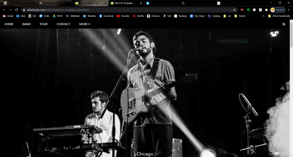
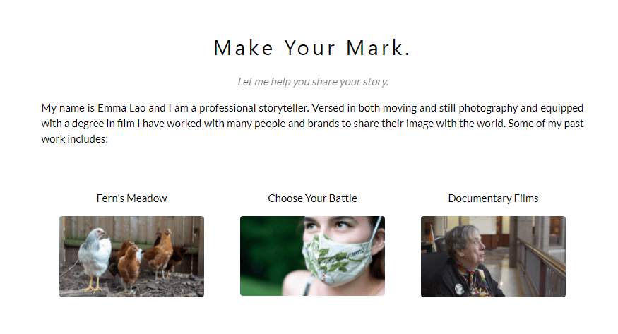
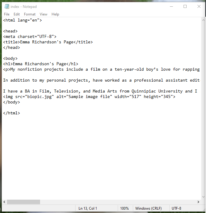
    What I thought would be a simple and straight-forward process of customizing this site turned into hours of me going deeper and deeper into customization, coding, and fixing errors. Let me walk you through how I went from this:
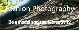
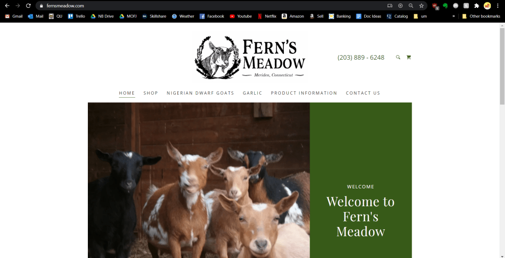
    Click the link to see the whole page!

    To this:

    Let’s get started!

    The Easy Stuff

    Replacing Images

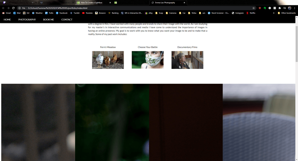
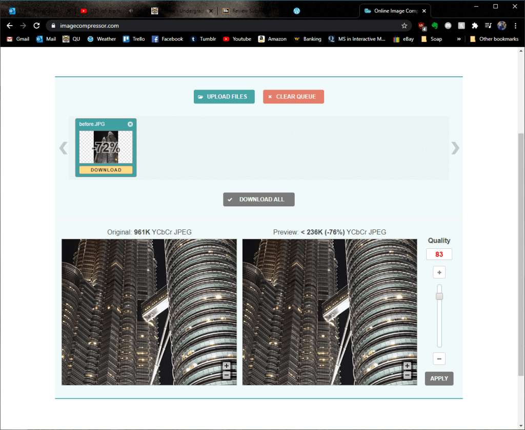
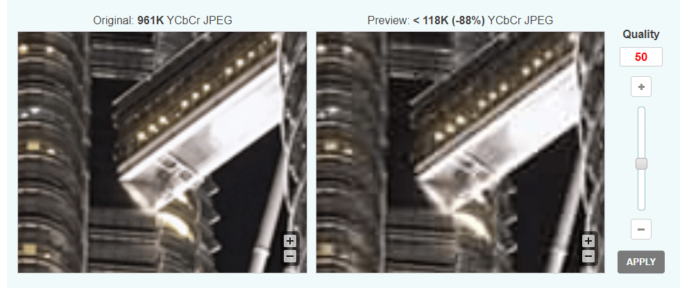
    This was the first and most important step for me since I wanted to make a photography site. The first part of it was simple – optimizing the images as I had learned in the past and changing the filename in the code to link to the correct image.

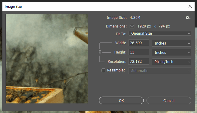
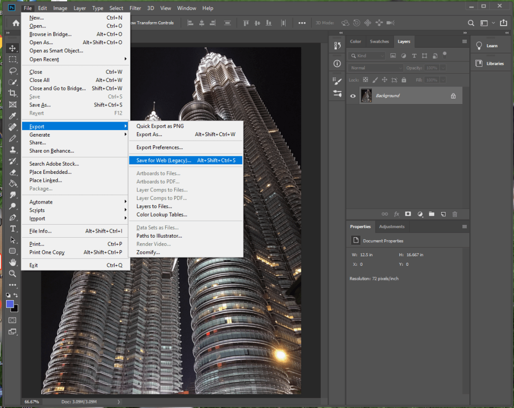
    Optimizing took a bit longer than I had thought since using optimizialla was not quite enough. I also imported each of the images into Photoshop, downsized them to be no bigger than 500 px wide (except for the gallery images), and exported them all with no metadata. Watch the tutorial below to follow the process I took:

    A little outdated, but it still works.

    Replacing Colors

    This was probably the easiest of the tasks to do technically, but it actually took me quite some time since I tested nearly every color from the W3Schools rainbow. I ultimately decided to go with “sand” and all I had to do was change the inline style in the navigation bar, photography section, and footer.

    Replacing Text

    This was mostly straightforward, except for the fact that I could not see the text from the image gallery because it was white. It was not as simple as changing the text to black since the pictures were multi-colored, so I decided to add some dropshadow. It took some tweaking, but I was able to make it readable.
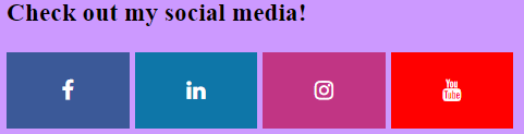
    Before & After

    Adding Links

    After changing the text, images, and colors I wanted to make the social media icons in the footer functional. All I had to do was replace the “i” (for icon) with an “a” (for a link) and insert the href.

    In this image I had only done the top icon.

    The Harder Stuff

    Adding a Gallery

    This is one that I spend about 4 hours on, and unfortunately had to give up after realizing that the style of the gallery made by W3Schools would interfere with the templates I found from the internet. I could have chosen not to share this on my blog post, but I want to be clear in the fact that coding, even when using a template, is not always easy.

    This was one of many problems I faced while trying to make an additional image gallery – I want to rip my hair out just looking at it!

    Re-Sizing Images

    After I optimized the images and placed them in the right spots, I noticed an issue. The width matched on all of the images, but for both the gallery and the portfolio images I saw that the height varied.

    It is hard to catch, but once you see the difference it is hard to unsee.

    What I had to do was open the images in Photoshop, change the images to the same width and resolution, then crop the images to the same height.
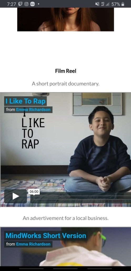
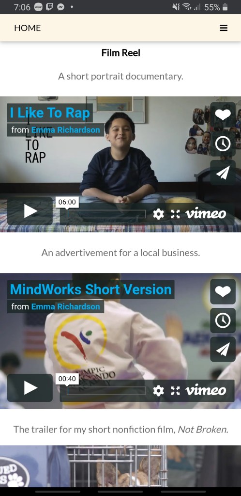
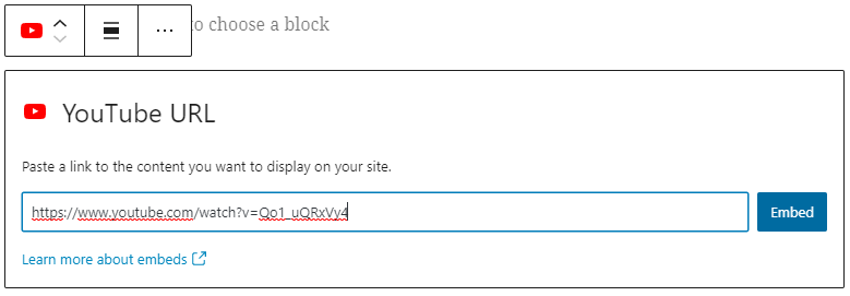
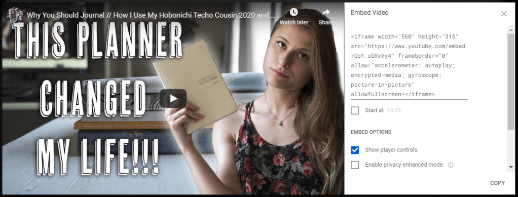
    If you are using inches to size your images, don’t forget to match the resolution!

    Embedding Videos

    Since this site is supposed to be my full portfolio, I decided to add some of my documentary and film freelancing work. To do this all I had to do was create a new <div> and add the embedding links. Beware, though, because Vimeo’s embedding uses outdated code.

    There were two issues I ran into while embedding the videos. First of all, Facebook, automatically has a smaller screen.

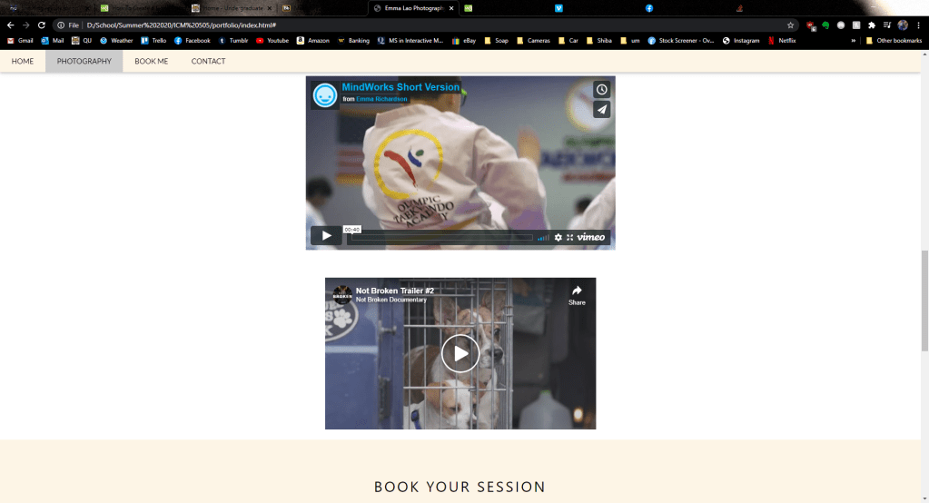
    Second of all, the videos were not responsive. This meant on mobile devices and smaller screens, the video ran off the screen and caused an awkward gap on the left side of the page.

    To make the embedded videos responsive, I had to follow the steps on this site. After inputting the code they told me to – voila! A good-looking and functional design. It also fixed the Facebook’s size issue.

    Going The Next Step: Making it Fully Functional

    While at this point my website looked good, I was not quite content since it was not fully functional. There were two parts of the page that were not functional – the “book now” modal and the contact form on the bottom. Had I learned PHP I would be able to make these forms work, but I found some work-arounds.

    I like the way it looks, but it goes nowhere!

    On the template after clicking the “book now” button a menu like this would pop up:

    The pop-up looks cool and all, but when you click “pay” nothing happens. Since I do not know PHP, I decided to change the code inside the button tags to link to an external sheet. Now, instead of it going nowhere, the button links to this Google Form.

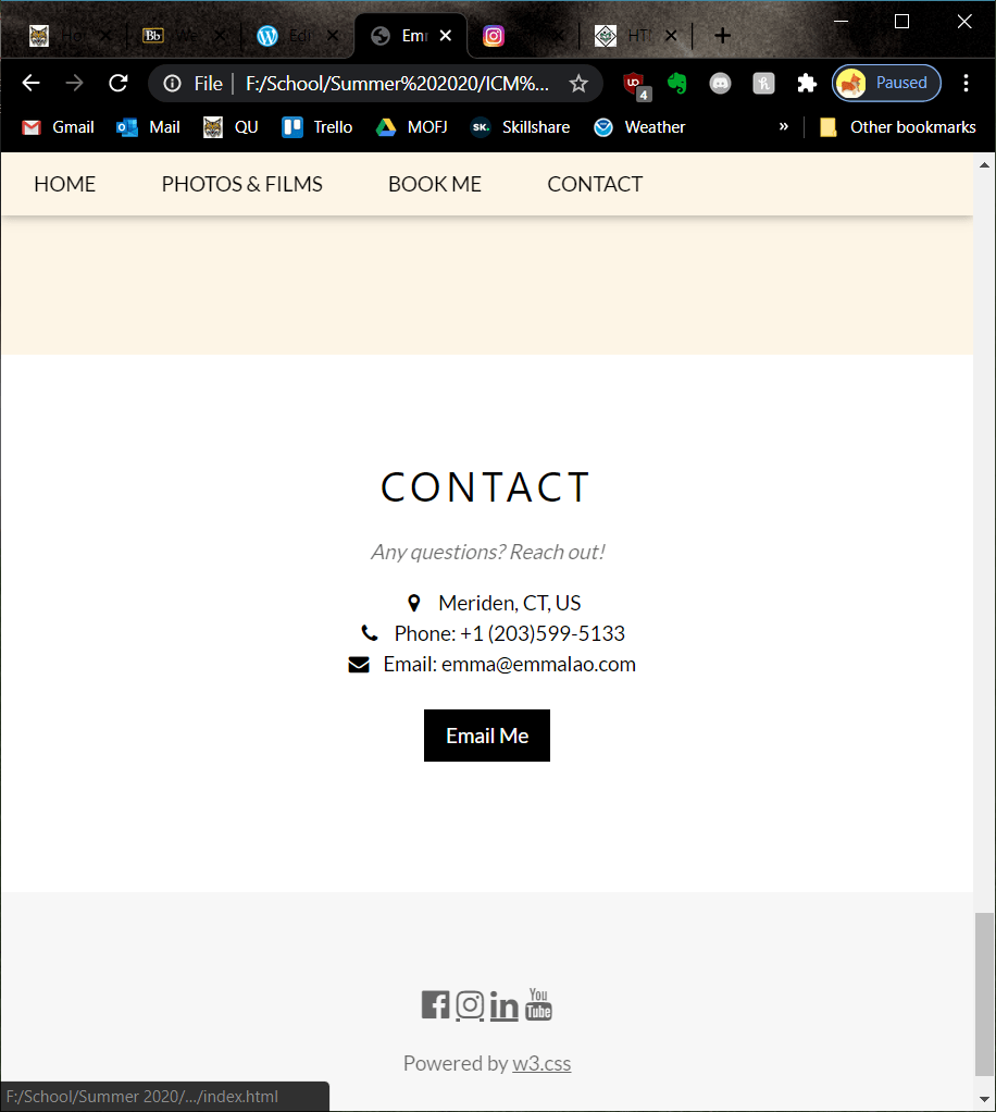
    The contact form on the bottom was another element that lead to nowhere.

    I decided to cut out the form and go straight to an “email me” button that causes your mail app to pop up upon clicking it. I also had to delete the <div> that held the contact form and modify the one with my contact info so it would be centered.

    Don’t Forget to Validate!

    Especially if you are using an older template, it is important to check for outdated code. Keep pasting your code into the validator and editing it until you see this message.

    Finally!

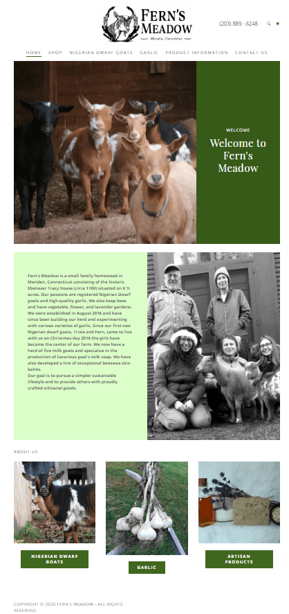
    And now the page is live! It took hours of doing, re-doing, and doing again before I was fully happy with it, but this is a page that I intend to use for my new photography and videography business. In fact, I went the extra step and bought my name’s domain on Google domains and plan to move it there soon. If I make updated to the website in the future, I will be sure to post it to my blog.

    For more posts on creating media follow my blog. In the next seven weeks I will be posting about Motion Across Media and Visual Storytelling – I cannot wait!

  • Search Engine Optimization: The Best Way to Get Your Page Seen

    August 19th, 2020

    Search Engine Optimization is referenced non-stop when doing research about creating a web page – and for a good reason. Having good SEO means more people will see your page, which means more traffic, which means reaching your goals! The best thing about SEO is the fact that it is a completely free method of gaining traffic – but it requires you understand at least the basics.

    Moz Pro’s Beginner’s Guide to SEO is a great resource if you are looking to get a full understanding of how to start, but I will summarize the most vital points you should know in this post.

    SEO Basics

    Before jumping into how to improve SEO, you need to understand some basic principles and lingo.

    Having an optimal SEO means you can gain much more organic search results, meaning you do not have to pay to be seen. Instead, you have to follow guidelines that align with how each search engine decides what gets to be seen.

    There are two techniques – “white hat SEO” and “black hat SEO”. White hat SEO is used when a website follows the guidelines as they were meant to be followed in the hope to provide value to a user. Black hat SEO is used by websites to try to trick search engines into bringing it to the top without adding value. This is risky (and a bit unethical) and it can severely penalize your search engine ranking if it is detected.

    When carrying out SEO, the most important thing to have in mind is aligning your site with the user’s intent. When creating the title, metadata, keywords, and of course content it should all be the type of content the user is actually looking for.

    Before you can know the user’s goals, however, you need to know what your goals are for your website. It is best to outline a Key Performance Indicator (KPI) so that you have a clear and actionable goal. If you want to raise your traffic it has to be for a reason, so outline that reason clearly and check to make sure that everything you are doing is helping you reach that goal as you go along.

    The Seven Steps

    No matter the KPI, having more traffic and a better ranking will help you reach that goal. There are seven steps that you can take to get better ranking in search engines, as outlined by Moz Pro:

    Image from Moz Pro.

    1: Establish Crawling, Indexing, and Ranking

    In order for your page to be seen on search engines, it needs to be accessible to “crawlers” that can index the content and rank it to how relevant it is for a search. See Google’s more in-depth explanation here.

    To start, see how many indexed pages from your site are already accessible to search engines by typing in “site:yourdomain.com”. If nothing appears, it may be because your site is too new, isn’t linked from an external site, is using black hat methods, or the navigation is too complicated.

    To understand your index coverage better, Moz Pro suggests signing up for Google Search Console. Verifying the ownership of your site is as easy as downloading the file and using a FTP to upload it to your site.

    Once you ensure that your site is visible to search engines, it is time to make it easy for crawlers to navigate and know what information is important.

    For unimportant information that would hurt the ranking you should use a robots.txt file. These allow or disallow certain pages to be seen by crawlers.

    To have crawlers easily access your content that you want to be seen there are several things you can do:

    • Don’t hide text you want seen in non-text content – if you need to have content in the form of images, videos, ect. try to put it in text within your code as well.
    • Make sure your site has clear navigation.
    • Test for errors that the crawlers could be encountering by using the Google Search Console’s Crawl Errors page.

    2: Create Compelling Content

    Once crawlers find and index the content on your site, they make a ranking. It is not 100% clear what it is based on, but it is known that a few factors contribute to a better SEO:

    • Links to the site and the quality of them.
    • Engagement metrics like clicks, time on page, and bounce rate.
    • The content on your page.

    Of course, those three factors go hand-in-hand – the better the content, the better the metrics, the more credible sites will link to yours. Avoid using “thin” content that is there for the sake of just existing; you should be sure that each page is there for a reason and it actually adds value.

    3: Use the Right Keywords

    The first step to knowing what keywords a user will type to find what they are looking for is to know who they are in the first place. One route to doing this is to create a persona of the user. To go more in-depth about your specific site, ask all of the questions pertaining to it that you can.

    Next, list all of the possible keywords that you can. Using a keyword research tool is very useful since it points out many suggestions and the volume of each keyword. For example, if I wanted to make a website displaying my photography portfolio or promoting a photography business, I cold see what keywords are getting the most volume. Of course, only add the keywords that are actually relevant to your page or you risk having a worse page bounce metric.

    Try to include keywords that your competitors are not using (you can see the competition metric in the image above) so that you are more likely to be seen. Also, update your keywords to match the time of year and your location – a good way to see the metrics for this is Google Trends.

    Avoid “keyword stuffing” though – as Moz Pro says “If a page is going to be valuable to users, it won’t sound like it was written by a robot, so incorporate your keywords and phrases naturally in a way that is understandable to your readers.”

    4: Improve Your User Experience

    To make sure that your page is valuable to its users, the experience of using it must also be good. Make sure that images are optimized and that they have alt text – bots will be able to better understand what the image is trying to convey. Check out more of my posts on adding functionality to your page to make a better UX design.

    5: Create Share-Worthy Content

    Earlier this Summer I made a series of blog posts on creating quality content on the web and before that I made posts on how to write for the web. If you want your page to grow, read those posts to get started.

    As mentioned before, links are an important aspect of SEO. As your page grows and you create quality content other sites will be linking to yours naturally, but there is more you can do to optimize your links. Read more about the specifics of links here.

    6: Have an Accurate Title, URL, and Description

    Within the HTML code you should be taking advantage of the header tags and title tag. As a quick reminder the header tags are in the <body> of the code and will be seen on your page, while the title tag is in the within the <head> and will be what appears in the search result. As suggested by Moz Pro, a title tag should use the optimal keywords, be under 60 characters, and include the name of your brand if possible.

    Meta descriptions are also an important part of your <head> – while they do not appear on your page, they show up under your title in a search result. Not only do they help people searching understand what your page is, but they help the bots understand too.

    URLs should be as clean-looking and easy to follow as possible since, according to Moz Pro, they will be “easier to copy and paste and more clickable”.

    7: Make Your Website More Bot-Accessible with Schema

    By adding structured markup to your page’s code will make it much easier for bots to understand what the content is about and therefore make your page more relevant to the proper searches. While I will not go more in-depth about how to markup your code, see this guide for how to implement the preferred markup type.


    And with that you now know the basic components of optimal SEO. Each of these aspects should be considered as you plan out and create your page so that all of your hard work can actually be seen by your target audience. Follow my blog to see the next post where I create a portfolio using all of the knowledge I have learned this semester!

  • Driving Traffic to Your Site: 5 Examples and What We Can Learn from Them

    August 11th, 2020

    You have made your site and it is ready to be seen by the world. The thing is, you are far from the only site people can go to – now you have got to be proactive in guiding your target audience to your site and keeping them coming back.

    To see what kinds of tactics are effective we will take a look at a few websites and how they are keeping their users engaged and loyal. Many of these sites are ones that have actually kept me engaged and buying even when I would consider myself to be a tough customer.

    Social Media Engagement – JetPens

    JetPens has an amazing online store with many features – videos accompanying products, in-depth descriptions, great images, blog posts and tutorials – the list goes on. One of the reasons many customers (including myself) return to the store is JetPen’s social media engagement, primarily on Instagram.

    Every few days they will make a post that spotlights new or topical products. On their page’s bio they have a link to the store page that has every post and links directly to each product that was shown.

    By posting the products on their page they remind the 193,000 people who follow them that they are a quality service – and their service is only a few clicks away if you see something you like.

    The posts look exactly like they do on Instagram, only this time they go to a product page.

    They also periodically host giveaways on their Instagram which encourages followers to share the page with their friends. This makes it possible to not only engage with their current followers, but to potentially make new customers.

    Influencer Marketing – G-Fuel

    Influencers are a somewhat new phenomenon but are quickly becoming one of the most effective ways to get more traffic to your site or product. One example of this is G-Fuel, an energy drink company. They partner with popular professional gamers to advertise for their company. The reason I chose G-Fuel in particular is because they currently have 18 flavors that are “inspired by” these partners.

    One of the most popular flavors is inspired by PewDiePie, a YouTuber who recently reached 100 Million Subscribers.

    While this tactic is not cheap, it definitely works. Since their first sponsorship in October of 2019 they have more than doubled their traffic.

    Graph courtesy of similarweb.com

    A common concern with influencer marketing is that people know that they are being sold to, but in many cases fans of influencers are happy to support them by buying their advertised products. In the case of PewDiePie, his fans have made memes of the sponsorship by buying exorbitant amounts of the product – only giving it more positive publicity.

    From a now deleted Reddit user.

    Advertising – SkillShare

    SkillShare is a unique platform that offers premium tutorials for a subscription fee. One of the primary ways they drive traffic to their site is by sponsoring videos on YouTube – mostly tutorials or how-to’s that are introductions to what can be explored in-depth on their site.

    The way I found out about SkillShare was by hearing about it in an ad at the end of a video by Matt D’Avella. The majority of his videos are about self-improvement and learning, something that is a perfect fit for SkillShare’s brand.

    The advertisement begins at 8:07.

    This type of advertising is extremely effective as it is not a shot in the dark or even an estimate as to whether or not the viewer would be interested in becoming a consumer – the viewer is already consuming content similar to what SkillShare offers and with a 2 Month Free trial it is hard to deny.

    Email – James Clear

    James Clear is a speaker and author of the book Atomic Habits. His website includes articles about habit formation and supplementary material to his book. Where he is most active and what keeps most of his audience engaged, however, are his weekly emails.

    I recently signed up for his email list since they offer tidbits that can brighten your day and inspire you to stick to your habits. Over 850,000 people receive this weekly email along with occasional promotions for his books and classes. One of those promotions actually worked on me when I decided to buy a physical copy of the book when it went on sale:

    This is an effective way of reaching to an audience because they have already expressed interest in what there is to offer – as long as you consistently deliver content that they deem worth the read, they will continue to follow you and your brand.

    Sign Up Bonuses – MANY Online Retail Stores

    Similar to how James Clear’s email list is a foot-in-the door to potential sales, there are many online stores that want your information so they can give you information on deals and promotions. What most of the online retailers do to get that information is offer a sign-on bonus – give them your email for a 20% off coupon on an item on your cart. (See a list of online stores that offer promotions like that here.)

    Even though the one-time coupon is nice, this is probably to most intrusive (and therefore, ineffective) tactic of driving in traffic that there is. If you have to bribe a person to sign up to a newsletter then it is unlikely that they want to read them in the first place and their inbox will just end up looking like this:

    Yes, this is my inbox. Yes, that is eight emails in one day. And yes, all of them are unopened.

    There is a chance that the customer will use the deals offered to them through the email, but the most effective way to drive them back to you is to offer quality, not quantity.

    The bottom line is that you have to figure out what method works best for you and your brand. See what others similar to you are doing and see if you can do it better – there are many options out there, so don’t give up if you goal isn’t met on your first try!

    Follow my blog for more posts on web technologies and ideas about your presence on the web.

  • Adding Functionality and Media to Your CMS and HTML Pages

    August 9th, 2020

    Adding functionality and media using widgets can raise your page’s quality and help you align your page with your brand’s goals. Luckily, many CMS’s have built-in widget tools that make this process quick and easy. If you want to add widgets to your HTML page, it is often one Google search away since there are so many resources with JavaScripts out there (although it will also require tweaking and testing as well).

    In this post, I will show you the process of adding a YouTube video, a Twitter feed, social buttons, a contact form, and an image gallery to my WordPress page. As a bonus, I will show you the process I used to add it to my HTML page. Let’s get started!

    WordPress “Blocks”

    On WordPress, widgets are called “blocks”. Adding many widgets is as simple as clicking the “add block” button and searching for the block you want.

    To embed a YouTube video all you have to do is paste a link.

    And it will end up looking like this:

    Embedding a Twitter feed is just as straightforward.

    And it will end up looking like this:

    https://twitter.com/aloproductivity

    A contact form is even more simple – you just have to select that block and customize the options if you wish. The default is below:

    Go back

    Your message has been sent

    Warning
    Warning
    Warning
    Warning.

    To make a photo gallery just search for the block, select the type you want, then upload the images. Don’t forget the importance of image optimization!

    Here is an example of the collage gallery:

    The process of adding social media buttons is a bit different. For my blog I decided to include it on the header of each page. To do the same, you need to go to the customize tab in your WordPress dashboard.

    Next, go to menus then create new menu. There will be an option for a “social menu” built in. Then you simply click “add item” for each link you want to place.

    WordPress will detect most of the links’ logos and make the button the same – if not, it will just appear as a link icon.

    There are many more widgets to explore on WordPress – now that you know the basics you should try some out on your own!

    Embedding with HTML

    There is some good news and some bad news when it comes to embedding with HTML. The bad news is, like everything with hand-coding, you have to understand the basics of HTML and you need to input the code yourself. The good news is that many websites have built-in embedding tools so it may be as simple as copying and pasting code then doing simple adjustments to customize it.

    To embed a video, you use the “iframe” tag. A simple template is here:

    <iframe width="560" height="315" src="VIDEO LINK HERE"> iframe>

    However, on YouTube all you have to do to grab this code is go to “share” and select “embed”. Then you just copy the code and paste it onto your website.

    To embed a Twitter feed, you need to use the Twitter Publish tool. This creates the code you need to embed a profile, hashtag, single tweet, timeline, and more.

    You can then customize the theme, size, and language and it will give you the code to copy and paste.

    Adding a contact form to HTML is a little more tricky. Luckily, as I said earlier, there are many resources that have the code already typed out for you. W3Schools has a contact form that uses HTML and CSS here. Note that the HTML code goes where you want it to appear on your page but any CSS goes in the style tag in your header. This form will not function without PHP, however, which I will explain in future posts.

    For an image gallery, there are countless pre-made scripts out there. For my own website I used this one from W3Schools. After you copy and paste it be sure to rename the image files to match the name in the folder. Like with all CSS, it must go in the style tag in the header.

    It took some tweaking the code (as it always will) but here is the final product. When you click on the image, a larger version appears below.

    One last function I will add are the social media buttons. Again, I used W3School’s pre-written code and style sheet.

    There are a few things you need to do to make the buttons look nice and functional.

    First of all, decide which buttons you want to add by copying this code and replacing the “social_meadia_name” with the name in all lowercase.

    <a href="#" class="fa fa-social_media_name"></a>

    Next, scroll up the the style section and replace the name there as well.

    /* Social Media Name */
    .fa-social_media_name {
      background: #C13584;
      color: white;
    }

    Change the background color to match either your website’s color palette or to the brand’s color. You can find the HEX codes for the social media sites here.

    After adding all the buttons you want and styling them, it is time to make them actually work. Just replace the # after the “a href=” to the url.

    <a href="#" class="fa fa-social_media_name"></a>

    Here is what my buttons look like after styling and activating them all:

    You can see all of these functions on my page here.


    Now that you know the basics of adding widgets to both CMS’s and HTML pages it is time to explore and try out different widgets that match your brand. Follow my blog for more posts on web technology as I continue to learn about improving my web spaces.

  • Responsive Design: The New Must-Do for Web Design

    August 3rd, 2020

    Today’s web space is accessed on devices of all kinds in countless shapes and sizes. When people go to your site on their mobile device, they expect to get the same experience as they would on your desktop site. This is what is called responsive design – the use of code to automatically adapt your page and its elements to resize so that it gives a good user experience across all devices.

    It may not be obvious to you when a page is using responsive design since it is natural to expect it at this point. However, it is very obvious when a page does NOT have responsive design, like the example below:

    While the rest of the mobile site is responsive, the banner and welcome page are the opposite of welcoming. W3Schools gives an example of code with and without responsive design code as well:

    There are many benefits to using responsive design in your code. The Neilson Norman Group points out several on their page about responsive web design and user experience. First of all, it saves time when creating a site – instead of having to create an almost identical page for different screen sizes the same code can have the page automatically adapt to whatever resolution it is displayed on. This means that it is also easier to preform maintenance on a page (since there is only one) and it is “future-proof” – no matter what types of resolutions are released, the code is ready to handle it.

    While they endorse the use of responsive design, they warn that it is not the only thing a page needs to function. They assert that “teams must focus on the details of content, design, and performance in order to support users across all devices.” This means there has to be lots of testing on all sorts of devices in different environments – not only for the looks, but for the connection speed and usability of the page.

    Responsive design is actually rather easy to add to a simple html page. To show you the process, I will change my basic html page to have responsive design.

    First I will add this line of code provided by the W3School’s page to my head:

    <https://www.w3schools.com/html/html_responsive.asp>

    The page already changed by making the image and footer bigger. However, it doesn’t fit too well to the dimensions of a mobile page. To make the image responsive, I need to add style=”max-width:100%; height:auto;” to my image tag. This makes sure that my image does not scale bigger than its largest size.

    Don’t forget the height: auto; or else your image will end up morphed!

    The header text is also something that can be altered to be a better fit to my screen simply by adding style=”font-size:10vw” within the opening h1 tag. The difference is best seen in landscape mode:

    While these are about all the changes that can be made on my site there are some more neat things that can be done with responsive design. For example, you can change the image based on the width of the browser. Check out the changes I made by looking at my new page and making the window smaller – see how it actually responds now!

    This is just scratching the surface of code used for responsive design. As I continue to create html pages and learn more about CSS I will be sure to incorporate responsive design.

  • Image Optimization 101: What, Why, and How

    August 3rd, 2020

    Images are vital to your web page – they compel the user, set the tone, and represent your brand. It is rare to find a web page without an image nowadays, and for a good reason. As explained in this CX Blog post, images draw attention to a page and trigger emotions that could push them to your call-to-action. However, as their last point states, it is important to make sure that your images are not slowing down your site.

    The process of making images faster to load on the web is called image optimization. The basic premise of image optimization is making your image smaller by changing the format, dimensions, or quality.

    There are a couple of reasons why image optimization should be considered when creating your web page:

    • Loading time. While internet speeds are faster than ever it is important to consider the importance of immediacy in the digital space. This article by Shaun Anderson shares statistics, quotes, and graphs concerning website load times – pointing out that as many as “47 percent of consumers expect a web page to load in two seconds or less”.
    • SEO improvements. Not only will longer loading times test the patience of users, but it will also lower your Google SEO rank. According to the CognitiveSEO article “How Page Speed Affects SEO & Google Rankings”, users are more likely to immediately or quickly leave a page that takes more than 3 seconds to load. In addition to that, Google may take a page’s speed into account directly for its ranking.
    • User experience. In web design, user experience is top priority – so images and web pages that are difficult to work with are no good. The goal of every page should be to get the user to your call to action as quickly as possible, and long loading times are just another possible hurdle for that goal.

    So now that we know the what and why of image optimization, it is time to jump into the how! I will explain the process using two programs: Adobe Photoshop and Optimizilla.

    Here is the sample image I will be working with:

    This is a large, high quality image. The dimensions are 900×1200 pixels with a resolution of 72 dpi. The file size (which is most important to consider in image optimization) is 960 KB.

    Image Optimization in Photoshop

    First open the image in Photoshop and select “File>Export>Save for Web…”.

    Here you can select a preset. I will select JPEG Medium. The quality goes from 60 to 30. I will also make the image smaller using the “Image Size” section. Eliminating the metadata (information about the camera, date taken, aperture, ect.) is also an easy way to make the file size smaller without losing quality.

    After exporting it the size is down to 82.8 KB. Since I sized down the resolution to 600×800, the dpi is actually up to 96. As you can see, the image is smaller but the difference is hard to see.

    And here is the before and after in full size:

    • Before
    • After
    The difference is so small that I can’t even tell!

    Image Optimization in Optimizilla

    Optimizilla is a free alternative where you can easily optimize your image.

    It is as simple as uploading the image then using the slider to determine how much quality you want to sacrifice for the sake of file size.

    Even when I lowered the quality to 50% the difference is nominal, especially when you consider how much smaller the image size is.

    And here is the before and after in full view:

    • Before
    • After
    It is still difficult to tell, but 88% smaller!

    Image Optimization in Adobe Illustrator

    Another way to lower your image size is by converting your image into a vector file. Vector files are generally much smaller and can scale to any size since it is not pixel-based like JPEGs and other raster image types.

    Keep in mind, however, that there are stylistic differences between a JPEG and an SVG. Typically vectors are used for icons, logos, and symbols since they are much more simple, so this conversion will not always work on an image if you want to keep the same picture style. Also it is not easy to make a highly detailed image into a small SVG file, as you will see with my example.

    Nonetheless, I will explain how to change an image to a vector using Adobe Illustrator.

    First, open the image in Illustrator then go to Object>Image Trace>Make. Be sure that the image is selected first!

    Now you can select from various presets to change it from that scary-looking black and white image. I chose 16 colors for this one.

    Another option which looks closer to the original is High Fidelity Photo, which is nice – but it ends up being much bigger than the original file.

    The exported SVG is the Low Fidelity Photo Option, and while it is about 400,000 Bytes bigger it is now scaleable. If the image were simpler it could very well make the file size much smaller – but this goes to show how detailed images are not the best for SVG files. While I cannot upload SVG files on WordPress, you can check it out here.


    Now that you see how much of a difference image optimization can make in such little time, I hope that you keep it in mind as you design your pages in the future. Follow my blog to keep updated with more tips as I learn the ins and outs of web technologies!

  • HTML5 Semantics: Step Up Your HTML Coding

    July 29th, 2020

    Semantic elements are the key definitions to the content in your code – they make it so both the browser and the developer know what the content within the tag is.

    They are split into sections called “blocks”. Below is a table form W3Schools that lists each semantic element and its basic function. I will explore each of these elements as I modify my first html page.

    Table from https://www.w3schools.com/html/html5_semantic_elements.asp

    <article> & <section>

    The article element is a block of self-contained content like a blog post or newspaper article. The section element is just that – a section of a document sharing thematic elements throughout. So far, all of the paragraph tags and the bio image could be classified as a section since it is an “about me”.

    This is not a big change at all, but on a page with lots of information it can be helpful to separate and define the elements.

    <header>

    The header element is where the heading, logo, and basic information (like date, author, ect.) would go. In my current code there is a heading, but there is no semantic tag to point it out. I added a header to both the page’s header and to the “About Me” section.

    <footer>

    The footer houses information like the author, contact info, a sitemap, and more. For my footer I will add links to my WordPress, LinkedIn, and YouTube.

    Be sure to test the links as you go by keeping the html file open in you web browser and refreshing as you make changes. I almost included a broken link because I didn’t include the “https://&#8221; before – something that I would not have realized had I not checked.

    <nav>

    The navigation element is for navigation links. These do not need to be all of the links in a page – just the ones that should be easily accessible from the get-go. In my page I will simply include the html pages I have made so far.

    I placed it right under the page header.

    <aside>

    The aside element contains content that is not directly related to the content at hand. Without CSS it looks just like the rest of the text, but with CSS elements you can easily distinguish it with different formatting. Check out the before and after example that W3Schools gives to see the difference CSS makes. I will throw in an aside to a new page containing a picture of my dog.

    I places the aside before my profile image

    <figure> & <figcaption>

    The figure and figure caption elements define a graph, table, or image and it’s caption. While I would not normally call a profile photo a “figure”, for the sake of learning semantics I will.


    And now we have a basic HTML page with semantics!

    Although there was little visible change from the first page, the code is much more clear-cut for the developer. Follow my posts to join me on my journey of basic web development and see my pages become more elaborate as I explain on the way!

  • My First HTML Page: (Very) Basic HTML and FTP How-To

    July 29th, 2020

    I have explored the elements of good and bad web design, but there is still much to be done in my journey of understanding the web and how it works. This week I took it back to the basics and created my first bare-bones HTML page from scratch and learned how to upload it to a server using an FTP program.

    Understanding Basic HTML

    Fist things first, it is best to understand each element of a basic a HTML page in order to know what I am doing as I create my own. The basis for my first website is taken from this code:

    <!DOCTYPE html>
    <html lang=”en”>

    <head>
    <meta charset=”UTF-8″>
    <title>Title of the document</title>
    </head>

    <body>
    <h1>Input heading here</h1>
    <p>Input first paragraph here.</p>
    <img src=”filename_of_the_photo_you_are_using.jpg” alt=”Sample image file” width=”set size in pixels here” height=”set size in pixels here“>
    </body>

    </html>

    First off, there is the Doctype and HTML language to tell the browser which type of HTML and language the code is in.

    Next there is the head. In the head all of the metadata (a set of data that describes and gives information about other data) which is not seen on the page by a user is stored. It indicates the titles, styles, and scripts. Since this page is HTML only, the only piece of metadata I will be using for now it the title. The user will actually see this on the tab the page is open in. For my page, I will just call it “Emma Richardson’s Page.”

    Now there is the body. This is where all of the visible content like headers, paragraphs, links, and images are stored.

    The first tag in the body of this code is <h1>, which is a heading. The numbers go from 1-6, 1 being the highest and most important text in the hierarchy and 6 being the least. See an example of the differences between each heading tag here.

    The next tag is a paragraph. This is rather self-explanatory – the text that goes between the opening and closing tag will be the text to appear on the page. Something to note is that the code will ignore any extra spaces or breaks within the tag, so you would have to close and start a new paragraph tag to make a new paragraph. If you want a space between the paragraphs, you need to add a horizontal rule <hr>.

    This means that even though I put breaks in my text in the code, they will not register.

    Now, with each section closed off between a <p> ad </p> and a <br> between each, there is a line break.


    The final element to this basic html code is the picture. To keep things simple I kept the image in the same folder as the index.html file. That way, all I had to do was write the file name after the “img src=”. The “alt=” is the text that would be displayed in case the picture can’t load because of an error or slow connection.

    The width and height is based on pixels. To find out what size the image is (so you don’t stretch it out) you right click the photo, go to properties, and select the “Details” tab.

    Once all of the image specs are in the code, the simple page is finished!

    Now it is time to make the website “live” using a FTP program.

    Using FileZilla as an FTP

    File Transfer Protocol (FTP) software is what allows you to upload your code to a sever so that a client can view the files from that server. This means that you will have to get a host. If you are working or in school your organization may let you host your site on their server – otherwise check out this tutorial on web hosting.

    FileZilla is a straightforward (and free) way to easily upload and manage the files on your remote site. Watch this video to learn how to download FileZilla and use its basic functions:

    The most difficult part of the process is making sure you are properly connected to your server. After creating a new site, I entered the host, encryption, logon type, user, and password. All of this information should be given to you by your host.

    After that, all I had to do was right-click on my folder with my index.html and photo file and click “upload”. Now when I go to the domain with my username and filename, the page pops up!

    http://mywebspace.quinnipiac.edu/elrichardson1/Emma/

    And just like that, here it is. It still does not look like much, however. Check out my blog post explaining HTML Semantics where I add more elements to the page and explain how they were done along the way.

  • CMS vs. Hand-Coding: Which Works for You?

    July 20th, 2020

    When it comes to web development there are three options: using Content Management Systems (CMS), hand-coding HTML, and using HTML editors. Each has its benefits and downsides, so it all comes down to what you are most comfortable using and what aligns with your goals as a web designer.

    CMS

    Content Management Systems are applications that are a all-in-one stop for web development. They come with the tools to create and manage your site. Most of them have templates you can use, but you can often go in-depth with customizing your site’s user interface if you choose. Many come with analytics so you can monitor the site’s performance as well.

    With a CMS you can easily add and manage images, text, videos, audio, and plugins with very little understanding of the code that works to make these work on your site. This means that instead of learning how to use HTML, CSS, and JavaScript you can still customize and manage your site. However, if you want to customize your site beyond the constraints of the layouts provided, knowing some code can help.

    This is the route that most businesses take now since it is so easy, inexpensive, and accessible. According to Nick Schaferhoff of WebsiteSetup, nearly half of all websites on the internet use a CMS. WordPress alone is used by 35.8% of the top 100,000 websites. In Schaferhoff’s article he lists the top CMS tools and the pros and cons of each.

    HTML Hand-Coding

    Learning to code with HTML is a long process, but may be worth the investment if you are looking to create a page that is exactly the way you envision. Hand-coding not only requires that you know HTML, however – modern websites use a combination of HTML, JavaScript, and CSS so you would have to know how to use these as well.

    Here is a breakdown of what each language does so you can understand why it is necessary to know all three to create a modern, quality website:

    • HTML is the program that is used as a building block for a web page. The elements of HTML include titles, headers, paragraphs, images, links, button, lists, and tables. You can learn more about each element and the basics of HTML5 coding here. While it is possible to make a functional web page using only HTML, its user interface will be ugly and outdated.
    • CSS controls the formatting and layout of the page. You can control the size, color, alignment and style of the text and links, the background color of your page, image formatting, and more. Without CSS there is no distinct style or design – only the bare-bones content that is referenced in the HTML code. This Skillcrush article by Scott Morris gives a basic explanation of CSS and its implementation.
    • JavaScript makes your page interactive – it tells the page to respond in a certain way when a user makes an action (like moving the mouse, clicking, pressing a key, ect.). Hack Reactor gives examples as to what JavaScript allows you to do on your page in this article. Some of their examples include:
      • Show or hide more information with the click of a button
      • Change the color of a button when the mouse hovers over it
      • Playing audio and video in a web page
      • Using a drop-down hamburger menu

    If you want to create a website that is on par with those that are produced by a CMS it will require lots of time and patience to learn the code required to do so.

    HTML Editors

    HTML Editors serve as a sort of middle-ground between a CMS and an entirely hand-coded web page. They provide templates like a CMS would and a real-time display of how the code you are writing would appear on a live page. This still requires an understanding of coding, but can make it easier for you to customize your page exactly to your liking – unlike a CMS. Lifewire has an article that lists the best HTML Editors for Windows if you are interested in exploring this option.


    If you are wondering which is best for you, it comes down to if you are willing to sacrifice the time to learn and write code to make a website that is completely customized to your liking.

    If you are running a digital business or you want to have a strong web presence I personally suggest that you go with a CMS since your time would be better spent elsewhere. There is still a learning curve when it come to CMS’s if you want to go beyond the templates given to you, but there is a much lower risk of creating a broken, buggy, or just plain ugly site than if you were starting from scratch. But if you are in for a challenge, I give you the best of luck with your coding journey!

  • Web Design Process: Fern’s Meadow Re-Design

    July 20th, 2020

    Fern’s Meadow is my family’s small farm in Meriden, Connecticut that sells fresh produce, artisan products, and breeds Nigerian Dwarf Goats. In a past class I have re-worked Fern’s Meadow’s social strategy – and now I will be taking the next step in improving their internet presence by re-working their website.

    First, let me explain the process of creating a website:

    1. Project Definition: The most vital part to the development process is defining the goals of the business. According to Jeff Cardello’s article The Modern Web Design Process: Setting Goals he points out that in the excitement of all the other steps, “it’s easy to lose sight of what’s important. Fuzzy expectations lead to frustration and can slow down the process. That’s why you need a clear sense of your project’s goals early on.” In order to clearly define your goal you could create personas to understand your target audience and do an audit of your competition to know what they are doing well and where they are going wrong.
    2. Planning: The next step website creation is to plan the site architecture. This is made from the sitemap and the wire frame. This step is vital as it not only provides a clear guideline for you to follow in development, but it ensures that your are following the goal you defined in the last step. I go more into this step below as I create the site architecture for the Fern’s Meadow re-design.
    3. Design: The design component consists of two parts – User Experience (UX) Design and User Interface (UI) Design. While they are often confused or grouped together, the article The Difference Between UX and UI Design – A Layman’s Guide outlines the difference between the two, summarizing a website as a living creature: “The organs represent the UX design: measuring and optimizing against input for supporting life functions. And UI design represents the cosmetics of the body; its presentation, its senses and reactions.” To design your website you can create mood boards, color palettes, grid structures, sketches, mockups, prototypes, and web typography.
    4. Development, Testing, Delivery, and Maintenance: The reason I am grouping these tasks together is because these steps will continue in a loop. Once you have a finished website you must test it to ensure it works, release it to the public, gather analytics, re-develop it, and repeat.

    The Fern’s Meadow website was made using a template from GoDaddy. While it is okay, it could do with a makeover that aligns more with the business’ goal of providing fresh veggies, quality goods, and cute goats to the public.

    Before I dive into the new site architecture, I will review the old one.

    Looking right from the get-go, things need to change. The picture is outdated and low-quality and doesn’t work with a screen that has an average resolution. It looks almost exactly the same on mobile thanks to the CMS’s responsive design, but it still needs to be made a bit more inviting.

    The remainder of the page is the background of the farm then the navigation buttons on the bottom. This needs to be changed so the navigation is more accessible (and uniform).

    The shop page is functional, but not great. The images should be bigger to show off the quality of each product. Some of the images must be replaced as well. The menu to the left is a little confusing and unnecessary since there are only five products.

    This page is again, functional, but not much more. First of all it needs to be updated with the new kids and better photos. There should be some sort of call to action with the purchase information. The family section could be made more appealing if it was a gallery-style – the light green box with an image is too repetitive.

    Instead of having a single page dedicated to garlic, this needs to be updated to all fresh produce. There also needs to be another call to action to contact about joining the email list.

    This entire page needs to be merged with the shop. The lavender information should be added to the new fresh produce section as well.

    At the bottom of this product info page is a gallery. This needs to be updated and moved to the top, although the images don’t belong on this page at all.

    The contact page is typical. I would move the map (which is below) to the side to get rid of the excessive white space.

    Now that we have assessed what needs to change, it is time to plot out these changes.

    Sitemap

    Sitemaps are a useful tool when it comes to ensuring your goal is reached through the site’s design. It can also help avoid duplicated or misplaced content, something the current website is guilty of on several counts.

    When creating this sitemap I took into consideration each critique I made in the audit of the current site. You will notice that I simplified the site quite a bit in order to make the site as easy as possible to navigate for the user.

    Having this site map enables me to know exactly what pages need to be made. In order to know how each page is presented, I created wireframes.

    Wireframes

    Wireframes are the next step in the planning process. They outline all of the important features on a website that allow a designer to visualize each page’s structure without getting distracted by the aesthetics or more surface-level elements.

    To make my wireframes I used wireframe.cc. If you are having trouble understanding them, check out this visual on how to read wireframes. Since the website is simple the only two elements that you need to understand are that the boxes with x’s are images (and galleries if arrows are to either side) and the text that is colored and underlined are links.

    Home Page
    Store Page
    Product Page (linked from Store Page)
    Produce Page
    Goats Page

    I decided to not include the About and Contact page – those pages are extremely simple and will be similar to their previous versions.

    When creating these wireframes I had a few things in mind which I had discovered when comparing good and bad site design: simplicity, a clear visual design, an obvious value proposition, and attractive imagery.

    Something to note is how easy it was to create these because I had my sitemap. I never questioned what content should be there; I was only concerned with how it was presented. Breaking down each step like this is a must if you want to stay organized and stress-free during your website creation.

    Mood Board

    Now that the site architecture has been established, it is time to design the aesthetic. The first step in this is creating a mood board.

    Mood boards are collages of images and materials that help reflect the ideas and style of your web page. There are countless mood board tools out there like Pinterest and Photoshop, but I chose to go with a site that had pre-made templates since this was my first time.

    This mood board was made at canva.com.

    The style I want to convey is homegrown and natural. The photos are all ones that I took from the farm (except for the photos of the produce). The brand’s message is to share quality products from the animals we love and to show our hard work, so I was sure to include photos of all of that. If the mood board were bigger I would add photos of the rustic barn and surroundings to add to the homegrown aesthetic, but I believe this mood board captures my vision for Fern’s Meadow.

    Color Palette

    You may have noticed the color blocks in the mood board. The color palette is another important part of the design process. Every color has a certain mood that comes with it, so I chose the colors carefully to align them with what want to convey.

    This article by Neil Patel gives a basic explanation of how color psychology can affect your user’s actions and feelings towards your brand. Using his guidelines, I chose the colors that best matched the interest of the site.

    Green is the main color – as you can see, it is the main color for the original site as well. It is the best choice for environmental products as it gives off a nice and organic feel.

    I chose blue as a secondary color because it is preferred the most by both genders and conveys a sense of trust. However, Patel warns designers NOT to use it for food, so it will only be used in the Goats and Contact page if there are more colors needed. If the page feels too overwhelming with the blue and other colors, then I will choose not to include it.

    Orange is the call-to-action color. It will be used on the buttons like “buy now” and “add to cart” as it gives a sense of haste, impulse, and action. It will only be used to contrast the most important actions in order to make the call to action as clear as possible.


    Now that the design and site architecture has been laid out it is time to develop, test, deliver, update, and repeat! Follow my blog for updates as I learn more about web design and I enhance my family’s web presence.

←Previous Page
1 … 4 5 6 7 8 9
Next Page→

Blog at WordPress.com.


Loading Comments...
 

    • Subscribe Subscribed
      • Emma Lao
      • Join 57 other subscribers
      • Already have a WordPress.com account? Log in now.
      • Emma Lao
      • Subscribe Subscribed
      • Sign up
      • Log in
      • Report this content
      • View site in Reader
      • Manage subscriptions
      • Collapse this bar