Images are what makes up a vast majority of today’s communication. Not only do we have devices that allow us to see a never-ending supply of visual stimulation, but those very devices are capable of creating images with ease. Just because you can, however, does not mean that it will be good. As Seth Gitner points out in the first chapter of his book Multimedia Storytelling for Digital Communications in a Multiplatform World, those who can create images with intention are those who make visual storytelling a true art. To explore the art of visual storytelling, I will explore ten different images that tell a compelling story.

The first image that tells a story is The Cycle of Terror and Tragedy by Graydon Parrish. When I began my research, this is the first thing that came to mind. I saw this painting in 2017 at the New Britain Museum of American Art and was awe-struck by every detail in this emotion-filled portrait of post-9/11 America.
Starting in the middle are the two twins standing on an island before a smoky and ruinous New York City. They are blindfolded; oblivious and naked to the world. To the left are children holding the two planes that would crash into them, also blindfolded. They show the innocence of the country before the tragedy. Next to them is a dying man with his face frozen in horror and the back of his hand to his heart, the opposite of what a pledge to the US flag typically entails. To the right side of the twins are crying, yelling, and cowering women, signifying how terrified and vulnerable the country felt after 9/11. Then is an old man silenced by a medical mask, a new blindfold stemming from his hand to cover the youth’s eyes. I am unsure of this evaluation, but I see it as the terror and pain from the older generation who was attacked making the next generation blind again – blind to the possibility that it could happen to them.
This painting is a strong example of dramatic storytelling (according to Chapter Two of Essentials of Visual Communication by Bo Bergstrom) – it has a beginning (the children with the planes), a middle (the dead man, vulnerable twins, and grieving women), and end (the blindness being passed on to the next generation) within a closed environment of a destroyed New York City.
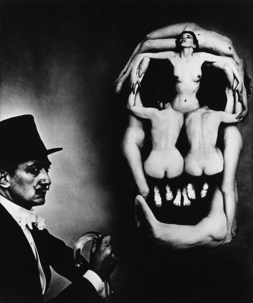
“In Voluptas Mors” is an interesting pick for me since I grew up seeing it on a postcard on the fridge at a friend’s home – and it has always haunted me. The title in English means “Voluptuous/Desirable Death”. It is a photo of a live sculpture of the female form being used to create a skull that entices one to the idea of death. There are seven women in the photo, but the only one with her face exposed is looking up and away, as if she is passively letting death take her.
I see two interpretations for this image – one is the “Desirable Death” signifying a trap for men seeking lustful pleasures without thinking of the consequences, even if it is death. Another could be that death is freeing – as free as the woman in the photo looks. This image is an example of using contradictory emotions intentionally to shock and captivate the viewers, an idea explored in the introduction of Andrew Losowsky’s Visual Storytelling.
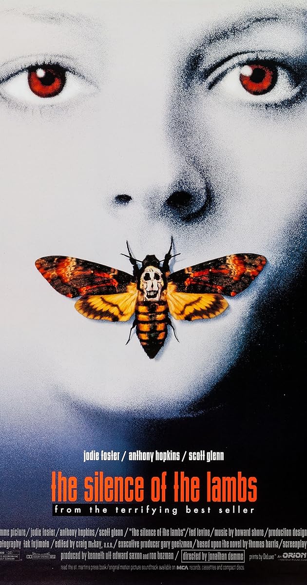
Speaking of moths, “In Voluptas Mors” is actually an element of one of my favorite movie poster designs. Spoiler/gross warning ahead. The moth on the poster of The Silence of the Lambs represents the film’s main antagonist – Buffalo Bill – as he is transforming from a man to a woman by kidnapping and skinning female victims. In this context, the Dalí artwork is being used to show both a desire to kill and a desire for the female form.
The abnormal use of color, specifically in the eyes of the protagonist Clarice, give an eerie feeling to the piece. This again is an example of contradictory elements being used to draw in a viewer.

This next image is the cover art of one of my favorite books, Colorless Tsukuru Tazaki and His Years of Pilgrimage by Haruki Murakami. This image is abstract to those who are unfamiliar with the book, but after reading the novel it shows the story of the book perfectly clear.
The novel follows the story of a man attempting to discover why his tight-knit high school friend group suddenly pushed him away. Each line of the hand represents a group member – their names each had a component of the coordinating color within it, so that is the name they went by in their friend group (Aka, Ao, Shiro, and Kuro). Tsukuru, the main character, was always an odd one out – he always felt “colorless”. Nonetheless every member came together to make a working hand. There is also a ongoing montra in the book about a story of a man who had a jar of fingers and one day lost them and felt as if he lost himself – showing that once the group disbanded, each member was lost.
When the book sleeve is taken off you see a intricate map of the Japanese railway system (which Tsukuru works for). Every line of color has a stop symbol, referencing to Tukuru’s visits, or stops, to each member of the group that he makes throughout the book. While the cover may not mean much to a person who is unfamiliar with the book, it holds a lot of significance as the reader begins to understand it in the context of the story. As book cover designer Peter Mendelsund said in his presentation at the Graphic Design Meetup: Design is Storytelling, “design does in fact exist in time and it does unfold – it unfolds for the viewer in time even though it is static.”

This painting by Norman Rockwell tells a story – and a true one – in a blunt and effective way. The walls with slurs written on it and tomatoes thrown against it making violent splatter patterns, while shocking to the viewer, are obviously no bother to the little girl in the photo who is looking straight ahead. While surrounded by men to protect her it is as if they are invisible, all faceless, adorning bland colors and identical poses, she is walking confidently to her goal of equal education.
The movement and composition of this image are what makes it give this girl such a brave look – it is framed so that she is the moving forward no matter the hate around her, and doing so alone as the only subject with a face shown.

At Eternity’s Gate is one of the most emotional self-portraits I have seen. Just by looking at the image you can see a man cowering, cold-toned colors surrounding him despite the fire, alone in the world. The use of color and space stand out most to me – the fact that the tones are cold and the painting is composed so that you can see that the man is in an empty room alone adds to the emotion of grief.

This image is significant to me because I know the girls featured. This was taken on a health survey to Bawa, Cameroon by a member of the Bawa Health Initiative, a non-profit organization co-founded by my father to provide clean drinking water, bed nets, health education, and even a clinic to a village in Cameroon.
A blog post by Jade Lien entitled The Four Principles of Visual Storytelling outlines some key elements that visual storytellers, especially in the field of non-profits, should consider. Two of the four principles are met in this image: sensory and relevancy. The sensory mark is hit by the emotion in the girls’ eyes as they sit on the ground in their old, worn out clothes. The relevancy mark is hit because these are the children that are befitting from BHI’s work, and they happen to be sitting in front of the water filter provided by BHI that they use to filter out water-borne diseases.

This image is a screenshot from my film Not Broken: Freedom Ride. This is my favorite still from the film – even those who have no idea what this is about can understand that the woman in the picutre is experiencing the raw joy that can only happen when holding a puppy (a puppy that just became hers). This shot is an example of capturing the moment. As explained in Seth Gitner’s book from earlier, “the moment” is when action and emotion come together to capture a story though a still image.

This photo, even to someone who knows nothing about Cambodian history, can be haunting. The eeriness of having an unidentifiable silhouette creep though rows and rows of faces of people wearing the same expression, hairstyle, and clothes tells enough. The fact that every one of those people in the pictures were tutored and killed shortly after it being taken adds so much more depth to this image.
This is the Tuol Sleng Genocide Museum, a primary school building-turned-prison during the Khmer Rouge where an estimated 20,000 people were imprisoned. There are only four known survivors. To me, the silhouette of this image is the most haunting part. That person, who is likely a tourist, could have very well have been any of the people who were photographed and killed if they had been in Cambodia in the late 70’s.

The final image I chose is from one of my favorite documentary photographers, Dorothea Lange, This image is a part of her work with the FSA to help let the American public see the poverty that was the reality for many farmers in 1936. The worry on the mother’s face, the shyness of her two children, the dirt on her baby’s barley-visible face all work together to tell a heart-breaking story of struggle. This image hits all four of Jade Lien’s principles for non-profit images – it is authentic, emotional, relevant, and character-driven, which is probably why Lange is considered as one of America’s greatest photographers.
Now that you have seen these examples of images that tell a story, keep an eye out as you consume visual media for images that compel or interest you. Are they able to tell an entire story within one frame? I know that I am excited to keep a watchful eye from here on out.
Follow my blog for more weekly posts on my exploration of visual storytelling.
Bergstrom, Bo. Essentials of Visual Communication. London, Laurence King Publishing, 2008.
Gitner, Seth. Multimedia Storytelling for Digital Communicators in a Multiplatform World. New York, Routledge, 2016.
Hewitt, Cooper. “Graphic Design Meetup: Design is Storytelling.” YouTube, uploaded by Cooper Hewitt, 5 Dec. 2017, https://youtu.be/Gc42K5P6dEY.
Lien, Jade. “The Four Principles of Visual Storytelling.” Action, 21 Dec. 2019, https://actiongraphicsnj.com/blog/4-principles-visual-storytelling/.
Losowsky, Andrew. Visual Storytelling. New York, Gestalten, 2011.

One response to “Images That Tell a Story”
Hello Emma!
I really enjoyed looking at your selection of images. I thought they provided a great range of different content. Each one expresses a different story from mystery, happiness, sadness, and hope. The image that works the best for me is At Eternity’s Gate by Vincent van Gogh and The Problem We All Live With by Norman Rockwell. Both of these paintings show a single moment in time where the reader has to comes up with the events that transpire before and after. Lastly, I thought you did a great job incorporating the readings into your post as well.
I look forward to seeing your work!
Jennifer
LikeLike