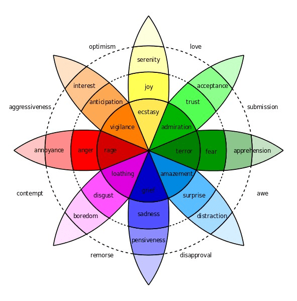
When designing an image there is a multitude of tools that can come in handy when attempting to convey a certain emotion to a viewer. One such tool is Plutchik’s Wheel of Emotions, a diagram showing the eight primary emotions and their varying degrees & combinations.
Every image emanates some form of the eight basic emotions by using context. Just like how our brains use context to understand what we are seeing, we are also able to connect to the images based on our own experiences of those emotions. In addition to that, the Gestalt Principles which help give context to what an image’s meaning is as well as the use of color for emotional design induce these emotions further.
While in my previous post I compared images with the same emotion with artists from different countries, I will be comparing images with different emotions from artists of one country now. My aim to show how no matter where you come from, visual design can influence how an artist conveys emotion to a viewer in many different (or similar) ways. Since I have a strong interest in Cambodian history, I will be reviewing three images from Cambodian artists, two post-Khmer Rouge and one modern piece.
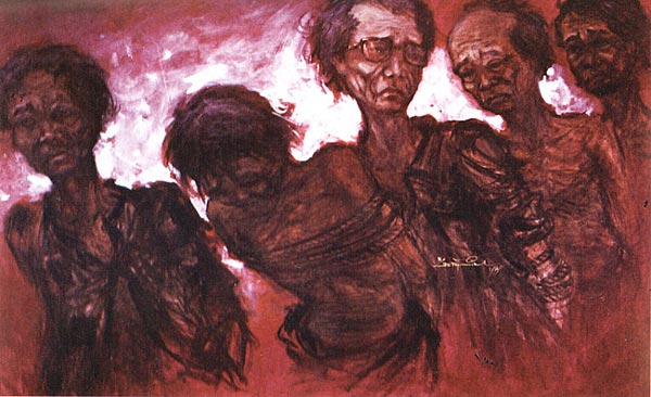
“The Last Look” was a painting created by Ngeth Sim capturing the moment when his father was taken away to be killed by the Khmer Rouge. Everything about this image screams terror to me – the terror that he, as a child, must have felt. Just reading this excerpt from Sim’s interview about the painting fills me with enough terror alone, never mind the awe-inducing painting:
“My poor father, at the moment when the Khmer Rouge led you away, I fixed on your face intently. At the bottom of my heart, a thousand thoughts clashed and overwhelmed me. I couldn’t speak. I remained mute in front of them and only the tears flowed down my cheeks. I sensed that I was going to lose you and life left me at the same time that they were taking yours. I did not have the force to protest in front of these torturers, to prevent them from taking you and killing you. Today still, this memory beats against my chest and keeps me from complete happiness. When I think of it, the feeling overwhelms me that I did nothing to return the love that you had given to me. I am truly an ungrateful son. Dearly beloved father, I pray every night that your soul will pardon me.”
Looking at the painting by itself instills terror as well due to its design. The most prominent Gestalt Principle captured in this painting is “common fate” – and their fate, in this case, is a terrible one. The movement in this photo is mostly to the left, but the one man making his “last look” to his son is staring back. The continuity and proximity of the men in line adds to the terror since you know that he was not the only father who was murdered – every single one of the thousands and thousands who were killed had families.
Another element that is highly influential to the emotions is color. In this case, the colors are red, black, and white. Not only is red the color of the party that was executing these men, but it also associated with “fire, violence, and warfare”. White is typically thought of as the color for virtue, but in the East it is more commonly associated with death. It works well in this painting to highlight the center of the image – the man giving the “last look”. The black charcoal that makes the outlines of the men is effective at representing the misery of the victims.

Vann Nath is a Cambodian artist who is well known for his images depicting scenes of torture that he witnessed as a prisoner at Security Prison 21. This painting, however, depicts an alternate reality that he could have experienced had the Khmer Rouge not taken over. Instead of omitting terror, it gives a feeling of peace to the viewer. He explained his vision he had here:
“My picture wishes to show what life ideally can be like in the countryside. The cowherd lying under the tree is free in his heart. He is his own master and does not suffer from oppression or intimidation. He lives honestly by his own labor and in peace and harmony with his own surroundings. He has no fear of anything and is not afraid that anyone will steal his possessions or his animals. It is thus the opposite of my paintings of torture and sadness. While painting this painting I was happy and hopeful. The Tuol Sleng paintings I painted to document what had happened but their painting was difficult for me.”
As far as the Gestalt Principles go, there a few that influence the feeling of peacefulness Nath was aiming for. The figure-ground which is supposed to determine the background and foreground is somewhat muted here since the colors and lines flow into each other in a relaxed way. Everything in this image is connected as well – the man, the cows, the nature, the clouds – they are all calm and together, instilling a feeling of grounding and connection.
The colors in this photo are all natural and analogous to the other; as I mentioned above, everything in the photo seems to flow together. Each color still gives a certain feeling to the viewer – the green grass promotes growth and stability, the blue sky promotes calm and safety, the white clouds and nearly-white flowers promote comfort and elegance. When looking at all of these attributes, it makes you sad to know that none of these where possible in the Cambodia that Nath actually experienced. He aimed for the exact opposite and he achieved it.

The final image I chose is by a modern Cambodian painter and is much more lighthearted as it has nothing to do with the genocide. Instead it depicts four performers who are sharing their art with the world. To me, this image emanates joy.
One Gestalt Principle that is present in this image is connectedness. Every figure is touching another and the lines are flowing as if they are coming from the same place. To me it seems that these people are sharing a strong link with each other as they play their music. There is also an element of simplicity to their faces; they are very bare-bones, but people are able to see them as faces due to perceptual constancy which allows humans to understand what something is due to its context.
This is the most abstract photo of the bunch and uses colors in an unrealistic, but fun way. The red in this photo is signaling youth, the accents of blue is promoting openness, the bit of yellow is adding happiness, and the black is adding a bit of edginess. With this “edge” I imagine these to be late-night or street performers. It is interesting to note that this painting also has a strong red and black color scheme much like the first, but the more vibrant red and the solid lines make it more lighthearted.
Emotions can be conveyed by artists of all backgrounds and in many different ways because we all share the same experience of being human. While images may mean more to some than others based on their life, some basic design principles can easily give the artist the ability to connect emotionally to any viewer.
Annenberg Learner. “Discovering Psychology: Updated Edition – Sensation and Perception” WGBH Educational Foundation, Feb. 2001, https://www.learner.org/series/discovering-psychology/sensation-and-perception/.
Busche, Laura. “Simplicity, symmetry and more: Gestalt theory and the design principles it gave birth to.” Canva, https://www.canva.com/learn/gestalt-theory/. Accessed 4 Sept. 2020.
Cao, Jerry. “Web design color theory: how to create the right emotions with color in web design.” The Next Web, 7 April 2015, https://thenextweb.com/dd/2015/04/07/how-to-create-the-right-emotions-with-color-in-web-design/. Accessed 4 Sept. 2020.
Chapman, Cameron. “Color Theory for Designers, Part 1: The Meaning of Color.” Smashing Magazine, 28 Jan 2010, https://www.smashingmagazine.com/2010/01/color-theory-for-designers-part-1-the-meaning-of-color/. Accessed 8 Sept. 2020.
McLeod, Saul. “Visual Perception Theory.” SimplyPsychology, 2018, https://www.simplypsychology.org/perception-theories.html. Accessed 4 Sept. 2020.
“Putting Some Emotion into Your Design – Plutchik’s Wheel of Emotions.” Interaction Design Foundation, 2020, https://www.interaction-design.org/literature/article/putting-some-emotion-into-your-design-plutchik-s-wheel-of-emotions. Accessed 4 Sept. 2020.

2 responses to “Mixed Emotions”
Hi Emma,
First off, I love how you applied a historical context by looking at Cambodian art through the experiences of artists affected (directly or indirectly) by the Khmer Rouge. Not only did you provide convincing arguments behind the emotions depicted through color theory & Gestalt principles, you provide a great lesson on “what was”, “what could have been”, and “what has become” of Cambodian internal affairs from the past half century through these images. When I was looking at “Music Scene”, my mind interpreted the band cutting through the red background as a new generation of Cambodians rising up from their oppressive past depicted in the red hues from “The Last Look”. “The Village of My Birth” provided great contrast from other red dominated works, but also gives a glimpse of a pre-Khmer Rouge Cambodia people unknown to the country’s history. All of these images express the emotions intended by the artist, but evoke different emotions of the viewer when placed within proper context of events. This is a well written entry. Great work!
-A.J.
LikeLike
[…] Visual design relies on evoking an emotion from the audience to share a story or an idea. There are design principles that help artists and designers express certain emotions such as the Gestalt Principles, contrast, color theory, and many more. Designers often follow Plutchik’s Wheel of Emotions to understand the eight basic emotions, their variations, and their combinations so that they can better utilize those principles to express the emotion they want. See my previous posts exploring emotion in images here and here. […]
LikeLike