Scientists have used data and visuals for centuries to display and exhibit facts and findings to the public and other specialists. One issue that is a hot topic in environmental discussion is the toll that the use of oil as a main energy source is having on the environment. One of the most apparent negative impacts that can occur are the oil spills that occur on coastlines. By using visuals to present this issue, scientists can not only make the issue more clear to the public, but even engage them in the issue and inspire them to make change.
:max_bytes(150000):strip_icc():format(webp)/GettyImages-dv118021-5c3f8c54c9e77c00017d2ca2.jpg)
This first image does not represent any data, but it needs no words. As Carolyn Barnwell explains in her talk at Middlebury College, there is a difference in telling facts versus sharing a story. There is no need to overload an image with numbers, sometimes showing an image that evokes a person’s morals can be enough. The fact that the scientist who posted this image is clear: oil spills damage the environment.
The image also follows all four principles of visual storytelling outlined by Jade Lien – for this particular image, the sensory response is strong. This image not only triggers emotion, but it is authentic and connects you to this character of a bird who is likely going to die. What’s more, every single reader, unless they are fully off the grid or exclusively on renewable energy, is partially responsible – the image is relevant to the reader.

This visual says the same thing as the first, but with a much different execution. In the paper by Kwan-Liu Ma and others a structure for presenting scientific data is suggested: first, consider the pace – take as much time as necessary (depending on the audience) to show the information. Then, “hold the audience’s attention by having interesting settings, plots, and characters,” and finally leave a lasting impression by piquing curiosity.
The pace of this graphic is rather “slow” – all of the information is laid out in a way that can easily be understood by the general audience that the NOAA was targeting. The “setting” of this graphic is laid out by both the short paragraphs on the left giving a bit of context and the visual of oil leaking from a boat into the water. The “characters” are the silhouettes and names of each animal and their “plot” is if/when they recovered from the spill.
Finally, there is the lasting impression. In this graphic the lasting thought for many viewers would be the species who are not recovering who are outlined by red. The color selection in this graphic is key to matching the data to the emotion: following the color guidelines from Jerry Cao, the green in this case means environmental stability and the red calls for urgency and importance. The act that an oil spill from over 30 years ago has still impacted that many species is something that should be considered rather urgent, so the colors were selected well and with intention.
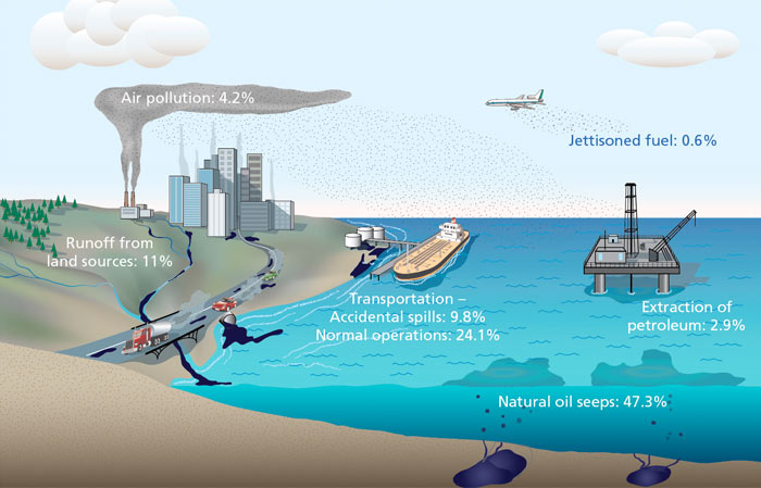
This visual is similar to the last as it is a combination of an illustration and data to create a better picture of where the oil in the ocean comes from. It shows a fuller picture: oil spills are in fact the fourth biggest contributor to oil in the ocean – transportation, runoff from land sources, and natural oil seeps are actually quite a bit ahead of oil spills when it comes to the amount of oil in the ocean. This visual is not trying to evoke any emotions or calls to action in particular; it simply breaks down the facts in an easy-to-follow way. Still, it does a better job at sharing this information since the world is so visually focused.
As an experiment (similar to the one Barnwell did in her presentation), look at the visual above, then look at the data set below:
SOURCES OF OIL IN THE OCEAN
- Natural oil seeps: 47.3%
- Transportation (normal operations): 24.1%
- Runoff from land sources: 11%
- Transportation (accidental spills): 9.8%
- Air pollution: 4.2%
- Extraction of petroleum: 2.9%
- Jettisoned fuel: 0.6%
Both the data set and the graphic said the exact same thing, but the visual is not only more likely to attract more viewers, but it helps those viewers interpret that data better.

This visualization is strictly data in the form of a bar graph, and like the previous, it gives a larger scope of the situation. While the first two images would imply that there is an increasing issue when it comes to oil spills, this graph actually says the opposite. The previous decade had the least oil spills by far from any other decade, more than 10x less the average in the 70’s. As explained in the article by the Interaction Design Foundation, every data set leaves out certain elements. The pervious visualizations have left out the fact that there has actually been improvement when it comes to oil spills – the future for the environment may be looking better than the other visuals suggested. However, just because there are less oil spills now does not mean that all is well.
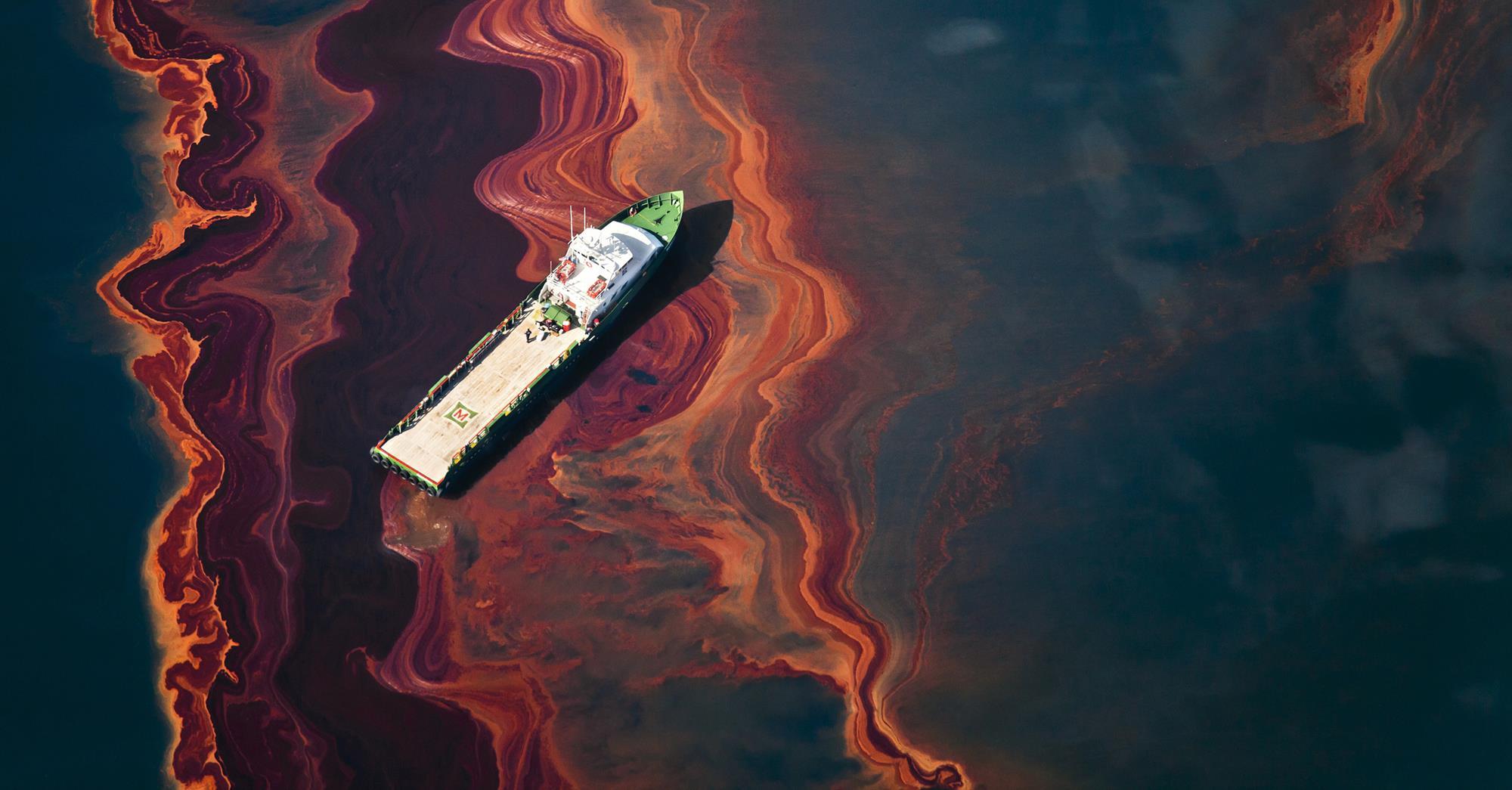
This final image displays an oil spill in a more zoomed-out perspective. It is interesting as its design elements are aesthetically pleasing. The calm, dull colors evoke a kind of tranquility, the white boat adding a hint of juxtaposition that suggests simplicity. However, when the setting is presented the tranquility quickly morphs into alarm. Like the first image, there is no data. Still it is evident – nature is at risk because of human error.
Barnwell, Carolyn. “Visual Storytelling for Science and Conservation Impact.” Middlebury Media Services, 2018, https://vimeo.com/260442084.
Cao, Jerry. “Web design color theory: how to create the right emotions with color in web design.” The Next Web, 7 April 2015, https://thenextweb.com/dd/2015/04/07/how-to-create-the-right-emotions-with-color-in-web-design/. Accessed 4 Sept. 2020.
Dahmen, Nicole. “How to Do Better Visual Journalism for Solutions Stories.” MediaShift, 22 Nov. 2017, http://mediashift.org/2017/11/visually-reporting-solutions-stories-newsrooms-classrooms/.
Dennison, Bill. “Practical Visual Literacy for Science of Communication.” University of Maryland Center for Environmental Science, 28 March 2017, https://ian.umces.edu/blog/2017/03/28/practical-visual-literacy-for-science-communication/.
“Information Visualization – A Brief Introduction.” Interaction Design Foundation, July 2020. https://www.interaction-design.org/literature/article/information-visualization-a-brief-introduction.
Lien, Jade. “The Four Principles of Visual Storytelling.” Action, 21 Dec. 2019, https://actiongraphicsnj.com/blog/4-principles-visual-storytelling/.
Ma, Kwan-Li, Frazier, Jennifer, & Kostis, Helen-Nicole. “Scientific Storytelling using Visualization.” University of California, Davis, http://vis.cs.ucdavis.edu/papers/Scientific_Storytelling_CGA.pdf.
Rodriguez, Fabiola Cristina & Davis, Lloyd Spencer. “Improving Visual Communication of Science Through the Incorporation of Graphic Design Theories and Practices Into Science Communication.” Science Communication 2015, vol. 37, p. 140-140, 2014. DOI: 10.1177/1075547014562914.
