Before creating a story from many different images, I wanted to plan what kind of emotion I wanted to capture – after all, emotion is just as important as information and function. For what I had in mind somewhere right between fear and surprise on Pultchik’s Wheel of Emotions would be just right – awe is what I would keep in mind while creating my composition.
After going through some images I captured over the Summer, I came up with the most awe-inspiring tale I could think of with the material I had: the “Attack of the Killer Kids”.
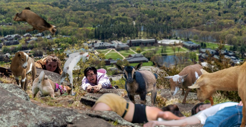
For this composition I knew that I wanted to showcase a few key elements when it comes to the illusion of spatial depth. First of all, I wanted to focus on using fore, middle, and background. In Chapter 7 of Robin Landa’s Graphic Design Solutions, the foreground is supposed to be bigger, brighter, and have more contrast and detail. While I followed the guideline of a bigger foreground, the brighter, more detailed part of the image is the middle ground.
I chose to have the middle ground be the area of focus by using an aerial perspective. While the human eye usually sees closer objects to be more clear, the depth of field is still limited (much like a camera). I wanted to bring focus to the person about to be attacked by the white goat – this was the area of the image that was clearest and brightest.
In addition to this, the area that is most in-focus (or the least blurred) lies right around the path of the Golden Mean. The eye begins with the largest objects in the image (the dead bodies about to be consumed in the foreground) and ends up where the innocent hikers are about to perish.
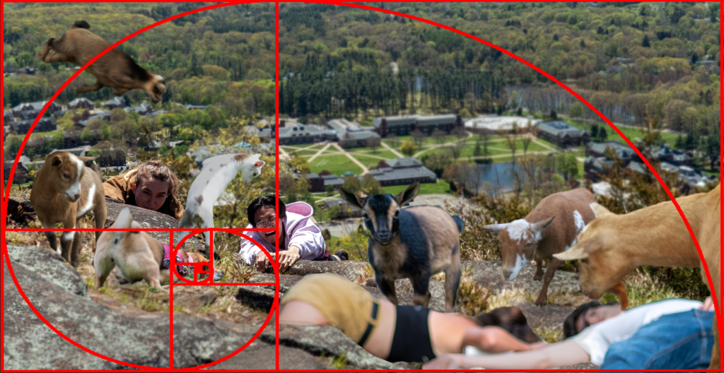
With the Golden Ratio also comes balance. Even though this image is far from symmetrical, I can still balance the visual weight; while there are more objects on the left side of the composition, the size of the elements on the right add more visual weight, making them about even.
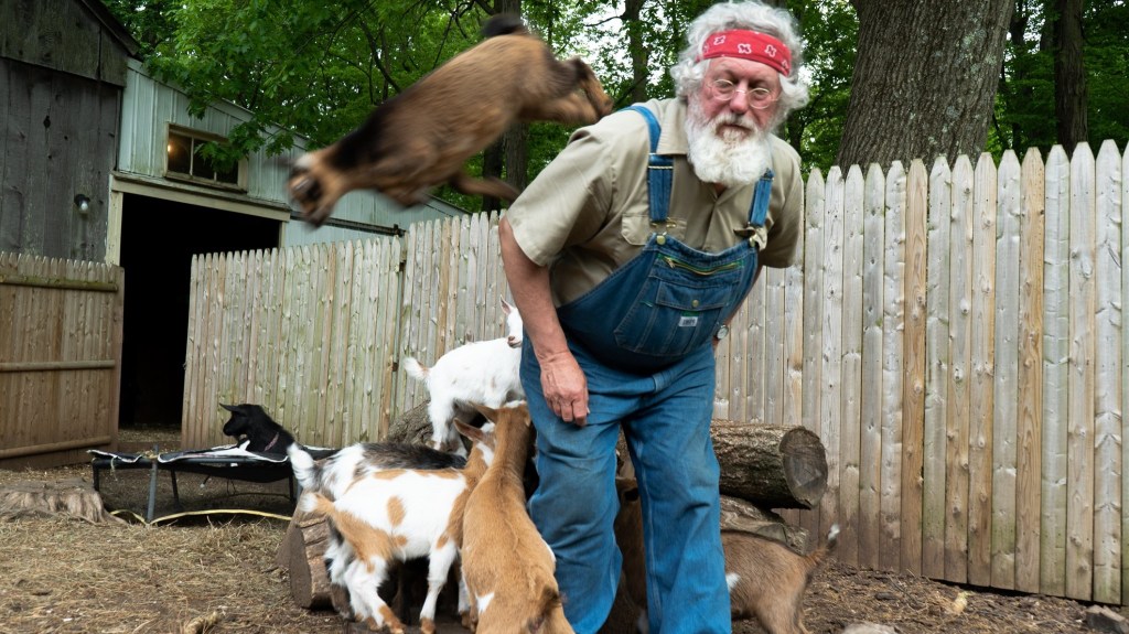
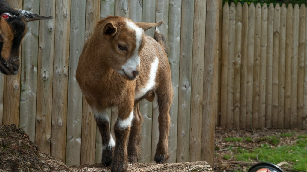
I used a total of nine images to create this composition. As you may notice, some of the elements I selected from these images were already blurry, so I used that to my advantage. For the ones that were not (like the base image of my friend and husband pretending to fall of Sleeping Giant) I used the blur tool in Photoshop to make the illusion of a smaller depth of field. To make the shadows match that base image I also had to play with basic adjustments of contrast and brightness.
Even though having the limitation of using images that I had already captured may have seemed difficult at first, I found that it opened me up to make a more creative story than I thought was possible. Trying to find associations between seemingly unrelated images is a useful creative tool that I will think about using again if I ever feel stumped.
Callahan, Ewa. “Depth Perception.” Visual Design, 25 Jan. 2021. Quinnipiac University. Lecture Recording.
Callahan, Ewa. “Design as Communication.” Visual Design, 1 Feb. 2021. Quinnipiac University. Lecture Recording.
Fontana, Anthony. “2D Foundations: Intro to Composition.” Bowling Green State University. Microsoft PowerPoint presentation.
Landa, Robin. Graphic Design Solutions. 6th ed., Cengage, 2019.





2 responses to “Visual Communication: Telling a Story Through Images”
Emma,
I absolutely love the creativity within this composition! It is definitely outside the box thinking and was a composition I did not expect when I first landed on your blog! I think it is great you began with emotions. That really set the tone for your piece. I also like how you used the blurry pictures to your advantage. Because that image is set in the foreground of the composotion, it looks like it is suppose to be blurry. Before I even read your blog post I thought that was a good way of showing perspective. My only suggestion would be maybe because you have the blurred images in the front of the picture, don’t blur out the campus in the background. Since the campus is already in the distance, it has that effect without it having to be blurred, even though why you did it makes sense, but I would be curious to see what the composition looks like without the blurred background.
LikeLiked by 1 person
Hi Emma!
I enjoyed that you used both people and animals in your composition. It is clear that you wanted to bring the audience’s eyes all over the composition. When I first looked at it I didn’t know where my eyes were going to focus. I slowly looked at the entire piece and it all flows really nicely and tells a story of it’s own. One suggestion I have would be to make the goat in the bottom right corner blurry as well, to match the people lying there. Overall, I really like your composition!
LikeLiked by 1 person