In an attempt to combine the knowledge I have gained so far on the principles of composition, I created a movie poster for an upcoming short documentary that I am creating. While the final poster appears basic, there are many aspects of design that I considered during its creation – much more than the rule of thirds and dimensions.

Conceptual Development
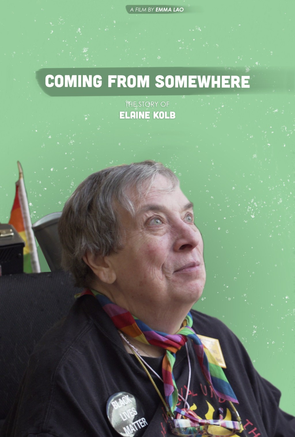
First and foremost, I had to ask myself some essential questions to design the poster. First – what is this poster’s purpose? I knew that I want to grab the viewer’s attention while forming some sort of emotional connection to Elaine, the subject of the film.
Next – how can I make the message resonate with the audience? The message of the film is that despite her hardships and trauma, Elaine was able to still conquer and be proud of who she is.
Both of these issues were addressed by my choice of image. I watched through footage that I filmed and found the perfect still of Elaine looking over the state’s capital building when she was attending sit-in for the clean-slate bill – in this moment, reminiscing about how many times she had been there to make change. This information is not known to the viewer of the poster, of course, but the emotion of accomplishment, pride, and reflection are all apparent.
Basic Considerations for Posters
Some major points for me to incorporate that should be considerations for any poster design (based on the chapter Posters from Robin Landa’s Graphic Design Solutions) are as follows:
Start with content you need to include. This is straightforward for this project – Elaine, the title, and my name. As I said earlier, I began with the most important element of all – a captivating image of the subject to draw the viewer in.
Image to type relationship (size). Since the image is the main element of the design, I did not want the text to compete for attention. Instead, I chose a nice, modern sans-serif in a small enough font so that it would be no more than complimentary.
Entry point. The viewers should know where to start the movement of their eyes so there is no confusion and therefore, a lesser chance of lost attention. The entry point for this composition is marked by contrast in color and size – Elaine is the darkest, most complex figure in the design so the eyes begin there, then follow her gaze up to the title.
Content-led thinking. I began this poster with the documentary in mind and continued this content-based vision throughout its design. Every element connects back to her story and the film, while maintaining a complete composition.
Color
There are two major uses of color in this composition – the combination of colors that created Elaine’s figure and the cool-green background that makes up the ground. First is the consideration of cool v. warm colors. Cool colors typically take the background and warm colors take the foreground, so I knew that I wanted the background to be cool so it does not compete with Elaine, who is supposed to be the most dominant figure in the composition.
Next is the consideration of emotion. Cool colors in general are considered to be calm and serene, but green is especially soothing. Elaine’s expression is once of calm strength – something that I believe is complimented nicely by the teal. A nice plus is that it makes her green eyes pop (and every photographer and videographer knows that the eyes are the gateway to the soul).
Hierarchy and Depth
Along with the contrast in size from the different elements, the texture, shape, and color difference between the figure of Elaine, title, and subtitles imply a clear dominancy hierarchy. This is the same hierarchy that tells the viewers where the entry point and path to continue their gaze lies.
There is also a bit of depth implied by the slight cast shadow around Elaine’s figure and the depth of field within her figure.
Type
For this composition I chose to use two type families – making sure that I was contrasting them enough to make a compelling and non-“mushy” design (Lupton). Each section of text has a distinct, yet overall harmonious, feel.
While it is not the busiest design, I believe that it captures exactly what I wanted it to. Simplicity and restraint when designing is just as important as anything else – if not more – so I knew that as long as I continued to lead my design with a content-based perspective and followed the basic design principles, it would turn out fine.
Baker, Justin. The Ultimate UX Guide to Color Design. Medium, 4 Dec 2017, https://medium.muz.li/the-ultimate-ux-guide-to-color-design-4d0a18a706ed.
Callahan, Ewa. “Depth Perception.” Visual Design, 25 Jan. 2021. Quinnipiac University.Lecture Recording.
Fontana, Anthony. “2D Foundations: Intro to Composition.” Bowling Green State University.Microsoft PowerPointpresentation.
Landa, Robin. Graphic Design Solutions. 6th ed., Cengage, 2019.
Thinking With Type. Ellen Lupton, 2009, http://thinkingwithtype.com/. Accessed 11 Feb. 2021.

3 responses to “The Principles of Design in Practice: Movie Poster”
Hi Emma! I think that is so cool you are making another documentary and I actually really like the simplicity of your poster. I think the choice of a simple background helps to draw the focus to the image of Elaine. Maybe just up the contrast and color on her to make her pop even more from the background. Making her coloring a bit warmer will create some contrast from the cool toned background which can help with depth too. Like you said you want her eyes to really pop more. I think that’s really nice that you were able to use a screen cap from your footage to express the meaning behind the entire film. I like the typography design of you title. The simpler font really fits with the overall feel of the poster and the sizing works to not overpower your main image. I also like the darker green streak behind it. This helps to differentiate it from the background rather than feeling flat. I think the only thing I would change or add to make it feel more like a movie poster is maybe some credits on the bottom. I know a lot of movie posters have that but it doesn’t work for every design. Overall I am intrigued by your story and would love to see the film when it’s done!
LikeLiked by 1 person
Hey Emma! I really enjoyed reading about your poster design and seeing the final product! When I look at your poster my eyes are drawn to Elaine’s eyes. The image of Elaine that you chose to work with is powerful and her expression shares a lot. Without knowing the background information, a great sense of pride can be seen. Her eyes are lively and driven, and as a viewer, I want to know more about what she sees and what is ahead of her. The background color choice also helps to emphasize her eyes. I think that including the white specks in the background also help create some depth and avoid it looking flat.
There is no dispute that Elaine is the focal point and subject of your poster design. No design elements are competing with her, which also helps convey that this poster is for a documentary film. I love how Elaine’s attire with the bandana, button, and flag help to share her story. Elaine is definitely contrasted from the green background, but I would love to see these important details highlighted even more. Some ways to do this may include increasing the saturation or increasing the size of the rainbow flag behind Elaine.
The typography that you worked with was simple and effective. It is not necessarily needed, but there is a lot of open space in the upper half of your poster, so you may want to play around with increasing the size of your title and Elaine’s name.
It was clear that every one of your design decisions was intentional and fueled by the elements of design! I look forward to seeing more work from you!
LikeLiked by 1 person
Appreciate it for helping out, good information.
LikeLike