
This week I took a look at how visual design is incorporated in web pages and mobile design. In order to demonstrate the most important concepts, I created a re-design of my family farm’s web homepage on both desktop and mobile.
Desktop Site Re-Design
Before I knew what I wanted to do to change the site, I first did an audit of what fernsmeadow.com looks like currently. While it is not awful, there are several fundamental rules that could be capitalized on.
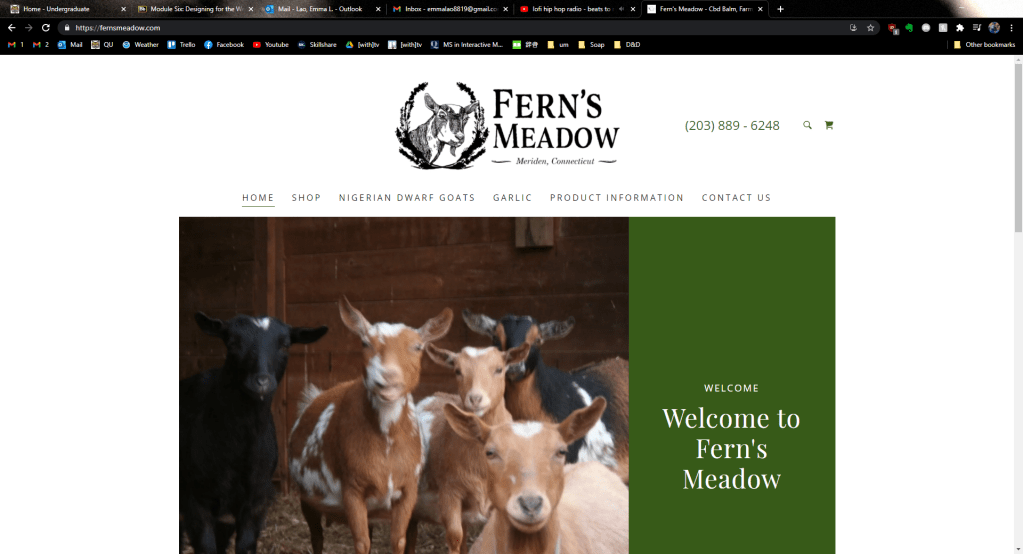
First of all, the header is rather bland and does not include all of the contact information a person may want. Some of the navigation keywords could be condensed for clarity too. What is the worst about this current homepage is that the above fold barley gives any information about what Fern’s Meadow is when the most important information should be in the above fold (Landa). This is troubling, considering that 77% of web users do not scroll down a page (Kolowich Cox).
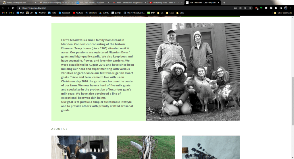
When you scroll down, there is another mediocre image (my eyes are closed, for crying out loud!) with a large block of text that can easily be condensed so that a first-time visitor can get the gist quickly. Below that is a misplaced “About Us” header then photos of goats, garlic, and artisan goods with buttons to the corresponding pages.
Looking at this site, it is clear that it was designed canvas-in rather than content-out (Landa). The images and typography do not stand out or particularly compliment each other and the images themselves definitely need to be updated for quality and information.
For my re-design I first planned what content and calls-to-action needed to be established. Then I began with the most important content at the top of the page, with the tagline and abridged “about” section below. The images I chose conveyed the four things that embody the brand: family, produce, artisan goods, and goats – all taken with my higher-quality camera.
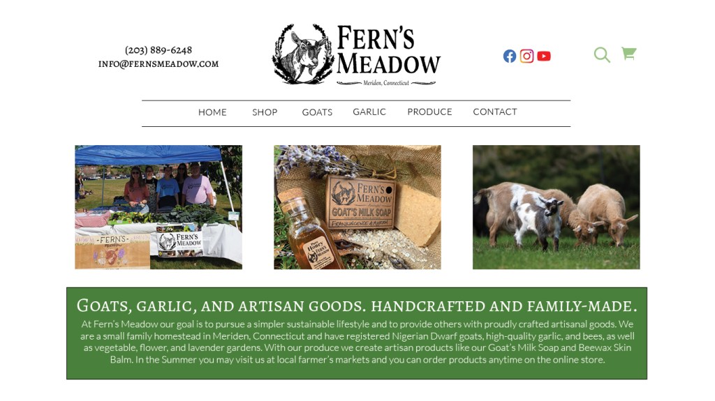
The header also received some changes – I moved the contact info to the right to add balance to the grid and added the email so that everything was there at-a-glance for any potential customers. I also changed the font so that it was one of two – in this case, it was the serif font that stands out more. The same goes for the tagline – I kept it in a larger, bolder serif font and had the additional information in an easy-to-read contrasting sans serif. The navigation bar was altered slightly as well – I created two lines to group the page keywords so that it stood out more to the user.

For the under-fold section of the homepage I added another on-brand image and some customer testimonials taken from our Facebook reviews to add credibility. After all, “72% of consumers say positive reviews make them trust a business more” (Kolowich Cox). Finally I re-designed the footer to also include the contact information again along with the already present contact info (Landa).

Mobile Site Re-Design
In today’s world the mobile site is just as, in not more, important as the desktop site. To do the re-design I went through the same process of auditing the current site.

Again, there is a lot of wasted space on the above-fold and the mistakes from the desktop site are almost identical to those on the mobile.

On the mobile site the bulkiness of that text is only amplified. I doubt that many consumers would want to scroll through a minute of reading when the attention span of humans is nearing that of a goldfish. This is on my Galaxy Note9 as well, a phone that has a taller aspect ratio than most.
For the re-design I began with the header and the navigation. I wanted the navigation to have a similar style to that of the desktop site – simple and easy to, well, navigate. Right under the header I created a “MENU” text between two lines to make it its own group. When the user clicks on it, this navigation menu will appear. Again I used the same simplified keywords for clarity.

For the above-fold of the mobile site, I again used an on-brand image and the tagline with abridged info. depending on the screen size, the text would expand or shrink for readability (something that would have to be included in responsive coding). The image would also be a sliding gallery that includes the two other images I selected that are featured on the desktop site.

For the under-fold I had another on-brand image and the customer testimonials again. On the bottom I also included the icons that would link to our various social media sites – something that is even more relevant on mobile as well.

To get a full picture of the mobile re-deign, see the image below.

I would love to implement these design changes into the live site as soon as I can, although there will likely be some minor changes since I will be working with a CMS. Next week I will be creating a tri-fold brochure for Fern’s Meadow that will implement all of the design principles I have learned so far, so stay tuned!
Kolowich Cox, Lindsay. “The Anatomy of a Winning Website Design [Infographic].” hubspot, https://blog.hubspot.com/marketing/anatomy-web-design. Accessed 3 Feb 2021.
Landa, Robin. Graphic Design Solutions. 6th ed., Cengage, 2019.
Lynch, Patrick J. & Sarah Horton. Web Style Guide. 3rd ed., Lynch and Horton, 2017, https://www.webstyleguide.com/wsg3/.
 Emma Lao
One response to “Designing for Web and Mobile: Revamping the Fern’s Meadow Homepage”
[…] the brochure system will work with the existing visual system”: Last week I had re-designed the website using two font families, certain colors (well, mostly just green), and assets that the brand […]
LikeLike