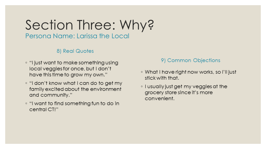
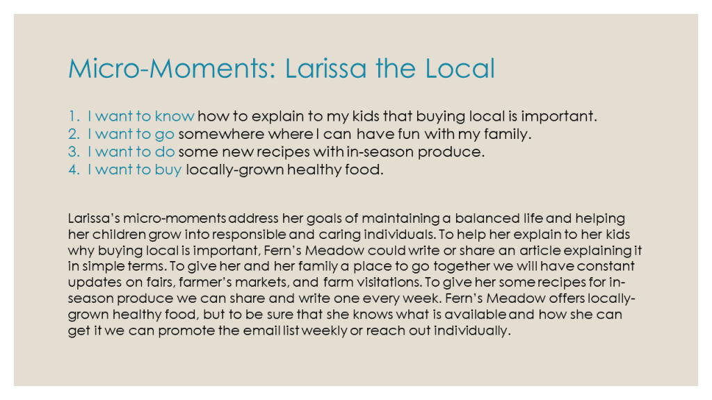
In today’s world, a website can make or break a brand. People are becoming increasingly impatient with confusing or badly-formatted websites. According to user experience researcher Jakob Nielson, the average internet user will stay on a page for only 10-20 seconds unless they are given a clear reason to stay within that time.
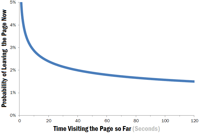
Nielson suspected that this brief 10-second window of a person deciding to stay or leave is “because users are extremely skeptical, having suffered countless poorly designed web pages in the past.”
So what constitutes poor design, and how can we avoid it?
Vitaly Freidman of Smashing Magazine answers this question in his article “10 Principles Of Good Website Design”. His most vital point is #1: “Don’t Make Users Think”. If a user does not understand what they are supposed to do, they will quickly lose patience and go to the hundreds of alternative websites that are more clear and straightforward.
To illustrate how web designers can avoid bad design, I re-visited some pages I came across when looking for a company to print t-shirts for my family’s farm.
The Bad
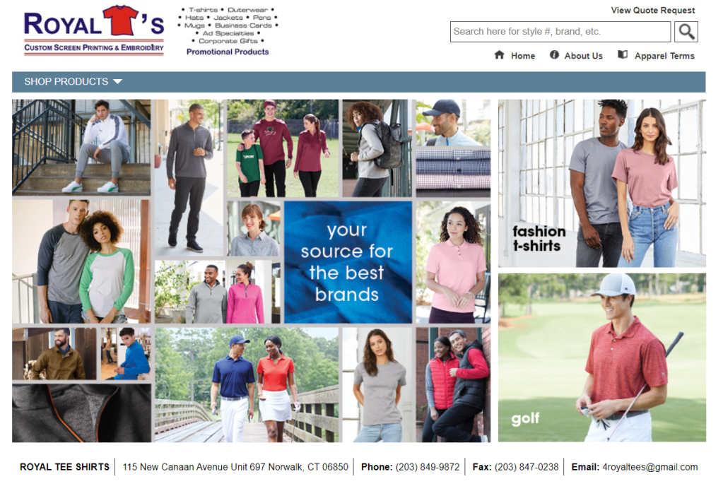
An example of a site that is not straightforward at all is from 4royaltees.com, a local print shop.

Let me outline a few things that caused me to think point my arrival to this website:
- Unclear Product Page. If I wanted to order a shirt, there looks to be four buttons that I have to press from the menu, along with three duplicates along the bottom. A way to fix this could be to create a single page called “Create a Product” where you would go through each competent section by section (pick your brand, then pick your product, then design your product, then check out) in a single page rather than four separate ones.
- Too Many Words! The top banner alone is way too much to look at. I already assume that they would print all of the apparel and products listed with the simple phrase “custom screen printing, embroidery, and promotional products”. Additionally, the information boxes near the bottom of the page could do with some photos to that it is not just a repeat of the menu above, especially since it is a page of text that leads to another page of text.
- Under-Utilized Home Page. This page does not offer any information on its own and requires the user to click on a link to reach anything of importance. One of the most important factors of user-centered design is to cut out as many asks from the user as possible. This welcome page doesn’t even have the full welcome – I have to click through to reach it!

One thing that they did well was to have the contact information in an easy-to-access spot. In an article by Ron Dod he points out that one of the biggest web design failures it to keep your contact info out of reach. While I did give up on the website, he at least made it easy for me to reach out the old-fashioned way.
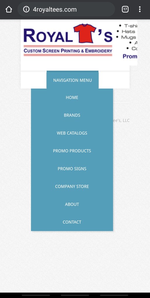
Another big web design failure that Ron Dod points out, though, is having “a non-mobile friendly website”. It is important to be able to reach a mobile audience given that almost every adult in the US uses their smartphones and tablets just as often as their desktop computer. Unfortunately, I would go as far as to say that this website is mobile-hostile.
The Good
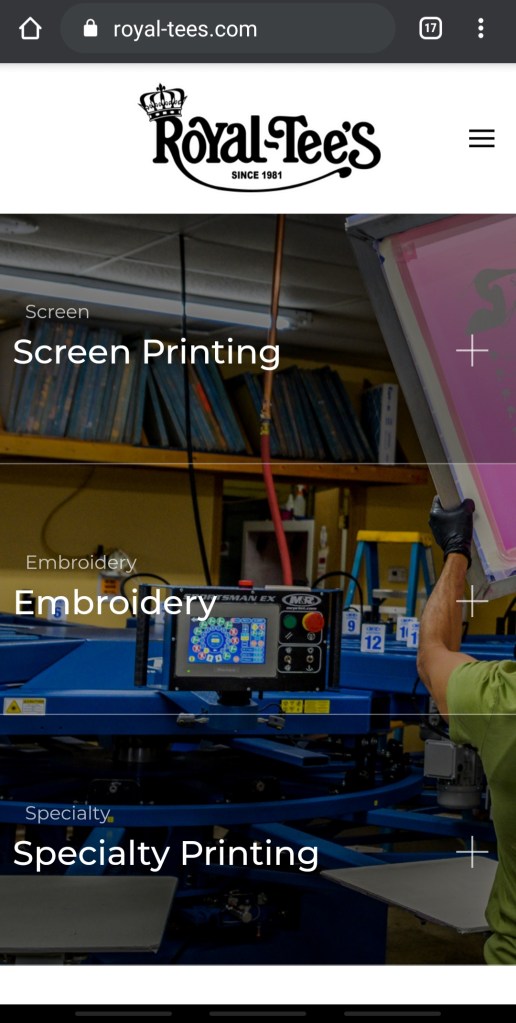
Now here is an example of a well-designed web page for another printing company, royal-tees.com.

Upon my arrival to this website, all of my issues were fixed:
- Clear Product Page. I knew exactly what I had to click to get the information I needed. Even though the links just lead to a page with some information, photos, and contact information it is still extremely straightforward.
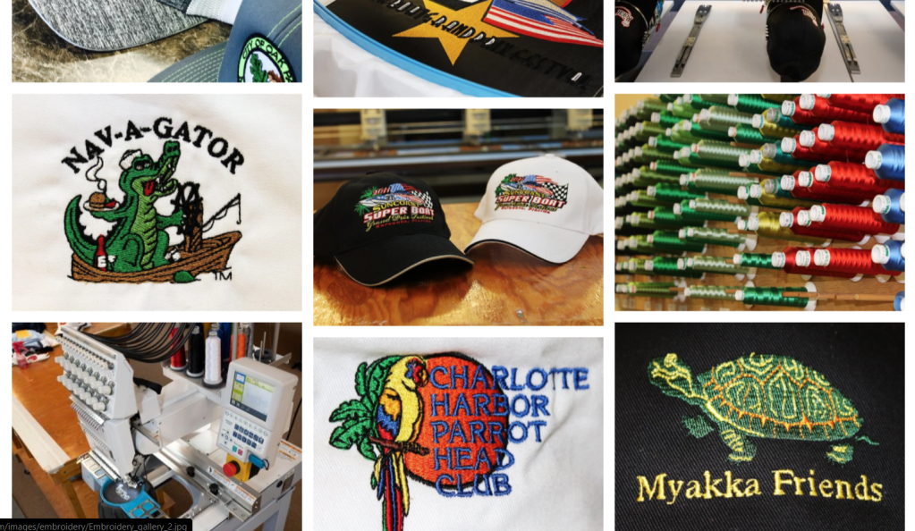
- Just the Right Amount of Words. With only 14 words on this page I have a better idea of the business in a significantly shorter amount of time. The use of a menu where you click to reveal photos of each process is beautiful to look at and a welcome break from the wall of text that was the last web page.
- Well-Utilized Home Page. Along with the stunning photos, if you scroll down they include the about, list of brands, and contact information, something that took the other site four additional pages to reach.
Their mobile website runs just as well and looks just as good as the desktop version.
In summary, there are five main takeaways that web designers can take away from these two websites:
- Simplicity: In my view, the most important principle that made the good website so much better was the amount (or, rather, lack of) of information displayed on the first page. As Freidman says in his list of principles, “the higher is the cognitive load and the less intuitive is the navigation, the more willing are users to leave the web-site and search for alternatives,” and I did just that.
- Clear Visual Design: Going hand-in-hand with the simplicity of information, having a visual hierarchy that points users in the right directions adds to the clarity web designers should strive for. In a HubSpot article by Erik Devaney he argues that using elements that draw users in to the desired action is highly effective. Looking at the good tee website, the “Request a Quote” button is a bright red that immediately requests the user’s attention.
- Value Proposition: In his research, Nielson concluded that a value proposition must be presented in 10 seconds for a user to stay on a web page. With the first page I was so overwhelmed that I couldn’t even figure out which page to go to see the products and get a quote since there were so many to choose from. On the second page it took a matter of seconds for me to scroll down and see the quality of the products in photos and click through to request a quote right away.
- Attractive Imagery: The visuals of the second page not only gave me information about the products I was looking to order, but it was simply pleasing to the senses. In Sujay Pawar’s article “8 Principles of Good Website Design” he lists Visuals and Color Platte as a vital part of web design. The deep colors and consistent red, black, and white color palette added to a sense of consistency and credibility.
- Accessibility: The first website had long loading times and was full of outdated and broken links. In addition to that, the first website was not mobile-friendly at all, while the second worked exactly as expected on my phone.
By implementing the successful elements and knowing exactly what bad web design looks like, we can create sites that can hold a user’s attention and boost our brand’s image.


 Emma Lao