It is not news that images can spark a variety of emotions in the human soul – this is why people spend hours and hours in an art museum, are inspired by beautiful sunsets, and buy that product just because it feels “right”.
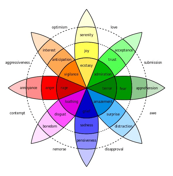
Emotional design, that is designing a product, art piece, or image in the hopes to elicit an emotional response from a viewer, has become extremely popular. The Interaction Design Foundation even suggests that “you can use those emotions to either create loyalty or to drive a customer to take action.” What many look to for understanding what emotions to appeal to is Plutchik’s Wheel of Emotions: a diagram outlining the eight basic primary emotions and their derivations & combinations.

In this post I will be exploring the emotion of joy in its different intensities through three different oil paintings. They each employ different methods of conveying the same basic emotion even though they were created years and miles apart.
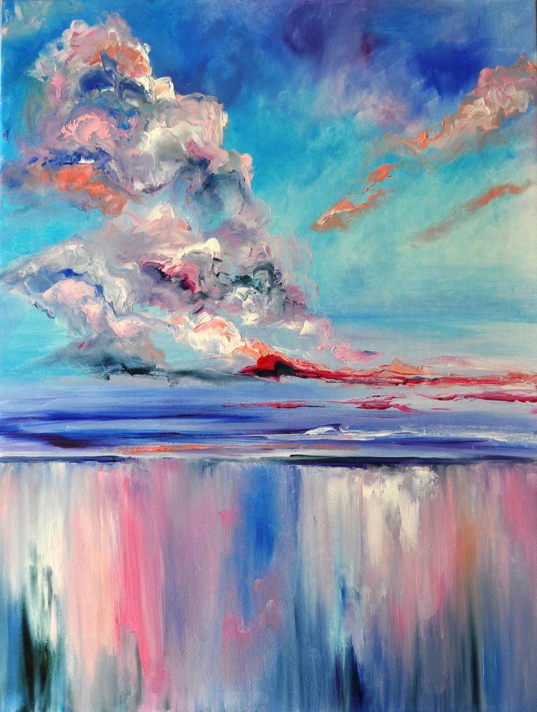
The first image of interest is “Serenity” by Elena Den, a Ukrainian artist. The image, while objectively blurry, is immediately recognizable as a horizon over a body of water. On a fundamental level this image is no more than a bunch of paint that has been dabbed, brushed, and scraped along a canvas. However, our brains are capable of taking in this sensory information and contextualizing it based on our past experiences – something that is called “top-down processing” in visual perception theory.
There are also a few Gestalt Principles that help us recognize what this image is. One is the principle of “common fate” – we are able to see that the clouds are clouds because of the direction they are going, and that the bottom third of the image is water since it is going in a uniform and opposite direction. We also know that the clouds are all clouds because of their proximity to one another.
But our mind goes beyond simply recognizing it as a horizon. We also feel the serenity the artist has sought out from within us. The main aspect of this painting that brings this out is the color palette. According to this article by Jerry Cao each color promotes certain emotions – and every single color in this painting can be linked to serenity. The blues promote calm & openness; the red promotes importance and youth; the orange promotes friendliness; the white promotes virtue & simplicity. The scheme is analogous, meaning that it has only complimentary colors (all of these colors can be found on one end of the color wheel) which bring out the best of each color, and the most of the emotion each color emits.
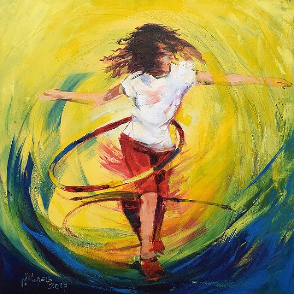
The next image and level of emotion is “Joy” by Taher Abdel Azeem, an Egyptian artist. Similar to the previous, the painting is almost abstract – the lines are not solid and flow into each other. Still, because of the brain’s ability to perceive images based on context (especially when that image resembles a human) the viewer can see the image of a child hula-hooping.
The Gestalt Principles can outline why this is easily identifiable. For one, the enclosure around the girl is made clear from the circles of yellow and blue – they not only show us that she is a different object, but that she is the main object. The action of her hula-hooping can be seen by the continuation of movement through her body. From her head, to her arms, to her hips and finally her feet we can see the movement.
To me, this painting brings out the most visceral response within me. As explained in the paper by Donald Norman and Andrew Ortony this is “gut-reaction” is one of three main emotional responses that a designer can hope to elicit in a viewer. This is due to the nostalgia of childhood joy – seeing a child at play has brought out the feelings I have when reflecting on the good times of childhood.
Again, color has a big impact on the emotions of this image as well. The deep blue conveys safety, an emotion that is invisible yet predominant throughout childhood. The yellow gives a blast of happiness and enthusiasm – again, emotions that are constant in a healthy childhood. Her shorts are red, a color signifying youth. Not only are the colors themselves good indicators of these emotions, but the fact that they are in a triadic scheme makes for a very balanced image where these emotions can shine.
Finally we have reached the most intense version of joy – “Ecstasy” by Matthew Parrish, an early 20th-century American artist. Unlike the other two this portrait is based in realism – the clouds, mountains, ocean, and of course woman in the center are all closely resembling reality.
One Gestalt Principle that helps our brains understand this painting are figure-ground: the woman is obviously the forefront of this piece because she is clear as day in the foreground, while the middle and background get progressively foggier. There is also lots of continuity in this image. The mountains and cliff-side can be followed in both its parallels and colors, and the same goes for the clouds in the sky.
What gives this painting the most intense feeling of joy is three aspects: the colors, the direction, and the openness. The main colors in this painting are blue (calm, openness), red (power), and white (virtue). While the left side of the image is full of objects, the right (more specifically, the upper-right) is clear and open. The woman in the painting is looking out into this openness, motioning away from all the business behind her, and surrendering herself to the vastness of the sky with the look of ecstasy on her face.
While in different styles and by artists from across the globe, the emotion of joy is able to be conveyed through art by utilizing the principles taught by psychology and color theory. In my opinion, above all else, experience is what makes images not only easy to understand, but to feel. By knowing the beauty of a sunset, the joy of being a child, and the feeling of freedom I was able to bring my past into these photos, and with it, the joy that came form those experiences.
“Putting Some Emotion into Your Design – Plutchik’s Wheel of Emotions.” Interaction Design Foundation, 2020, https://www.interaction-design.org/literature/article/putting-some-emotion-into-your-design-plutchik-s-wheel-of-emotions. Accessed 4 Sept. 2020.
Annenberg Learner. “Discovering Psychology: Updated Edition – Sensation and Perception” WGBH Educational Foundation, Feb. 2001, https://www.learner.org/series/discovering-psychology/sensation-and-perception/.
Bonner, Carolann. “Using Gestalt Principles for Natural Interactions.” Thoughtbot, 15 Sept. 2014, https://thoughtbot.com/blog/gestalt-principles. Accessed 4 Sept. 2020.
Busche, Laura. “Simplicity, symmetry and more: Gestalt theory and the design principles it gave birth to.” Canva, https://www.canva.com/learn/gestalt-theory/. Accessed 4 Sept. 2020.
Cao, Jerry. “Web design color theory: how to create the right emotions with color in web design.” The Next Web, 7 April 2015, https://thenextweb.com/dd/2015/04/07/how-to-create-the-right-emotions-with-color-in-web-design/. Accessed 4 Sept. 2020.
McLeod, Saul. “Visual Perception Theory.” SimplyPsychology, 2018, https://www.simplypsychology.org/perception-theories.html. Accessed 4 Sept. 2020.


4 responses to “Visual Representation of Emotions”
[…] in my previous post I compared images with the same emotion with artists from different countries, I will be comparing […]
LikeLike
[…] all else, follow your gut. Even though there are basic Western meanings applied to some colors that elicit certain emotions and the guidelines mentioned above, it is okay to break those […]
LikeLike
[…] principles to express the emotion they want. See my previous posts exploring emotion in images here and […]
LikeLike
Thank you for this. I learned so much.
LikeLike