• Blog Feed

Emma Lao

Habits

Tarot

Wellness

Hobonichi

Productivity

Media Studies

  • YouTube
  • Instagram
  • Facebook
  • Goodreads
  • TikTok
  • Project Planning for Content Creation

    November 2nd, 2020

    This week I take the next step in solidifying my project by creating a detailed project plan. I also have begun my research on the platform of YouTube and the first episode.

    Finding a Project Management System that Works for Me

    To my surprise one of the things that took the most time this week was finding a project management system that works for me and the project I am working on. When I am in doubt, I turn to my Hobonichi first. I had purchased a Hobonichi Techo Avec for the use of personal projects which has unfortunately been left mostly blank – until now! I began the process of detailed project planning by breaking down each step from the content calendar I had made in my proposal into a schedule that looked reasonable.

    As always I color coordinated based on the type of task. In this case yellow is research, violet is filming, red is editing and social media, and the bluish-gray is tasks for my course. Even before I put my pen down I got a text from my boss saying that my schedule would be picking up so I adapted to it by moving some tasks around – this will no doubt have to happen again, but having an outline like this gives me much more clarity on what needs to be done when.

    Next I began to look for a digital project management system where I could break down these tasks even more. I knew that I wanted a program that is easy to use, aesthetically pleasing, and has the ability to show me all the tasks that have to get done in a clear and organized way.

    I began by creating an Asana account and adding the tasks for the first week. The tasks were easy to see and the program was easy to use, but there was something that didn’t sit well with me when it came to the way it looked and felt to use. The super-white background and minimal style made it feel…cold in a way, and very corporate. This project is about instilling my creativity into creating systems that make it easy to reach your goals – and Asana was not letting that creativity through.

    The next system I tried was one that I had used in the past with some success – Trello. I found that creating the tasks in this program made a lot more sense. Rather than having a different screen for each week, the entire project can be seen at once. I can also see everything I need to at a glance – the category a task belongs to, the number of subtasks, and the due date for each task.

    When I click the task it breaks it down even further into the subtasks. By rule of thumb I try to keep things as simple as possible – if I know that certain things need to be done for a task to be completed, it is not necessarily worthy of being a subtask – but if it takes an ample amount of time then I will add it in.

    Trello also makes it much easier to categorize tasks by color so the overview is as simple as possible to follow. I assigned colors that matched the ones I had made in the Hobonichi for some consistency across the board.

    Trello also has calendar views that look much nicer to me than the Asana one – in both the weekly and monthly view everything is as clear as it can possibly be.

    In this document I created an explanation my project plan. Feel free to download and read it here:

    lao_projectplanDownload

    Research Phase Two: YouTube Best Practices & Habits

    The latter part of my week was spent researching and taking notes on the sources I found last week. I began with looking at all of the articles, videos, and books that I had gathered that focused on YouTube best practices and growing/maintaining an audience.

    Two HootSuite articles that I found very helpful for things to keep in mind as I create my channel and videos are “The Complete Guide to YouTube Marketing in 2020” and “YouTube Analytics: A Simple Guide to Tracking the Right Metrics”. They made it clear that I need to conduct a competitive analysis, use my community tab, keep retention high by having short intros and getting right to the point, and utilize keywords to their full potential.

    An article that was helpful in the same vein was “YouTube SEO: How to Rank YouTube Videos in 2020″ by Brian Dean. In this article he outlines the four key elements that must be addressed to create a successful channel: keyword research, high-retention rate, video optimization, and video promotion.

    The source that made me the most excited to get my channel started was the SkillShare course “YouTube Success: Build an Authentic Channel That’s Worth the Follow” by Sorelle Amore. This course focused more on building who you want to be on your channel and how to incorporate that into a system that will grow an audience.

    I also began the research for my first video. This research focused on habits that will make you a better person who does what they want to do. First I read The War of Art by Steven Pressfield. This book discussed the problem of resistance and outlined how professionals thrive despite it.

    For the first episode I will stress the importance of treating your passions as a full-time job where you show up everyday, show up no matter what, stay on the job all day (or in the case of practicality, in the time you allot), and are committed over the long haul. I will especially focus on how important it is to show up every day and to be patient with yourself since the “goal is no victory but to handle [your]self, [your] insides as sturdily and steadily as [you] can” (Pressfield, 82).

    The next book I read, Atomic Habits by James Clear, also shows how important it is to show up every day, especially on the days where it seems impossible. The book is broken down into five parts: the fundamentals and the four different steps to making a habit stick. In the fundamentals, Clear explains that there are two systems of behavior change; goal-based habits that focus on changing the outcomes, then your behavior, then your identity and identity-based habits which work from the inside out.

    He also says that systems are much more important than goals and every habit includes four steps: a cue (making it obvious), a craving (making it attractive), a response (making it easy), and a reward (making it satisfying). The rest of the book breaks down how to make your habit work based on those steps.

    Both of these books will serve as a foundation for the habit tracking and long-term goal section of the first episode. Stay tuned to see more progress in the upcoming weeks!

  • Content Creation – Let’s get Started!

    October 26th, 2020

    This week is the first of seven where I am planning, researching, filming, editing, and uploading a three-part video series to my YouTube Channel that focuses on using the Hobonichi Cousin as a basis to improve your creativity, productivity, and well-being.

    Step One: Picking My Project

    So how did I come to this decision? I have a few reasons.

    First of all, there is not anything like this out there. There are tons of productivity YouTube Channels out there like Matt D’Avella, Rowena Tsai, and Better Ideas that explore the ideas of productivity and self-improvement but it does not go as far as to create an action plan that could sustain any veiwer’s interests and goals. The same can be said for journaling channels like AmandaRachLee, procrastinate_create, and studyquill that are excellent at showing what works for them when it comes to journaling, but it is rarely based on research and may be a little intimidating to newcomers.

    Second, I personally feel like I could use this video series; something that has the research behind it as well as an actionable plan, and I am sure that many others could use it too. Pre-Covid I would write daily in my Hobo, be on top of all of my assignments, and was generally good at keeping up with my habits. Then…well I think everyone reading this can figure it out. Because of Covid I was in and out of work, the lack of structure completely threw off my motivation, and I have been feeling just downright depressed. I could use a serious overhaul to how I conduct my days, weeks, months, and life.

    Third of all, this is the kind of work that excites me. I actually began a YouTube channel last Summer centering around these ideas, albeit much more loosely. It was not going anywhere until my third (and so far, final) video gained some traction. As of writing this post it has 2,600 views, 100 likes, and got me about 36 subscribers. It does not seem like much but I was honestly shocked – I expected it to go nowhere from the get-go but now I know that people are interested in this topic.

    Step Two: Gathering the Research

    Since I know that I want these videos to be research-based I created a list of sources that apply to four different categories: Medium Research, Video One (Months), Video Two (Weeks), and Video Three (Days) – each with a different color for organization.

    The Medium research is everything that applies to YouTube channel creation, analytics, SEO, thumbnail/channel art, tags, and other best practices. Some main resources for this includes the online course from SkillShare called “YouTube Success: Build an Authentic Channel That’s Worth the Follow” by Sorelle Amore and articles about YouTube Marketing and Analytics from Hootsuite.

    The research for episode one (Months) is anything that pertains to long-term goals, habits & habit tracking, and even expressing gratitude. A few of the most important sources for this section are Jordan Peterson’s 12 Rules for Life, James Clear’s Atomic Habits, Steven Pressfield’s The War of Art, and interviews with David Goggins.

    Episode two (Weeks) requires research about smaller goals, time-blocking, and the importance of taking time for yourself. Some important resources for this episode includes Hector Garcia and Francesc Miralles’ Ikigai: The Japanese Secret to a Long and Happy Life, scholarly articles on motivation and turning goals into actions, and articles by Cal Newport explaining the importance of planning out your workday as in-depth as possible.

    You can see my full list here. Keep in mind that I will be adding more resources and the annotations as I read through them (the calendar is a part of my Project Proposal).

    annotated-bibliography-emma-laoDownload

    Step Three: The Project Proposal

    Then it was time to gather all of my thoughts and ideas into a comprehensive presentation, as if I were pitching this idea to a business. Within this document I lay out the main goal, all the artifacts I will need, the content calendar, and an overview of each episode. While it is less formal-looking than most business proposals, I think it suits the aesthetic of the project well and gets everything that I need to say across to the reader.

    You may also view the PDF here:

    lao_proposalDownload

    What’s Next?

    While I am pumped up about starting this project I will keep the momentum going by converting my content calendar into a project plan on Asana and my Hobonichi. From there I will begin my research and simply follow the plan. Follow my blog for more weekly updates on my research, planning, and production – and of course to see the finished products!

  • Motion Design Module 7: Advanced Motion

    October 12th, 2020

    In my final post exploring animated design I wrap up Liz Blazer’s book, look at some rotoscoped films, and create a trailer for a rotoscope documentary that I have been wanting to make.

    Reading & Writing: Show and Tell

    The film is finally done – you have exported it and cannot wait to see how the world will respond. In the final chapter of Liz Blazer’s Animated Storytelling she breaks down the last three steps that should be done as you are planning to release your art to the world.

    First you should package your product with a title card, logo, and still from the film and create a synopsis, director bio, and story of the film’s creation. Get this out of the way even before submitting it or sharing it so that all this information is easily available to those who want to learn more about the film and, of course, the talent behind it.

    Next you should create a network of people in the field that you are inspired by. One of the best ways to do this is to speak up as much as possible at film festivals and events of that sort, but in these times it is probably best to stick to online groups and emailing (yes, please stay home). Do not be afraid to reach out to the creators you admire – the worst that can happen is they ignore you and the possibilities are endless if they do not!

    Finally, share your film across your platforms and submit to film festivals that interest you. Film Freeway is a great way to find and submit your film to festivals all around the world. And once you started creating and sharing, never stop!

    Research to Inform: Rotoscope Animation

    For my final project I wanted to create flashback sequences using rotoscope animation. A looked back to a few animations that I admire and looked to new ones for inspiration on style.

    I have shared a trailer for Undone in the past, but it is a show that heavily inspired my idea for this film. The show is both rotoscoped and about a psychotic break and my film is rotoscoped and about a psychotic break – seems pretty perfect to me. I think the reason rotoscoping is so effective for stories in this vein is because it imitates reality but has a lot of flexibility with it – in Undone, reality is constantly manipulated to create a dream-like feeling that emulates the main character’s illness.

    I have not seen this film, but I am intrigued by the way the animators blended the realism of rotoscoped bodies with anime-style faces. While the mixing of computer animation makes me feel a bit uneasy (I still can’t watch the 2D/3D shows on Netflix without feeling off), the mix of styles is done pretty well.

    https://www.youtube.com/watch?v=Xi5vfipPVeI

    Waltz with Bashir is one of my favorite documentaries for so many reasons, one of them being the unique style of animation. It is a mix of 2D CGI and rotoscoping to make it match the graphic novel style that it is based upon. Like Undone and my film it is also about a person struggling with reality – in this case it is about a veteran with PTSD exploring the past.

    On the note of the past, this is another aspect that Undone, Waltz with Bashir, and my film all have in common – they all have flashbacks to the past. Again, I think that rotoscoping is the perfect animation style for this since reality is present to a degree, but able to be easily manipulated.

    Create: Coming from Somewhere

    Ever since I met Elaine I have been fascinated by her journey. This story and the song that came from it really struck a chord with me. I knew that I wanted to rotoscope this story to bring it to life in a dream-like way and I think rotoscope animation is the best way to do it. There is still a lot of work to be done to give the light and color to the story that I believe it deserves, but I think for a teaser to my final doc about her this is something I can be proud of.

    While the animated sections themselves are short, the process of making this was extremely time consuming. I would estimate that the whole process took about about 50 hours, not including me already gathering the interview footage which was done quite some time ago.

    Part of the process was following some of the steps from the book. I decided on the story structure, created a storyboard, honed in on an animation style, filmed and drew over the frames (of which there are about 1500), then tweaked it to fit a more appropriate size for a trailer. I regret that I did not have the time to experiment with color and assets, but this is something that I will have to keep in mind for my final project.

    No description available.
    A peek at my storyboard. My sister was nice enough to be the actor for me to trace over. Even though I had 13 shots, I was only able to get to about 9 of them – one of the most valuable things I have learned is how difficult it is to make the time to rotoscope when you are taking other courses and have three part-time jobs!

    I am excited to keep working on this (maybe in 2 hour sessions instead of 10) and to see what people think. I am happy that I was able to learn so much about animation while taking this course so that I can use the knowledge to make my dream films come true – which is beginning to happen with this trailer. Let me know your thoughts of what I can do with the film in the comments!

  • Five Deadly Sins of Visual Storytelling

    October 11th, 2020

    It is not new knowledge to most that images are able to be easily altered. When in the hands of people with the wrong intent, visuals have just as much power to do bad by misleading or blatantly lying to an audience. Below I explore five practices of visual storytelling that are unjust.

    Misrepresentation of the Human Body. With the arrival of Photoshop (and now hundreds of filters and apps) came the altering of humans, mostly women. And with that came the expectations that you should look like these altered people in real life. For several instances of this see CNET’s article.

    In about an hour a person familiar with Photoshop can alter the appearance of a person and make them look completely different. What concerns me is the lack of people in the comments saying how harmful it can be to have an image of a fake body that looks so realistic.

    Staging “News” Photos. In a very concerning survey done by the New York Times it was found that more than half of the news photographers surveyed said that they sometimes stage photos and 12% that say they stage photos half of the time. This only adds to the mistrust of the media and goes against the code of conduct for most of the news agencies that these photographers work for.

    Altering Elements of a Photo Without Disclosure. Alterations to photos are often innocent and do not change the meaning or intent behind it. However, in some cases it can change the entire photo. In the case of the photo shared by BP of their oil spill cleanup the color correction made the water seem much cleaner than it was in reality. Even slight alterations can change the impact of a photo drastically.

    BP oil spill

    Omitting Information that Changes Meaning. Eliminating an element of a photo can change the way it is perceived entirely. Take this image of Obama for example – in the altered photo it appears that he is looking down in frustration and defeat, when in reality he is simply listening to the woman (who has disappeared thanks to the powers of photoshop).

    Misusing Statistics to Push Your Point. When it comes to statistics there are many things that can go wrong that make data mean something completely different. A few of the examples explained in this article by Mona Lebied, to name a few:

    • faulty polling: if the question is phrased a certain way, the answer can change
    • flawed correlations: if you compare enough data points, similarities will appear where there is no legitimate correlation
    • data fishing: using tons of data without any hypothesis means seeking conclusions that do not exist
    • data omission: it is easy to use only the numbers and data that support your claim
    • selective bias: omitting or even adjusting data to make your point stronger
    • sample size: if the amount of people polled is under 200, it should be considered invalid

    There are many more sins of visual storytelling out there, but after reading this I hope that you keep in mind how the actions you take as you create a visual can alter it’s perception – and even the truth.


    CNET News Staff. “Pictures that lie (photos).” CBS Interactive, 12 May 2011, https://www.cnet.com/pictures/pictures-that-lie-photos/.
    Lebied, Mona. “Misleading Statistics Examples – Discover The Potential For Misuse of Statistics & Data In The Digital Age.” Datapine, 8 Aug. 2018, https://www.datapine.com/blog/misleading-statistics-and-data/.
    The New York Times. “Staging, Manipulation and Truth in Photography.” The New York Times, 16 Oct. 2015, https://lens.blogs.nytimes.com/2015/10/16/staging-manipulation-ethics-photos/.

  • Photojournalism: When Words are Not Enough

    October 11th, 2020

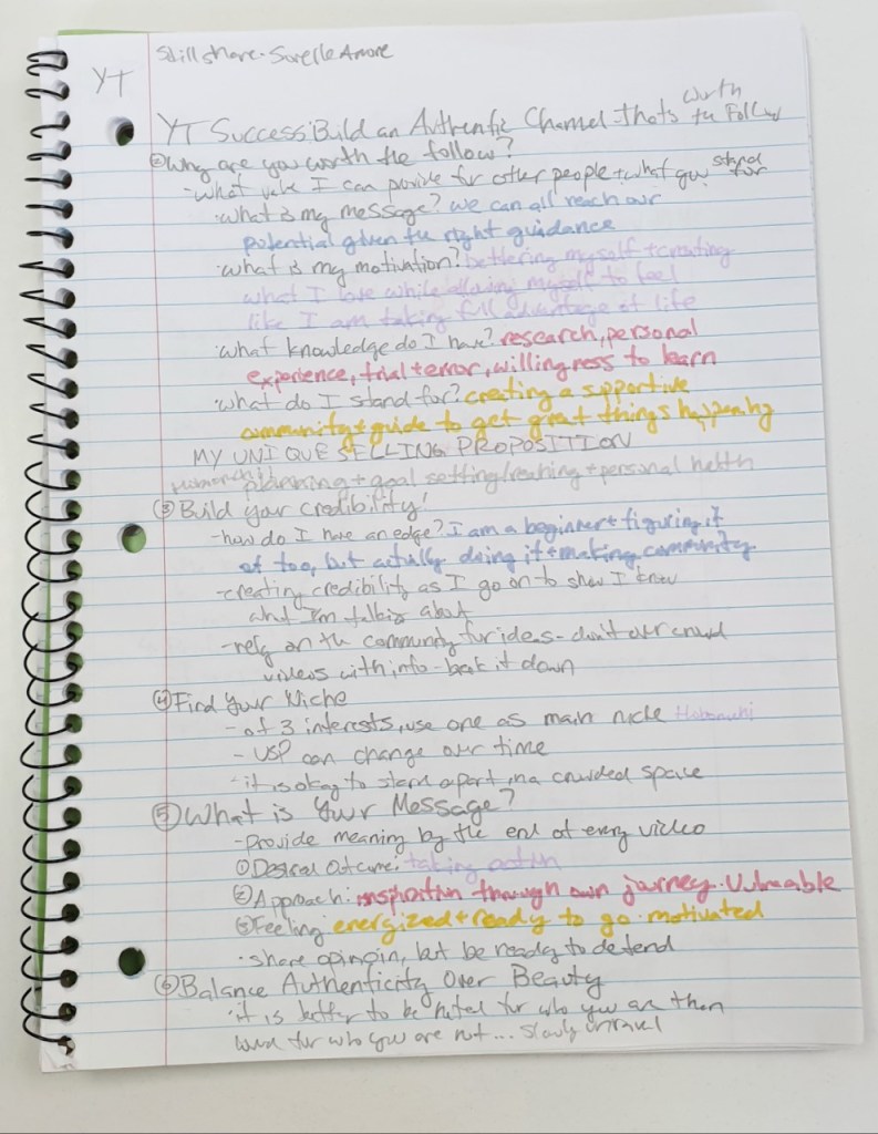
    “A Picture Says A Thousand Words.” – This is a phrase that you have no doubt heard before. Words are great at conveying information, of course, but cannot match the power of a visual when it comes to telling a story. The raw, tactile emotions that can be conveyed by a single image allow for people to understand situations much quicker, and with more empathy. While there are difficulties in capturing documentary photographs the images wield power that words are unable to.

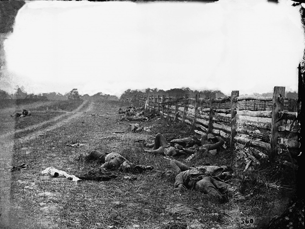
    The birth of photojournalism is often attributed to the photographers like Alexander Gardner and Mathew Brady who captured images of the Civil War. Historian Mark Katz explained that they were able to make the tremendous accomplishment of “extending the power of the photographic image [to] affect public awareness. The photographic coverage of the Civil War by Gardner and others sent authentic images of the horrors of the battlefield directly to the public for the first time” (Harris). For the first time, a conflict was able to be experienced by those who were not at the scene.

    Source

    Another wave of photojournalists arrived when depression-era photographers were funded by the government to promote Roosevelt’s New Deal. One of the most influential photographers of the time was Dorthea Lange. Historian Linda Gordon argues that her work was an outstanding display of democracy, writing that “By showing her subjects as worthier than their conditions, she called attention to the incompleteness of American democracy. And by showing her subjects as worthier than their conditions, she simultaneously asserted that greater democracy was possible” (Gordon).

    Source

    Photos became a tool that allowed us to tap into people’s lives and cultures, whether they are a thousand miles away or our neighbors. Photos are not filtered through a writer’s words – rather, documentary photographers should strive to take each photo to show the reality of the situation. As photojournalist Tom Rankin said in his introduction to the Southern Cultures journal, “we strive with all we have to make full representations of what sits in front of and around us, trying to make something lasting and true that will bring us back once again to reflect–again, again, and again–on just what transpired, what it all means“ (Rankin). This image that he took on the side of the road after helping jump-start a young couple’s car in Alabama paints a picture that has many implications – they mean something completely different to people from different parts of the country and with differing political views. The important thing is that as he took the photo he intended for it to simply be the moment, not to put any agenda behind it – that is up to the viewer to decide.

    Source

    There are some images, however, that convey emotions so strongly that almost every person who views them can empathize with the issues of the subject. When context or action is added to the image, the result is an encapsulation of “the moment”. This combination of action and emotion that photojournalists capture tells so much in a single shot (Gitner). Take this image, for instance. A young man at bat, just a millisecond away from taking his swing. The nervous but determined expression in his face is something that everyone can relate to. This photo is both authentic and sensory – it is full of an emotion that is difficult to capture in words, but easy to understand by the look of a person’s eyes (Lien).

    Source

    Some argue that this “moment” is at times fabricated by photographers to create a more dramatic and interesting scene. Unfortunately, this is the case for more than half of the news photographers in the United States who say that they sometimes stage photos and for the 12% that say they stage photos half of the time (The New York Times). Not only does this go against most codes of conduct for the agencies that they work for, but it makes moments less reliable in the public eye.

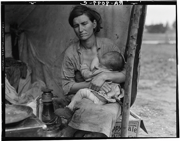
    Not all staging is inherently bad, however. Take portrait photography for example – the goal of this type of photograph is to give a representation of a person (or more often a group of people) through a single image. Migrant Mother by Dorthea Lange is perhaps the most famous photo portrait in existence, and the topic of hot debate as to whether Lange directed some elements of the photo or not. In an analysis of the photo series on Jorg Colberg’s Conscientious Photo Magazine he argues that “Portraiture makes the viewer’s task particularly tricky, because it often seduces us to see things that aren’t actually there. A photograph of another person never is that other person. It always ‘only’ is a photograph, made with specific devices and (usually) intent” (Colberg). This is necessary to create a photo – after all, a photographer cannot include every element of a person into one frame.

    Still, is necessary for the viewer to think about what is in the image, and more importantly, what is not. In the case of Migrant Mother, the daughter of the mother herself reflected on why her mother came to dislike the photo. “She was a very strong woman. She was a leader. I think that’s one of the reasons she resented the photo—because it didn’t show her in that light” (Library of Congress). Even though the series of images painted a portrait of the struggles of the impoverished American people, it was not necessarily representative of the subject herself – that was what was not in the image.

    Source

    Alexander Gartner, the Civil War Photographer mentioned earlier, staged to a more direct degree. He would move dead bodies to create a better composition and even went as far as to dress the same dead body in both Union and Confederate uniforms to push the idea that the Civil war was causing mass destruction and loss on both sides (Curto). This sounds terrible to a person who hears it at first, but considering the limitations that Gartner was facing it is important to consider if he would have had the same impact on the American public had he not staged some of the elements. The intention was well placed and he made a significant impact on the way Americans viewed the war – but by modern standards what he did would be highly immoral.

    Intention of the photographer is important not just for the viewers of the image to consider, but it distinguishes documentary photography from photojournalism. There are many similarities between the two, but professionals in photography such as Rebecca Nasr find the difference in intention (Gautreu):

    Though [documentary photography] is close to photo-reporting or indeed press photography in general by virtue of both theme and, on occasion, plastic form, it remains distinct from them… Its characteristics are, on the one hand, a discourse, an intention, a positioning on the part of the author and, on the other hand, a relationship between photographer and subject that involves a time-scale.

    Gautreau

    This distinction has become more blurred in modern times. Now that visuals are a core element to most stories – as Mario Garcia puts it the written and visual part of a news story is “now a single until of thought” – photojournalists strive to follow the same techniques as documentary photographers (Garcia). The difficulty of not only gaining the trust of a subject, but maintaining it, is especially important since the trust in media is so low. John Happel of Nieman Storyboard observed that “thinking about access in ways that extend beyond the superficial is important not only in terms of a storyteller’s craft, but also his or her credibility – and humanity” (Happel). Still, with the time constraints that are inherent in journalism, it is difficult to get that time-dependent relationship between subject and photographer that is necessary for a successful documentary photo.

    In addition to this difficulty to connect when there is a looming deadline, there are factors outside of the photographer’s control that could influence the way their subject feels about them, and in turn, how open and authentic they may be. Even with great amounts of time and effort a good relationship may not come into fruition. In a study by the Queensland University of Technology it was found that there were over twenty factors that could influence subject-photographer relations, only two of which the photographer has complete control over (Thomson).

    There are not only these roadblocks, but the aftermath of working as a photojournalist in a world that craves bad news. On the BBC News website, 19 of the 20 most clicked stories in 2015 were negative (Campbell). There have been many studies on the detrimental effects that all this negative news has on the reader, but recent surveys show that up to 98% of photojournalists have been exposed to traumatic events and almost 6% could qualify for a PTSD diagnosis (Thompson). While this may not have been brought to many people’s attention, it makes sense after realizing how many horrific images of starving, injured, or dying people, wars in action, wreckage from terrible storms, and other depictions of awful situations we are witness to in the news cycle.

    Source

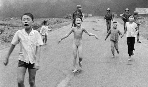
    The price that journalists pay is unfortunate, but the power that the images they take can do so much good. There are moments in history where change was made or pain was felt – so many of these moments that no one outside of that situation would be aware of if it had not been captured. For instance, it was not only the news that pushed much of the American public to protest the Vietnam War – it was the photo and video evidence that shocked the world. As photojournalist James Nachtwey explained in his TED Talk, “politicians were telling one thing, photographers were telling another” (Nachtwey).

    Source

    The ability that sharing an image of a human face – a face of a person being affected by otherwise unimaginable conflicts – make those conflicts seem much less far away and abstract (Nachtwey). While words could explain death and destruction, nothing can convey grief like a face full of sorrow. No words can convey pain like the image above.

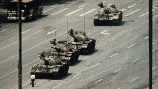
    Single photographs have also been able to represent struggles of an entire population. Take the image below as an example. The man standing in from of the tanks on Tiananmen Square during the 1989 protests and massacre represented the strength of individuals against forces much larger than them. Not only is a photo the capturing of a moment – it is able to be easily reproduced and spread to the world so that these struggles can be understood and change can be made (Memou, p. 1-2).

    Source

    Even though most photojournalism (and news in general) covers negative events, a rising trend is “solutions journalism” – where the story moves beyond the issues and looks at the efforts to respond to them (Midberry). David Campell, the director of programs and outreach at The World Press Photo Foundation asked, “If you can capture all the problems with a photo, why can’t you capture the solutions?” (Granger) While capturing sadness and anger can spark revolutions and make changes to unjust systems, it is important to not underestimate the power of positive imagery.

    Source

    A study by Karen McIntyre of Virginia Commonwealth University found that positive news has a significant positive affect on reader’s moods. Even stories about events that are negative can still make the readers feel good by highlighting a positive outcome (McIntyre). The image below is a part of an AP story breaking news of making leeway in getting same-sex marriage legalized back in 2013. Instead of focusing only on the pain and struggles that the LGBTQ community took to get to that point, the article takes a moment to revel in the positivity that came from their hard work by sharing a personal story of a couple that could finally legally be together (The Associated Press).

    Source

    It is not only photos that have more impact than words, but the person behind the camera. In a study published in Journalism & Mass Communication Quarterly the images from the Times Hearld-Record were analyzed before and after the layoff of all their photographers. They found that “professionals are better at capturing intimate, emotional, and graphically appealing images than non-professional photographers” and 82% of the images captured by the non-professionals were purely informational (Mortensen). The professional photos also more often included conflict, action, the “human element”, and timeliness than the non-professional photos. While the study was unable to conclude that one form of photography was better than the other it solidified the fact that photojournalists can highlight the human side of an issue (Mortensen).

    Now there is a rising population of citizen photojournalists that can capture moments as they happen from the point of view of a person being affected by the experience. The images taken by terrified students during a lockdown or the events of a natural disaster as it is unfolding is difficult to compete with. They are there right as the action is happening, after all. Still, the ability to represent a person’s struggles in a way that is approachable and effective is strong in professional photojournalism. An analysis of these two sources of photojournalism by Stuart Allan suggests that instead of choosing to endorse one or the other, collaboration between the two can bolster a story’s facts and emotions even further (Allan). Both of the images below (the top done by a professional, the bottom by a citizen) are valuable by themselves, but together they help pain a more complete picture.

    Source
    Source

    Photojournalism and documentary photography create a human connection. Everyone has the same ability to harness and express emotions, so when those emotions are shared through visual proof the world comes closer together and change can be made.


    Works Cited
    Allan, Stuart. “Introduction: Photojournalism and citizen journalism.” Journalism Practice, vol. 9, no. 4, pg. 455-464, DOI: 10.1080/17512786.2015.1030131.
    The Associated Press. “Supreme Court issues landmark gay marriage rulings.” The Associated Press, 26 June 2013, https://www.peninsuladailynews.com/news/breaking-news-supreme-court-issues-landmark-gay-marriage-rulings/.
    Campbell, David. “Why it’s time for visual journalism to include a solutions focus.” Medium, 22 Jan. 2018, https://witness.worldpressphoto.org/why-it-is-time-for-visual-journalism-to-include-a-solutions-focus-5be15aec3afc. (Module 4)
    Colberg, Jorg M. “Looking at Dorthea Lange’s Migrant Mother.” Conscientious Photography Magazine, 20 May 2013. https://cphmag.com/migrant-mother/. (Module 7)
    Curto, Jeff. “Photo History Class 2: History Survey Part 1.” History of Photography Podcast, 24 Jan. 2014, http://photohistory.jeffcurto.com/wp-content/podcasts/Photo_History-Class_02_Podcast_Survey1.mp4.
    Garcia, Mario R. “Digital storytelling, Part One: The fusion of writing/editing/design.” Garcia Media, 19 Jan. 2017, https://garciamedia.com/blog/digital_storytelling_part_one_the_fusion_of_writing_editing_design/. (Module 4)
    Gautreu, Marion & Kempf, Jean. “Contemporary documentary photography in the Americas.” IdeAs, vol. 13, 1 March 2019, DOI: https://doi.org/10.4000/ideas.5542.
    Gitner, Seth. Multimedia Storytelling for Digital Communicators in a Multiplatform World. New York, Routledge, 2016. (Module 1)
    Gordon, Linda. “Dorthea Lange: A Life Beyond Limits.” W.W. Norton & Co. Inc., New York, 2009.
    Granger, Jacob. “Solutions photojournalism.” Mousetrap Media Ltd, 28 Aug. 2019,
    https://www.journalism.co.uk/news/solutions-journalism-meets-photojournalism-responding-to-community-problems-with-a-camera/s2/a743828/.
    Happel, John. “Five immersive photographers share their experiences on gaining trust.” Nieman Storyboard, 19 April 2018, https://niemanstoryboard.org/stories/five-immersive-photographers-share-their-experiences-on-gaining-trust/.
    Harris, John M. ““Truthful as the Record of Heaven”: The Battle of Antietam and the Birth of Photojournalism.” Southern Cultures, vol. 19 no. 3, 2013, p. 79-94. Project MUSE, doi:10.1353/scu.2013.0021.
    The Library of Congress. “Exploring Contexts: Migrant Mother.” American Memory, https://memory.loc.gov/ammem/awhhtml/awpnp6/migrant_mother.html.
    Lien, Jade. “The Four Principles of Visual Storytelling.” Action, 21 Dec. 2019, https://actiongraphicsnj.com/blog/4-principles-visual-storytelling/. (Module 2)
    McIntyre, Karen E. & Gibson, Rhonda. “Positive News Makes Readers Feel Good: A “Silver-Lining” Approach to Negative News Can Attract Audiences.” Southern Communication Journal, vol. 81, no. 5, 7 June 2016, DOI: 10.1080/1041794X.2016.1171892.
    Memou, Antigoni. Photography and Social Movements: From the Globalisation of the Movement (1968) to the Movement against Globalisation (2001). Manchester University Press, 2013. JSTOR, http://www.jstor.org/stable/j.ctt21215w4. Accessed 28 Sept. 2020.
    Midberry, Jennifer & Dahmen, Nicole Smith. “Visual Solutions Journalism: A Theoretical Framework.” Journalism Practice, vol. 13, 18 Nov. 2019, DOI: 10.1080/17512786.2019.1689371.
    Mortensen, Tara M., and Peter J. Gade. “Does Photojournalism Matter? News Image Content and Presentation in the Middletown (NY) Times Herald-Record Before and After Layoffs of the Photojournalism Staff.” Journalism & Mass Communication Quarterly, vol. 95, no. 4, Dec. 2018, pp. 990–1010, doi:10.1177/1077699018760771.
    Nachtwey, James. “My wish: Let my photographs bear witness.” TED, March 2007, https://www.ted.com/talks/james_nachtwey_my_wish_let_my_photographs_bear_witness. (Module 4)
    The New York Times. “Staging Manipulation and Truth in Photography.” The New York Times, 16 Oct. 2015, https://lens.blogs.nytimes.com/2015/10/16/staging-manipulation-ethics-photos/. (Module 7)
    Rankin, Tom. “Looking and telling, again and again: the documentary impulse.” Southern Cultures, vol. 22, no. 1, 2016, p. 3+. Gale Literature Resource Center.
    Shurbaji, Eman. “Photo narratives: Defining picture stories, essays and packages.” Medium, 17 Dec. 2014, https://medium.com/learning-journalism-tech/photo-narratives-d77b812f99dd.
    Thomson, T.J. & Greenwood, Keith. “Beyond Framing.” Journalism Practice, vol. 11 no. 5, p. 625-644, 8 March 2018, DOI: 10.1080/17512786.2016.1152908.
    Thomson, TJ. “Mapping the Emotional Labor and Work of Visual Journalism.” Journalism, Sept. 2018, doi:10.1177/1464884918799227.

  • Motion Design Module 6: Interface Animation

    October 7th, 2020

    In this module I explore the ever-growing medium of user interface (UI) animations and take a whack at it by creating my own little calendar animation.

    Reading & Writing: Animate!

    In previous posts I covered all of the steps for planning an animation from Liz Blazer’s book Animated Storytelling. Now it is finally time to begin the process of actually making the darn thing!

    However (as a professional procrastinator I am well aware of this), sometimes starting is the hardest part. What Blazer suggests you do is start with the easiest tasks first so that you can gain the momentum that is required to get through the rough patches. You should also do your best to break up bigger tasks into specific and smaller goals so you don’t get overwhelmed or intimidated. Here is one (of many) YouTube videos that break down how to break down tasks:

    While this is for more general lists, the idea and execution is the same.

    It is also important that you are constantly saving, backing up your files, and ensuring proper organization. In fact, before you even begin you should plan out how you are going to organize your files. This will take no more that 7 minutes and save you lots of time in the long run.

    You should also be keeping the basic animation principles in mind, as well as being open to changing up the movement and sounds as appropriate. The soundtrack is very important as you are creating your piece – while you should be flexible with the music, animate to the music you do choose to use.

    After you made a sequence of shots it is very important that you take a step back and analyze every shot to see if it is worth keeping in the piece or not. I have done this many times with documentary editing as well – even if a shot is good or you love it, it is sometimes best to cut it for the sake of moving the story forward and maintaining flow.

    This weekend I will be publishing a post on the final part of the process – getting your work out there. Stay tuned for that!

    Research to Inform: UI Animations

    Animations have become a key part of making a user interface feel smooth and responsive. They are key indicators that the program is working and that an action done by the user actually did something. It also enhances UX by adding a bit of fun to simple tasks, as seen in the animations below.

    Attaching File icons icon gif animation button attach file ui ux
    By  Roman Bulakh 

    This first animation is one of the most “functional”. There are a few elements that suggest to the user that their actions have meaning. First, when the attach button is clicked it shrinks and expands to show that the click was registered. Next the circle around the icon fills up as the attachment is uploading, presumably the amount of progress that is being made is equivalent to the amount of the ring that is green. Once it reaches 100%, a green paper icon slides into the paperclip addon, meaning that the document was successfully attached.

    Not only is the animation itself a key indicator of its success, but the color is as well. Green has become synonymous with correctness, goodness, or simply the action for “go”. If the color were to be changed to red, it would seem that the file did not attach successfully. In the same vein, yellow may mean that the attachment was paused. While it is just a color, a color with as strong of an implication as green is an intentional and important choice.

    tubikstudio pull refresh animation
    By tubik

    This animation has a bit of fun mixed with function. When the moon revolves around the planet it indicates that the app is refreshing. There is an additional animation that makes it appear like the planet is spinning – something that is really unnecessary, but a nice subtle addition to the interaction.

    restaurant menu animation ui
    By tubik

    This animation again has two elements – the fun and the functional. The functionality is more direct – the menu, separated into colored blocks, moves as the user swipes up and down. The “fun” part is how the icons match the physics of the movement is various ways. While this is one of the most unique, I may argue that it is bordering the line of being a bit distracting to the user. It gets away with it on a screen with so little information, but it is good to keep in mind that too much of a good thing can be bad.

    weather app design
    By tubik

    This interface and its animation are beautifully designed. Every piece of it serves a function while being engaging to use. The first part of the animation is the dragging of the time-of-day card which makes that time bigger, revealing more information and making space for the other animation. The sun/moon and cloud are great because they add fun and functionality at the same time. The sun is always spinning to show its presence and the cloud and precipitation show the user what the weather is without them having to read anything. It is also amazing to see how seamlessly it is able to change from one part of the day to the next – the balance of the expanding screens and slight movement of the icon makes a well-composed UI.

    Image for post
    From Medium

    This UI animation is complex, but completely functional. The first element is the click of the register button – it goes up and down to imply that the click worked. Next, the text of the questions appear then shrink, and the line for you to fill in your answer swipes onto the screen. As each form is filled out the color of the background progresses along the screen to show that the user is only steps away from finishing. Each answer is also met with either a slick “click” movement to acknowledge the input or shakes side to side (and turns red) to show that it was wrong. Finally, the box swipes out of existence and the welcome text is seen.

    Login form using an animated SVG avatar made by @dsenneff
    So. Freaking. Cool!

    Play with it: https://t.co/7t3LjX7SKC pic.twitter.com/IEo3oeehXJ

    — Pablo Stanley (@pablostanley) February 21, 2018

    The animation of this login screen is all fun – and fantastic! The yeti’s eyes and face follow the text as it is typed, then he covers his eyes for the password. It is simple, but effective at making the user feel welcomed by the service.

    The final UI animation that I explored was this neat little calendar widget. It is extremely simple – the user clicks on a day, a line of white with the text “What would you like to do?” appears between the separated calendar, and the user types in a simple task. Afterward a dot is placed under that date to show that there is a task assigned to it.

    Create: My Own UI Animation

    I absolutely love planning and journaling, so I knew from the start that I wanted to create an animation that incorporates that passion. I was inspired by the minimal aesthetic of the one I just analyzed, but I wanted to add a bit more of a free-drawn look as if it were from a physical planner.

    There are several pieces to this animation. First, the action of clicking on a date will expand that date, move the calendar to the side, and open up the note menu. After the user inputs a goal, a circle appears around that date. If the user checks the box to say that it is finished, the circle fills in. If those actions are erased, the animations are reversed.

    Finally I added some simple sounds: typing and a clicking sound. My goal was to keep the UX as simple and minimal as possible to align with the idea of getting their task done.

    While I wish I was better at knowing how to orient the animation over the mockup photo, I am proud of what I made!

  • Visual Storytelling in Science: Oil Spills and their Environmental Toll

    October 5th, 2020

    Scientists have used data and visuals for centuries to display and exhibit facts and findings to the public and other specialists. One issue that is a hot topic in environmental discussion is the toll that the use of oil as a main energy source is having on the environment. One of the most apparent negative impacts that can occur are the oil spills that occur on coastlines. By using visuals to present this issue, scientists can not only make the issue more clear to the public, but even engage them in the issue and inspire them to make change.

    Oiled Guillimot After Empress Oil Spill, West Wales
    Source.

    This first image does not represent any data, but it needs no words. As Carolyn Barnwell explains in her talk at Middlebury College, there is a difference in telling facts versus sharing a story. There is no need to overload an image with numbers, sometimes showing an image that evokes a person’s morals can be enough. The fact that the scientist who posted this image is clear: oil spills damage the environment.

    The image also follows all four principles of visual storytelling outlined by Jade Lien – for this particular image, the sensory response is strong. This image not only triggers emotion, but it is authentic and connects you to this character of a bird who is likely going to die. What’s more, every single reader, unless they are fully off the grid or exclusively on renewable energy, is partially responsible – the image is relevant to the reader.

    Source.

    This visual says the same thing as the first, but with a much different execution. In the paper by Kwan-Liu Ma and others a structure for presenting scientific data is suggested: first, consider the pace – take as much time as necessary (depending on the audience) to show the information. Then, “hold the audience’s attention by having interesting settings, plots, and characters,” and finally leave a lasting impression by piquing curiosity.

    The pace of this graphic is rather “slow” – all of the information is laid out in a way that can easily be understood by the general audience that the NOAA was targeting. The “setting” of this graphic is laid out by both the short paragraphs on the left giving a bit of context and the visual of oil leaking from a boat into the water. The “characters” are the silhouettes and names of each animal and their “plot” is if/when they recovered from the spill.

    Finally, there is the lasting impression. In this graphic the lasting thought for many viewers would be the species who are not recovering who are outlined by red. The color selection in this graphic is key to matching the data to the emotion: following the color guidelines from Jerry Cao, the green in this case means environmental stability and the red calls for urgency and importance. The act that an oil spill from over 30 years ago has still impacted that many species is something that should be considered rather urgent, so the colors were selected well and with intention.

    Sources of Oil in the Ocean
    Source.

    This visual is similar to the last as it is a combination of an illustration and data to create a better picture of where the oil in the ocean comes from. It shows a fuller picture: oil spills are in fact the fourth biggest contributor to oil in the ocean – transportation, runoff from land sources, and natural oil seeps are actually quite a bit ahead of oil spills when it comes to the amount of oil in the ocean. This visual is not trying to evoke any emotions or calls to action in particular; it simply breaks down the facts in an easy-to-follow way. Still, it does a better job at sharing this information since the world is so visually focused.

    As an experiment (similar to the one Barnwell did in her presentation), look at the visual above, then look at the data set below:

    SOURCES OF OIL IN THE OCEAN

    • Natural oil seeps: 47.3%
    • Transportation (normal operations): 24.1%
    • Runoff from land sources: 11%
    • Transportation (accidental spills): 9.8%
    • Air pollution: 4.2%
    • Extraction of petroleum: 2.9%
    • Jettisoned fuel: 0.6%

    Both the data set and the graphic said the exact same thing, but the visual is not only more likely to attract more viewers, but it helps those viewers interpret that data better.

    Statistics - ITOPF
    Source.

    This visualization is strictly data in the form of a bar graph, and like the previous, it gives a larger scope of the situation. While the first two images would imply that there is an increasing issue when it comes to oil spills, this graph actually says the opposite. The previous decade had the least oil spills by far from any other decade, more than 10x less the average in the 70’s. As explained in the article by the Interaction Design Foundation, every data set leaves out certain elements. The pervious visualizations have left out the fact that there has actually been improvement when it comes to oil spills – the future for the environment may be looking better than the other visuals suggested. However, just because there are less oil spills now does not mean that all is well.

    Oil spill cleanup | Feature | Chemistry World
    Source.

    This final image displays an oil spill in a more zoomed-out perspective. It is interesting as its design elements are aesthetically pleasing. The calm, dull colors evoke a kind of tranquility, the white boat adding a hint of juxtaposition that suggests simplicity. However, when the setting is presented the tranquility quickly morphs into alarm. Like the first image, there is no data. Still it is evident – nature is at risk because of human error.


    Barnwell, Carolyn. “Visual Storytelling for Science and Conservation Impact.” Middlebury Media Services, 2018, https://vimeo.com/260442084.
    Cao, Jerry. “Web design color theory: how to create the right emotions with color in web design.” The Next Web, 7 April 2015, https://thenextweb.com/dd/2015/04/07/how-to-create-the-right-emotions-with-color-in-web-design/. Accessed 4 Sept. 2020.
    Dahmen, Nicole. “How to Do Better Visual Journalism for Solutions Stories.” MediaShift, 22 Nov. 2017, http://mediashift.org/2017/11/visually-reporting-solutions-stories-newsrooms-classrooms/.
    Dennison, Bill. “Practical Visual Literacy for Science of Communication.” University of Maryland Center for Environmental Science, 28 March 2017, https://ian.umces.edu/blog/2017/03/28/practical-visual-literacy-for-science-communication/.
    “Information Visualization – A Brief Introduction.” Interaction Design Foundation, July 2020. https://www.interaction-design.org/literature/article/information-visualization-a-brief-introduction.
    Lien, Jade. “The Four Principles of Visual Storytelling.” Action, 21 Dec. 2019, https://actiongraphicsnj.com/blog/4-principles-visual-storytelling/.
    Ma, Kwan-Li, Frazier, Jennifer, & Kostis, Helen-Nicole. “Scientific Storytelling using Visualization.” University of California, Davis, http://vis.cs.ucdavis.edu/papers/Scientific_Storytelling_CGA.pdf.
    Rodriguez, Fabiola Cristina & Davis, Lloyd Spencer. “Improving Visual Communication of Science Through the Incorporation of Graphic Design Theories and Practices Into Science Communication.” Science Communication 2015, vol. 37, p. 140-140, 2014. DOI: 10.1177/1075547014562914.

  • Ignite Presentation: Photojournalism

    September 28th, 2020

    Below is the ignite presentation where I discuss the importance of visuals in journalism. As a documentary filmmaker, photojournalism is extremely compelling to me. If you enjoy this quick presentation, keep an eye out for my longer essay expanding on the topics I covered!

  • Motion Design Module 5: Motion for Promotion

    September 28th, 2020

    This week I get into the nitty-gritty of technique, the basic animation principles, and create my own logo stinger.

    Reading & Writing: Technique

    So far Animated Storytelling by Liz Blazer has explained pre-production, storytelling, sound, and color for animation. In Chapter 8 she covers the final piece of the pre-production process: knowing what technique to use. Every aspect of your animated piece that has been planned so far can be enhanced by the right style of animation. She listed the styles and their uses for you to consider:

    • Hand-drawn animation is best for more expressive and emotionally-driven work. This is the most common traditional form of animation, but is quickly gaining competition due to the relative ease of computer-generated animation. Still, it is an option – and a great one – for many animated films.
    Milt Kahl's pencil test for “Peter Pan.” | 12 Mesmerizing Disney Pencil  GIFs That Will Make You Miss 2D Animation | Disney sketches, Disney  drawings, Pencil test
    Almost all children’s films pre-2000’s were hand-drawn. Source.

    Cel animation is a hand-drawing technique where each frame is drawn on a transparent sheet so that the next frame can easily be created through onion skinning. This type of animation is not at all common in modern animation, but the cels from popular shows are actually very popular among collectors.

    This video is quite interesting if you are interested in traditional animation styles.
    • Stop-motion animation (explored in my previous post) is another form of traditional animation that is not as popular as it once was, but is still used for the purpose of setting a specific tone. This is one style that is highly dependent on story – since this is probably the most time consuming technique you should really be sure that it does enhance your story. Almost every stop-motion film that I have watched in recent years has done just that.
    Both of Wes Anderson’s stop-motion films are extremely stylized, which makes them beloved to many who watch them.
    • 2D CGI is one of the most common form of animation now since it is relatively quick and easy to make. It can be easily combined with traditional animation to cut out some steps of drawing every single frame. This is very common in children’s shows are 2D characters are seen as more “relatable”.
    • 3D CGI is dominating animation (at least in the United States) right now, and for good reason. They are like stop-motion where there are 3D figures in a 3D space – but now with no limitations. However, it has a much different “feel” than other forms of animation. As the Nostalgia Critic puts it, unlike 3D CGI “hand-drawn [animation] surprisingly takes more life to create…as each drawing has to be done from scratch the majority of the time.”
    This is a long video, but if you feel passionate about 2D animation it is worth the watch.

    If you feel like a technique that you know nothing about would be the best for your story, you can still do you best to adapt it into something you already know. Still, challenge yourself! The best way to grow as an artist is to take risks and dive into new art forms, even if it may seem scary.

    Research to Inform: The 12 Principles of Animation

    This week we were introduced to The 12 Basic Principles of Animation. Each one is something that everyone has seen, but that I have just started to actually notice. Researching each of these principles has proven to me that animating is a lot more than simply knowing a program and being good at art. While I will explain some of the principles with examples below, check out this video for a great explanation of all 12.

    This cute animation is a perfect example of squash and stretch – the principle that shows weight and flexibility in objects. Basically, if something gets squashed (usually from downward momentum) then is must get stretched to maintain the same mass. Pay attention to the birds’ bodies as they bounce up and down. Each time they get a bit wider and a little more squashed, making for a very bouncy and fun feeling.

    Among Us is a party game that rose to popularity within the past month where there are up to ten crewmates on a ship with two impostors (who want to kill them all) aboard the ship. While it is quick, in each of the kill animations there is a feeling of anticipation for what is about to come. Along with the sound and background hinting to the impending doom, each kill animation has some sort of “rearing up” before the kill. For the first one, the knife is pulled back before being thrust forward so that the player can see it and understand what is happening. For the final one the hands are exaggerated to show that they are the weapon of choice, brought up in the air, then quickly used to snap the poor crewmate’s neck. Each one has a tiny moment before the actual kill happens so that there is a moment (literally a split second) to know what is happening.

    I Lost My Body is a great animated film and immediately came to mind when I thought of the laws of physics in animation. Even though I could not find the clip I was looking for, the follow through and overlapping action in this animation is even seen throughout this trailer. As the main character’s hand is traversing the city, trying to find his way back to his body, he is constantly moving – and the movement feels real. This is because it is animated with a sense of inertia; parts of the body (or hand) continue to move forward when the action is put to a halt since that is how real life works.

    Spoiler warning for those of you who have not seen Avatar: The Last Airbender yet (if you haven’t, what are you doing? It’s on Netflix – stop reading and binge it all now!). In every fight scene (or scene with lots of movement) in this show, everyone moves in arcs. In this fight in particular Aang and the elements he bends do not make a straight line until he reaches the Avatar state. Like in real life, the power and speed of his bending at that point allow for straight lines to occur, like when he is blasting Ozai with air. This is one of many reasons this show was great – it really made bending feel like it was real by how realistically it was animated.

    This music video has both good secondary animation and staging. Secondary animation are elements are are moving, but emphasize rather than take away from the main action. This is seen in the washing machine, cars, and lights racing by – but the attention is not every taken from the characters. The lights also serve as a way to stage the action – they are almost always on either side of the characters as if to frame them. The characters are also generally in the center of the frame.

    Create: Logo Stinger – YouTube Channel Animation

    This week I set out to create a logo stinger for my YouTube channel. This required quite a bit of work since I not only had to animate my logo, but I had to make on in the first place. In designing my logo I referenced the color emotion guide – I stuck with a pinkish-purple vibe to inspire creativity and imagination.

    Next I thought about how to animate it. I wanted the main focal point to be my name since it is the name of my brand/channel. To keep that the center of attention I had only simple secondary animations of the three little images moving in and the background squiggle appearing. I still kept in mind the principle of slow in and slow out so that the animation looked a little less robotic.

    I used the pen tool to create the path for the pen icon to spell out my name. Then I masked out each stroke of my name and animated them to appear in the direction the stroke went as the pen passed over it. This required thirty different masks and lots of tweaking to get right – but I am happy with how it turned out.

    Lastly, I added some sound. There is a sound effect of the writing (which I had to slow down so it could sort of match the pen animation) as well as the upbeat music. Each video I intro with different music so that is subject to change. The logo will also probably stay on screen a moment longer before fading out, but the length I exported it at made the music go in a perfect loop.

    https://youtu.be/gysvAF1zAdQ

    As I learn more about animating in After Effects I may update my logo stinger, but for now I am proud of what I have done since I am new to the program. Let me know what you think!

  • Mixed Emotions in Visual Design: Expressing vs. Evoking Emotion

    September 21st, 2020

    Visual design relies on evoking an emotion from the audience to share a story or an idea. There are design principles that help artists and designers express certain emotions such as the Gestalt Principles, contrast, color theory, and many more. Designers often follow Plutchik’s Wheel of Emotions to understand the eight basic emotions, their variations, and their combinations so that they can better utilize those principles to express the emotion they want. See my previous posts exploring emotion in images here and here.

    Source.

    Sometimes, though, artists will express one emotion through their design, but evoke another within the viewer. In the follow examples I will show one image where this was done intentionally for the sake of contrast and another where it is done naturally.

    Joan Cornellà on Twitter: "… "
    From artist Joan Cornella.

    Joan Cornella is a Spanish artist who has become famous for his many satirical comics and illustrations. In all of his images the characters adorn a permanently-happy face and are also very bright and colorful. Both of these aspects point towards the emotion of joy. However, the subject matter of his drawings are almost always cynical, violent, or shocking. This comic is one of his more bizarre ones – you see a couple tossing their baby in the air, the mothers’ disgusted look, then the baby being tossed all the way up to the sky where the pelican takes it away. Even though that situation is horrific, everyone (including the tossed baby) is happy about it (at least on the outside).

    Joan Cornellà, Ladies and Gentlemen. Gotta love him. : nihilism

    Much of his work has to do with the idea of “fakeness” and discontent with life. The fact that the colors are so bright and the characters appear to be so happy initially evokes a bright, pleasant emotion to the viewer, but after actually seeing what the images portray it is apparent that there is a conflict between the image’s message and the design elements that express emotion. This conflict works perfectly to push Cornella’s idea that even though people put on a happy face, they are usually empty or simply messed-up on the inside.

    Image from Associated Press.

    The next image is a photo taken at a court ruling. The emotion that this image is evoking is full of grief – the defendant has his head down to the table, his lawyers are crying or trying to comfort him, and you can see from the muscles on his head that he is crying. As explained in the psychology of sensation and perception, humans are able to look at an image and process the information in milliseconds then make an implicit assumption based on that information. From the context of the situation – a courtroom, the emotions on their faces, the defeated position, a viewer would assume that the emotion this image is grief.

    While the visual context is expressing grief, the textual context tells a completely different story. This man is actually crying from joy. Brian Banks was falsely accused of rape, causing him to serve a prison sentence for five years. After a taped confession from the woman accusing him came out, he was released. This image is capturing the moment that the judge made the decision to make him a free man again – and with that information the emotion which is evoked is completely changed.

    Both of these examples show the importance of distinguishing between expressing emotion and evoking emotion. While the design of an image may express a certain emotion, the emotion that is actually evoked can be completely different depending on its content.


    Annenberg Learner. “Discovering Psychology: Updated Edition – Sensation and Perception” WGBH Educational Foundation, Feb. 2001, https://www.learner.org/series/discovering-psychology/sensation-and-perception/.
    Busche, Laura. “Simplicity, symmetry and more: Gestalt theory and the design principles it gave birth to.” Canva, https://www.canva.com/learn/gestalt-theory/. Accessed 4 Sept. 2020.
    Cao, Jerry. “Web design color theory: how to create the right emotions with color in web design.” The Next Web, 7 April 2015, https://thenextweb.com/dd/2015/04/07/how-to-create-the-right-emotions-with-color-in-web-design/. Accessed 4 Sept. 2020.

    “Putting Some Emotion into Your Design – Plutchik’s Wheel of Emotions.” Interaction Design Foundation, 2020, https://www.interaction-design.org/literature/article/putting-some-emotion-into-your-design-plutchik-s-wheel-of-emotions. Accessed 4 Sept. 2020.
    Walter, Aarron. “Designing For Emotion (Aarron Walter).” YouTube, April 12 2012, https://www.youtube.com/watch?time_continue=1&v=ks91vBm3oT8&feature=emb_logo.

←Previous Page
1 2 3 4 5 6 … 9
Next Page→

Blog at WordPress.com.


Loading Comments...
 

    • Subscribe Subscribed
      • Emma Lao
      • Join 57 other subscribers
      • Already have a WordPress.com account? Log in now.
      • Emma Lao
      • Subscribe Subscribed
      • Sign up
      • Log in
      • Report this content
      • View site in Reader
      • Manage subscriptions
      • Collapse this bar