• Blog Feed

Emma Lao

Habits

Tarot

Wellness

Hobonichi

Productivity

Media Studies

  • YouTube
  • Instagram
  • Facebook
  • Goodreads
  • TikTok
  • Motion Design Module 4: Production and Post

    September 21st, 2020

    This week was spent exploring sound and text animation in motion design, as well as doing the production and post production for my full stop-motion animation.

    Reading & Writing: Sound and Design Rules

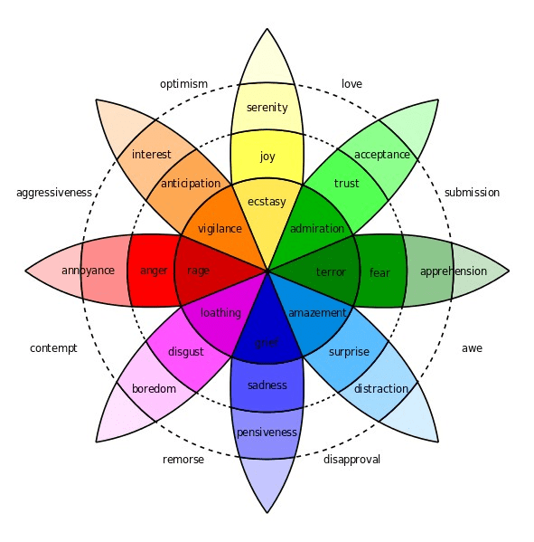
    The first chapter for this week in Liz Blazer’s Animated Storytelling concerned every aspect of sound in animation. She emphasized the idea that sound is a result of all of the action on screen, so the audience expects it to be there. Not only do they expect it to be there, but they expect it to be there right when it’s supposed to be there – timing means making either an undetectable sound design (as it should be) or making the audience feel off.

    Blazer argues that sound should not only be heavily considered when making an animated film, but that it should be the main concern – sound should lead the story, rather than the other way around. She suggests picking a soundtrack (regardless of whether it will be in your film or not) that matched the mood of what you are going for.

    From there, you pick your sound effects and music to best match the emotion and action of the scenes. It is a good idea to match certain audio motifs with characters or ideas that are presented throughout your story. It is also important to consider contrasting the scene to cause discomfort when the story calls for it – audio can be much more powerful than many audience members realize.

    Here is an example of effective audio in an animated short. It is neat to see where all of the sounds come from!

    Dialogue is something that is best to be avoided since you should do your best to express the story visually. If that is not possible, then it is vital to make the dialogue as natural as possible – each line that comes out of a character’s mouth should match that character and the mood should be easily detected from the pacing of the dialogue (short and snappy for a tense mood, long and “musical” for a happy mood, ect.).

    Here is an infamous example of dialogue done wrong – everything about this scene is awkward from the forced lines to the fact that it is ADR. It is truly iconic.

    Narration and voiceover, typically saved for motion graphics, should be written before animating since the total run time (TRT) is usually of upmost importance. What is said (and the visuals to match it) should be simple and brief.

    The next chapter focuses in on the importance of designing the rules of the worlds you create. Audiences are willing to have a suspension of disbelief to be pulled in by even the wildest stories, but the second a rule that has been established is broken that connection between art and spectator is broken.

    Time and Place are the first rules to be established. There are lots of choices when it comes to this, but you should try to pick a time and place that would create organic roadblocks and elevate the story’s conflict in some way. The same goes for Physical Laws – any physical law should be meaningful to the story, otherwise it risks just serving as a distraction.

    Social Laws can be fun since there are so many places to look to for inspiration – history, nature, current societies – the list goes on. Visual Laws also allow many liberties to be taken when it comes to space, lines, shapes, colors, contrast, and texture within the world. The important thing for both of these laws, remember, it to be consistent and meaningful with you choices.

    The world of Avatar: The Last Airbender is an excellent example of using history and nature to create rules in a completely fictional environment. All of the rules in this show are upheld (at least until its sequel series [sigh]) which may explain why it is held so near and dear to many of its viewer’s hearts.

    Research to Inform: Text Animation and Audio

    Since I already explored examples of stop-motion animation in my last post, it is time to look at some good utilization of sound and text animation.

    This first video is part of a cute animated series I stumbled upon this past summer. The reason I chose this as an example of good sound design is because of the use of sound effects and music. The soundtrack is somehow lighthearted, but hardcore at the same time – matching the whacky vibe of this short. There are also sound effects everywhere you would expect them to be – the car’s acceleration, the cannon, and the goofy sound of the boss bouncing out of the van (well, that one is the opposite of what you would expect for comedic effect). There is also ambiance of the road that I did not even notice until listening to it while listening closely for sound design, which is a great sign since good sound design is invisible.

    The part I talk about is the first minute or so.

    When I think ambient sound, this music video is the first to come to mind. I remembering watching an interview with Grimes where she explained that the first part of this music video was made on a whim – the sky looked great and they were in the middle of the desert with cameras, so they decided to just go for it. The ambient-chant-like sound that she added to match her slow-motion movements set the tone for the rest of the video perfectly – it is as if you are being transported to a different, more mystical world.

    Sorry for the additional Grimes video (but I am not really sorry these are wonderful). There are quite a few different things going on with the titles in this video. The first one is not animated, per se, but it is “moving” since it is transparent but with inverted colors. The next animated title comes in at 1:18, where it appears then swipes off the screen. I really do not know why I am so drawn to these titles – the animation itself is very minimal, but it is extremely stylized. I tend to prefer for minimal effects with titles since I want to pay attention to what it is trying to say. The ones in this are compelling enough where I appreciate them as art, but I am also able to understand them.

    The title comes in at 0:52.

    Fantastic Mr. Fox has another minimal, but highly stylized title. The reason I like this simple movement from one end of the screen to the next is for a few reasons. First of all, it matches the symmetry of the rest of the film – as the little airplane moves across the screen the title appears from the opposite direction at the same pace (this is super Wes Anderson – and I love it!). The second reason I am drawn to this title animation is because it matches the animation style of the very beginning of the film where they introduce the poem about the villains. Nothing is more satisfying that a book-ending, even one as subtle as that.

    Create: Stop-Motion Animation

    After many, many hours of moving pens around, snapping photos, moving pens around more, snapping more photos, and on and on and on…the animation of my non-linear story is complete! I am very happy with how it turned out, especially how I was able to synch up the “dance” to the music I had picked almost perfectly. Check it out for yourself here:

    My only regrets during the production process is that I did not have a remote to take the photos with so the camera wouldn’t have those slight movements and that I did not take extra photos of moments I wanted to stay on for a second or so. Still, considering how well the timing worked out, I am very happy with my final result.

    The post-production process went over well. I use Adobe Premiere to create the animation and add/edit the sound then used After Effects to create the short animation on my title. Looking at it in retrospect since I decided to go with such a simple animation I could have done it in Premiere, but the After Effects practice did not hurt.

  • A Photo Story: The Hobby Farmer’s Morning

    September 20th, 2020

    Dr. Dennis Richardson leads a busy life as a full-time professor at Quinnipiac University and one of the lead researchers for parasitology in the country. However, his day begins long before he starts his preparation for classes. Four years ago he and his family moved to a small farm in Meriden, CT where he discovered his love for breeding, milking, showing, and caring for Nigerian Dwarf Goats.

    The alarm goes off anytime between 5:30 and 6:30 a.m.
    First order of business: coffee. This is the first of two cups for the hour.
    The ducks have their own house outside the main barn.
    The six ducks that Dennis owns are shown every year at local fairs. Last year his drake earned many “Champion Waterfowl” titles.
    Next comes the barn, home to the goats and chickens.
    Fernie eagerly jumps onto the milk stand ready for her morning grain. Without the meal, they can get a little rowdy.
    There are five milking does, each producing about a pint of milk a day. At their height it can be up to a quart each.
    Dennis’ main source of nutrition is goat’s milk, whether it be in the form of creamer, yogurt, cheese, or ice cream. He has not bought a bar of soap from a store in years – all of the soap bars in his house are made from goat’s milk and lye.
    While the products may have been why he began his goat venture, the dairy goats quickly became pets. Every morning he takes a coffee break with Trixie, his first Nigerian Dwarf Goat.
    Once Dennis gets all of he milk he needs, it is the kids’ turn. He has six baby goats from last Spring’s batch that he admits should have been sold already, but are hard to give up.
    At last, the animals are set free to their spacious yard where they will graze, play, and lay around for the day until it is time for them to be put to bed at sunset.
    It is 7 a.m., the sun has fully risen, and it is time for Dennis to start his day at his real job as a Professor. While teaching is his career, his true passion lies in farming.

    His interest in farming has manifested itself in many ways since he was a child born & raised in Arkansas. From owning a few cattle and horses, to moving to the Connecticut suburbs where he had a small garden plot and hen house, to establishing a real business with his hobby farm his sustainable, do-it-yourself lifestyle has fully manifested. He is dreaming of the day when he can retire and move back to the country so that he can live in a goat-filled paradise.


    Photo narratives are becoming increasingly prevalent in journalism. As Eman Shurbaji explains in her article Photo narratives: Defining picture stories, essays and packages, “photos, unlike text, video or maps, have the potential to show an exact representation of an exact moment.” Adding a human face to an issue or situation can make it feel much less abstract and lead to more interest and change.

    While design was an overlooked aspect of journalism before traditional media had at way to easily incorporate images, it has quickly become one of the most pivotal parts of planning and telling a story. Writing, editing, and design have now become “a single unit of thought” in journalism. Visuals are no longer an afterthought to a story – they are something that can clarify, engage, and convey the story to the audience with ease.

    My goal for this short project was not as grand as James Nachtwey’s work and the many impressive visual journalism articles shared by Annie Schugart, but it was still something that is near and dear to my heart. I wanted to share the daily routine that my father has every morning – something that many people would not expect him to do, being a PhD in Biological Sciences and a well established professor. Like all of my documentary work, I wanted to show the raw, unfiltered story of what it is like to be a person in this world – including all of the weird little unexpected aspects of being human.

    For the majority of these photos I am attempting to appeal to the viewer’s visceral response of seeing a person work closely with animals and what that entails. In the first image the light on the bedside lamp and time on the clock gives the immediate reaction that this is an early-riser. The image of the barn door being opened, the warm lights contrasting with the cool tone of dusk, shows that something is about to begin – in this case, morning chores.

    My favorite image, and that which I feel captures the most emotion, is the one where he is sitting beside Trixie, watching her eat. Not only does that orange glow of the barn lights add a friendly energy to the image, but the composition of everything being level to each other shows equality. My father, Trixie, and the camera are all at the same level – no entity has a dominant force over the other. This is also an instance of “capturing the moment” (an idea explained in Seth Gitner’s book) where the farmer does not see an animal as a tool, but as family.

    Many of the techniques I used to create these images stems form my experience creating documentary films. Most of the angles I used were from a lower position – I wanted to be at the level of the action, not above it. I also did my best to be invisible. This was easier since I was working with my father who is comfortable with me and used to me taking pictures around him, but it was a little more difficult when it came to curious goats who want to approach me and chew on my camera strap. I had to adapt and switch from a 50mm to my 24-75mm so I could have more flexibility with close subjects.

    I also kept The Four Principles of Visual Storytelling in mind as I did my shoot. I told my father to do his morning chores as usual – nothing was staged and it was all authentic (yes, he uses that coffee cup every morning). Emotion came into play in the shot with him and Trixie spending some quality time together, taking a break from all of the business in the morning routine. The narrative was extremely personal – there are very few biology professors who as goat-crazy and willing to wake up before dawn for their passion of goat farming.

    While this story may not be as profound as many other works of photo journalism, it at least is something positive to see (when most people veer towards negativity in stories) and gives a good dose of humanity to the reader’s perspective on hobby farmers.


    Campbell, David. “Why it’s time for visual journalism to include a solutions focus.” Medium, 22 Jan. 2018, https://witness.worldpressphoto.org/why-it-is-time-for-visual-journalism-to-include-a-solutions-focus-5be15aec3afc. (Module 4)
    Cao, Jerry. “Web design color theory: how to create the right emotions with color in web design.” The Next Web, 7 April 2015, https://thenextweb.com/dd/2015/04/07/how-to-create-the-right-emotions-with-color-in-web-design/. Accessed 4 Sept. 2020. (Module 2)
    Dahmen, Nicole. “How to Do Better Visual Journalism for Solutions Stories.” MediaShift, 22 Nov. 2017, http://mediashift.org/2017/11/visually-reporting-solutions-stories-newsrooms-classrooms/. (Module 4)
    Garcia, Mario R. “Digital storytelling, Part One: The fusion of writing/editing/design.” Garcia Media, 19 Jan. 2017, https://garciamedia.com/blog/digital_storytelling_part_one_the_fusion_of_writing_editing_design/. (Module 4)
    Gitner, Seth. Multimedia Storytelling for Digital Communicators in a Multiplatform World. New York, Routledge, 2016. (Module 1)
    Lien, Jade. “The Four Principles of Visual Storytelling.” Action, 21 Dec. 2019, https://actiongraphicsnj.com/blog/4-principles-visual-storytelling/. (Module 1)
    Nachtwey, James. “My wish: Let my photographs bear witness.” TED, March 2007, https://www.ted.com/talks/james_nachtwey_my_wish_let_my_photographs_bear_witness. (Module 4)
    Norman, Donald A. & Ortony, Andrew. “Designers and Users: Two Perspectives on Emotion and Design.” “Foundations of Interactive Design”, Nov. 2003, http://projectsfinal.interactionivrea.org/2004-2005/SYMPOSIUM%202005/communication%20material/DESIGNERS%20AND%20USERS_Norman.pdf. Accessed 4 Sept. 2020. (Module 2)
    Sagolj, Damir. “7 Photojournalism Tips.” Thomson Reuters Foundation, 2012, https://vimeo.com/48815231. (Module 4)
    Schugart, Annie. “The Best in Interactive Multimedia Journalism 2017: Pushing the Limits of Storytelling.” Medium, 1 Jan. 2018, https://medium.com/@aschugart/the-best-in-interactive-multimedia-journalism-2017-pushing-the-limits-of-storytelling-e2ccdec8e576. (Module 4)
    Shurbaji, Eman. “Photo narratives: Defining picture stories, essays and packages.” Medium, 17 Dec. 2014, https://medium.com/learning-journalism-tech/photo-narratives-d77b812f99dd. (Module 4)

  • Visual Numbers

    September 17th, 2020

    Data visualization is one of the fastest-growing methods of communicating the ever-expanding wealth of knowledge that the world is accumulating into an easy-to-digest way. As explained in the TED Talk by Manuel Lima, humans have been using visuals to process and portray information since ancient times; the most popular form of visual information being the Porphyrian tree which was used to map morality, genealogy, systems of law, species, and more. While still a popular form of visualization, there has been a trend towards networkism: an art full of variety that carries the principle that everything is connected in some way, rather than strictly hierarchical.

    Family trees are the main form of Porphyrian tree that is still used to this day. Image Source.

    These networks are often extremely complex, yet through data visualization humans can understand visuals with minimal cognitive effort. This is because we are constantly bombarded with sensory information, most of which is unconscious and visual. As explained by David McCandless in his TED Talk, the huge amounts of data that are now in this world need some sort of “knowledge compression,” and mixing visual design with data is an optimal way to do so. In an article by Tableau, this idea is clearly defined in a few sentences:

    “While traditional education typically draws a distinct line between creative storytelling and technical analysis, the modern professional world also values those who can cross between the two: data visualization sits right in the middle of analysis and visual storytelling.”

    “Data visualization beginner’s guide: a definition, examples, and learning resources.” Tableau. https://www.tableau.com/learn/articles/data-visualization.

    Without this combination, the sheer amount of data can lead to decision paralysis. However, there is no way to include every part of the data in one visual. Bringing in different data sets for comparison can help bring context to stats that may seem to imply something that is far from the whole picture (just watch this TED Talk starting at 10:05 to see how different data sets can change how you see an issue).

    Still, it is impossible to show every point of data. That is why when it comes to creating these visualizations the information, story, goal, and visual form must balance each other out to make sure you are successful in achieving what you want with your presentation. This whole concept is explained in a graphic by David McCandless:

    Image Source

    In addition to understanding those aspects of your visualization, you need to determine what type of visualization you want to create. This depends on the complexity and type of data you are conveying. While it is best to be as simple as possible with your visuals since people are more likely to accurately interpret them, sometimes simple visualizations won’t be in-depth enough so you will have to turn to things like slopegraphs, parallel coordinates, or others.

    No matter the type of visualization it is, you always want to keep in mind some principles outlined in a presentation by HubSpot and Visage:

    • Use Color Well. Each data point should have its own color so that it is easy to compare, but stick to six or less. Also stay away from high-contrast color combinations.
    • Do Not Distract from the Data. While callouts and visual cues can be used to emphasize or enhance data, avoid using unnecessary illustrations, fonts, or font elements.
    • Order Your Data Correctly. Use a logical hierarchy when ordering your data. Your main goal is to make it as easy for your viewer to understand as possible.

    There are more ways to represent data than with the typical graphs and charts, though. Sarah Illenberger creates data-driven images that are more on the creative side. Using objects related to her data, she takes photos of them and uses a key to outline the differences between them and what they represent.

    Using the same technique, I created this infographic based on data collected by Julia Engelmann in 2019.

    This image took quite a long time to produce for a number of reasons. First of all, I had planned on creating an infographic on the benefits of jounrnaling, but after hours of research I could only find one statistic on it – the rest of it was all qualitative. Still set on using my collection of Japanese stationary to create my image, I scaled back my grand plan and went with a data point that is simple to collect.

    After I finally had the statistics, it was time to translate them to real life. I divided the percentages by 4 (unfortunately I do not have that many pens) and made groups of each color based on their percentage. From there I began to experiment with how to present the data. At first I tried re-creating a pie-chart using the groups of pens, but the differences between the colors were not obvious enough. In addition to this I would have had to place the key in awkward positions, something that is advised against in the guide by HubSpot and Visage.

    Instead I created a mix of a bar graph and clusters of data – both the amount of pens and their vertical position show their popularity. As a bonus I know a bit of Japanese, so I was able to make my infographic bi-lingual. While the process of creating it did not go as planned, I am proud of how I was able to adapt the data in a fun way that is a little more interesting (albeit, slightly less accurate) than a simple pie chart.


    “Data visualization beginner’s guide: a definition, examples, and learning resources.” Tableau. https://www.tableau.com/learn/articles/data-visualization.
    “Data Visualization: How to Design Charts and Graphs.” HubSpot & Visage. https://cdn2.hubspot.net/hub/53/file-863940581-pdf/Data_Visualization_101_How_to_Design_Charts_and_Graphs.pdf.

    “Information Visualization – A Brief Introduction.” Interaction Design Foundation, July 2020. https://www.interaction-design.org/literature/article/information-visualization-a-brief-introduction.
    Lima, Manuel. “A visual history of human knowledge.” TED, 2015, https://www.ted.com/talks/manuel_lima_a_visual_history_of_human_knowledge?language=en#t-11500.
    McCandless, David. “The beauty of data visualization.” TED, 2010, https://www.ted.com/talks/david_mccandless_the_beauty_of_data_visualization#t-35216.
    McCandless, David. “Knowledge is Beautiful.” Harper Design, New York, 21 Oct. 2014.
    Sinar, Evan. “7 Data Visualization Types You Should be Using More (and How to Start).” Medium, 14 Feb. 2016. https://medium.com/@EvanSinar/7-data-visualization-types-you-should-be-using-more-and-how-to-start-4015b5d4adf2
    Watson, Hugh. (2017). Data Visualization, Data Interpreters, and Storytelling. Business Intelligence Journal. 22. 5-10.

  • Motion Design Module 3: Pre-Production in Action

    September 14th, 2020

    This week I begin the process of creating my very first stop-motion film. Before the actual creation, however, I need to do the pre-production which includes planning the story and making a storyboard. Read more about this process from my previous post.

    Reading & Writing: Color & Experimentation

    This week’s reading from Liz Blazer’s Animated Storytelling covers two aspects of animation that make it quite unique: color sense and the “weird science” of experimentation. Both chapters can be summarized with a few lists.

    Color can make an animated film very special, and what is neat about it is that the creator has the ability to color it however they please. Still, there are some basic principles to keep in mind:

    • Limit the colors you use. Animation already involves having the viewer follow motion, so don’t make an array of colors compete for their attention. When in doubt stick to making the background much more subtle (almost as if it were white space) and make use of complimentary colors.
    • Pick two main colors: one thematic, one accent. This not only makes it easier to follow the first principle, but it creates some continuity for the viewer so that they can easily associate one color with the main theme and another with opposing/complimentary forces.
    • Above all else, follow your gut. Even though there are basic Western meanings applied to some colors that elicit certain emotions and the guidelines mentioned above, it is okay to break those boundaries and create something new. If everyone stuck to the same old rules, there would be no innovation!

    On the note of following your gut comes the next chapter – experimenting. Blazer gives a few tips to help you get started on this vital step to creating a unique project:

    • Now…go against your gut! Blazer argues that you are at your best creativity-wise when you are not worried about what people will think about your work. So, try your best to go against your instincts and create something bad. You will definitely learn something, and maybe even learn what you like!
    • Challenge yourself. Do not stay in the comfort of what you know. There are so many techniques used in animated storytelling that you should explore – you may end up being very skilled in or loving a type of animation that you never even thought of.
    • Do what you want – and you will prosper. Make projects that you want to get paid for. Your portfolio will end up being what people expect from you, so do what you want. The work you put into doing these personal projects will inevitably pay off!

    If you are having trouble doing any of this on a project you are working on, start by looking at each key frame on your storyboard and look at every aspect that could be experimented with. It takes time, but that time will result in something that is uniquely yours.

    Research to Inform: Stop-Motion Animations

    This week I will be exploring some stop-motion animations for inspiration as I start to plan my own.

    This video is the first thing that came to mind when I began my research. I remember seeing this when I was in middle school and being amazed by the creativity involved. The way they use these toys is amazing and the way they emulate a sound wave is entrancing. The little things are excellent in this as well – how the toys look scared or run away when they are about to meet their demise, how the sound waves go into the red when it’s peaking (for the Connect-4 and the Battleship ones), the colors of the play-dough matching the pattern of the crushed-up toys. After watching this years after first seeing it, it is obvious why this stuck to my mind.

    Lee Hardcastle is an extremely talented stop-motion (mostly claymation) artist and filmmaker. However, his work is not for the lighthearted. This is actually the least terrifying and gory of his shorts, so I highly suggest you check him out if you can handle it – but I am warning you, it can get very disturbing. Something I have noticed in stop-motion filmmaking is that there are many disturbing animations. Even just looking back to my history of regrettable YouTube deep-dives things like Bobby Yeah and The Separation leave me feeling very…uncomfortable. (I mean how do I even stumble across this stuff??) My theory as to why stop-motion is a favorite for creepy vibes is because it is something that can be fully controlled and it is so close to real motion (but not) that it leaves an uncanny feeling in your mind. There is more on this subject in this great video essay.

    For this film in particular there is a mix of live action, stop motion, and computer animation. The body and silhouette of the monster is stop-motion, its face close-up is CGI, and everything else in the film is live action. My favorite part of this short is the twist – it is truly terrifying!

    The stop-motion portion begins at 01:05

    This is another video that came to mind when I began my research. I am honestly impressed that it only took them six days! They do so many fun tricks like shaving and un-shaving his face, using banana peels as skates, and creating the illusion of flying in the air or walking on water. The part where the clothes come to life is very cool – I love the use of contrast to make the dancers invisible. There are a few parts where you can tell they just changed the frame rate on a video rather than take frame-by-frame photos like the part with the two judges, but this is still an extremely impressive video.

    I added this video to this mix just to show that stop-motion doesn’t require a whole production crew – you can do it with your phone and a bit of creativity! This is basically a longer version of this Vine (which I think was the origin of the jumping-in-midair-a-bunch-to-look-like-you’re-flying fad) but it goes to show how anything can be achieved with the power of animation!

    Yet another throwback for me – this video was sooo funny to me when I was in elementary school. Now…I guess I grew out of that type of humor. Still, this is a cute little animation that shows how creating odd characters can give joy to millions of people. It looks like there is a combination of stop-motion for Marcel’s movement and 2D animation for his mouth. The sound in this one is also charming – his squeaky walk matched with his squeaky voice works perfectly for the tone.

    I added this last one because I was impressed with how much could be done with one type of object. The smoothness of some of the wave sequences is mesmerizing. I also appreciate the visualization of sound waves (like the other music video). Another reason I chose this one is because I was thinking of doing my own stop-motion short using the (too) many pens and pencils I have to journal with.

    Create: Stop Motion Test & Ideas

    Before I make my film I need to prepare by doing a creative brief and creating a storyboard. I also have to decide which one to do, which you are welcome to comment on. I am thinking of using whatever I make as an intro or outro for my YouTube videos so I have a lighthearted theme including journaling supplies for both.

    For my first idea I have a short linear story about highlighters working together to include everyone. Check out my creative brief and storyboard here:

    pre-production-summary-template-linearDownload

    My second idea is a non-linear short where my pens escape their pencil case, have a creative party, and get swept back into the case once they are discovered. I think I prefer this one since it would fit better as an intro to a YouTube video. Here is that creative brief and storyboard:

    pre-production-summary-template-non-linearDownload

    Finally, I did a little test using my highlighters, camera, tripod, and some lights. Doing this test made me more aware of some things I should do when I go to create my final film. First of all I forgot to switch my file format to JPG in my camera so I had to go into Lightroom and export all 175 photos. My tripod was also a little bit shaky, so I will have to get a sandbag or put it in a more stable position. Overall, however, I am feeling good about this and I am excited to make my stop-motion film!

  • Mixed Emotions

    September 9th, 2020

    When designing an image there is a multitude of tools that can come in handy when attempting to convey a certain emotion to a viewer. One such tool is Plutchik’s Wheel of Emotions, a diagram showing the eight primary emotions and their varying degrees & combinations.

    Image Source

    Every image emanates some form of the eight basic emotions by using context. Just like how our brains use context to understand what we are seeing, we are also able to connect to the images based on our own experiences of those emotions. In addition to that, the Gestalt Principles which help give context to what an image’s meaning is as well as the use of color for emotional design induce these emotions further.

    While in my previous post I compared images with the same emotion with artists from different countries, I will be comparing images with different emotions from artists of one country now. My aim to show how no matter where you come from, visual design can influence how an artist conveys emotion to a viewer in many different (or similar) ways. Since I have a strong interest in Cambodian history, I will be reviewing three images from Cambodian artists, two post-Khmer Rouge and one modern piece.

    “The Last Look” by Ngeth Sim

    “The Last Look” was a painting created by Ngeth Sim capturing the moment when his father was taken away to be killed by the Khmer Rouge. Everything about this image screams terror to me – the terror that he, as a child, must have felt. Just reading this excerpt from Sim’s interview about the painting fills me with enough terror alone, never mind the awe-inducing painting:

    “My poor father, at the moment when the Khmer Rouge led you away, I fixed on your face intently. At the bottom of my heart, a thousand thoughts clashed and overwhelmed me. I couldn’t speak. I remained mute in front of them and only the tears flowed down my cheeks. I sensed that I was going to lose you and life left me at the same time that they were taking yours. I did not have the force to protest in front of these torturers, to prevent them from taking you and killing you. Today still, this memory beats against my chest and keeps me from complete happiness. When I think of it, the feeling overwhelms me that I did nothing to return the love that you had given to me. I am truly an ungrateful son. Dearly beloved father, I pray every night that your soul will pardon me.”

    Looking at the painting by itself instills terror as well due to its design. The most prominent Gestalt Principle captured in this painting is “common fate” – and their fate, in this case, is a terrible one. The movement in this photo is mostly to the left, but the one man making his “last look” to his son is staring back. The continuity and proximity of the men in line adds to the terror since you know that he was not the only father who was murdered – every single one of the thousands and thousands who were killed had families.

    Another element that is highly influential to the emotions is color. In this case, the colors are red, black, and white. Not only is red the color of the party that was executing these men, but it also associated with “fire, violence, and warfare”. White is typically thought of as the color for virtue, but in the East it is more commonly associated with death. It works well in this painting to highlight the center of the image – the man giving the “last look”. The black charcoal that makes the outlines of the men is effective at representing the misery of the victims.

    “The Village of my Birth” by Vann Nath

    Vann Nath is a Cambodian artist who is well known for his images depicting scenes of torture that he witnessed as a prisoner at Security Prison 21. This painting, however, depicts an alternate reality that he could have experienced had the Khmer Rouge not taken over. Instead of omitting terror, it gives a feeling of peace to the viewer. He explained his vision he had here:

    “My picture wishes to show what life ideally can be like in the countryside. The cowherd lying under the tree is free in his heart. He is his own master and does not suffer from oppression or intimidation. He lives honestly by his own labor and in peace and harmony with his own surroundings. He has no fear of anything and is not afraid that anyone will steal his possessions or his animals. It is thus the opposite of my paintings of torture and sadness. While painting this painting I was happy and hopeful. The Tuol Sleng paintings I painted to document what had happened but their painting was difficult for me.”

    As far as the Gestalt Principles go, there a few that influence the feeling of peacefulness Nath was aiming for. The figure-ground which is supposed to determine the background and foreground is somewhat muted here since the colors and lines flow into each other in a relaxed way. Everything in this image is connected as well – the man, the cows, the nature, the clouds – they are all calm and together, instilling a feeling of grounding and connection.

    The colors in this photo are all natural and analogous to the other; as I mentioned above, everything in the photo seems to flow together. Each color still gives a certain feeling to the viewer – the green grass promotes growth and stability, the blue sky promotes calm and safety, the white clouds and nearly-white flowers promote comfort and elegance. When looking at all of these attributes, it makes you sad to know that none of these where possible in the Cambodia that Nath actually experienced. He aimed for the exact opposite and he achieved it.

    Music scene
    “Music Scene” by Dina Chhan

    The final image I chose is by a modern Cambodian painter and is much more lighthearted as it has nothing to do with the genocide. Instead it depicts four performers who are sharing their art with the world. To me, this image emanates joy.

    One Gestalt Principle that is present in this image is connectedness. Every figure is touching another and the lines are flowing as if they are coming from the same place. To me it seems that these people are sharing a strong link with each other as they play their music. There is also an element of simplicity to their faces; they are very bare-bones, but people are able to see them as faces due to perceptual constancy which allows humans to understand what something is due to its context.

    This is the most abstract photo of the bunch and uses colors in an unrealistic, but fun way. The red in this photo is signaling youth, the accents of blue is promoting openness, the bit of yellow is adding happiness, and the black is adding a bit of edginess. With this “edge” I imagine these to be late-night or street performers. It is interesting to note that this painting also has a strong red and black color scheme much like the first, but the more vibrant red and the solid lines make it more lighthearted.


    Emotions can be conveyed by artists of all backgrounds and in many different ways because we all share the same experience of being human. While images may mean more to some than others based on their life, some basic design principles can easily give the artist the ability to connect emotionally to any viewer.


    Annenberg Learner. “Discovering Psychology: Updated Edition – Sensation and Perception” WGBH Educational Foundation, Feb. 2001, https://www.learner.org/series/discovering-psychology/sensation-and-perception/.
    Busche, Laura. “Simplicity, symmetry and more: Gestalt theory and the design principles it gave birth to.” Canva, https://www.canva.com/learn/gestalt-theory/. Accessed 4 Sept. 2020.
    Cao, Jerry. “Web design color theory: how to create the right emotions with color in web design.” The Next Web, 7 April 2015, https://thenextweb.com/dd/2015/04/07/how-to-create-the-right-emotions-with-color-in-web-design/. Accessed 4 Sept. 2020.
    Chapman, Cameron. “Color Theory for Designers, Part 1: The Meaning of Color.” Smashing Magazine, 28 Jan 2010, https://www.smashingmagazine.com/2010/01/color-theory-for-designers-part-1-the-meaning-of-color/. Accessed 8 Sept. 2020.

    McLeod, Saul. “Visual Perception Theory.” SimplyPsychology, 2018, https://www.simplypsychology.org/perception-theories.html. Accessed 4 Sept. 2020.
    “Putting Some Emotion into Your Design – Plutchik’s Wheel of Emotions.” Interaction Design Foundation, 2020, https://www.interaction-design.org/literature/article/putting-some-emotion-into-your-design-plutchik-s-wheel-of-emotions. Accessed 4 Sept. 2020.

  • Motion Design Module 2: Mixing Motion

    September 8th, 2020

    This week I learned the process of storytelling and storyboarding in animation and explored the world of cinemagraphs. I even made a few of my own!

    Reading & Writing: Storytelling & Storyboarding

    The second chapter of the book Animated Storytelling: Simple Steps for Creating Animation & Motion Graphics by Liz Blazer is all about storytelling for animation. While you may already feel like you have the story down after coming up with the idea there is a lot of work to do – the most difficult being reeling in your imagination so that you can make sure that every moment has a purpose.

    The first step to honing in your story is writing out all of these moments, also called “beats”. When plotting out your beats, the author suggests using post-it notes so that you are able to move them around to gauge for the most emotional impact. Beats should always push your story forward, so when narrowing down or trying to make your story more concise the best rule of thumb is to see if your story is still progressing without it.

    It is at this point that you also want to decide whether to make your story the typical linear three-act structure or if you are inspired enough to make the story non-linear. The three-act structure is much more common. In act one the character and conflict is established, in act two the character works towards a solution, and in act three they attain the solution. A nonlinear story can employ a multitude of different structures, including:

    • book-ending: the end and the beginning meet
    • countdown: each beat is elevated in intensity
    • puzzle: information is withheld from the viewer and revealed little by little
    • beaded necklace: non-diegetic elements like voice-over, sounds, and music guide the viewer through chaos

    Once the structure has been determined and the beats have been plotted out, it is time to build a storyboard, which is covered in chapter three of the book. The basic idea of creating a storyboard is to create rough sketches (called thumbnails) of each moment in your story with dialogue or a brief explanation written below it.

    King of OOO: skronked: ADVENTURE TIME STORYBOARD TESTS! ...
    Here is an excerpt of a storyboard posted on the blog of Adventure Time’s art crew.

    While is is still technically a “rough” sketch, the whole point of the storyboard is to clarify your creation. It is important to keep continuity, framing, and shot composition in mind while trying your best to show some of your style. Once you have drawn each thumbnail it is best to establish a total runtime and figure out the exact timing for each scene. Then you can create an animatic with the exact timing and sounds that will be in your animation.

    Here is an example of an animatic for an episode of Adventure Time.

    Research to Inform: Cinemagraphs

    This week I am researching and creating cinemagraphs. Cinemagraphs are GIFs that make one or a few elements from a moving image the only moving part while everything else remains frozen. They are also meant to be on an endless loop.

    Old 3D cinemagraph test animation animated glass cinemagraph 3d
    From Mario Majstorović’s Dribble

    I was drawn to this one instantly because of the technical aspects that must have been involved. This goes far beyond masking out the area where you want movement – this must have been two completely separate videos that were layered onto each other to create this illusion. Getting the reflection of the glass must have taken quite some time!

    Handmaids Tale - Season 2 hbo motion graphics motion still cinemagraph tv show handmaidstale
    From Frederik Røssell’s Dribble

    I chose this because I not only love The Handmaid’s Tale, but because of what they chose to animate. The curtains, her blinking, and the tiny specs of dust make it seem like it is almost a video, but she is so unnaturally still that it cannot be. In this instance it mirrors her situation – being forced into slavery, able to look at the outside but frozen and unable to move to it.

    Behind the scenes studio gif editorial campaign art direction beauty photography fashion cinemagraph model
    From John Wallace’s Dribble

    I loved the use of motion in this since it subverts expectations. Typically you would expect the model to be staying still while the cameraman moves frantically around to grab angles, but she is the only moving element.

    Chicago Winter animation winter snow iphone6 loop chicago cinemagraph photoshop aftereffects
    From Chris Petersen’s Dribble

    I love this one because of the atmosphere they created while making it. The train and the river look to be masked out like normal, but the snow was an extra layer that the creator must have chosen to add. It fits that cloudy, grey city in winter atmosphere nicely.

    Handmaiden cinemagraph movie GIF - Find on GIFER
    From an unknown artist, based on Park-chan Wook’s The Haindmaiden

    The Handmaiden is one of my favorite films because of how beautiful almost every shot it. The way the creator of this cinemagraph drew attention to the warm candles and the cold winter reminds me of why I love this film. The same could be said as the GIF from The Handmaid’s Tale, where the character is stuck in this position figuratively, and with this animation, literally.

    From Tyler Pacheo’s Portfolio

    I had to find a cinemagraph of an animal since I love the way animals move. I could sit for hours watching my dog, goats, chickens, or ducks since they all act and move so interestingly. I love the way this cinemagraph captures the movement of the dog’s ears in such a natural-looking way. Even though the rest of the dog is completely still, I would think this were a video if it didn’t loop!

    Create: My Own Cinemagraphs!

    Now that I had done the research, it is time for me to try out some on my own! Even though I was pinched for time, I wanted to go beyond stock footage so I decided to grab my camera and get shots of the Fern’s Meadow animals.

    The first cinemagraph is of Rita-Katherine doing a cute little tail waggle and booty adjustment. For this one I deiced to use After Effects since it would be hard to make the GIF flow without the use of the reverse feature. After exporting the file to Photoshop I had an issue – I realized that I shot with over 200 frames per second, so when I exported it not only took up a lot of time and space, but the GIF was in slow motion. To fix this I had to do a quick Google search to find out how to change the timeline’s frame rate.

    This next cinemagraph is my personal favorite. I used Photoshop to make a still of little Luna, masked out her snout, cut the footage in the middle and added a transition to make it flow, and viola – a cute little never-ending chew cycle. This was a much simpler process since it got rid of the extra step of exporting it from After Effects, but the reverse feature can be useful for other footage.

    This last cinemagraph I also did in Photoshop. This one was by far the most difficult since it has the most movement. I had to very carefully use the lasso tool to make the selection for the mask so that I did not cut out too much movement while also making sure that the other chickens did not step into the boundary. Having a drawing tablet was very useful for this one. Even though I could probably make this look a little cleaner with more experience, I am happy with how it turned out for my third-ever cinemagraph.


    Give me a follow if you would like to know more about motion design as I continue to learn different methods of animation and about the process of creating animations. This week I will be starting my project on stop-motion!

  • Visual Representation of Emotions

    September 5th, 2020

    It is not news that images can spark a variety of emotions in the human soul – this is why people spend hours and hours in an art museum, are inspired by beautiful sunsets, and buy that product just because it feels “right”.

    Emotional design, that is designing a product, art piece, or image in the hopes to elicit an emotional response from a viewer, has become extremely popular. The Interaction Design Foundation even suggests that “you can use those emotions to either create loyalty or to drive a customer to take action.” What many look to for understanding what emotions to appeal to is Plutchik’s Wheel of Emotions: a diagram outlining the eight basic primary emotions and their derivations & combinations.

    From the Interaction Design Foundation’s article.

    In this post I will be exploring the emotion of joy in its different intensities through three different oil paintings. They each employ different methods of conveying the same basic emotion even though they were created years and miles apart.

    “Serenity” by Elena Den

    The first image of interest is “Serenity” by Elena Den, a Ukrainian artist. The image, while objectively blurry, is immediately recognizable as a horizon over a body of water. On a fundamental level this image is no more than a bunch of paint that has been dabbed, brushed, and scraped along a canvas. However, our brains are capable of taking in this sensory information and contextualizing it based on our past experiences – something that is called “top-down processing” in visual perception theory.

    There are also a few Gestalt Principles that help us recognize what this image is. One is the principle of “common fate” – we are able to see that the clouds are clouds because of the direction they are going, and that the bottom third of the image is water since it is going in a uniform and opposite direction. We also know that the clouds are all clouds because of their proximity to one another.

    But our mind goes beyond simply recognizing it as a horizon. We also feel the serenity the artist has sought out from within us. The main aspect of this painting that brings this out is the color palette. According to this article by Jerry Cao each color promotes certain emotions – and every single color in this painting can be linked to serenity. The blues promote calm & openness; the red promotes importance and youth; the orange promotes friendliness; the white promotes virtue & simplicity. The scheme is analogous, meaning that it has only complimentary colors (all of these colors can be found on one end of the color wheel) which bring out the best of each color, and the most of the emotion each color emits.

    “Joy” by Taher Abdel Azeem

    The next image and level of emotion is “Joy” by Taher Abdel Azeem, an Egyptian artist. Similar to the previous, the painting is almost abstract – the lines are not solid and flow into each other. Still, because of the brain’s ability to perceive images based on context (especially when that image resembles a human) the viewer can see the image of a child hula-hooping.

    The Gestalt Principles can outline why this is easily identifiable. For one, the enclosure around the girl is made clear from the circles of yellow and blue – they not only show us that she is a different object, but that she is the main object. The action of her hula-hooping can be seen by the continuation of movement through her body. From her head, to her arms, to her hips and finally her feet we can see the movement.

    To me, this painting brings out the most visceral response within me. As explained in the paper by Donald Norman and Andrew Ortony this is “gut-reaction” is one of three main emotional responses that a designer can hope to elicit in a viewer. This is due to the nostalgia of childhood joy – seeing a child at play has brought out the feelings I have when reflecting on the good times of childhood.

    Again, color has a big impact on the emotions of this image as well. The deep blue conveys safety, an emotion that is invisible yet predominant throughout childhood. The yellow gives a blast of happiness and enthusiasm – again, emotions that are constant in a healthy childhood. Her shorts are red, a color signifying youth. Not only are the colors themselves good indicators of these emotions, but the fact that they are in a triadic scheme makes for a very balanced image where these emotions can shine.

    “Ecstasy” by Matthew Parrish

    Finally we have reached the most intense version of joy – “Ecstasy” by Matthew Parrish, an early 20th-century American artist. Unlike the other two this portrait is based in realism – the clouds, mountains, ocean, and of course woman in the center are all closely resembling reality.

    One Gestalt Principle that helps our brains understand this painting are figure-ground: the woman is obviously the forefront of this piece because she is clear as day in the foreground, while the middle and background get progressively foggier. There is also lots of continuity in this image. The mountains and cliff-side can be followed in both its parallels and colors, and the same goes for the clouds in the sky.

    What gives this painting the most intense feeling of joy is three aspects: the colors, the direction, and the openness. The main colors in this painting are blue (calm, openness), red (power), and white (virtue). While the left side of the image is full of objects, the right (more specifically, the upper-right) is clear and open. The woman in the painting is looking out into this openness, motioning away from all the business behind her, and surrendering herself to the vastness of the sky with the look of ecstasy on her face.


    While in different styles and by artists from across the globe, the emotion of joy is able to be conveyed through art by utilizing the principles taught by psychology and color theory. In my opinion, above all else, experience is what makes images not only easy to understand, but to feel. By knowing the beauty of a sunset, the joy of being a child, and the feeling of freedom I was able to bring my past into these photos, and with it, the joy that came form those experiences.


    “Putting Some Emotion into Your Design – Plutchik’s Wheel of Emotions.” Interaction Design Foundation, 2020, https://www.interaction-design.org/literature/article/putting-some-emotion-into-your-design-plutchik-s-wheel-of-emotions. Accessed 4 Sept. 2020.
    Annenberg Learner. “Discovering Psychology: Updated Edition – Sensation and Perception” WGBH Educational Foundation, Feb. 2001, https://www.learner.org/series/discovering-psychology/sensation-and-perception/.

    Bonner, Carolann. “Using Gestalt Principles for Natural Interactions.” Thoughtbot, 15 Sept. 2014, https://thoughtbot.com/blog/gestalt-principles. Accessed 4 Sept. 2020.
    Busche, Laura. “Simplicity, symmetry and more: Gestalt theory and the design principles it gave birth to.” Canva, https://www.canva.com/learn/gestalt-theory/. Accessed 4 Sept. 2020.
    Cao, Jerry. “Web design color theory: how to create the right emotions with color in web design.” The Next Web, 7 April 2015, https://thenextweb.com/dd/2015/04/07/how-to-create-the-right-emotions-with-color-in-web-design/. Accessed 4 Sept. 2020.
    McLeod, Saul. “Visual Perception Theory.” SimplyPsychology, 2018, https://www.simplypsychology.org/perception-theories.html. Accessed 4 Sept. 2020.

  • Images That Tell a Story

    August 31st, 2020

    Images are what makes up a vast majority of today’s communication. Not only do we have devices that allow us to see a never-ending supply of visual stimulation, but those very devices are capable of creating images with ease. Just because you can, however, does not mean that it will be good. As Seth Gitner points out in the first chapter of his book Multimedia Storytelling for Digital Communications in a Multiplatform World, those who can create images with intention are those who make visual storytelling a true art. To explore the art of visual storytelling, I will explore ten different images that tell a compelling story.

    The Cycle of Terror and Tragedy by Graydon Parrish.

    The first image that tells a story is The Cycle of Terror and Tragedy by Graydon Parrish. When I began my research, this is the first thing that came to mind. I saw this painting in 2017 at the New Britain Museum of American Art and was awe-struck by every detail in this emotion-filled portrait of post-9/11 America.

    Starting in the middle are the two twins standing on an island before a smoky and ruinous New York City. They are blindfolded; oblivious and naked to the world. To the left are children holding the two planes that would crash into them, also blindfolded. They show the innocence of the country before the tragedy. Next to them is a dying man with his face frozen in horror and the back of his hand to his heart, the opposite of what a pledge to the US flag typically entails. To the right side of the twins are crying, yelling, and cowering women, signifying how terrified and vulnerable the country felt after 9/11. Then is an old man silenced by a medical mask, a new blindfold stemming from his hand to cover the youth’s eyes. I am unsure of this evaluation, but I see it as the terror and pain from the older generation who was attacked making the next generation blind again – blind to the possibility that it could happen to them.

    This painting is a strong example of dramatic storytelling (according to Chapter Two of Essentials of Visual Communication by Bo Bergstrom) – it has a beginning (the children with the planes), a middle (the dead man, vulnerable twins, and grieving women), and end (the blindness being passed on to the next generation) within a closed environment of a destroyed New York City.

    In Voluptas Mors – Salvador Dalí

    “In Voluptas Mors” is an interesting pick for me since I grew up seeing it on a postcard on the fridge at a friend’s home – and it has always haunted me. The title in English means “Voluptuous/Desirable Death”. It is a photo of a live sculpture of the female form being used to create a skull that entices one to the idea of death. There are seven women in the photo, but the only one with her face exposed is looking up and away, as if she is passively letting death take her.

    I see two interpretations for this image – one is the “Desirable Death” signifying a trap for men seeking lustful pleasures without thinking of the consequences, even if it is death. Another could be that death is freeing – as free as the woman in the photo looks. This image is an example of using contradictory emotions intentionally to shock and captivate the viewers, an idea explored in the introduction of Andrew Losowsky’s Visual Storytelling.

    The Silence of the Lambs (1991) - IMDb
    Poster Design by Dawn Baillie

    Speaking of moths, “In Voluptas Mors” is actually an element of one of my favorite movie poster designs. Spoiler/gross warning ahead. The moth on the poster of The Silence of the Lambs represents the film’s main antagonist – Buffalo Bill – as he is transforming from a man to a woman by kidnapping and skinning female victims. In this context, the Dalí artwork is being used to show both a desire to kill and a desire for the female form.

    The abnormal use of color, specifically in the eyes of the protagonist Clarice, give an eerie feeling to the piece. This again is an example of contradictory elements being used to draw in a viewer.

    Colorless Tsukuru Tazaki and His Years of Pilgrimage – Book Cover by Chip Kidd

    This next image is the cover art of one of my favorite books, Colorless Tsukuru Tazaki and His Years of Pilgrimage by Haruki Murakami. This image is abstract to those who are unfamiliar with the book, but after reading the novel it shows the story of the book perfectly clear.

    The novel follows the story of a man attempting to discover why his tight-knit high school friend group suddenly pushed him away. Each line of the hand represents a group member – their names each had a component of the coordinating color within it, so that is the name they went by in their friend group (Aka, Ao, Shiro, and Kuro). Tsukuru, the main character, was always an odd one out – he always felt “colorless”. Nonetheless every member came together to make a working hand. There is also a ongoing montra in the book about a story of a man who had a jar of fingers and one day lost them and felt as if he lost himself – showing that once the group disbanded, each member was lost.

    When the book sleeve is taken off you see a intricate map of the Japanese railway system (which Tsukuru works for). Every line of color has a stop symbol, referencing to Tukuru’s visits, or stops, to each member of the group that he makes throughout the book. While the cover may not mean much to a person who is unfamiliar with the book, it holds a lot of significance as the reader begins to understand it in the context of the story. As book cover designer Peter Mendelsund said in his presentation at the Graphic Design Meetup: Design is Storytelling, “design does in fact exist in time and it does unfold – it unfolds for the viewer in time even though it is static.”

    The Problem We All Live With - Part One - This American Life
    The Problem We All Live With by Norman Rockwell

    This painting by Norman Rockwell tells a story – and a true one – in a blunt and effective way. The walls with slurs written on it and tomatoes thrown against it making violent splatter patterns, while shocking to the viewer, are obviously no bother to the little girl in the photo who is looking straight ahead. While surrounded by men to protect her it is as if they are invisible, all faceless, adorning bland colors and identical poses, she is walking confidently to her goal of equal education.

    The movement and composition of this image are what makes it give this girl such a brave look – it is framed so that she is the moving forward no matter the hate around her, and doing so alone as the only subject with a face shown.

    The Sorrowing Old Man (At Eternity's Gate) Vincent van Gogh 1890 This is  one of his last painti… | Van gogh art, Vincent van gogh paintings, Van  gogh paintings
    At Eternity’s Gate – Vincent van Gogh

    At Eternity’s Gate is one of the most emotional self-portraits I have seen. Just by looking at the image you can see a man cowering, cold-toned colors surrounding him despite the fire, alone in the world. The use of color and space stand out most to me – the fact that the tones are cold and the painting is composed so that you can see that the man is in an empty room alone adds to the emotion of grief.

    Bawa Health Initiative | Volunteer! It Only Takes One.
    Via the Bawa Health Initiative.

    This image is significant to me because I know the girls featured. This was taken on a health survey to Bawa, Cameroon by a member of the Bawa Health Initiative, a non-profit organization co-founded by my father to provide clean drinking water, bed nets, health education, and even a clinic to a village in Cameroon.

    A blog post by Jade Lien entitled The Four Principles of Visual Storytelling outlines some key elements that visual storytellers, especially in the field of non-profits, should consider. Two of the four principles are met in this image: sensory and relevancy. The sensory mark is hit by the emotion in the girls’ eyes as they sit on the ground in their old, worn out clothes. The relevancy mark is hit because these are the children that are befitting from BHI’s work, and they happen to be sitting in front of the water filter provided by BHI that they use to filter out water-borne diseases.

    From my film Not Broken: Freedom Ride

    This image is a screenshot from my film Not Broken: Freedom Ride. This is my favorite still from the film – even those who have no idea what this is about can understand that the woman in the picutre is experiencing the raw joy that can only happen when holding a puppy (a puppy that just became hers). This shot is an example of capturing the moment. As explained in Seth Gitner’s book from earlier, “the moment” is when action and emotion come together to capture a story though a still image.

    Transitional Justice at Sites of 'Dark Tourism': The Case of Genocide  Memorials in Cambodia | Justice in Conflict
    Photo by Tang Chhin Sothy

    This photo, even to someone who knows nothing about Cambodian history, can be haunting. The eeriness of having an unidentifiable silhouette creep though rows and rows of faces of people wearing the same expression, hairstyle, and clothes tells enough. The fact that every one of those people in the pictures were tutored and killed shortly after it being taken adds so much more depth to this image.

    This is the Tuol Sleng Genocide Museum, a primary school building-turned-prison during the Khmer Rouge where an estimated 20,000 people were imprisoned. There are only four known survivors. To me, the silhouette of this image is the most haunting part. That person, who is likely a tourist, could have very well have been any of the people who were photographed and killed if they had been in Cambodia in the late 70’s.

    Florence Owens Thompson - Wikipedia
    “Migrant Mother” by Dorothea Lange

    The final image I chose is from one of my favorite documentary photographers, Dorothea Lange, This image is a part of her work with the FSA to help let the American public see the poverty that was the reality for many farmers in 1936. The worry on the mother’s face, the shyness of her two children, the dirt on her baby’s barley-visible face all work together to tell a heart-breaking story of struggle. This image hits all four of Jade Lien’s principles for non-profit images – it is authentic, emotional, relevant, and character-driven, which is probably why Lange is considered as one of America’s greatest photographers.


    Now that you have seen these examples of images that tell a story, keep an eye out as you consume visual media for images that compel or interest you. Are they able to tell an entire story within one frame? I know that I am excited to keep a watchful eye from here on out.

    Follow my blog for more weekly posts on my exploration of visual storytelling.


    Bergstrom, Bo. Essentials of Visual Communication. London, Laurence King Publishing, 2008.
    Gitner, Seth. Multimedia Storytelling for Digital Communicators in a Multiplatform World. New York, Routledge, 2016.
    Hewitt, Cooper. “Graphic Design Meetup: Design is Storytelling.” YouTube, uploaded by Cooper Hewitt, 5 Dec. 2017, https://youtu.be/Gc42K5P6dEY.
    Lien, Jade. “The Four Principles of Visual Storytelling.” Action, 21 Dec. 2019, https://actiongraphicsnj.com/blog/4-principles-visual-storytelling/.
    Losowsky, Andrew. Visual Storytelling. New York, Gestalten, 2011.

  • Motion Design Module One: Animated GIFs

    August 30th, 2020

    This is my first week of exploring the world of motion design. Let’s dive right in!

    Reading & Writing: Intro & Chapter One

    This week I read the introduction and first chapter of the book Animated Storytelling: Simple Steps for Creating Animation & Motion Graphics by Liz Blazer.

    The introduction instilled the idea that “being intentional about storytelling is the key to success,” no matter the type of animation you are doing. Both animation, which is typically considered to be in teh school of filmmaking entailing character-driven sorties, and motion design, which focuses on branding and content promotion, follow the same fundamental principles.

    One of the main principles of any type of animation is the process of creation. The first chapter explains the first step of creating motion designs: pre-production. Before starting your project it is vital to plan as much as you can to save time, money, and headaches.

    The first part of pre-production is Concept Development. During this phase you conduct a creative brief (either with yourself or with a client) to outline the who, what, how, when (being as specific as possible), and why of your project. Next you need to map out your big idea by doing a brain-dump of everything you feel about the idea behind the project then circling the thoughts that are most compelling to you. Finally you “hone your pitch” of the idea by starting out with a larger elevator pitch that outlines the tone, plot, and theme then narrowing it down to a tagline that sums up the idea in a few words.

    The next phase of pre-production is Previsualization. This is where you narrow down the look and feel of the project by looking to outside references for inspiration, experimenting with different styles while letting your creativity go wild, and opening up to the idea of changing up your initial plot based on your design.

    The final phase of pre-production is Asset Building. This is the most simple, but likely most time-consuming, part of the process. During this you create an organization system for all of your assets as you gather them; character designs, backgrounds, fonts, sound effects, ect.

    Next week I will be exploring the next steps in creating motion graphics, stay tuned to hear more!

    Research to Inform: Animated GIFs

    For my research this module the aim was to find examples of fun, interesting, and effective GIFs. I used Pinterest, Reddit, Tumblr, and Dribble to find these neat animations.

    From artist SolKorra.

    One of the keywords I first looked for when researching was Avatar: The Last Airbender – not only because I am re-watching the series right now and remembering that it is in fact the best television show to have aired ever (and that is a fact) but because of how great the animation is in that show. The fight scenes are creative and beautifully done by hand-drawn animation, just like the GIF above done by a fan. Check out this animation analysis video for some cool details and facts if you love the show!

    From Tenor user cali7.

    Nowadays when you hear “GIF” you automatically think of “reaction”. GIFs have been incorporated into seemingly every app out there as a way to express emotion or leave a quick comment. I chose this one because of the way they used a series of photos (or more likely a video) to create the movement of the shiba. They also added in some tweening and onion-skinning for the text, worry lines, and sweat drops, which are a cute addition.

    From artist Marianna Raskin.

    This GIF is a cute and light-feeling animation. The faded colors, crayon-like style, and cute font work together to make this a delight to look at.

    From artist Adam Van Winden.

    This GIF is probably my favorite from this bunch. The style is cute and simple at first which gives happy, summery vibes – then BAM everything explodes, goes to nothing, and the cycle continues. I love the color palette and the fact that it is completely erased when the nothingness occurs. This stark change makes the animation all the more stunning.

    From artist Rich Armstrong.

    This GIF is the least colorful, but most visually engaging. At first I thought that there was not a story behind this one (and there may not be an intentional one), but the fact that there is so much going on on so many screens mirrors today’s world. Every screen has a unique, interesting, and exciting pattern – but when taking a step back and looking at it all at once it can be quite overwhelming.

    From artist Sam Burton.

    While I typically acclimate to more hand-drawn styles of animation, this one caught my eye. First of all, the color palette is fun and compelling. Second, I love the message this one conveys – it is very simple but bright and inspiring.

    Create: My Own Animated GIFs

    Method One: “Cut Out” Images

    The first GIF I created was made from a series of images I took of one of my pullets who was very interested in what I was doing. This style of animating reminds me of sequences of cartoon characters bouncing around the screen or making different faces and I thought the expressions the chicken had matched that vibe.

    I used Photoshop to create a layer with each image, cropping out everything but the head and neck then positioning it to match the base image (the one where her head is within her silhouette). I did have to use the eraser tool to clean up the edges, but overall I am proud of this curious chicken. I exported the GIF in both 64 and 128 color versions and to my surprise they look almost identical – if I wanted to optimize as much as I could, I would just post the 64 color version without any worries.

    The GIF on the left has 64 colors, while the GIF on the right has 128.

    Method Two: Onion Skinning

    For the next GIF I made a flip-book-style animation using onion skinning in Photoshop. Since I turned 21 during the pandemic and have yet to experience clubbing, I followed a video of a dancer frame-by-frame doing my best to translate her movements to stick-figure form. After making upwards of 75 frames, I am happy with how it turned out. To make it a little more rave-like I created a version where every 8 frames the color in a layer below changes.

    This dance was inspired by the first two seconds of this video.

    Method Three: Onion Skinning and Rotoscoping

    For my final GIF I wanted to practice rotoscoping since it is what I plan to do to create a short documentary. The subject matter for my practice is Mika, my shiba inu, making a cute head turn with her tongue sticking out. I first created a basic outline of her nose, ears, mouth, eyes, and eyebrows using onion-skinning and the original video as a guide. I then added a little color on her nose and tongue and some highlights to make the style more cute. Having a Wacom Cintiq definitely helped make the style look more authentic and hand-drawn since it has sensitivity detection.

    I am excited to create more rotocopes, but these 13 or 14 frames took me about 4 hours to make. Time to bust out the coffee and lofi hip hop radio if I want to get through a whole 5-minute film without losing my marbles!


    Next week I will be exploring and creating some cinemagraphs. Follow my blog for more posts about motion design!

  • A Reflection on Learning the Basics of Web Technologies

    August 23rd, 2020

    Over the past seven weeks I have expanded my knowledge on how web pages work and the basics of creating my own. While there is so much more to learn in every aspect of the web, what I learned and practiced will serve as a basis for my own journey in exploring digital communications and media.

    I began the course with a little knowledge of coding and expected to expand on that, but instead I learned about things that will be much more useful to me for my future. The reality is that I do not need to know how to code in-depth; what is more practical for me as a filmmaker and storyteller is to know the fundamentals of web design, how to use a CMS, and understanding how to get my site to be seen.

    However, the hand-coding that I did experiment with was fun and useful – creating my portfolio page form a template made me understand how challenging, yet rewarding it can be to make something that is yours. I am genuinely proud of what I have made and while I will probably end up using templates from a CMS to re-create it once my business goes live, I know what I am looking for in my design since I spent so much time working on it in depth.

    Along with hand-coding is understanding servers, browsers, and hosts. By downloading an FTP and using it every week I became familiar with the basics of what hosting means – something that is behind every single web page on the internet.

    Another very useful element of this class for me was learning about image optimization. Not only will it help me for my own websites, but I will be able to explain to clients how to optimize the photos (which are very high resolution) for their own web pages. It will also help me as I dive into visual design for my future courses.

    In the future I plan to learn more about basic Javascript and PHP so that I can understand templates further and create working forms. While the workaround in my final portfolio is fine, it would be mice to make use of the well-designed and integrated forms. After all, one less call to action only makes the user more likely to stay on your site.

    In this last week of class I have already begun to look into creating my own website for my photography and videography business. After learning about SEO, web design, Google Analytics, and more I feel confident that I can create a website that is not only functional, but is actually seen by people. I feel even better knowing that I was able to create my own website from a template almost exactly to my liking.

    Overall, this course has solidified my understanding of how website building works and I am excited to continue learning on my own now that I know the basics. What I have learned has given me a stronger understanding of what is possible in creating sites either using a CMS or coding with templates.

←Previous Page
1 … 3 4 5 6 7 … 9
Next Page→

Blog at WordPress.com.


Loading Comments...
 

    • Subscribe Subscribed
      • Emma Lao
      • Join 57 other subscribers
      • Already have a WordPress.com account? Log in now.
      • Emma Lao
      • Subscribe Subscribed
      • Sign up
      • Log in
      • Report this content
      • View site in Reader
      • Manage subscriptions
      • Collapse this bar