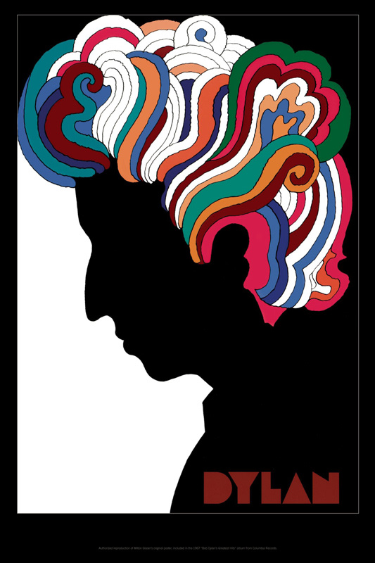
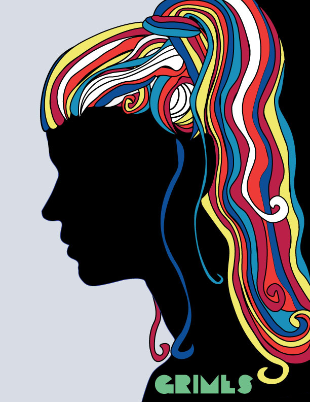
For this week’s continued practice in the visual design, I explored color theory and color schemes. I would create my own rendition of Milton Glaser’s famous poster of Bob Dylan by using the silhouette (the outline of an object) of a person I admire and adding opaque, spontaneous color via the abstractified hair.
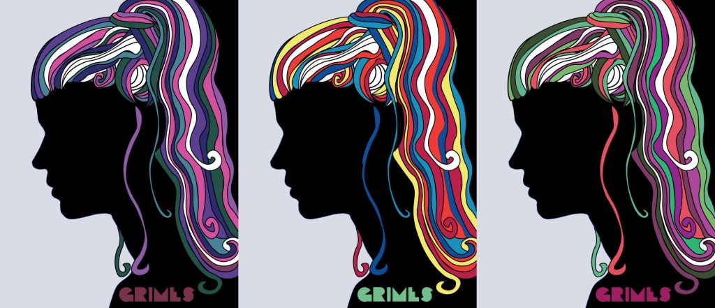
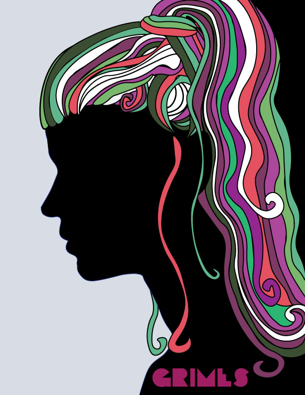
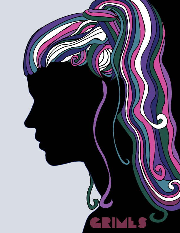
For the portrait I decided to feature my favorite musician (and probable future queen of Mars) Grimes. She immediately came to mind for this project because I appreciate all of the art that she creates, and her use of color being a large contributor to her talent. Each of these color palettes is based on a look or album cover – all of which fit into certain color schemes.
First is the palette based on the hairstyle I chose to capture for this composition. I was able to extract the colors into an easy-to-use palette by using the Colrd image DNA tool.
This palette is an example of a split-complementarycolor scheme – a mixture of three colors (and their slight variants) that are made of adjacent colors on the color wheel. While a fully complimentary palette would be more dramatic, this combination is still visually intense.
This next palette was based on her album cover for Halafaxa. All of these colors are part of the cool color scheme, occupying the side of the color wheel that includes blue, green, and violet. Cool color schemes are more calm and serene than their warm counterpart. In this particular composition, that calmness presents as a sort of ethereal-galaxy type vibe – something that matches the music of this album very well.
Finally, I created a rendition using the triadic primary color scheme that is based on her album cover for Art Angels. This is definitely the most vibrant of the batch (again, much like the contents of the album itself). The red, blue, and yellow combo is bold, yet playful and may actually be my favorite.
This exercise was a fun way to practice both Adobe Illustrator and color theory while showing appreciation for an artist that inspires me to go out of my comfort zone to be as creative as possible.
In an attempt to combine the knowledge I have gained so far on the principles of composition, I created a movie poster for an upcoming short documentary that I am creating. While the final poster appears basic, there are many aspects of design that I considered during its creation – much more than the rule of thirds and dimensions.
Conceptual Development
First and foremost, I had to ask myself some essential questions to design the poster. First – what is this poster’s purpose? I knew that I want to grab the viewer’s attention while forming some sort of emotional connection to Elaine, the subject of the film.
Next – how can I make the message resonate with the audience? The message of the film is that despite her hardships and trauma, Elaine was able to still conquer and be proud of who she is.
Both of these issues were addressed by my choice of image. I watched through footage that I filmed and found the perfect still of Elaine looking over the state’s capital building when she was attending sit-in for the clean-slate bill – in this moment, reminiscing about how many times she had been there to make change. This information is not known to the viewer of the poster, of course, but the emotion of accomplishment, pride, and reflection are all apparent.
Basic Considerations for Posters
Some major points for me to incorporate that should be considerations for any poster design (based on the chapter Posters from Robin Landa’s Graphic Design Solutions) are as follows:
Start with content you need to include. This is straightforward for this project – Elaine, the title, and my name. As I said earlier, I began with the most important element of all – a captivating image of the subject to draw the viewer in.
Image to type relationship (size). Since the image is the main element of the design, I did not want the text to compete for attention. Instead, I chose a nice, modern sans-serif in a small enough font so that it would be no more than complimentary.
Entry point. The viewers should know where to start the movement of their eyes so there is no confusion and therefore, a lesser chance of lost attention. The entry point for this composition is marked by contrast in color and size – Elaine is the darkest, most complex figure in the design so the eyes begin there, then follow her gaze up to the title.
Content-led thinking. I began this poster with the documentary in mind and continued this content-based vision throughout its design. Every element connects back to her story and the film, while maintaining a complete composition.
Color
There are two major uses of color in this composition – the combination of colors that created Elaine’s figure and the cool-green background that makes up the ground. First is the consideration of cool v. warm colors. Cool colors typically take the background and warm colors take the foreground, so I knew that I wanted the background to be cool so it does not compete with Elaine, who is supposed to be the most dominant figure in the composition.
Next is the consideration of emotion. Cool colors in general are considered to be calm and serene, but green is especially soothing. Elaine’s expression is once of calm strength – something that I believe is complimented nicely by the teal. A nice plus is that it makes her green eyes pop (and every photographer and videographer knows that the eyes are the gateway to the soul).
Hierarchy and Depth
Along with the contrast in size from the different elements, the texture, shape, and color difference between the figure of Elaine, title, and subtitles imply a clear dominancy hierarchy. This is the same hierarchy that tells the viewers where the entry point and path to continue their gaze lies.
There is also a bit of depth implied by the slight cast shadow around Elaine’s figure and the depth of field within her figure.
Type
For this composition I chose to use two type families – making sure that I was contrasting them enough to make a compelling and non-“mushy” design (Lupton). Each section of text has a distinct, yet overall harmonious, feel.
While it is not the busiest design, I believe that it captures exactly what I wanted it to. Simplicity and restraint when designing is just as important as anything else – if not more – so I knew that as long as I continued to lead my design with a content-based perspective and followed the basic design principles, it would turn out fine.
Baker, Justin. The Ultimate UX Guide to Color Design. Medium, 4 Dec 2017, https://medium.muz.li/the-ultimate-ux-guide-to-color-design-4d0a18a706ed. Callahan, Ewa. “Depth Perception.” Visual Design, 25 Jan. 2021. Quinnipiac University.Lecture Recording. Fontana, Anthony. “2D Foundations: Intro to Composition.” Bowling Green State University.Microsoft PowerPointpresentation. Landa, Robin. Graphic Design Solutions. 6th ed., Cengage, 2019. Thinking With Type. Ellen Lupton, 2009, http://thinkingwithtype.com/. Accessed 11 Feb. 2021.
For this week’s exploration of visual design I studied typography. There is so much depth to how text is presented that many – myself included, until now – take for granted. For example, there are many terms for the anatomy of a letter, as explored in this diagram from Thinking With Type:
Beyond the specific terms of each part of an induvial letter, there are also terms for how characters interact with each other. Kerning is the spacing between two characters which makes sure that characters flow from one to the next with optimal readability.
Leading, like kerning, is a type of spacing. It is the amount of space from one baseline to the next. As you can see from the image below, it is important to adjust the line spacing when integrating different fonts and point sizes.
There is also a rich history of type classifications. According to Robin Landa’s Graphic Design Solutions the main classifications include Old Style (roman with angled/bracketed serifs), Transitional (with less defined serifs), and Modern (smaller serifs, more geometric, with a larger contrast between thick and thin strokes). Along with these there is also slab serif, sans serif, blackletter, script, and display.
After getting an understanding of the fundamentals of typography, it was time for me to give it a go. I chose one word to design in a meaningful way. I chose “Organization” – as both a noun and a verb – since this week I began an internship which has made me motivated to get organized as I join a new organization.
The elements that I most wanted to incorporate were a tight kerning and a suitable type. The type classification for this would be a modern, geometric sans-serif. When one thinks of the word “organization” it is something that is structured in some way – there is no need for serifs or other unnecessary adornments when productivity and efficiency is involved.
At the same time, organizations are fluid and each character within an organization takes on a different position while still being tightly knit into a cohesive team. To get this element of the word into the type I manipulated the points (in Adobe Illustrator) to form around the other characters and be their own unique part of the whole, which allowed me to make the kerning super tight.
The maximum cap height of all of the characters is the same, but I decided to have the O also reach beyond the baseline like a descender would (like the g does). I wanted to do this to represent an organization’s leader – someone who is an all-encompassing character. However, they are not as integrated with the rest of the organization – while all of the other characters are woven together, the O stands alone, leading the group.
Another element that I wanted to be sure to incorporate is the roundness of the counters (the space enclosed by the strokes of a letter). The contrast of the roundness mixes with the straight, sharp lines adds a bit of bubbliness and a lighter emotion. The “direction”, of path the eye takes to follow the word, is also dynamic and creative – much like an organization should be.
While I am sure I could do more if I had more practice in Illustrator, I think that the simplicity of the type I created works well. This is a creative exercise I would love to do again in the future when I am inspired by another word.
Landa, Robin. Graphic Design Solutions. 6th ed., Cengage, 2019. Thinking With Type. Ellen Lupton, 2009, http://thinkingwithtype.com/. Accessed 11 Feb. 2021.
Before creating a story from many different images, I wanted to plan what kind of emotion I wanted to capture – after all, emotion is just as important as information and function. For what I had in mind somewhere right between fear and surprise on Pultchik’s Wheel of Emotions would be just right – awe is what I would keep in mind while creating my composition.
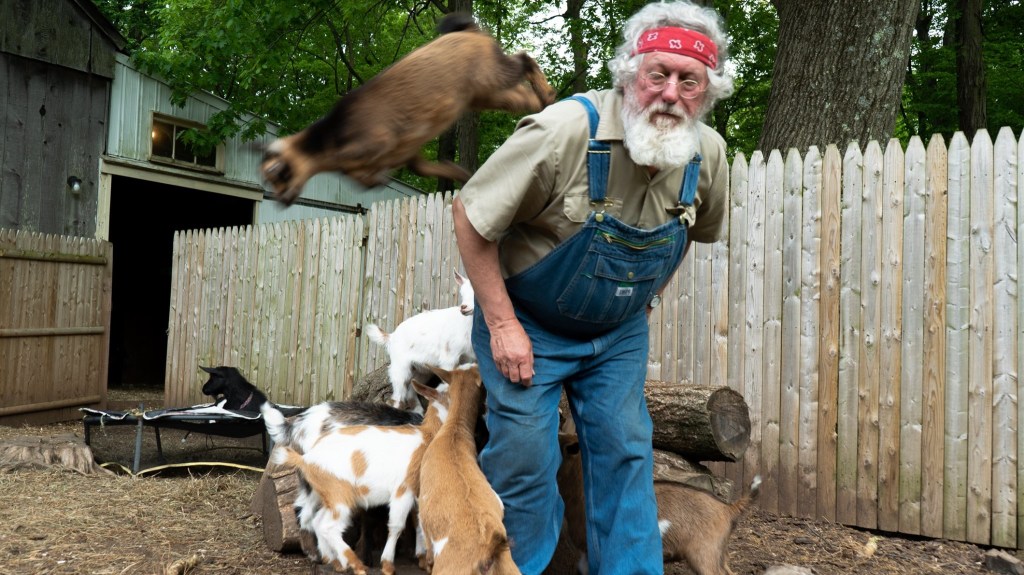
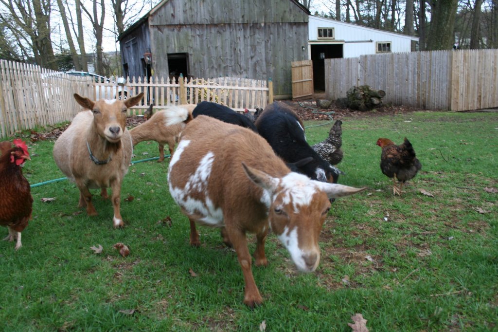
After going through some images I captured over the Summer, I came up with the most awe-inspiring tale I could think of with the material I had: the “Attack of the Killer Kids”.
“Attack of the Killer Kids”
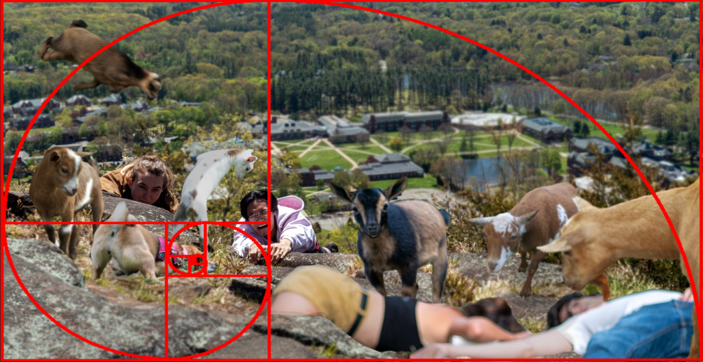
For this composition I knew that I wanted to showcase a few key elements when it comes to the illusion of spatial depth. First of all, I wanted to focus on using fore, middle, and background. In Chapter 7 of Robin Landa’s Graphic Design Solutions, the foreground is supposed to be bigger, brighter, and have more contrast and detail. While I followed the guideline of a bigger foreground, the brighter, more detailed part of the image is the middle ground.
I chose to have the middle ground be the area of focus by using an aerial perspective. While the human eye usually sees closer objects to be more clear, the depth of field is still limited (much like a camera). I wanted to bring focus to the person about to be attacked by the white goat – this was the area of the image that was clearest and brightest.
In addition to this, the area that is most in-focus (or the least blurred) lies right around the path of the Golden Mean. The eye begins with the largest objects in the image (the dead bodies about to be consumed in the foreground) and ends up where the innocent hikers are about to perish.
Composition with the Golden Ratio overlay
With the Golden Ratio also comes balance. Even though this image is far from symmetrical, I can still balance the visual weight; while there are more objects on the left side of the composition, the size of the elements on the right add more visual weight, making them about even.
I used a total of nine images to create this composition. As you may notice, some of the elements I selected from these images were already blurry, so I used that to my advantage. For the ones that were not (like the base image of my friend and husband pretending to fall of Sleeping Giant) I used the blur tool in Photoshop to make the illusion of a smaller depth of field. To make the shadows match that base image I also had to play with basic adjustments of contrast and brightness.
Even though having the limitation of using images that I had already captured may have seemed difficult at first, I found that it opened me up to make a more creative story than I thought was possible. Trying to find associations between seemingly unrelated images is a useful creative tool that I will think about using again if I ever feel stumped.
Callahan, Ewa. “Depth Perception.” Visual Design, 25 Jan. 2021. Quinnipiac University. Lecture Recording. Callahan, Ewa. “Design as Communication.” Visual Design, 1 Feb. 2021. Quinnipiac University. Lecture Recording. Fontana, Anthony. “2D Foundations: Intro to Composition.” Bowling Green State University. Microsoft PowerPoint presentation. Landa, Robin. Graphic Design Solutions. 6th ed., Cengage, 2019.
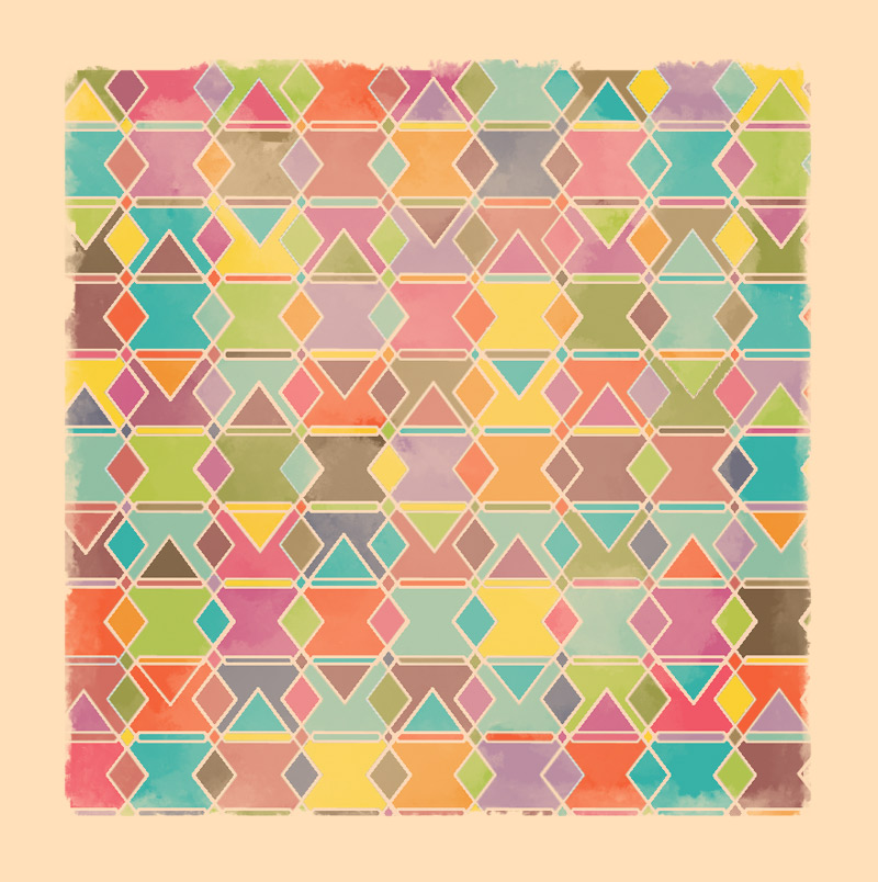
For my first venture into the world of visual design, I created a piece of abstract art inspired by a series of paintings created by another artist. After some discussion with my friend who appreciated abstract paintings, he suggested that I check out the work of Simon C Page, a British graphic designer and illustrator.
While browsing through his work, the series “Grunge Geometry”, which can be viewed on Page’s art prints shop, stood out to me. Before taking a try of creating my own composition based on his style, I analyzed each of the pieces below, keeping the basics of graphic design in mind.
The first of the series starts with a geometric bang. This composition is made of many randomly-colored curved lines and a ground that is a light beige. The curved lines do not touch, but due to the Gestalt Principle of continuity (Callahan), the human brain perceives the four curved lines that are just barley separated to be touching in order to make a full circle.
The next in the series that caught my eye was “Grunge Geometry D”. This one is vastly different from the previous since it is asymmetrical. According to Anthony Fontana’s presentation on 2-D Foundations, an asymmetric balance in a composition, unlike a symmetric one, will bring movement and dynamic qualities to the image. There are also elements of hierarchy – the larger hexagons are more dominant than the smaller ones near the center of the image (Fontana). This could also imply that the larger hexagons are closer to us than the further ones, giving a feel of fore, middle, and background. Looking at it this way makes it seem like the viewer is positioned in between two waterfalls of colorful hexagons (although it is a bit of a stretch – still abstract art is there to make you think)!
“E”, again, is different from the rest. If it were not for the colors the symmetry of the piece would make it static, but the gradient from orange to pink to purple to many shades of blue makes for a dynamic and compelling piece. In addition, the different colors of the triangles create the illusion of a form shadow on the shapes (Callahan), making the point where four triangles meet appear as if it were closer like a bunch of little pyramids poking up at the viewer.
“G” is very eye-catching. The color palette, randomization of color, and presence of many shapes is similar to the rest of the group, but the way the curved rectangles are larger on the outside and get smaller as they go in makes the piece very dynamic. This composition uses the depth perception cue of linear perspective – the bigger shapes appear closer to the viewer and the smaller ones appear very distant (Callahan). It is as if it is a colorful tunnel that the viewer is peering down.
“J” is my favorite of the collection since it seems so simple at first glance, but is actually quite complex. Page used only 2 types of shapes – a diamond and a hexagon – to create this entire image. The lines (which I would consider a sort of white space/ground as it is the same color as the border around the figures) are all parts of the shapes – one long hexagon, one regular hexagon, and a large diamond in the middle with a smaller diamond on either side.
This one is much like “J” but only has large hexagons overlapping each other, creating random polygons in the process. While the idea of that sounds boring, I believe that the unity of the piece makes it all come together very nicely; the repetition in the hexagons, the satisfying configuration which leaves no space odd or unaccounted for, and the variety that the randomly selected colors from the palette bring (Landa).
The final piece I reviewed stumped me more than the rest – From what I could gather Page was using lines to create triangles within triangles within triangles until two small triangles overlapped into a shape resembling the Star of David. For this choice of shape I agree with Rune Madsen in his article “Basic Shapes and Relationships” – the triangle is still basic, but brings a lot of edge and movement into the piece. That combined with the huge variety in color from shape to shape (while sticking to a somewhat limited palette) take the eyes for a rollercoaster.
For my own piece I based the color palette mostly on J, K, and M but did my best to keep the spirit of symmetry and continuity that is present in the majority of the series intact. I was also drawn to the thin, but vital, whitespace that those three utilized.
I wanted to do the same idea as “J” where I use two shapes (of varying sizes) to create a composition, and I think it worked well. I began with stretched hexagons then overlapped them vertically to make a new super thin hexagon. After adding more rows, I overlapped them again horizontally to create medium-sized diamonds within the figures and a small diamond where there was a bit of “ground” (which became a figure when I colored it in and made it its own shape). Finally, I added larger diamonds on top of every other horizontal hexagon, which I feel added a little more variety to the image.
Next, I used the eyedrop tool in Photoshop to select colors from the palettes that were used in J, K, and M. Since I was using the fill tool to do this and not an actual paintbrush I added a bit of variety to the value of the colors for some texture.
After I had the fully colored shapes and lines, I used the brush tool (while holding shift to keep it straight) to create the border, then the blend tool to add the brush-like strokes near the inner edges like in the original paintings.
Finally, I needed to emulate the cloud-like texture that is present in the original pieces. To do this I used the same brush as the border, lowered the opacity, scribbled in the center of the canvas, then blended it like crazy with the finger smudge tool.
In time I hope to be able to create pieces more complex than this – one that is asymmetrical and with more movement perhaps – but for my first piece, I am happy with it. Follow my blog to keep updated in my pursuit to know more about visual design and the pieces I make to practice those concepts along the way!
Sources:
Callahan, Ewa. “Depth Perception.” Visual Design, 25 Jan. 2021. Quinnipiac University. Lecture Recording. Fontana, Anthony. “2D Foundations: Intro to Composition.” Bowling Green State University. Microsoft PowerPoint presentation. Landa, Robin. Graphic Design Solutions. 6th ed., Cengage, 2019. Madsen, Rune. “Basic Shapes and Relationships.” Programming Design Systems, http://printingcode.runemadsen.com/lecture-form/. Accessed 27 Jan. 2021.
This week I finished the Hobonichi Series! In this post I will explore my final takeaways and thoughts of this entire process.
The Finished Product
This week I uploaded my third and final video of my Hobonichi Series. The process of writing, filming, and uploading this video was the quickest and easiest yet – even though I have only made a few videos, I have pinned down a decent system that works for me.
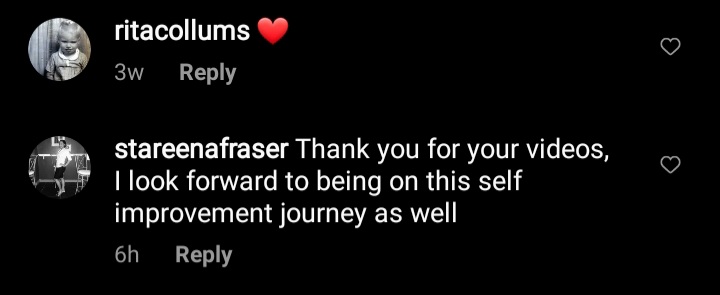
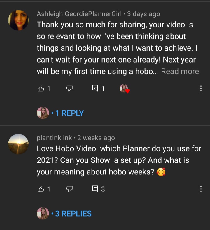
Even though I only uploaded this video hours before writing this post, it already has 45 views, five likes, and two users who commented on it. I have also had several comments on my Instagram post promoting this video.
Even though I did not add much more than I had initially gathered, I also cleaned up my final annotated bibliography, which you can view here:
I also created a project page summarizing this entire experience – the planning, research, pre-production, production, finished product, and future plans. In the final sections of this page I share the many comments that I have received in the past couple of weeks (comments that are coming in more and more as the days continue).
I went into this project thinking that I would get about the amount of views that I have received, but I honestly did not expect to get this much positive feedback. Hearing how much people enjoyed this content energizes me to spend more of my time to continue working on this channel. If I continued to upload actively I think that my channel could get even more attention and reception. Over the next couple of months I will continue to upload videos about the planner – now that I know some good systems that I can continue to optimize it should take less time to create the videos and leave more time for research and development.
Going Back to the Beginning – the WHY
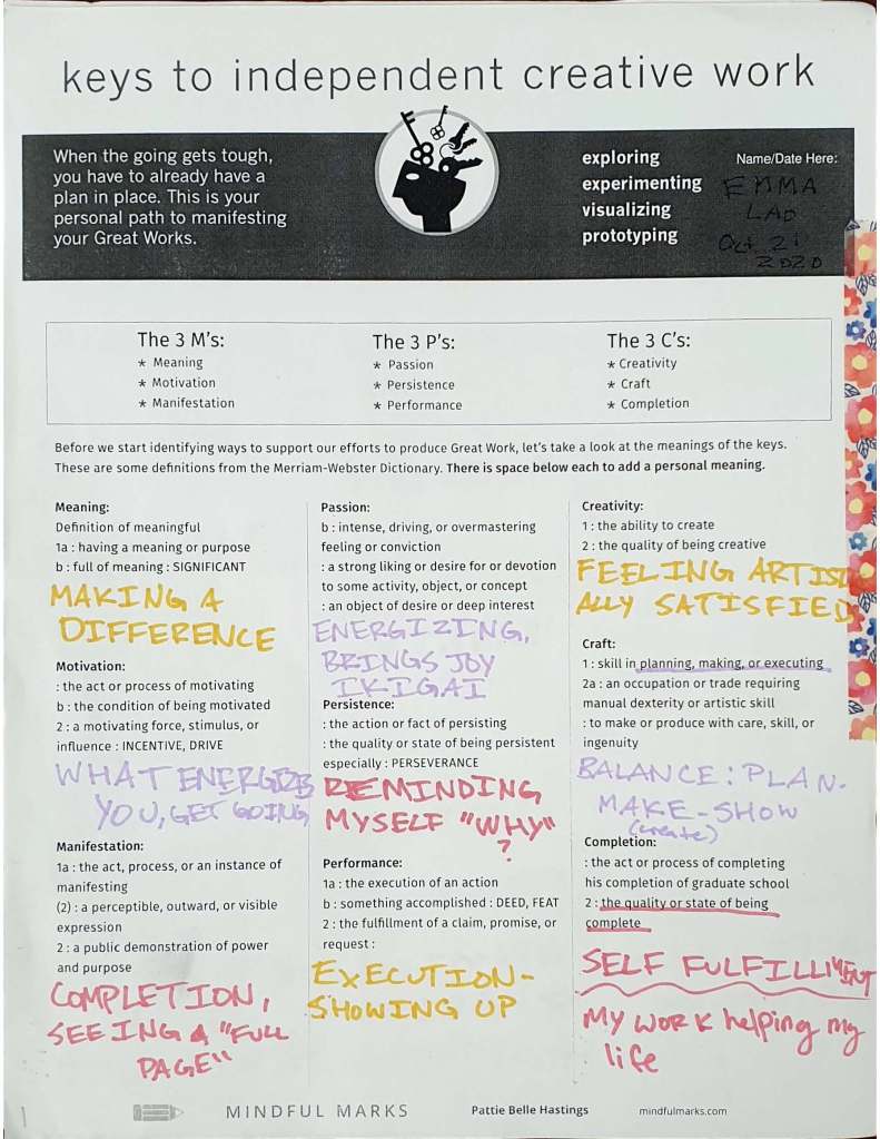
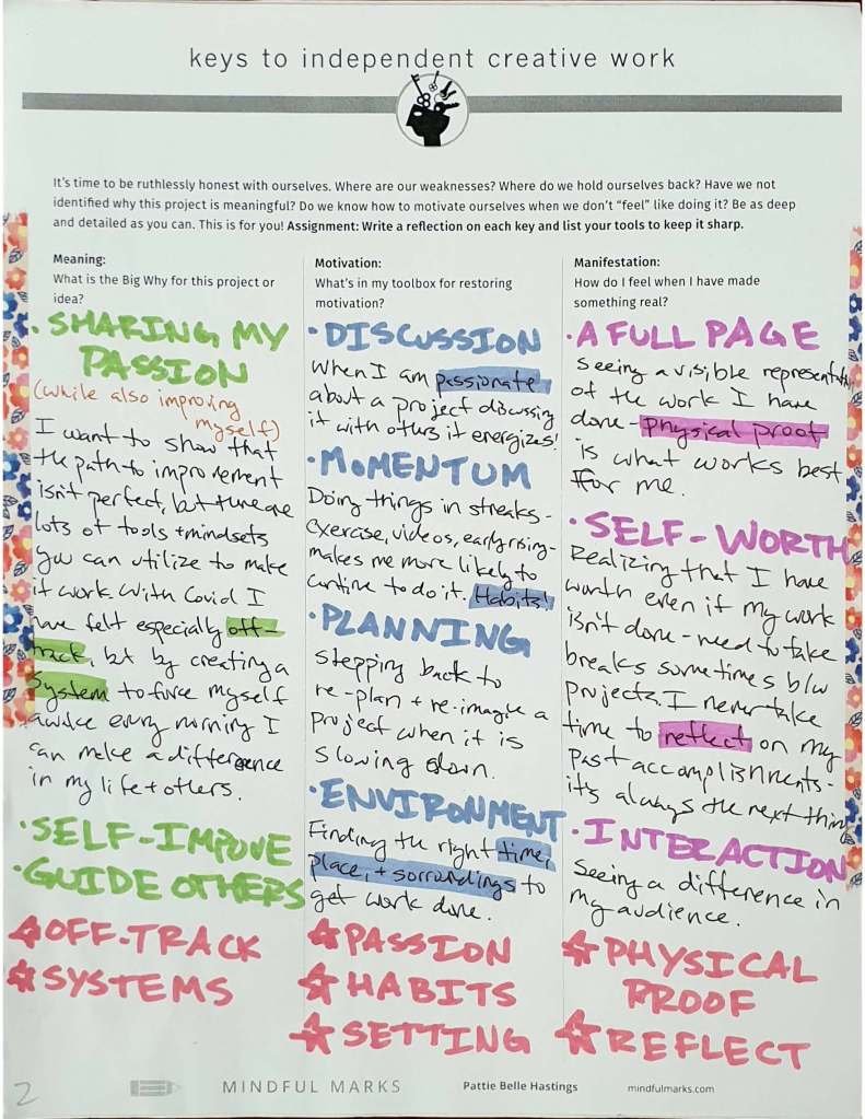
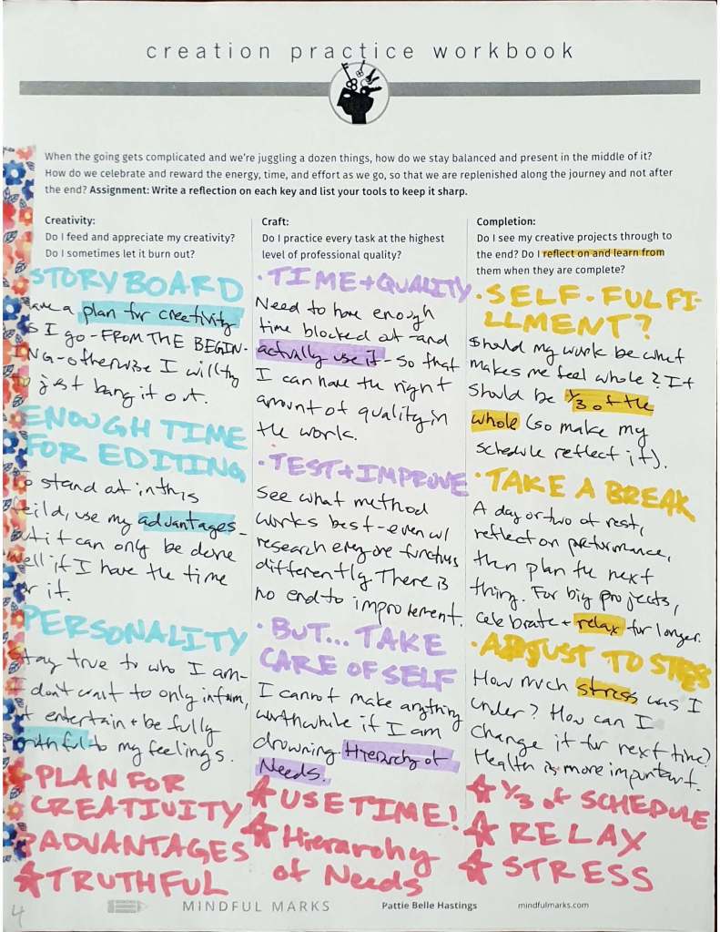
To conclude this experience I decided to take some of my own advice and assess why I wanted to do this project in the first place. Before I had even fully fleshed out my idea I filled out a worksheet on the keys to independent creative work from Mindful Marks.
Some key elements that I want to infuse with the work I do includes doing what energizes me, making a difference, showing up to do the work, and having my work be fulfilling/help my own life.
The very nature of my videos is that of finding balance and self-fulfillment, so the research for this work is actually mostly just working on bettering my life so that I can guide others. While the videos have a front of being about the Hobonichi Cousin, there are lessons that can be applied to many aspects of life. As I continue to make content I would like to branch out more and more (while maintaining deep roots in these keys) to continue giving value to my audience and energy within the work.
At the end of the day, this project (and the videos I will continue to make) will create value either way. I am overjoyed that my content has been able to bring joy and inspiration to others, but even if it did not it was beneficial to me in itself. By making these videos I have a documentation of a system that works for whatever path I decide to take in my life – whether it is content creation or not – that I can continue to re-visit.
The process of creating the content has been an extremely helpful practice as well. While my past work and studies have focused on documentary work on other subjects, I had to learn to adapt to being the subject as well as the director and editor. The timeline and best practices are also much different (and something that will still take a while to get used to) – I am used to spending tons of time on a single project so that it has the upmost quality. I am still focused on quality, of course, but the deadlines for YouTube videos of this caliber are closer together so there is a different balance.
For now I will continue to make videos, albeit at a slightly more spaced-out but strict schedule. What is next in my line of sight is a Hobonichi Cousin 2021 first impressions and goals video and perhaps a video on my quest to “Marie Kondo” my home. What will come after that is not known as of yet, but what I know is that I need to rest, reset, and re-envision. More will come in time and the positive reaction I have received so far is making me even more excited to continue this project.
If you would like to see what I am creating next, follow my blog. If the Hobonichi Series interested you in particular subscribe to my YouTube Channel to see even more. Thank you for following me in this journey, I am excited to see where I go next!
Full disclosure: this week was rough for me. Still, I had to get what I need to get done. Thanks to the preparation and work I put in earlier I was able to upload the second part of my series, even if it meant I was completely drained by the end of it. Still, it can only go up from here.
A Good Start – Then Life Did It’s Thing
I started the week feeling great and excited about wrapping up my project. I was able to bang out a script for the last video based on the last bits of research I had and made a plan for the week that seemed full-proof (after all, I have been at this for 5 weeks now and I finally have a feel for how long certain tasks take). You can see my script and shot list here:
Then, one bad thing came after the other. I spent the majority of the day on Tuesday (which was my main filming day) jumping from vet to vet to get my cat help and felt to emotionally drained to do anything after my shift that night. Then I had work for two days and was able to finally get started again on Friday.
Getting Ahead (Even When I’m Behind)
I made the decision to film both episodes in the same session to save time later on. While it may have contributed to me to missing this deadline by a day, I have all of my footage captured, transferred, and proxied. In the future this is probably a better idea if I do another project like this since a lot of the time filming is in the setup and cleanup, so I saved quite a bit of time overall.
One major frustration that I had was my lav mic picking up my clothes rubbing against it. I feel awful spending all that time capturing footage just for the audio to be so bad, but I had to continue on for the sake of time. I am hoping that the better quality audio from my Blue Yeti balances out the crappy quality from an unlucky shoot.
Another major frustration came when I had just begun to edit – I came down with an awful migraine that I couldn’t shake. I edited what I could and realized that it was unrealistic for me to upload the video that night so I just decided to get some rest and pick it up again tomorrow. Tomorrow came, and here I am. The rest of the editing process when smoothly – much faster than last time since I have already made a layout for text, archival footage, titles and end cards, and my thumbnails. I was also able to edit my good audio quicker. I spend a few hours trying to figure out a way to fix the lav issue, but found that the time it would take to make very minimal changes was just not worth it.
To see a summary of everything I did this week you can see my production journal here:
While it is too early to give any analytics or insights on the video’s performance yet, I am excited to give an update at the end of the week. Check out my video and let me know what you think:
By the end of the week I will upload my final video on the daily journal section of the Hobonichi and have a page to sum up my entire project. Follow my blog to keep updated!
This past week (well, actually the week before that since I took a break for Thanksgiving) I finally posted my first episode! It feels great to finally see a finished product from my work. I still have two more to get to, though!
Step One: The Filming
First off I had to film my video. This turned out much smoother than my test shoot – there were no technical issues and every shot I had planned I got to make. Since I had mapped out every single shot and what type of shot it was (b-roll, talking to camera, looking at journal, ect.) the process was smooth as could be.
One thing that I think would improve this step would be to gather my voiceover sooner than I had. Instead of making the rough cut and v.o. right after filming I waited a couple of days and by then I had lost my momentum so I had to build it up again. Still, I was able to do so and moved to the second phase.
Step Two: Editing
Again, because of my script and shot list, this process was fairly easy – though with the color correction, voice over, audio editing, gathering music, text editing, and image creation it ended up taking about seven or so hours. I may have been able to chop off an hour if I had made proxies of my footage earlier, though.
Along with editing the video I used stills from the shoot to create my channel art and icon. For my icon I used photoshop, taking a pose that I made during my filming that I knew I would use either for my thumbnail or the icon.
For my banner I used the tool from snappa.com. This was very helpful since there are borders that certain devices will see. if you go to my channel page on desktop or mobile you will only see a narrow strip of the image, but on a television you will see the full thing.
I also made my thumbnail in in Photoshop. I went for a more simple look, similar to AmandaRachLee‘s thumbnails (which I took note of from last week’s competitive analysis). I think next week I will try to mix things up but keep the same font for continuity.
Step Three: Uploading
Finally I was able to upload my video. While the file was processing I took my time to create a description that had relevant keywords, links to my social media, and timestamps for each section.
And now, the result! It feels good to finally have a finished prodcut from all of the work I have done so far.
Step Four: Monitor & Interact
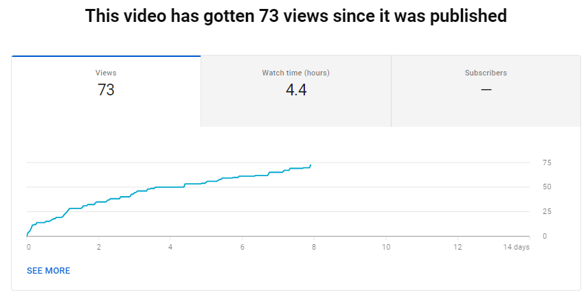
As of right now (a week after posting) the video has 73 views and comments from two users that I have replied to. The views seem to be growing steadily, so I am satisfied with this result.
The retention rate is not optimal, but not the worst. As you can see from the chart below the views drop to about 55% within the first few seconds. This means that for my next video I will get to the point right away. After I begin the videos main content, though, the retention stays at around 33% so it looks like those who are interested in what I begin to talk about stay to hear it all.
As the weeks go on I will continue to monitor the analytics and make adjustments as needed. For now I am happy to know that my views are going up, even if it is a slow growth.
On to the next…
This week I also finished my research for the rest of my videos and wrote the script and shot list for Episode 2. I am glad that I ended up doing the research for Episode 3 before beginning the script for Episode 2 since I incorporated a lot of ideas from Arnold Bennett’s How to Live on 24 Hours a Day.
Because I found the method of color-coding each beat in the script and shot list to be very useful in the filming and editing process the first time, I continued that in these next documents. You can see my updated (and almost complete) bibliography and the script & shot list for Episode 2 below:
One final task I did was shift the dates on my Trello board since I decided to use my week off after finishing Episode 1. I have no wiggle room now, so I will be sure to keep on top of everything and listen to my own advice!
Stay tuned for next week’s post where I will be tackling the next episode’s filming, editing, uploading, and creating the script and shot list for the third and final video.
This week I ran into quite a few hurdles. I had planned a week full of productivity and production, but sickness – both physical and mental – did what it does best and got in the way. I am not too anxious about the future, though, since I spent the time knowing that I had to rest, then reset once I was feeling better and re-envision the future of my project.
Great Expectations not Quite Met: The Production Journal
This week’s plan had my week full of activities – researching for episode two, creating social media channels, and most importantly filming and editing my first episode. Unfortunately I prioritized the quickest work first so when I got sick it meant that my longest and most important task (filming and editing the first episode) had to be pushed to next week.
Luckily, though, I had two factors working in my favor: one, I had planned to finish all of my work a week earlier than it is due and two, I made one of my weeks lighter on work (which just happened to be this upcoming week). So even though I am behind, it is more like I am behind on being ahead – and if all goes well this coming week I should be continuing on as planned.
To see this week’s production journal that breaks down every task I did (and did not) do, look at the document below:
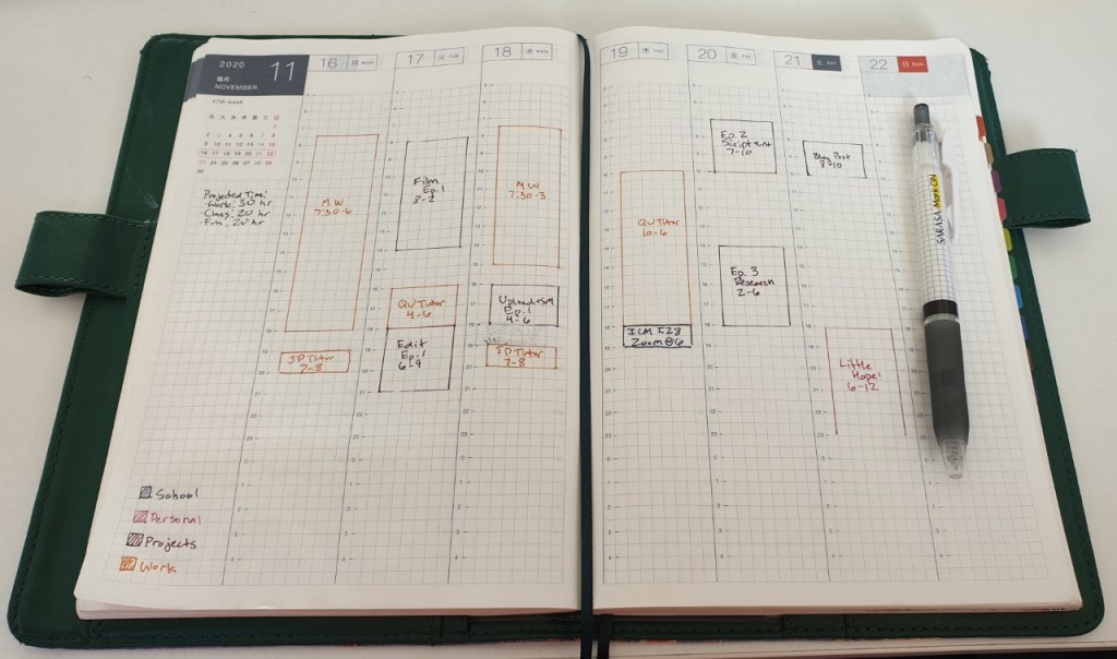
The pre-decorated plan for this week. As long as I follow this, all should run smoothly!
Learning from the Creators: Competitive Analysis
To make my channel preform at its peak and reach the audience I want it to I need to look at how the creators with similar channels are successful. In my analysis I looked to five channels and their sub count, average and peak viewership, titles, descriptions and keywords, thumbnails, audience comments, strengths, weaknesses, opportunities, and threats (if there are any).
For most of these notes I looked to their twelve highest performing videos. Some key takeaways I had from this analysis were keywords that are relevant (and that will connect me to their channels), which thumbnails were on their most popular videos, using the description not only for keywords but to timestamp different sections (which is also a new built-in tool for YouTube), and sticking to my niche once it is established.
Connecting to my Audience: Social Media Creation & Content Planning
If there is one thing that I am not naturally good at (well, there are many things of course) it is social media. Even though I am a part of the most active generation of users and I grew up during its creation, I do not use social media nearly as much as my peers. It my be due to the fact that I know how harmful it can be to mental health and productivity (which is something that I will actually explore in one of my videos) but the fact of the matter is if you have an online presence, you need to be active. Luckily I have taken a course in Social Media Strategy so I have the training I need to connect and engage with my audience.
I decided that I will use three main social media outlets: YouTube (of course for my videos, but the community tab as well), Instagram, and Facebook.
YouTube. This will not only be the place where my content lives, but where I can most directly reach my viewers via comments and the community tab. I will be replying to as many comments as I can as they pop up and have planned posts for the community tab that include previews for my videos, reminders to connect on other social pages, and polls for video topics.
Instagram. My Instagram will be used more as a tool to gather new viewers, promote my content, and share messages and photos that relate to my message/brand. Posts will include weekly spreads, any pages that I create that spark joy, previews to new videos, and content that it topical (like a Thanksgiving post about gratitude).
Facebook. Originally I had made a Facebook business for my channel, but I decided to scrap that and create a group instead. This page will serve to create a community where my viewers can share their creations, goals and progress, ask for advice, and encourage each other to make progress towards creating systems that will improve their life. Posts will include links to new videos, weekly spreads and progress reports, and questions about how others work best (ex. what music they listen to while studying, photos of their workspaces, ect.). Making the shift from a business page to a group has sparked lots of excitement for what is to come as the community grows.
To see a peek at what content I will be creating over the next month view my content calendar below:
This week, of course, I continued on with my research in preparation for writing the script for episode two. This research centered on taking care to plan each minute of your day with regards to the processes you planned to reach your goals, living the life that you want to live (not the life that someone else lives or says you should live), and setting aside time for rest to avoid burnout and stress.
One of the main readings this week was Ikigai: The Japanese Secret to a Long and Healthy Life by Hector Garcia and Fransec Miralles. This book came to me at a time when I was in great need – I was nearing the end of my trip in India where I was filming a documentary and I was inches away from total self-destruction led by neglecting my needs. The ideas explored in this book are the exact counter to that issue: ways to do what you love while maintaining a healthy and stress-free life.
One of the topics that I will explore in-depth in my video will be the seven requirements to reach a state of flow (knowing what to do, knowing how to do it, knowing how well you are doing, knowing where to go, perceiving significant challenges, perceiving significant skills, being free from distractions).
Another topic will cover how to concentrate on a single task at a time (no screens during the 1st or last hour of the day, turn off your phone during flow, tech fasting day, Pomodoro, set email times, doing an enjoyable ritual before work, and bundling ritual tasks).
The book also has many excerpts from people who have lives a fulfilling and balanced life, as well as some exercises that promote wellness. One of my favorite activities that I have instilled from this book is the sun salutation stretch that should be done every time you wake up or begin a new task:
Next week is the real deal – my first episode will be filmed, edited, and uploaded and my social media channels will start being active. Stay tuned for that and more!
This week I finished the research for episode one, created the script and shot list, made a test video, and made a production journal.
Project Planning in Action: The Production Journal
In order to take stock of what needs to be done every week I have already created my project management system, but now I want to record how long each component took and how I felt about the task in a weekly production journal.
From the beginning it was clear that I underestimate the time it takes to do most tasks – mostly the research (since I like to take time to write down notes on everything relevant) and the filming since I had not made room for equipment error (of which there was plenty). Still I got everything done except for one short task which I will move to next week. Seeing the cumulative hours spent on the project (this week was 22) makes me excited to create these videos with the research put behind it.
I have another column in the project plan titled E/N/D. This is something that I borrowed from Amber Rae when I heard how she takes stock of her daily tasks (I have the clip that I used as an example from a previous video timestamped below). After every task she writes E if it energized her, N if it was neutral, and D if it drained her. It is important to see what tasks energize you so you can try to incorporate things like it more and what drained you so you can try to see why.
Finally there is a column for a note of my general takeaway or something that stood out to me during the task. I will continue to do these journals for every week so stay tuned for more!
Episode One Research
This week I wrapped up the research for episode one with the articles, podcasts, and the book 12 Rules for Life by Jordan B. Peterson – a text that excited me for this project beyond belief.
Since the book is rather dense I chose four of the twelve rules that apply most to the first episode: “Rule 2: Treat Yourself Like Someone You are Responsible For Helping,” “Rule 4: Compare Yourself to Who You Were Yesterday, Not to Who Someone Else is Today,” and “Rule 7: Pursue What is Meaningful (Not What is Expedient).”
Rule 2 will be used in the introduction of my video to explain why it is important to set systems for habit change in place – you need to ask yourself “What might my life look like if I were caring for myself properly?” (62). Rule 4 ties in well to the need for systems vs. goals as described in Clear’s Atomic Habits; “Perhaps happiness is always to be found in the journey uphill, and not in the fleeting sense of satisfaction awaiting at the next peak” (94). Rule 7 ties into Pressfield’s idea of resistance as explained in The War of Art – it is easy (or expedient) to give into resistance and not do what you need to do, but it is almost always the wrong choice that could even lead to evil.
From Reddit user u/overtotheedge, a compilation of illustrations by Ethan Van Sciver
I would love to explore his ideas further in future videos if my audience is receptive to it – even though it is not as clearly linked to habit change and productivity as the two books from last week, it was still extremely helpful in tying all of these ideas together. To see my full updated bibliography see the document below:
Now that all of the research had been done it was time for me to create the script and bring all of the ideas together into a comprehensive and actionable plan. This was the most energizing task yet since I could finally start to visualize how this will all look in a final product. As always I began with a written draft then cleaned everything up in a digital copy afterwards.
After making the digital draft of the script I made another document with the shot list, coordinating the number of the line with the shots that will go with it. There are five different kinds of “shots” that will be in the video – b-roll, speaking to the camera, text animation, the journal shot, and archival footage. I did my best to make a variety so that the audience would not get bored visually. See the two documents below:
Next I conducted a test shoot in each situation I will be recording. This is the first frustration I have come across – all was going well until one of the bulbs for my lights blew out. I spent about an hour trying to get a replacement sent to me – thankfully it will be here on time – but it really soured my mood. I decided to work out to get my mind off of it (and used the opportunity to practice grabbing some b-roll) and by the time I was done I felt better, but I was out of time to practice more.
This was after one of the bulbs blew – I had to improvise with my light bounce.
I am glad that this happened, though, because I know that I need to add on at least two extra hours to my filming day for obstacles such as these. I also realized how bland my background is which set me to research backdrops and find an extra setup (using my desk as the background and sitting in my chair).
Still, I am feeling excited overall and I cannot wait to jump into next week where I create my social media channels and plan, re-vamp my channel (after a competitive analysis), and shoot and edit my first episode. Stay tuned for more!